What is the yaml code to show 2 entities on the same graph (such as temperature and humidity for example) ?

As far as I know, this is not possible with the standard HA sensor graph card. Therefore use Mini-Graph Card from HACS.
You can add 2 sensors and also show 2 graphs.
Here an example. I’ve used Card-Mod to customize the mini-graph card, which will be my new header.

hey is it possible that someone could help me with my mediacard design? iam to dumb to do this 
i want the same look like my other cards.

type: entities
entities:
  - type: custom:mini-media-player
    entity: media_player.sonos_roam
    group: true
    source: icon
    info: short
    hide:
      volume: true
      power: true
    card_mod:
      style: |
        ha-state-icon {
          color: black;
          primary-text-color: black;
          border-radius: 25px !important;
          border-style: none
         }
         ha-card {
           font-family: "HK Nova";
            primary-text-color: black;
        }
  - type: custom:mushroom-chips-card
    alignment: end
    chips:
      - type: entity
        entity: script.do_912
        tap_action:
          action: toggle
        content_info: name
        name: DO 91,2
      - type: entity
        entity: script.media_play_1live
        tap_action:
          action: toggle
        content_info: name
        name: 1LIVE
      - type: entity
        entity: script.media_play_antenen_unna
        tap_action:
          action: toggle
        content_info: name
        name: Antenne Unna
      - typ: entity
        entity: sensor.sonos_roam_batterie
    card_mod:
      style: |
        ha-card {
         --chip-background: transparent;
          font-family: "HK Nova";
          --primary-text-color: black;
         }
  - type: custom:mini-media-player
    entity: media_player.unnamed_room
    group: true
    source: icon
    info: short
    hide:
      controls: true
    card_mod:
      style: |
        ha-state-icon {
          color: white;
          border-radius: 25px !important;
          border-style: none
         }
         ha-card {
           font-family: "HK Nova";
        }
  - type: custom:mushroom-chips-card
    alignment: end
    chips:
      - type: entity
        entity: script.do_912
        tap_action:
          action: toggle
        content_info: name
        name: DO 91,2
      - type: entity
        entity: script.media_play_1live
        tap_action:
          action: toggle
        content_info: name
        name: 1LIVE
      - type: entity
        entity: script.media_play_antenen_unna
        tap_action:
          action: toggle
        content_info: name
        name: Antenne Unna
      - typ: entity
        entity: sensor.unnamed_room_batterie
    card_mod:
      style: |
        ha-state-icon {
          color: black;
          primary-text-color: black;
          border-radius: 25px !important;
          border-style: none
         }
        ha-card {
         --chip-background: transparent;
          font-family: "HK Nova";

          --primary-text-color: black;
         }
theme: Rounded
state_color: true
card_mod:
  style: |
    ha-card {
    background-color: var(--black7);
    primary-text-color: black;
    secondary-text-color: black;
    box-shadow: 10px 12px 24px 0px rgba(0,0,0,0.66) !important;
    border-radius: 36px 36px 36px 36px !important;
    }
1 Like
Have you manually added HK Nova font to your resources? Though, this is a paid font. There is one font type the medium version available for free on certain platforms.
Yes, manually added! But the Font is not the problem.
I would use a custom button card as “container”. Style it so that the icons and stuff fit. Then add the media player cards as custom_fields. Set the icon of the media player card to none or set the width to 0. With the help of card_mod.
You get better control over the design with button card.
Very nice dash!
Do you want to share your room card code?
Thx!
Hi i am Working on my old Window/Cover Card:

I cant get the right alignment with the Custom Buttons.
Maybe someone can help me please 
type: vertical-stack
cards:
- type: vertical-stack
cards:
- type: custom:vertical-stack-in-card
cards:
- type: custom:button-card
name: Schlafzimmer
icon: mdi:bed
entity: cover.velux_window_2
tap_action: none
show_state: false
show_icon: false
custom_fields:
btn:
card:
type: custom:mushroom-chips-card
chips:
- type: entity
tap_action:
action: toggle
icon: mdi:weather-windy
entity: input_boolean.helfer_luften_schlafzimmer
content_info: name
name: Lüften
card_mod:
style: |
ha-card {
--chip-background: {{ 'var(--blue)' if is_state('input_boolean.helfer_luften_schlafzimmer', 'on') else 'var(--contrast8)' }};
padding: 1px!important;
border-radius: 10px!important;
{% if is_state('input_boolean.helfer_luften_schlafzimmer', 'on') %}
animation: blinkAnimation 1s infinite; /* Blinken mit einer Sekunde Dauer */
{% endif %}
}
@keyframes blinkAnimation {
0% {
--chip-background: var(--blue);
}
50% {
--chip-background: var(--contrast8);
}
100% {
--chip-background: var(--blue);
}
}
styles:
grid:
- grid-template-areas: '"n btn"'
- grid-template-columns: 1fr min-content
- padding: 6px
card:
- padding: 6px
- background: var(--contrast2)
name:
- justify-self: start
- align-self: center
- padding-left: 10px
- font-size: 20px
- font-weight: 500
- color: var(--contrast20)
- type: tile
entity: cover.velux_window_2
icon: mdi:window-closed-variant
color: var(--contrast10)
tap_action:
action: none
icon_tap_action:
action: none
show_entity_picture: false
hide_state: false
vertical: false
features:
- type: cover-position
- type: vertical-stack
cards:
- type: horizontal-stack
cards:
- type: custom:button-card
tap_action:
action: call-service
service: cover.set_cover_position
service_data:
position: 100
entity_id: cover.velux_window_2
entity: cover.velux_window_2
name: Auf
show_icon: false
card_mod:
style: |
ha-card {
--ha-card-background:
{% if 1 <= state_attr('cover.velux_window_2', 'current_position') <= 100 %}
var(--red);
color: var(--contrast20);
{% else %}
var(--contrast8);
{% endif %}
}
styles:
card:
- border-radius: 10px
- box-shadow: 0px 0px 0px 0px
- padding: 10%
- margin: 5%
- type: custom:button-card
tap_action:
action: call-service
service: cover.set_cover_position
service_data:
position: 75
entity_id: cover.velux_window_2
entity: cover.velux_window_2
name: 75%
show_icon: false
card_mod:
style: |
ha-card {
--ha-card-background: var(--contrast8);
}
styles:
card:
- border-radius: 10px
- box-shadow: 0px 0px 0px 0px
- padding: 10%
- margin: 5%
- type: custom:button-card
tap_action:
action: call-service
service: cover.set_cover_position
service_data:
position: 30
entity_id: cover.velux_window_2
entity: cover.velux_window_2
name: 30%
show_icon: false
card_mod:
style: |
ha-card {
--ha-card-background: var(--contrast8);
}
styles:
card:
- border-radius: 10px
- box-shadow: 0px 0px 0px 0px
- padding: 10%
- margin: 5%
- type: custom:button-card
tap_action:
action: call-service
service: cover.set_cover_position
service_data:
position: 10
entity_id: cover.velux_window_2
entity: cover.velux_window_2
name: 10%
show_icon: false
card_mod:
style: |
ha-card {
--ha-card-background: var(--contrast8);
}
styles:
card:
- border-radius: 10px
- box-shadow: 0px 0px 0px 0px
- padding: 10%
- margin: 5%
- type: custom:button-card
tap_action:
action: call-service
service: cover.set_cover_position
service_data:
position: 0
entity_id: cover.velux_window_2
entity: cover.velux_window_2
name: Zu
show_icon: false
card_mod:
style: |
ha-card {
--ha-card-background:
{% if 0 <= state_attr('cover.velux_window_2', 'current_position') <= 0 %}
var(--green);
color: var(--contrast20);
{% else %}
var(--contrast8);
{% endif %}
}
styles:
card:
- border-radius: 10px
- box-shadow: 0px 0px 0px 0px
- padding: 10%
- margin: 5%
- type: tile
entity: cover.velux_internal_cover
icon: mdi:roller-shade
color: var(--contrast10)
tap_action:
action: none
icon_tap_action:
action: none
show_entity_picture: false
hide_state: false
vertical: false
features:
- type: cover-position
- type: vertical-stack
cards:
- type: horizontal-stack
cards:
- type: custom:button-card
tap_action:
action: call-service
service: cover.set_cover_position
service_data:
position: 100
entity_id: cover.velux_internal_cover
entity: cover.velux_internal_cover
name: Auf
show_icon: false
card_mod:
style: |
ha-card {
--ha-card-background:
{% if 1 <= state_attr('cover.velux_internal_cover', 'current_position') <= 100 %}
var(--red);
color: var(--contrast20);
{% else %}
var(--contrast8);
{% endif %}
}
styles:
card:
- border-radius: 10px
- box-shadow: 0px 0px 0px 0px
- padding: 10%
- margin: 5%
- type: custom:button-card
tap_action:
action: call-service
service: cover.set_cover_position
service_data:
position: 75
entity_id: cover.velux_internal_cover
entity: cover.velux_internal_cover
name: 75%
show_icon: false
card_mod:
style: |
ha-card {
--ha-card-background: var(--contrast8);
}
styles:
card:
- border-radius: 10px
- box-shadow: 0px 0px 0px 0px
- padding: 10%
- margin: 5%
- type: custom:button-card
tap_action:
action: call-service
service: cover.set_cover_position
service_data:
position: 30
entity_id: cover.velux_internal_cover
entity: cover.velux_internal_cover
name: 30%
show_icon: false
card_mod:
style: |
ha-card {
--ha-card-background: var(--contrast8);
}
styles:
card:
- border-radius: 10px
- box-shadow: 0px 0px 0px 0px
- padding: 10%
- margin: 5%
- type: custom:button-card
tap_action:
action: call-service
service: cover.set_cover_position
service_data:
position: 10
entity_id: cover.velux_internal_cover
entity: cover.velux_internal_cover
name: 10%
show_icon: false
card_mod:
style: |
ha-card {
--ha-card-background: var(--contrast8);
}
styles:
card:
- border-radius: 10px
- box-shadow: 0px 0px 0px 0px
- padding: 10%
- margin: 5%
- type: custom:button-card
tap_action:
action: call-service
service: cover.set_cover_position
service_data:
position: 0
entity_id: cover.velux_internal_cover
entity: cover.velux_internal_cover
name: Zu
show_icon: false
card_mod:
style: |
ha-card {
--ha-card-background:
{% if 0 <= state_attr('cover.velux_internal_cover', 'current_position') <= 0 %}
var(--green);
color: var(--contrast20);
{% else %}
var(--contrast8);
{% endif %}
}
styles:
card:
- border-radius: 10px
- box-shadow: 0px 0px 0px 0px
- padding: 10%
- margin: 5%Hi there, do you mind maybe sharing an example code for that please? I already use the custom HACS card, but I cannot seem to alter the styling via card_mod… Probably some syntax error… Thanks!!
Where did you get those images for youtube/npo/twitch/etc?
Sorry, this might be a stupid question but where is the rounded.yaml file?
Did anybody find a way to use the new section dashboard with the rounded theme?
Sure. I just changed my code, so that it looks closer to Leons original design. I left most of the attributes in the code, so that you guys xan play around. I would recommend to change each background and font-color tona different color, then you can see the changes. It took me like one day to figure out, how I can modify the card.
type: custom:mini-graph-card
entities:
  - entity: sensor.temp_sensor_flur_temperature
    color: var(--teal)
    index: 0
    name: Temperatur
    unit: °
    show_fill: false
  - entity: sensor.temp_sensor_flur_humidity
    color: var(--blue)
    index: 0
    name: Feucht
    show_state: true
    unit: ''
    y_axis: secondary
    show_fill: false
show:
  icon: true
  name: true
  labels: false
  legend: false
height: 100
animate: true
decimals: 1
card_mod:
  style: |
    ha-card {
      background-color: var(--blue-tint) !important;
      padding: 1rem 1rem 1rem 1rem !important;
      border-radius: 24px 24px 24px 24px;;
      color: var(primary-text-color);
    }
    .graph {
      background: none;
      overflow: hidden;
      align-self: flex-end;
    }
    .graph__container {
      margin-top: 0;
      background-color: rgba(0,0,0,0);
    }
    .states {
      flex-flow: row wrap !important;
      row-gap: 0rem !important;
      align-self: flex-start !important;
      margin-top: 0rem !important;
      margin-bottom: 0rem;
      padding: 0rem 0rem 0rem 0rem !important;
      border-radius: 24px 0px 0px 24px !important;
      color: var(--primary-text-color) !important;
      background-color: none;
      order: 1 !important;
    }
    .state.false {
      font-size: 18px !important;
      color: var(--primary-text-color) !important;
      line-height: 36px !important;
      align-self: flex-start !important;
      background-color: none;
      border-radius: 0 !important;
      padding: 0rem !important;
      margin-top: 0rem !important;
    }
    .state.false .state__uom {
      margin-top: 0 !important;
      margin-left: 0rem !important;
      padding: 0rem 0rem 0rem 0rem !important;
      font-size: 42px !important;
      line-height: 36px !important;
      background-color: rgba(0,0,0,0);
      opacity: 1 !important;
      border-radius: 0 !important;
      z-index: 1;
    }
    .states--secondary {
      font-size: 7px !important;
      opacity: 0.6 !important;
      line-height: 36px !important;
      align-self: flex-start !important;
      background-color: rgba(0,0,0,0) !important;
      padding: 0 !important;
      border-radius: 24px 24px 24px 24px !important;
    }
    .state--small .state__uom {
      font-size: 12px !important;
      font-weigth: 500 !important;
      line-height: 36px !important;
      background-color: none;
      opacity: 0.6 !important;
    }
    .state__value {
      margin-top: 0rem !important;
      padding: 0rem !important;
      background-color: none;
      line-height: 36px !important;
      z-index: 1;
    }
    .header {
      width: min-content;
      font-size: 12px !important;
      line-height: 18px !important;
      background: var(--primary-text-color);
      border-radius: 24px !important;
      padding: 6px 10px !important;
      margin: 1.5rem 1.5rem -1.5rem 1.5rem !important;
      z-index: 1 !important;
      order: 2 !important;
    }
    .name .ellipsis {
      color: var(--primary-background-color);
      opacity: 1 !important;
      align-self: flex-end !important;
    }
    .icon {
      align-self: flex-end !important;
      color:
        {%- set hvac = states('climate.heizung_kuche') %}
        {%- if hvac == 'off' %}var(--primary-background-color) !important
        {%- else %}red !important
        {%- endif %};
      opacity: 1 !important;
    }
any recommendations for more colors that fit to light/dark mode?
I’m rocking this dashboard for a year now and I love it. Same goes for the now playing card, however I miss some media controls in the card itself. Would it be somehow possible to add skip and play pause to the card? For example underneath the artist/song info. If someone has an idea on how to make this happen, you’re my hero! Please let me know! Thanks!
Hey good people!
I tried to make a use if this wonderful guide and theme and create my own Rounded dashboard, but I’m having very annoying bug. The swipable card with sensors is not working as it should be. It used to have correct alignment, but at some point it started to look like in the screenshot. All the config is straight up copy pasted from this thread (the updated version of the rounded theme yaml file minus the bottom bar)
Do you have any suggestions as to what needs to be changed or what (or where) might have gone wrong?
I have exactly the same problem with the incorrect display of the sensor graph card since the Home Assistant 2024.07 update 
I have already tried and commented out some settings of the card-mod-card-yaml: category in the rounded theme file. But unfortunately without success so far.
I’m also excited to see how my dashboard will turn out  Recently, I’ve been working on other projects because I was missing custom cards for my ideas. So, I wrote them myself. Home Assistant needs a bit more swipe love. CSS slider cards and a swipe button card. What’s special about them is that they are more like containers, and you can integrate any card from Home Assistant (incl. Button-Card) and adjust it to your own design. Im not a good developer, but the cards are pretty simple and working perfectly, while using mostly css and js. no swipe engine. I would be happy, if you or Leon want to test and even contribute. Bet you are better in coding, than me. Here a video, what they look like.
CSS Swipe Card and Swipe-Button-card
2 Likes
I had the same problem since the update. Fixed it by adding
      .graph .footer {
        order: 3;
      }
below
      .graph hui-graph-header-footer {
        order: 3;
      }
in Rounded.yaml. @CM000n
4 Likes
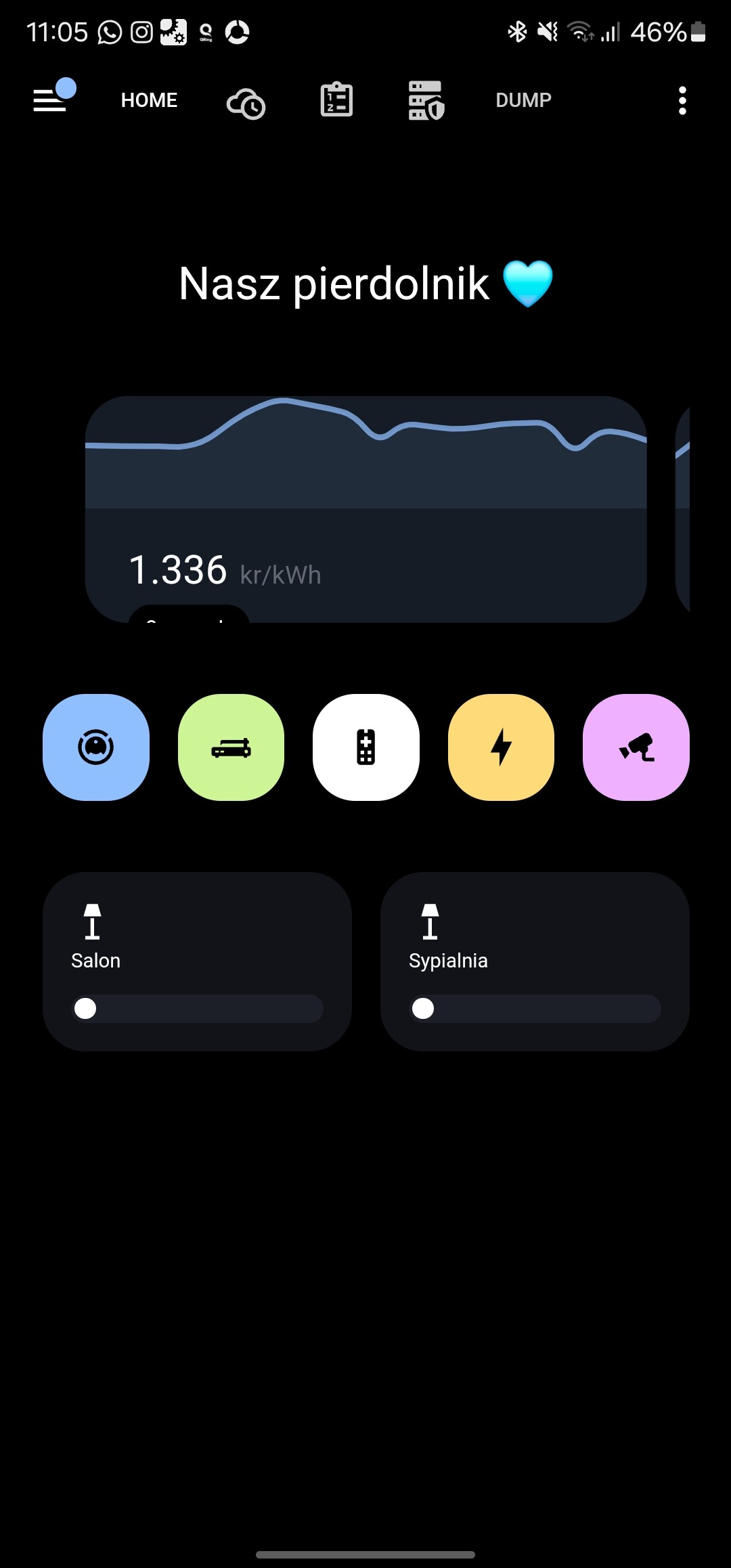
Anyone got any info on how you can get a single banner across the top? and then the individual lights underneath?
https://www.reddit.com/r/homeassistant/comments/17fc5nc/home_assistant_tablet_dashboard/#lightbox
