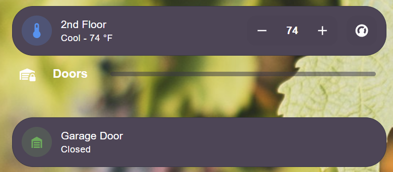
Hello - I’ve recently converted my dashboard to sections. I’m using a divider card (bubble card in HACS) to separate my “sections”. Here is what it looks like:
Unfortunately the spacing is sort of weird. The various title cards look better as far as spacing goes but don’t look as nice (no icon for example or the line).
I’m wondering if anyone is aware of a card in HACS that can accomplish my look with more flexibility? Or if it is possible to “style” one of the built in card to look similar my example?
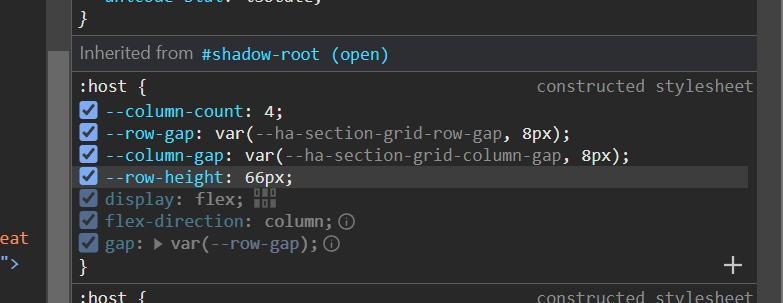
Seems others are having issues with other cards and too much white space below and they have identifies the same property. Unfortunately my knowledge here is fairly limited so I’m completely lost on finding a solution.