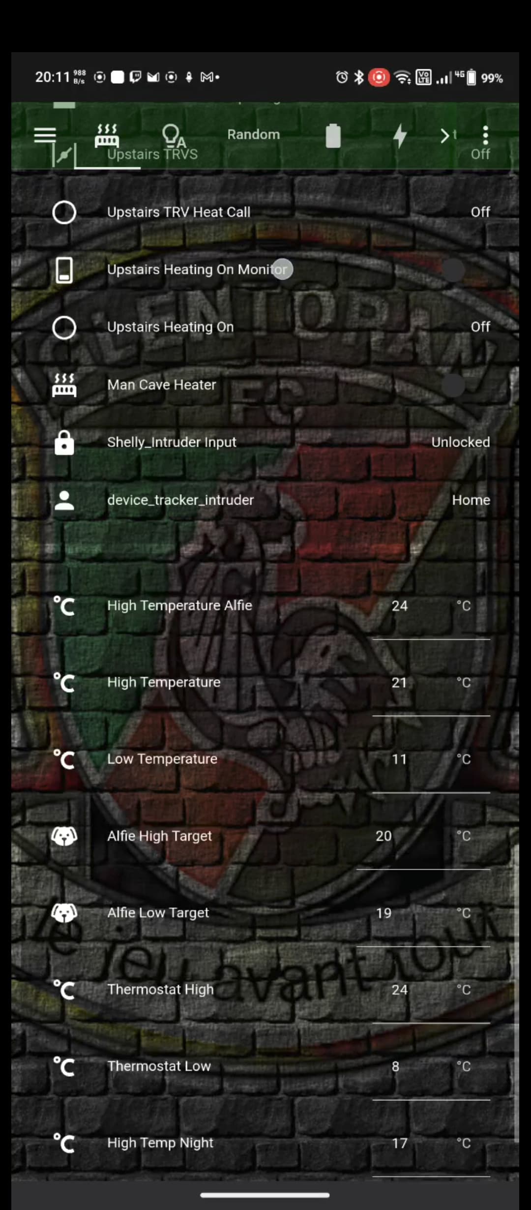
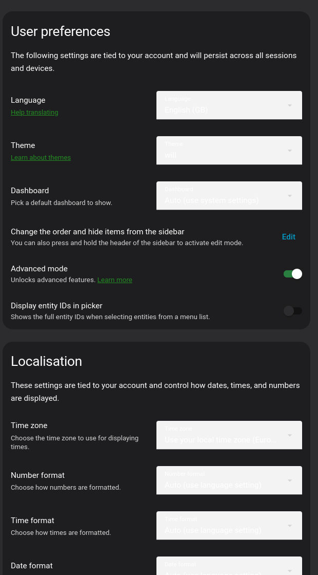
Hello, I have used a custom theme for a few years but a recent update must have changed something about the dropdown/selection boxes and I can’t for the life of me figure out how to fix it.
will:
# Global
background-image: "center / cover no-repeat fixed url('/local/images/glens.png')"
lovelace-background: var(--background-image)
primary-color: "#228b22" # from Apple systemOrange dark mode
light-primary-color: "#B6B6C1" # (icons on left menu) (light: systemGray5 from iOS dark mode, dark: XXX)
primary-background-color: "#2c2c2e" # systemGray5 dark mode
secondary-background-color: rgba(25, 25, 25, 0.9)
divider-color: rgba(152, 152, 157, 0.3) # from Apple systemGray dark mode
accent-color: rgba(255, 159, 9, 1)
# Text
primary-text-color: "#FFF"
secondary-text-color: "#d3d3d3"
text-primary-color: "#FFF"
disabled-text-color: "#555" # XXX: https://github.com/basnijholt/lovelace-ios-dark-mode-theme/issues/2
text-dark-color: "#FFF"
# Sidebar Menu
sidebar-background-color: var(--primary-background-color)
sidebar-icon-color: var(--light-primary-color)
sidebar-text-color: "#F1F1F1"
sidebar-selected-background-color: var(--primary-background-color)
sidebar-selected-icon-color: "#FFF" # (light: systemGray5 from iOS light mode, dark: XXX)
sidebar-selected-text-color: var(--sidebar-selected-icon-color)
# States and Badges
state-icon-color: "#FFF"
state-icon-active-color: rgba(255, 214, 10, 1) # or make light icons yellow when active: rgba(255, 214, 10, 1)
state-icon-unavailable-color: var(--disabled-text-color)
paper-item-icon-active-color: rgba(255, 214, 10, 1) # see https://github.com/basnijholt/lovelace-ios-dark-mode-theme/issues/30
# Sliders
paper-slider-knob-color: "#FFFFFF"
paper-slider-knob-start-color: var(--paper-slider-knob-color)
paper-slider-pin-color: var(--paper-slider-knob-color)
paper-slider-active-color: "#0984ff" # from Apple systemBlue dark mode
paper-slider-secondary-color: var(--paper-slider-knob-color)
paper-slider-container-color: rgba(255, 255, 255, 0.5)
paper-slider-font-color: "#000"
ha-slider-background: none !important
# Labels
label-badge-background-color: "#23232E"
label-badge-text-color: "#F1F1F1"
label-badge-red: rgba(255, 159, 9, 0.7) # from Apple systemOrange dark mode
# Cards
card-background-color: var(--secondary-background-color) # Unused entities table background
paper-listbox-background-color: var(--primary-background-color)
ha-card-border-radius: 20px
ha-card-background: rgba(10, 10, 10, 0.4)
paper-card-background-color: var(--ha-card-background)
ha-card-border-width: 0 # https://github.com/basnijholt/lovelace-ios-dark-mode-theme/issues/82#event-7732695357
# Toggles
paper-toggle-button-checked-button-color: "#484848"
paper-toggle-button-checked-bar-color: "#484848"
paper-toggle-button-unchecked-button-color: var(--paper-toggle-button-checked-button-color)
paper-toggle-button-unchecked-bar-color: var(--disabled-text-color)
# Table row
table-row-background-color: var(--primary-background-color)
table-row-alternative-background-color: var(--secondary-background-color)
# Switches
switch-checked-color: "#30d257" # XXX: remove when https://github.com/home-assistant/home-assistant-polymer/pull/4203 is in HA
switch-checked-track-color: "#30d158" # from Apple systemGreen dark mode
switch-checked-button-color: "#FFF"
# Other
paper-dialog-background-color: rgba(55, 55, 55, 0.8) # e.g., background of more-info
paper-item-icon-color: white # also should mini-media-player icon white (but doesn't work by itself)
more-info-header-background: rgba(25, 25, 25, 0.5)
lumo-body-text-color: var(--primary-text-color) # see https://github.com/basnijholt/lovelace-ios-dark-mode-theme/issues/42
app-header-background-color: rgba(5, 80, 0, 0.4)
markdown-code-background-color: "#464646"
code-editor-background-color: "#161616"
# Custom
mcg-title-letter-spacing: .15em
mini-media-player-base-color: white
mini-media-player-icon-color: white
# Added for https://github.com/basnijholt/lovelace-ios-dark-mode-theme/issues/72
# TODO: add description for lines below. Suggested in https://github.com/basnijholt/lovelace-ios-dark-mode-theme/issues/72
input-ink-color: var(--primary-text-color)
input-fill-color: transparent
input-disabled-fill-color: transparent
input-label-ink-color: var(--primary-text-color)
input-disabled-ink-color: var(--disabled-text-color)
input-dropdown-icon-color: var(--primary-text-color)
input-idle-line-color: var(--secondary-text-color)
input-hover-line-color: var(--secondary-text-color)
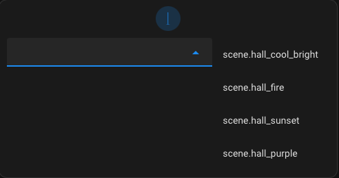
codemirror-property: var(--accent-color)I did base this theme off one of the IOS themes that haven’t been updated in a while and they’re all doing the same thing with the white boxes.
I’d looked through a few old posts about similar issues but none of the additional options I’ve tried seem to change the colour of the boxes.
#  mdc-select-fill-color: var(--primary-background-color)
#  mdc-select-ink-color: var(--primary-text-color)
#  mdc-select-label-ink-color: var(--primary-text-color)
#  mdc-select-dropdown-icon-color: var(--primary-text-color)
#  paper-listbox-background-color: var(--secondary-background-color)
# Add to your theme yaml file
#  mdc-select-fill-color: var(--primary-background-color)
#  mdc-select-ink-color: var(--primary-text-color)
#  mdc-select-label-ink-color: var(--secondary-text-color)
#  mdc-select-dropdown-icon-color: var(--primary-text-color)

# Fix for input fields / text boxes
#  mdc-text-field-fill-color: var(--primary-background-color)
#  mdc-text-field-ink-color: var(--primary-text-color)
#  mdc-text-field-label-ink-color: var(--secondary-text-color)

# Fix for dropdown background popup
  mdc-select-container-color: rgba( 75, 92, 105, 0.45)
  mdc-text-field-fill-color: rgba( 75, 92, 105, 0.45)
  mdc-text-field-ink-color: "#FFF"
  mdc-text-field-label-ink-color: "#FFF"
  mdc-select-fill-color:  rgba( 75, 92, 105, 0.45) #rgba( 10, 10, 10, 0.5)
  mdc-select-ink-color: "#FFF"
  mdc-select-label-ink-color: "#FFF"
  md-sys-color-surface: rgba( 75, 92, 105, 0.45)
I can change the text colour within the boxes with the text variables but the white boxes are ugly so I’d love to know what element I need to set the colout for to put them back to the nice grey they were last month.