benm7
December 16, 2020, 1:22am
1
Hi all,
Have decided to make a separate dashboard from my default dashboard as it has been built for mobile, and doesn’t utilise the full real estate of a large widescreen monitor or tablet.
Looking for some inspiration, and couldn’t find a thread where people are showing off their designs, so am keen to see what everyone’s dash looks like!
My thinking is to have a header which shows weather, presence, and common scenes like vacuuming the house, leaving the house, going to bed etc. Then split the rest of the dash below in to:
Lights
Appliances
Climate
Security (including cameras)
Media
But again, keen to see what others are using!
krovachek
December 16, 2020, 6:58am
2
Here is mine
It’s not the latest setup but more or less it looks like it now.
pepe59
December 16, 2020, 9:41am
3
Very nice. Can you share how you set the pop-up window for example a thermostat?
benm7
December 21, 2020, 5:07am
4
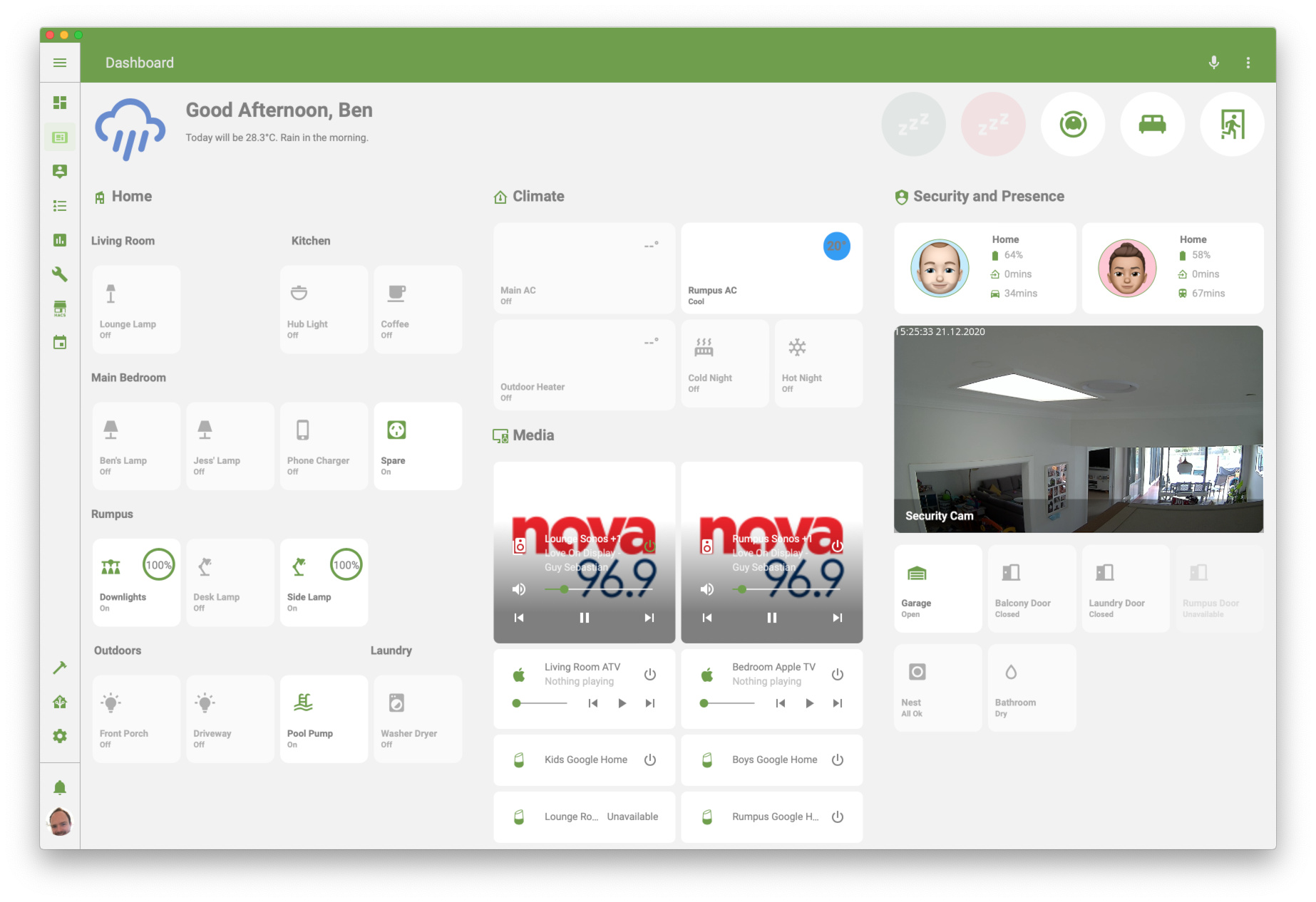
Thought I would share where I am at with my dashboard.
Not 100% happy or finished but getting there!
Steveuk
December 21, 2020, 3:14pm
5
Looking good so far.
benm7
December 21, 2020, 10:23pm
6
Sure thing, here you go. I am actually trialling two versions, one with the map alongside (based on someone else’s design!) and one without. Likely will go without the map as the zoom buttons take up too much room. Codes for both below, I use decluttering templates.
Button code:
              - type: custom:decluttering-card
                template: person_card_tablet
                variables:
                  - entity: person.ben
                  - name: Ben
                  - battery: device_tracker.life360_ben
                  - work_sensor: sensor.ben_to_work_waze
                  - home_sensor: sensor.ben_to_home_waze
                  - work_icon: mdi:car
                  - entity_picture: /local/Ben.png
                  - show_entity_picture: true
                  - tap_action:
                      action: more-info
                      haptic: light
              - type: custom:decluttering-card
                template: person_card_tablet_map
                variables:
                  - entity: person.jess
                  - battery: device_tracker.life360_jess
                  - work_sensor: sensor.jess_to_work
                  - home_sensor: sensor.jess_to_home
                  - work_icon: mdi:train
                  - name: Jess
                  - entity_picture: /local/jess.png
                  - show_entity_picture: true
                  - tap_action:
                      action: more-info
                      haptic: light
decluttering templates:
person_card_tablet:
default:
- size: 60%
- color: auto
- variable: spin
- spin: false
- show_name: false
- show_state: true
- show_label: false
- show_icon: true
- show_last_changed: false
- show_entity_picture: false
- tap_action:
action: more-info
haptic: light
- aspect_ratio: 2/1
- margin-right: 20px
- label: ' '
- off_icon_color: gray
- off_name_color: gray
- off_state_color: gray
card:
type: custom:button-card
battery: '[[battery]]'
home_sensor: '[[home_sensor]]'
work_sensor: '[[work_sensor]]'
work_icon: '[[work_icon]]'
name: '[[name]]'
icon: 'mdi:[[icon]]'
size: '[[size]]'
color: '[[color]]'
aspect_ratio: '[[aspect_ratio]]'
entity: '[[entity]]'
label: '[[label]]'
show_name: '[[show_name]]'
show_icon: '[[show_icon]]'
show_state: '[[show_state]]'
show_label: '[[show_label]]'
show_last_changed: '[[show_last_changed]]'
tap_action: '[[tap_action]]'
hold_action: '[[hold_action]]'
entity_picture: '[[entity_picture]]'
show_entity_picture: '[[show_entity_picture]]'
styles:
card:
- border-radius: 12px
- --card-background-color: '[[background_color]]'
icon:
- grid-column: 1
- grid-row: 1 / 4
label:
- color: gray
- font-size: 11px
# - font-family: Helvetica
- padding: 0px 10px
- justify-self: start
state:
- font-size: 14px
# - font-family: Helvetica
- padding: 0px 10px
- justify-self: start
- text-transform: capitalize
- font-weight: bold
- padding-left: 10px
- color: var(--primary-text-color)
grid:
- grid-template-areas: '"i s" "i battery" "i home" "i work"'
- grid-template-columns: 50% 50%
- grid-template-rows: 25% 25% 25% 25%
img_cell:
- align-self: start
- text-align: start
# - margin-right: '[[margin-right]]'
name:
- justify-self: start
- padding-left: 10px
- font-weight: bold
# - font-family: Helvetica
- font-size: 13px
entity_picture:
- height: 80px
- width: 80px
- border-radius: 100%
custom_fields:
battery:
- align-self: start
- justify-self: start
- font-size: 14px
- color: var(--secondary-text-color)
home:
- align-self: start
- justify-self: start
- font-size: 14px
- color: var(--secondary-text-color)
work:
- align-self: start
- justify-self: start
- font-size: 14px
- color: var(--secondary-text-color)
custom_fields:
battery: >
[[[
if (states['[[battery]]'].attributes.battery_charging === false)
return `<ha-icon
icon="mdi:battery"
style="; --mdc-icon-size: 16px; padding-left: 6px; padding-right: 5px; color: var(--primary-color);">
</ha-icon><span>${states['[[battery]]'].attributes.battery}%</span>`
else return `<ha-icon
icon="mdi:battery-charging"
style="; --mdc-icon-size: 16px; padding-left: 5px; padding-right: 5px; color: var(--primary-color);">
</ha-icon><span>${states['[[battery]]'].attributes.battery}%</span>`
]]]
home: >
[[[
return `<ha-icon
icon="mdi:home-import-outline"
style="; --mdc-icon-size: 16px; padding-left: 6px; padding-right: 5px; color: var(--primary-color);">
</ha-icon><span>${states['[[home_sensor]]'].state}mins</span>`
]]]
work: >
[[[
return `<ha-icon
icon="[[work_icon]]"
style="; --mdc-icon-size: 16px; padding-left: 6px; padding-right: 5px; color: var(--primary-color);">
</ha-icon><span>${states['[[work_sensor]]'].state}mins</span>`
]]]
state:
- value: "not_home"
styles:
card:
- opacity: 0.6
entity_picture:
- border: 1px solid var(--secondary-text-color)
- value: "home"
styles:
entity_picture:
- border: 1px solid var(--primary-color)
- value: "Ben Work"
styles:
entity_picture:
- border: 1px solid var(--secondary-color)
- value: "Jess Work"
styles:
entity_picture:
- border: 1px solid var(--secondary-color)
- value: "Poppy and Lola Home"
styles:
entity_picture:
- border: 1px solid var(--secondary-color)
- value: "GPa and GMa Home"
styles:
entity_picture:
- border: 1px solid var(--secondary-color)
person_card_tablet_map:
default:
- size: 65%
- color: auto
- variable: spin
- spin: false
- show_name: false
- show_state: true
- show_label: false
- show_icon: true
- show_last_changed: false
- show_entity_picture: false
- tap_action:
action: more-info
haptic: light
- aspect_ratio: 2/1
- margin-right: 20px
- label: ' '
- off_icon_color: gray
- off_name_color: gray
- off_state_color: gray
card:
type: custom:button-card
battery: '[[battery]]'
home_sensor: '[[home_sensor]]'
work_sensor: '[[work_sensor]]'
work_icon: '[[work_icon]]'
name: '[[name]]'
icon: 'mdi:[[icon]]'
size: '[[size]]'
color: '[[color]]'
aspect_ratio: '[[aspect_ratio]]'
entity: '[[entity]]'
label: '[[label]]'
show_name: '[[show_name]]'
show_icon: '[[show_icon]]'
show_state: '[[show_state]]'
show_label: '[[show_label]]'
show_last_changed: '[[show_last_changed]]'
tap_action: '[[tap_action]]'
hold_action: '[[hold_action]]'
entity_picture: '[[entity_picture]]'
show_entity_picture: '[[show_entity_picture]]'
styles:
card:
- border-radius: 12px
- --card-background-color: '[[background_color]]'
icon:
- grid-column: 1
- grid-row: 1 / 4
label:
- color: gray
- font-size: 11px
# - font-family: Helvetica
- padding: 0px 10px
- justify-self: start
state:
- font-size: 14px
# - font-family: Helvetica
- padding: 0px 10px
- justify-self: start
- text-transform: capitalize
- font-weight: bold
- padding-left: 0px
- color: var(--primary-text-color)
grid:
- grid-template-areas: '"i s map" "battery battery map" "home home map" "work work map"'
- grid-template-columns: 25% 25% 50%
- grid-template-rows: 40% 20% 20% 20%
img_cell:
- align-self: start
- text-align: start
# - margin-right: '[[margin-right]]'
name:
- justify-self: start
- padding-left: 10px
- font-weight: bold
# - font-family: Helvetica
- font-size: 13px
entity_picture:
# - height: 40px
# - width: 40px
- border-radius: 100%
custom_fields:
battery:
- align-self: start
- justify-self: start
- padding-top: 5px
- font-size: 14px
- color: var(--secondary-text-color)
home:
- align-self: start
- padding-top: 5px
- justify-self: start
- font-size: 14px
- color: var(--secondary-text-color)
work:
- align-self: start
- justify-self: start
- padding-top: 5px
- font-size: 14px
- color: var(--secondary-text-color)
map:
- align-self: middle
- justify-self: middle
- border-radius-top-right: 12px
- border-radius-bottom-right: 12px
custom_fields:
battery: >
[[[
if (states['[[battery]]'].attributes.battery_charging === false)
return `<ha-icon
icon="mdi:battery"
style="; --mdc-icon-size: 16px; padding-left: 6px; padding-right: 5px; color: var(--primary-color);">
</ha-icon><span>${states['[[battery]]'].attributes.battery}%</span>`
else return `<ha-icon
icon="mdi:battery-charging"
style="; --mdc-icon-size: 16px; padding-left: 5px; padding-right: 5px; color: var(--primary-color);">
</ha-icon><span>${states['[[battery]]'].attributes.battery}%</span>`
]]]
home: >
[[[
return `<ha-icon
icon="mdi:home-import-outline"
style="; --mdc-icon-size: 16px; padding-left: 6px; padding-right: 5px; color: var(--primary-color);">
</ha-icon><span>${states['[[home_sensor]]'].state}mins</span>`
]]]
work: >
[[[
return `<ha-icon
icon="[[work_icon]]"
style="; --mdc-icon-size: 16px; padding-left: 6px; padding-right: 5px; color: var(--primary-color);">
</ha-icon><span>${states['[[work_sensor]]'].state}mins</span>`
]]]
map:
card:
type: map
style: |
ha-card {
box-shadow: none;
border-radius-top-right: 12px;
border-radius-bottom-right: 12px;
}
default_zoom: 12
entities:
- '[[entity]]'
state:
- value: "not_home"
styles:
card:
- opacity: 0.6
entity_picture:
- border: 1px solid var(--secondary-text-color)
- value: "home"
styles:
entity_picture:
- border: 1px solid var(--primary-color)
- value: "Ben Work"
styles:
entity_picture:
- border: 1px solid var(--secondary-color)
- value: "Jess Work"
styles:
entity_picture:
- border: 1px solid var(--secondary-color)
- value: "Poppy and Lola Home"
styles:
entity_picture:
- border: 1px solid var(--secondary-color)
- value: "GPa and GMa Home"
styles:
entity_picture:
- border: 1px solid var(--secondary-color)
benm7
December 21, 2020, 10:24pm
7
The avatars are also just from the avatars on my iPhone. Saved the images and then uploaded to HA.
Steveuk
December 22, 2020, 10:04am
8
Thanks for that,
Steveuk
December 23, 2020, 4:24pm
9
Hi Ben thanks again for the code.
type: 'custom:decluttering-card'
template: person_card_tablet
variables:
  - entity: person.steve_2
  - name: Steve
  - battery: sensor.mi_a2_lite_battery_level
  - work_icon: 'mdi:car'
  - entity_picture: /local/steve.png
  - show_entity_picture: true
  - tap_action:
      action: more-info
      haptic: light
Now i’m getting a error at the top saying “Cannot read property ‘person_card_tablet’ of undefined”
benm7
December 23, 2020, 10:41pm
10
Hey Steve,
Add this to your main Lovelace UI yaml. You will need to change the folder location to a location that makes sense for you to store a new yaml called decluttering_templates.yaml.
decluttering_templates:
  !include lovelace/decluttering_templates/decluttering_templates.yaml
Create ‘decluttering_templates.yaml’ in the location you referenced above, and add the following to it. Change the states at the bottom as needed based on the locations you have created in your presence app or HA Map.
person_card_tablet:
  default:
    - size: 60%
    - color: auto
    - variable: spin
    - spin: false
    - show_name: false
    - show_state: true
    - show_label: false
    - show_icon: true
    - show_last_changed: false
    - show_entity_picture: false
    - tap_action:
        action: more-info
        haptic: light
    - aspect_ratio: 2/1
    - margin-right: 20px
    - label: ' '
    - off_icon_color: gray
    - off_name_color: gray
    - off_state_color: gray
  card:
    type: custom:button-card
    battery: '[[battery]]'
    home_sensor: '[[home_sensor]]'
    work_sensor: '[[work_sensor]]'
    work_icon: '[[work_icon]]'
    name: '[[name]]'
    icon: 'mdi:[[icon]]'
    size: '[[size]]'
    color: '[[color]]'
    aspect_ratio: '[[aspect_ratio]]'
    entity: '[[entity]]'
    label: '[[label]]'
    show_name: '[[show_name]]'
    show_icon: '[[show_icon]]'
    show_state: '[[show_state]]'
    show_label: '[[show_label]]'
    show_last_changed: '[[show_last_changed]]'
    tap_action: '[[tap_action]]'
    hold_action: '[[hold_action]]'
    entity_picture: '[[entity_picture]]'
    show_entity_picture: '[[show_entity_picture]]'
    styles:
      card:
        - border-radius: 12px
        - --card-background-color: '[[background_color]]'
      icon:
        - grid-column: 1
        - grid-row: 1 / 4
      label:
        - color: gray
        - font-size: 11px
#        - font-family: Helvetica
        - padding: 0px 10px
        - justify-self: start
      state:
        - font-size: 14px
#        - font-family: Helvetica
        - padding: 0px 10px
        - justify-self: start
        - text-transform: capitalize
        - font-weight: bold
        - padding-left: 10px
        - color: var(--primary-text-color)
      grid:
        - grid-template-areas: '"i s" "i battery" "i home" "i work"'
        - grid-template-columns: 50% 50%
        - grid-template-rows: 25% 25% 25% 25%
      img_cell:
        - align-self: start
        - text-align: start
#        - margin-right: '[[margin-right]]'
      name:
        - justify-self: start
        - padding-left: 10px
        - font-weight: bold
#        - font-family: Helvetica
        - font-size: 13px
      entity_picture:
        - height: 80px
        - width: 80px
        - border-radius: 100%
      custom_fields:
        battery:
          - align-self: start
          - justify-self: start
          - font-size: 14px
          - color: var(--secondary-text-color)
        home:
          - align-self: start
          - justify-self: start
          - font-size: 14px
          - color: var(--secondary-text-color)
        work:
          - align-self: start
          - justify-self: start
          - font-size: 14px
          - color: var(--secondary-text-color)
    custom_fields:
          battery: >
              [[[
                if (states['[[battery]]'].attributes.battery_charging === false)
                  return `<ha-icon
                    icon="mdi:battery"
                    style="; --mdc-icon-size: 16px; padding-left: 6px; padding-right: 5px; color: var(--primary-color);">
                    </ha-icon><span>${states['[[battery]]'].attributes.battery}%</span>`
                else return `<ha-icon
                  icon="mdi:battery-charging"
                  style="; --mdc-icon-size: 16px; padding-left: 5px; padding-right: 5px; color: var(--primary-color);">
                  </ha-icon><span>${states['[[battery]]'].attributes.battery}%</span>`
              ]]]
          home: >
              [[[
                return `<ha-icon
                  icon="mdi:home-import-outline"
                  style="; --mdc-icon-size: 16px; padding-left: 6px; padding-right: 5px; color: var(--primary-color);">
                  </ha-icon><span>${states['[[home_sensor]]'].state}mins</span>`
              ]]]
          work: >
              [[[
                return `<ha-icon
                  icon="[[work_icon]]"
                  style="; --mdc-icon-size: 16px; padding-left: 6px; padding-right: 5px; color: var(--primary-color);">
                  </ha-icon><span>${states['[[work_sensor]]'].state}mins</span>`
              ]]]
    state:
      - value: "not_home"
        styles:
          card:
            - opacity: 0.6
          entity_picture:
            - border: 1px solid var(--secondary-text-color)
      - value: "home"
        styles:
          entity_picture:
            - border: 1px solid var(--primary-color)
      - value: "Ben Work"
        styles:
          entity_picture:
            - border: 1px solid var(--secondary-color)
      - value: "Jess Work"
        styles:
          entity_picture:
            - border: 1px solid var(--secondary-color)
      - value: "Poppy and Lola Home"
        styles:
          entity_picture:
            - border: 1px solid var(--secondary-color)
      - value: "GPa and GMa Home"
        styles:
          entity_picture:
            - border: 1px solid var(--secondary-color)
Try this and let me know how you go
Steveuk
December 24, 2020, 10:56pm
12
Hi i messaged you before about struggling with this but got past that problem now but have a issue still.
decluttering_templates:
  !include lovelace/decluttering_templates/decluttering_templates.yaml
But it wasn’t having it then i read you don’t use the !include when using that so then i added it asdecluttering_templates: lovelace/decluttering_template_folder/decluttering_templates.yaml
i created this folder
Sam1501
December 26, 2020, 8:49pm
13
Can I ask what you used for the buttons for lights etc, feel like I’ve seen them somewhere but can’t work it out? Thanks
RichardU
December 28, 2020, 4:35pm
14
@benm7 would you mind sharing your configuration for the Rumpus Downlights button?
Cheers, Richard
shelbycsx
December 31, 2020, 10:39am
15
Just starting to figure out this Lovelace and Home Assistant stuff. Tinkered with it a little in the past with my zwave switches but recently got some Sonoffs I flashed with tasmota and been having a lot of fun over the Christmas break. Here’s my first dashboard after working on getting this set up over the last couple days. Making progress. Lol.
I got a Sonoff S31 tracking my washer cycles and can see exactly what stage my washer is on up to the second with automations tracking the watts. (Idle, Fill, Aggitate, Waiting for Wash Spin, Wash Spin, Rinse Fill, Rinse Aggitate, Prep for Final Spin, Final Spin, Complete)
Took me a long time but I learned a lot.
I just realized I spelled Agitate wrong thanks to this message box. I also just created my account on here. I might need help from time to time and thought it would be fun to connect with people and their cool projects.
Looking forward to joining the community. This platform is the best.
benm7
January 10, 2021, 10:38pm
16
Yeah I definitely stole it from somewhere
Here is the code for one of the lights, have used Rumpus Downlights (@RichardU ) which I have modified to style the brightness ring based on the colour of the lights at the time. You can see in the below screenshot the colour of the lights is now cyan.
                  - type: custom:decluttering-card
                    template: brightness_button_card_2_rgb
                    variables:
                      - entity: light.rumpus
                      - name: Downlights
                      - icon: vanity-light
brightness_button_card_2_rgb:
  default:
    - size: 50%
    - lock: false
    - color: auto
    - variable: spin
    - spin: false
    - show_name: true
    - show_state: true
    - show_label: true
    - show_icon: true
    - show_last_changed: false
    - tap_action:
        action: toggle
        haptic: light
    - hold_action:
        action: more-info
        haptic: success
    - aspect_ratio: 1/1
    - margin-right: 10px
    - label: ' '
    - opacity: 0.6
    - off_icon_color: gray
    - off_name_color: gray
    - off_state_color: gray
  card:
    type: custom:button-card
    name: '[[name]]'
    icon: 'mdi:[[icon]]'
    size: '[[size]]'
    color: '[[color]]'
    lock: '[[lock]]'
    aspect_ratio: '[[aspect_ratio]]'
    entity: '[[entity]]'
    label: '[[label]]'
    show_name: '[[show_name]]'
    show_icon: '[[show_icon]]'
    show_state: '[[show_state]]'
    show_label: '[[show_label]]'
    show_last_changed: '[[show_last_changed]]'
    tap_action: '[[tap_action]]'
    hold_action: '[[hold_action]]'
    entity_picture: '[[entity_picture]]'
    styles:
      card:
        - border-radius: 12px
        - --card-background-color: '[[background_color]]'
      label:
        - color: gray
        - font-size: 11px
#        - font-family: Helvetica
        - padding: 0px 10px
        - justify-self: start
      state:
        - font-size: 11px
#        - font-family: Helvetica
        - padding: 0px 10px
        - justify-self: start
        - text-transform: capitalize
        - font-weight: bold
        - padding-left: 10px
        - color: gray
      grid:
        - grid-template-areas: '"i info" "n n" "s s" "l l"'
        - grid-template-columns: 1fr 50%
#        - grid-template-areas: '"i" "n n" "s s" "l l"'
#        - grid-template-columns: 1fr
        - grid-template-rows: 1fr min-content min-content
#        - position: relative
#      grid:
#        - grid-template-areas: '"i" "n" "s" "l"'
#        - grid-template-columns: 1fr
#        - grid-template-rows: 1fr min-content min-content
      img_cell:
        - align-self: start
        - text-align: start
#        - justify-content: start
#        - align-items: start
        - margin-right: '[[margin-right]]'
      name:
        - justify-self: start
        - padding-left: 10px
        - font-weight: bold
#        - font-family: Helvetica
        - font-size: 13px
      custom_fields:
        info:
        - align-self: start
#        - overflow: visible
#        - position: absolute
#        - right: 40%
#        - top: 40%
#                  <text x="50%" y="54%" fill="var(--primary-text-color)" font-size="12" text-anchor="middle" alignment-baseline="middle">${brightness}<tspan font-size="12">%</tspan>
    custom_fields:
      info: >
          [[[
            function capitalizeFirstLetter(string) {
              return string.charAt(0).toUpperCase() + string.slice(1).toLowerCase();
            }

            const length = 34;
            const width = 3;

            if (entity.state === 'on' && entity.attributes.brightness) {
              const radius = length / 2;
              const brightness = Math.round(entity.attributes.brightness / 2.54);
              const circumference = radius * 2 * Math.PI;
              return `
                <svg viewBox="0 0 50 50">
                  <circle cx="25" cy="25" r="${radius}" fill="none" stroke="var(--secondary-text-color)" opacity="0.3" stroke-width="${width}" />
                  <circle style="
                      transform: rotate(-90deg);
                      transform-origin: 50% 50%;
                      stroke-dasharray: ${circumference};
                      stroke-dashoffset: ${circumference - brightness / 100 * circumference};
                    "
                    id="c_brightness" cx="25" cy="25" r="${radius}" stroke="var(--button-card-light-color)" stroke-width="${width}" fill="none" stroke-linecap="round" />
                  <text x="50%" y="54%" fill="var(--primary-text-color)" font-size="12" text-anchor="middle" alignment-baseline="middle">${brightness}%</text>
                </svg>
                `;
              }
            else if (entity.state === 'on' && entity.attributes.speed && entity.attributes.speed_list)  {
              const text = capitalizeFirstLetter(entity.attributes.speed);
              const gap = 5;
              const edge = (50 - length) / 2;
              const y = 50 - edge;
              var items = entity.attributes.speed_list;
              if (items.indexOf('off') !== -1){
                items.splice(items.indexOf('off'), 1);
              }
              const current = items.indexOf(entity.attributes.speed)
              var i;
              var x1 = edge;
              var ret = `<svg  viewBox="0 0 50 50">`;
              var l = (length - gap * (items.length - 1)) / items.length;
              for (i = 0; i < items.length; i++) {
                var x2 = x1 + l;
                var color = (i <= current) ? "var(--paper-item-icon-active-color)" : "var(--paper-item-icon-color)";
                var opacity = (i <= current) ? "1.0" : "0.5";
                ret += `<line x1="${x1}" y1="${y}" x2="${x2}" y2="${y}" stroke="${color}" stroke-width="${width}" opacity="${opacity}" stroke-linecap="round" />`;
                x1 = x2 + gap;
              }
              ret += `<text x="50%" y="54%" fill="var(--primary-text-color)" font-size="14" text-anchor="middle" alignment-baseline="middle">${text}</text></svg>`
              return ret;
            }
          ]]]
    state:
      - value: "on"
        '[[variable]]': '[[spin]]'
        styles:
          name:
            - color: var(--primary-text-color)
          state:
            - color: var(--secondary-text-color)
          icon:
            - color: var(--primary-color)
          card:
            - opacity: 1.0
      - value: "off"
        styles:
          card:
            - opacity: '[[opacity]]'
          icon:
            - color: '[[off_icon_color]]'
          name:
            - color: '[[off_name_color]]'
          state:
            - color: '[[off_state_color]]'
          lock:
            - color: black
      - value: "unavailable"
        styles:
          card:
            - opacity: 0.2
          icon:
            - color: gray
          state:
            - color: gray
          name:
            - color: gray
benm7
January 10, 2021, 10:41pm
17
How did you go with this? Any luck? If not might be best just to build it without using a decluttering template and then work backwards from there!
Steveuk
January 10, 2021, 11:06pm
18
I gave up in the end i couldn’t figure out where i was going wrong so i moved onto another version but that’s not working correctly now.
benm7
January 11, 2021, 12:54am
19
I hear you, it can be a real source of joy and frustration at the same time
I’d day it’s definitely an issue referencing the decluttering templates file. I’m pretty sure it doesn’t;t work unless you put ! include in the path name. So try this:
decluttering_templates:
  !include lovelace/decluttering_template_folder/decluttering_templates.yaml
Also make sure it is the first thing in your Lovelace yaml file, above the title: line
Let me know if it still doesn’t work and I’ll try and build you one without decluttering to test out.
Steveuk
January 11, 2021, 8:44am
20
Thanks Ben I’ll try it again from scratch tonight.
NdR
January 11, 2021, 2:00pm
21
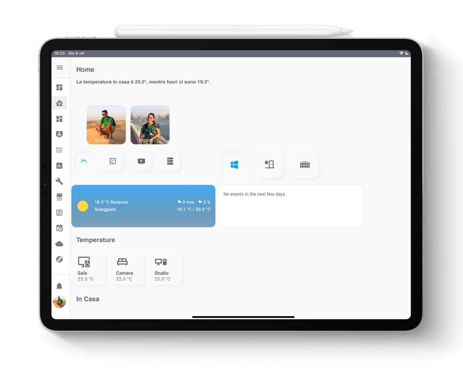
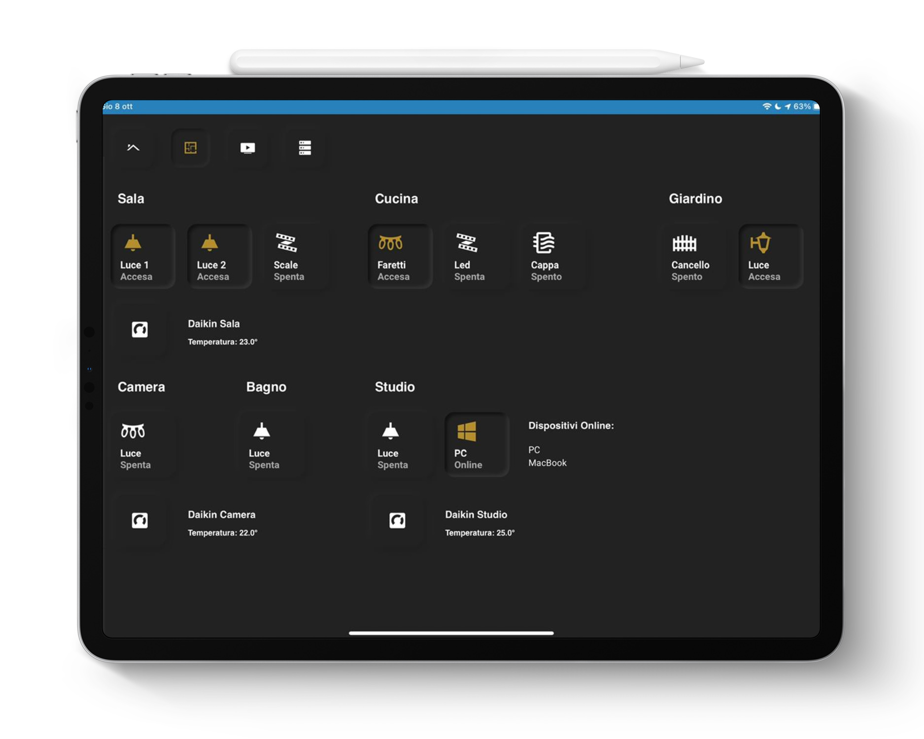
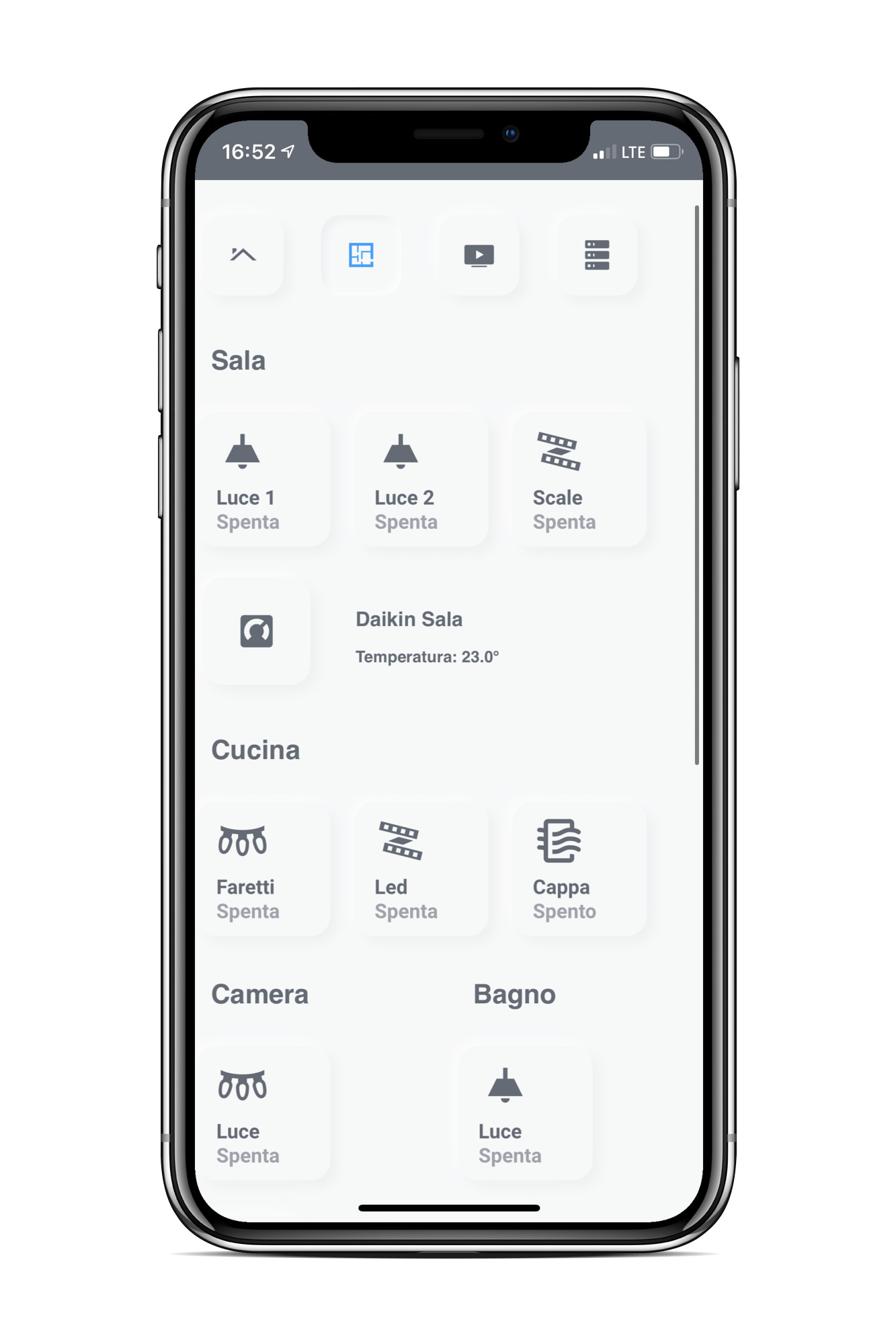
Currently I’m developing two different design.
One is focused on a Scalable UI:
The other one is a Tablet UI only. Still developing: