Sharing back to this great community! Here is my HA setup

Hey!

I would like to offer my sincere gratitude for people who develop and maintain Home Assistant and for this community which is very actively sharing their projects and developing integrations and custom cards for Home Assistant!

Few years back I was about to start my own project to develop visualization for my heating data but that seemed like an overwhelming exercise. Luckily I eventually found Home Assistant.

I wanted to share back to the community and published my Home Assistant configuration in Github:

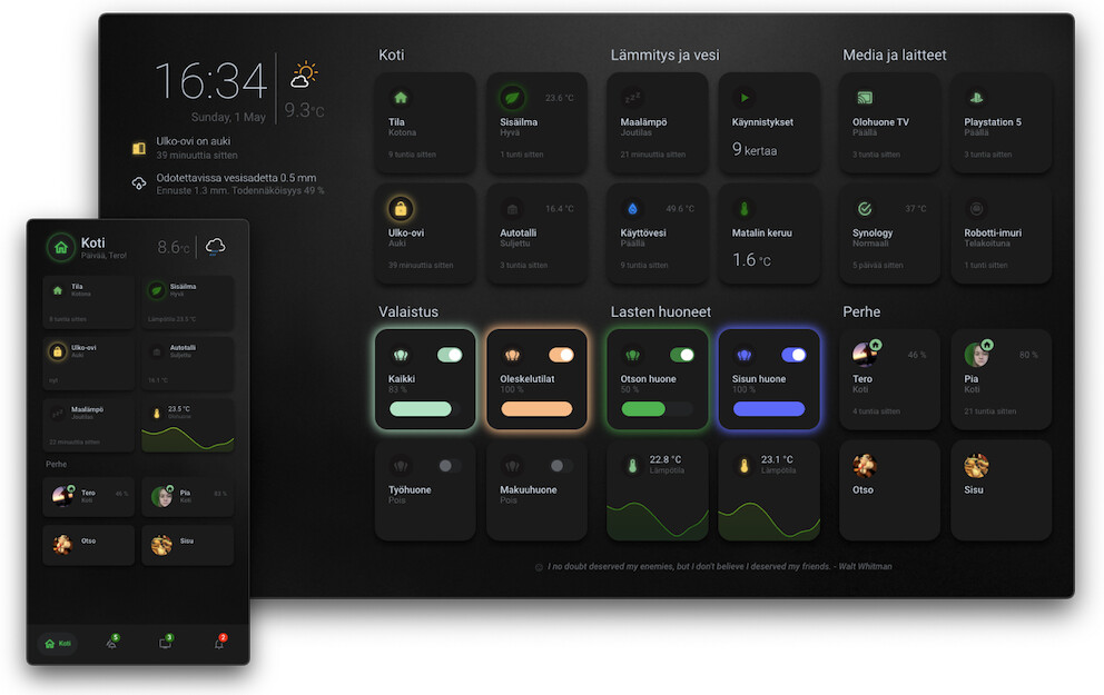
You can find more details and screenshots in my Github repo. I use decent amount of integrations but mostly rely on MQTT to publish data from various sources. Like many here, I extensively use YAML to setup everything and there is a lot of it
 I have a hate and love relationship with it but at the moment it is the most flexible way to configure everything and I’m so used to it that it is my go-to solution instead of the UI based configuration.

A lot of the UI concepts are inspired by UI-Lovelace-Minimalist and matt8707’s really nice tablet design! Thanks to people working on these projects as well!

At the moment deploying the setup is non-trivial but if people are interested I intent to try setting up a devcontainer with demo sensors so that you can try the setup yourself.

Thanks again everyone for this great community!

P.S. I wonder if there will be an API for HA backend some day? Wondering if it would enable people building their custom dashboards and not doing that much YAML.

16 Likes

I really like your work!

(Apologies for the Finnish language)
Tosi hienoa pÀÀstÀ kerrankin lukemaan ja tutkimaan jonkun suomalaisen tekeleitÀ. Aika paljon löysin mielenkiintoisia juttuja. Joutunen lainaamaan vÀhÀn sun koodia :wink:
Noi Robotti-imurin koodit oli mielenkiintoisia. Mulla toi sÀiliön tÀyttyminen lasketaan niin ettÀ jokaisella huoneella on oma lukunsa ja kun 100 tÀyttyy ajaa robotti itsensÀ roskiksen luokse odottamaan tyhjennystÀ.
Kiitos kun jaoit koodisi, arvostan!

Fantastic work @troinine!
Just one doubt about your navigation bar in mobile dashboard. Is it fixed?I mean if you scroll down the view is it still visible?
Thank you!

Kiitos! Ja koodit on siellÀ ehdottomasti sitÀ varten, ettÀ niistÀ joku muukin hyötyisi!

Tuo pölysÀiliön tÀyttyminen tuli lisÀttyÀ juuri ÀskettÀin, kun Roborock ei sitÀ ole malttanut mitenkÀÀn approksimoida, joten tein itse tuollaisen köyhÀn miehen ratkaisun, joka tarkentuu ajan kanssa. Tuo idea huoneiden painoarvosta on hyvÀ! Eteinen luonnollisesti ainakin lapsiperheessÀ tuottaa melko paljon roinaa verrattuna muihin huoneisiin :smile:

Och samma pÄ engelska:

Thank you! And the code is there definitely for others to find it useful!

The dustbin fill up I added just recently as Roborock hasn’t even tried to approximate it in any way. Therefore I ended up doing this kind of poor man’s solution which will get more accurate over time. I really like the idea of different rooms having their own weight! Entrance naturally gets a lot of dirt compared to other rooms at least in our family as we have kids.

Thank you @dgarciadonado!

Just one doubt about your navigation bar in mobile dashboard. Is it fixed?I mean if you scroll down the view is it still visible?

At the moment the mobile navbar is fixed at bottom and would be pushed down if you add content. I have not yet had the problem myself and I try to avoid adding too much content to each view that would make it scrollable. However, I might need to revert that decision in the future and try to make the navbar floating. I don’t think it is impossible but couldn’t get it work with a very quick try. I have seen people successfully implementing floating components on lovelace.

wow! That looks great! I’ll definitely use your dashboard for some inspiration for my dashboard. I really like the glow effect and the brightness slider.

1 Like

@troinine thx for sharing your great dashboard!
I have copied it to my HA installation and have made some changes (entities), but on my phone i don’t get rounded corners at the buttons and on my tablet (8.7 inch) he doesn’t scale the buttons. Is there a fix for it?

Thanks for the kind words!

but on my phone i don’t get rounded corners and on my tablet (8.7 inch) he doesn’t scale the buttons

Did you apply the respective theme on mobile (and tablet) from the user’s settings? I would guess this could be the issue.

@troinine thanks for sharing, like your dashboard a lot.
One question about the navigation bar: If I have a lot of cards on one page and have to scroll to see the lower cards, will the navigation bar still be shown all the time or only when I scroll to the very end?

One question about the navigation bar: If I have a lot of cards on one page and have to scroll to see the lower cards, will the navigation bar still be shown all the time or only when I scroll to the very end?

Apologies for the late reply!

Sadly when you have more cards in the view, the navbar jumps around (goes below the screen or shows only partially). Other cards will be placed behind it but it is buggy. I did try few tricks back when I implemented it but quickly reverted to having only relevant cards visible and dividing the mobile into multiple views.

I’m planning to create a custom component which would be placed into the main layout if possible as I have two issues:

  1. I would like to add more cards and scroll a view as well :smile:
  2. I have started to use hass-swipe-navigation and it looks weird with an animation when the navbar also follows the animation

I know there are custom components to move the built-in header around but as it can’t be customized that well (notification badges, colors, text placement and visibility) I think I need to write my own navbar component.

In the meantime, I have also found a way to build a suitable solution for me. Have combined header cards and the badges of the mushroom cards for it!

1 Like

Hi again!

Just wanted to share few late additions that are worth mentioning:

User popups

I did use the default user / person popups for a while but lately it started to be inconvenient to click through multiple users to see their location and in addition, to realize that their current location might be reasonable old. Therefore I decided to create two new popups; one for single user details and one for seeing everyone on a single map.

A single user popup:

I can see relevant info about the user’s sensors plus I can request a location update for that user.

Family popup:

The nice thing here is that I can request a location update for all users with a single button click.

The family popup led to another discovery that some users probably have used for a long time but I discovered just now; you can dynamically generate your lovelace cards when you are inside a button-card context! More about this below.

Dynamic creation of cards in button-card context

I have a lot of duplicate code which often times is due to the layout differences between mobile and tablet. On mobile I prefer swiping through pages instead of scrolling up and down and I use swipe-card for this purpose. On the tablet view, everything fits nicely to the screen so most of the time no need for swiping. This leads to duplication assuming you don’t like YAML anchors or use declutter card.

The nice thing about button-card is that you can construct lovelace configuration dynamically in Javascript. This also allows me to adjust the layout based on screen width etc. As an example I can do something like this:

browser_mod:
  service: browser_mod.popup
  data:
    ... redacted ...
    content:
      type: vertical-stack
      cards:
        - |
          [[[
            const isMobile = screen.availWidth < 600

            if (isMobile) {
              // return something that suits mobile such as entities card
              const entities = ["sensor.one", "sensor.two"]
              
              return {
                "type": "entities",
                "entities": entities,
              }
            } else {
              // return something that works for tablet like grid with 4 columns
              const cards = [...]
              return {
                "type": "grid",
                "columns": 4,
                "square": false,
                "cards": cards,
              }
            }
          ]]]

I also use this method to dynamically construct light cards of groups in the light popup that I use on both, mobile and tablet.

The downside of this is that you don’t have the support of VSCode Home Assistant addon but for me that is an acceptable loss.

Hope someone finds this useful! Check my repo for more details. The link is on the first post.

Thanks!

mind sharing how you moved your navbar to the bottom? the code for it.
looking to do so, but havent found a good solution

The navbar on mobile is not the standard home assistant navbar but a custom button card. The card template can be found in here: hass-config/navbar.yaml at 5b3259e07f47a1d718706205a0db6d26715cf95b · troinine/hass-config · GitHub

Note that is has certain limitations like when the amount of cards exceeds the page height, then the navbar doesn’t work exactly as it should in terms of its position. So far I have been able to manage with this so I haven’t paid too much attention to the issue.

If you want to move the hass built-in navbar, there are few community addons to do that, like GitHub - javawizard/ha-navbar-position: Moves the Home Assistant dashboard navigation bar to the bottom of the screen and the solution that @Noah proposed few posts earlier.

Hope this helps!

1 Like

Please have a look at this post. Maybe you can resolve your problems with the button navbar by referring to it.

Hello all,
Hello troinine,

I am currently in the process of making my first attempts at my own dashboard. In this context I stumbled across this fantastic UI.

Have also already tried some things to adapt but currently fail at an error in relation to the resources
‘/local/marked.min.js?v=4.2.12’

I didn’t find the file in your github @troinine.
Or is there another way to get it? :slight_smile:

Thanks a lot for your help

Thanks @Oligarch for pointing me to that post!

Even though It didn’t exactly solve the issue I had, it made me spend few moments with my navbar. I was able to sort out few issues and it works now pretty ok:

navbar

Now, also the view title is sticky.

One thing I tried to do is to change the background color of the title when the scroll is not on the top. It would be nice to apply the same background and blur when the page scrolls down, similar to the styles that are present in the navbar. However, button-card is a bit limited on that matter and nothing with extra_styles that I tried seemed to work so only applied the blur as it would look a bit weird on top of everything without it. I’m not sure if I like this yet but it can stay like that for now.

So, it would be highly appreciated if anyone has ideas how to change button-card styles depending on the scroll position!

Anyways, thanks for the motivational push! I like the mobile views now better as I can have more content on a single view.

Hi @MikeMunich and thanks for praising my dashboard :smile:

The project uses markedjs for parsing markdown. This is especially useful with the Todoist tasks as their API returns markdown for most of the content.

I haven’t stored the library in my repo but you can get the release version from the project’s github repository. Link to version 4.2.12:

https://github.com/markedjs/marked/raw/v4.2.12/marked.min.js

Store the js file under the www folder and you should get things working. Note that newer 4.x versions probably work fine as well but I haven’t yet updated myself.

I can’t help with that. Accidentally came across this post in a neighboring topic. I just remembered your dashboard (very nicely made) and the problem with the navbar.

Managed to implement dynamic title styles:

sticky_header

Tested at least to work on Safari and Chrome on iOS, macOS and Android.

This can be achieved with a window scroll listener and an “empty” button-card javascript template. Registering a named function avoids registering the listener multiple times.

sticky_title:
  custom_fields:
    scroll: |
      [[[
        const element = this;
        function updateStyle() {
          let opacity = 0.8;
          let blur = '5px';
          let boxShadow = '0 2px 4px 0 rgba(0,0,0,.4)';

          if (document.documentElement.scrollTop < 5) {
            opacity = 0;
            blur = '0px';
            boxShadow = 'none';
          }

          const card = element.shadowRoot.querySelector("#card");
          card.style.background = `rgba(var(--card-background-color-rgb), ${opacity})`;
          card.style['backdrop-filter'] = `blur(${blur})`;
          card.style['-webkit-backdrop-filter'] = `blur(${blur})`;
          card.style['box-shadow'] = boxShadow;
        }

        window.addEventListener('scroll', updateStyle, { passive: true })
      ]]]

Link to the source: hass-config/button_card_templates/troinine/titles.yaml at 450f21ef7d7c970bd6e9da64c0d2cf24c2ee1a3a · troinine/hass-config · GitHub

1 Like