Here’s my sheds and gate control with some animated GIFs to represent door movements and states. Gate also slides

Looks very nice, which components do you use for the icons on the top right? Can you share the code?
Hi, all the buttons are custom button cards. This is the code for the first two buttons, all the rest are the same more or less, with different colors. I you need one in particular let me know.
          - type: custom:button-card
            name: 'Aire acondicionado:'
            icon: mdi:air-conditioner
            state:
              - value: 'off'
                icon: mdi:air-conditioner
                color: '#000000'
              - value: cool
                icon: mdi:snowflake
                color: '#0079FF'
              - value: heat
                icon: mdi:fire
                color: '#E72929'
              - value: dry
                icon: mdi:water-percent
                color: '#0079FF'
              - value: fan_only
                icon: mdi:fan
                color: '#F9FBE7'
              - value: heat_cool
                icon: mdi:sun-snowflake-variant
                color: '#FBFFB1'
            tap_action:
              action: more-info
            show_name: false
            entity: climate.aire_acondicionado
            custom_fields:
              temphum: >
                [[[ return
                states['climate.aire_acondicionado'].attributes.temperature +
                '°C']]]
            styles:
              grid:
                - grid-template-areas: '"i temphum"'
                - grid-template-columns: min-content min-content
                - grid-template-rows: min-content
              card:
                - margin-right: 0.1vw
                - border-radius: 50px
                - padding: 0px 8vw 0px 0px
                - height: 3.2vw
                - width: 7vw
              icon:
                - width: 1.8vw
                - padding: 0
              img_cell:
                - background: '#A1C398'
                - border-radius: 200px
                - width: 3.2vw
                - height: 3.2vw
              custom_fields:
                temphum:
                  - justify-self: start
                  - font-size: 1.2vw
                  - opacity: '0.7'
                  - padding-left: 0.8vw

          - type: custom:button-card
            name: 'Termo:'
            show_name: false
            show_state: true
            icon: mdi:water-boiler
            entity: switch.termo
            tap_action:
              action: more-info
            styles:
              card:
                - border-radius: 50px
                - padding: 0
                - height: 3.2vw
                - width: 3.2vw
                - margin-right: 0.1vw
              icon:
                - width: 1.8vw
                - color: black
                - padding: 0
              img_cell:
                - background: '#F9E8D9'
                - border-radius: 200px
                - width: 3.2vw
                - height: 3.2vw
            state:
              - value: 'on'
                icon: mdi:water-boiler
              - value: 'off'
                icon: mdi:water-boiler-off
Would you be so kind as to share your code?
Oh wow this looks so good. May i know how you did the floor plan please? Totally new to this sort of dashboard. Thanks for your advice! ![]()
Hi, the 3D images are done with sweet home 3D software. It’s free.
There are a lot of info here and in YouTube about how to make a floor plan.
Try this post
https://community.home-assistant.io/t/floorplan-ui-with-color-synced-lights/169417
Is not difficult to do, only needs time ![]()
I recently finished my energy dashboard.
Including weather inside/outside, waste schedule gas prices and real time energy input/output.
Within the PC browser the proportions are not 100% exact. On the tablet it shows all nice.
Used some CSS statements to tweak the layout.
Here is my phone dashboard. I have very similar dashboards for my PC and tablets. I did try to remove so PII so somethings are blured
Got recently a new EV (Mustang Mach E, with the FordPass integration) in combination with a MyEnergy Zappi charger. Dashboard is there to get a fast glance of the current states of both. Next to that added several automations to use the input_select helpers to optimize my energy consumption.
.Looks very clean & ‘proper’ ![]() Very interested in the rest of your dashboards. Looking for some inspiration to move from mobile only to wall-mounted tablet. Will you share some screenshots ?
Very interested in the rest of your dashboards. Looking for some inspiration to move from mobile only to wall-mounted tablet. Will you share some screenshots ?
Thanks! Next to the EV dashboard been tuning my garden automation where I monitor all of my moisture sensors (MiFlora Bluetooth connected to a Raspberry Pi Zero, sending via MQTT). The coloring of the gauges are linked to the automation scripts that will trigger the water pump based on several more variables, like upcoming weather, current wind speeds, robot mower status etc.
And added some custom energy dashboard with a better view on the phases and inverters on every single phase with solar panels in different directions.
Looks amazing. How did you make the tile with the car and the surrounding information about being locked, home, connected, etc?
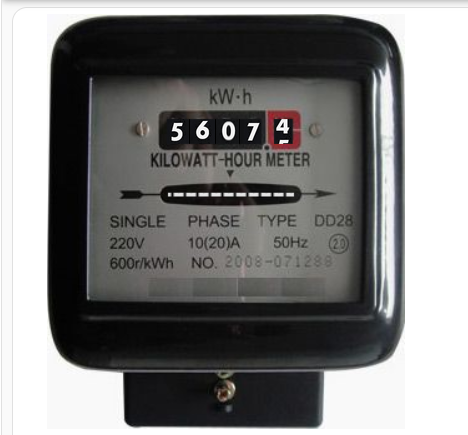
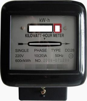
I created the following analog meter.

This looks at my power and translates that number into a number of digits and displays the appropriate digit image for each; The current grid usage is displayed as a spinning wheel (this uses css animation) and the speed is relevant to the amount of power used.
I used 3 images for this
-
a strip of numbers - this image is used for each digit
-
a horizontal spinner.
-
the meter (with transparent places for digits and spinner)

Jeez that looks nice. Any chance you might share some of your work or otherwise in text the used components? I’m busy building a tablet dashboard for my Samsung Tab A9 Plus.
it is a mix up of all this beautiful community work. In general it is a 3 column section layout with the sidebar card from HACS.
I also used the bubble card
Some modificated cards of hacasa and also that theme from him. BTW thx for that.
and a lot card_mod for sure
I would offer you Money for the code. ![]() This is the most beautiful dashboard I have ever seen. world class work! Since I could never do it like this, can you please share the code? I need a dashboard like that too! very cool work! keep it up
This is the most beautiful dashboard I have ever seen. world class work! Since I could never do it like this, can you please share the code? I need a dashboard like that too! very cool work! keep it up
this is one of the cleanest dashboards I have seen so far!
well done!
can you share the code of that laundry card, I trying to setup that too, but can’t seem to fix the two laundry entities in one card.
love those bins!
can you share how you have done that?


