Interested in this aswell… 
The icon isn’t actually in the markdown, it’s a separate button card for the icon.
You can embed specific icons in markdown (can send code if you want this) but I have chosen to replicate most markdowns as button cards as it gives much more flexibility.

So this is a 2 button or a 3 button area?
It’s a layout card in columns with a button (weather icon) then a markdown (all the weather words) then another area for four alert buttons when doors are open, lights are on, leaks in bathroom, or garbage needs to be taken out.
Will upload full yaml to GitHub tonight 
Here is the full code for the greeting.
I add this to the top of every view so it appears at the top of each one consistently. Example of. main screen below:
title: Home
path: home
icon: mdi:home-variant
background: var(--background-image)
popup_cards:
  !include ../popup-cards/main-popup-card.yaml
cards:
  - type: vertical-stack
    cards:
      - !include '../custom_header/greeting2.yaml'
Hi Ben,
Could you please to share config for Downstair card in Girls Room view?
I’m interested with the percentage value…
button_card
  circle:
    variables:
      circle_input: >
        [[[ return Math.round(entity.attributes.brightness / 2.54); ]]]
    custom_fields:
      circle: >
        [[[
          if (entity.state === 'on') {
            const input = variables.circle_input;
            const radius = 18;
            const circumference = radius * 2 * Math.PI;
            return `
              <svg viewBox="0 0 50 50">
                <style>
                  circle {
                    transform: rotate(-90deg);
                    transform-origin: 50% 50%;
                    stroke-dasharray: ${circumference};
                    stroke-dashoffset: ${circumference - input / 100 * circumference};
                  }
                  tspan {
                    font-size: 10px;
                  }
                </style>
                <circle cx="25" cy="25" r="${radius}" stroke="#b2b2b2" stroke-width="1.5" fill="none" />
                <text x="50%" y="54%" fill="#8d8e90" font-size="13" text-anchor="middle" alignment-baseline="middle" dominant-baseline="middle">${input}<tspan font-size="10">%</tspan></text>
              </svg>
            `;
          }
        ]]]
    styles:
      custom_fields:
        circle: &person
          - top: 1%
          - left: 60%
          - width: 3.5vw
          - position: absolute
          - letter-spacing: 0.03vw
Amazing, really helpful.
But a small question - I want to fit the card into the phone, and it is too big.
I did exactly what was written - the icons work really well, but the big one is really huge.
Can you help with the size of the phone card?
helpful 
@olegosipenko87 Do you have your full code posted somewhere? I’m interested in several things, though especially your sidebar code.
Thanks!
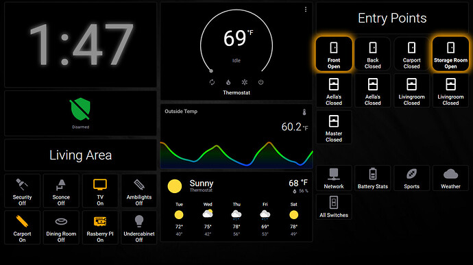
Hi, here are some photos of my Dashboard on an 8” Lenovo Tab 3 with fully kiosk:
I have selected only the most interresting ones.
Main Dashboard with the main controls and a navigation to other pages:
Media Page to control all the media, with Kodi, AndroidTV, snapserver and spotify
System+Network overview dashboard:
Door/Window Motion + other informarion dashboard:
Mind sharing your home and “girls room” templates?
The room dashboard is so clean, very good work.
Joined the HA bandwagon this month, working on learning the code, and love the ability to have so much control over everything.
its not really coding…
I know its not like coding, but its not as simple as my Action Tiles setup either.
Amazing, @benm7
Would you mind sharing the code für the „room cards“ on the overview? Screenshot Nr. 4
Thank you!
This is still a work in progress and a couple areas still need some attention, but it’s about 85% complete…of course in the world of Home Assistant, is anything really ever complete?
Absolutely NOT! I’m roughly 5 years into it… still a work in progress, you know, because they keep adding so many cool new features. HINT: wait until you see what is coming in 2022.9!


