This is my dashboard. I created my own button-gauge-card.

Still a lot to do…
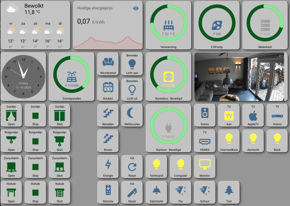
On the left
First row → status of the device (ready,drink ready etc), Main storage solenoid lock, Main storage door status
Second row → Status of the door where it gets delivered, its solenoid lock, WS2812B strip to show off the glass.
3rd and 4th rows are self explanatory.
Right side
some stats for my reference.
All compartments stays in apartment balcony, posing as big electrical appliances. the delivery box is at my desk, housing an old style 2 pole 2way switch as dummy.
Please let me know for more photos.
Any chance you can share your yaml for the room cards showing temps with buttons? Trying to do something similar for my dashboard.
Sure!
type: custom:stack-in-card
mode: vertical
cards:
  - type: custom:layout-card
    layout_type: grid-layout
    layout:
      grid-template-columns: 36% auto 10% 10% 10% 10% 10% 10%
      margin: 0
    cards:
      - color: teal
        type: tile
        entity: sensor.raumklima_wohnzimmer
        icon: mdi:sofa
        name: Wohnzimmer
        icon_tap_action:
          action: more-info
        card_mod:
          style: |
            ha-card {box-shadow: none !important; padding-top: 8}
      - type: button
        icon: none
        card_mod:
          style: |
            ha-card {box-shadow: none !important}
      - type: button
        show_name: false
        entity: binary_sensor.rauchmelder_wohnzimmer_smoke
        icon_height: 24px
        card_mod:
          style: |
            ha-card {box-shadow: none !important}
      - type: button
        icon: none
        icon_height: 18px
        card_mod:
          style: |
            ha-card {box-shadow: none !important}
      - type: button
        card_mod:
          style: |
            ha-card {box-shadow: none !important}
        icon: mdi:lightbulb-outline
        entity: light.leseecke_unten
        show_name: false
        icon_height: 18px
        tap_action:
          action: call-service
          service: scene.turn_on
          data: {}
          target:
            entity_id: scene.wohnzimmer_gemutlich
        hold_action:
          action: call-service
          service: scene.turn_on
          data: {}
          target:
            entity_id: scene.wohnzimmer_arbeiten
      - type: button
        card_mod:
          style: |
            ha-card {box-shadow: none !important}
        icon: mdi:weather-night
        show_name: false
        icon_height: 18x
        tap_action:
          action: call-service
          service: scene.turn_on
          data: {}
          target:
            entity_id: scene.wohnzimmer_aus
      - type: button
        entity: media_player.wohnzimmer
        show_name: false
        icon_height: 18px
        card_mod:
          style: |
            ha-card {box-shadow: none !important;
                      --state-media_player-active-color: #009682;
                      --state-media_player-speaker-paused-color: #83949f;
                      --state-media_player-speaker-playing-color: #009682;

            }
      - show_name: false
        show_icon: true
        type: button
        entity: vacuum.maunzi
        icon_height: 18px
        card_mod:
          style: |
            ha-card {box-shadow: none !important;
            }
  - type: conditional
    conditions:
      - condition: state
        entity: media_player.wohnzimmer
        state: playing
    card:
      type: custom:mini-media-player
      entity: media_player.wohnzimmer
      name: Chromecast
      artwork: cover
      hide:
        volume: true
        source: true
        power_state: false
        progress: true
      info: scroll
      sound_mode: icon
      toggle_power: true
Is this PowerFlow Card custom Made? Do you mind sharing the code?
It’s the Powerflow Plus-Card with custom CSS. I changed it a bit more and removed the direction-arrows completely, since they are redundant. This allows for a slightly bigger font and gives an overall cleaner look.
card_mod:
  style: |
    ha-card div.circle {
      font-size: 13px;
    }
    ha-card [class^='battery-'] ha-icon {
      display: none;
    }
    ha-card .small {
      display: none;
    }
Thank you very much!


