I suppose that the intention of having this card is to act as a container that you can swipe - But I face problems when the card is not ‘standard’ card.
For example this code with a fold entity row card is not showed correctly in the swipe card, but well outside the swipe card
@Tommy_Lecossois , can you please open GitHub reports for both issues with as much as information as possible. Please explain in detail what is happening so I can take a look at fixing this, if possible.
are you sure this crd config is as it is supposed to be? you nest vertical stacks, and the vertical-stack-in-card at that, which has always been problematic.
Why not just use an entities card there? that would hold the fold-entity-row and the underlying auto-entities
makes for a much more efficient card, maybe fix this too…
I will also open another bug / improvement
We cannot use sliders, it’s sliding and swiping at the same time. This was also a problem from the swipe-card.
Do you know what I should change to have the same with this release?
I know that I could use an input select with nice buttons on top changing the ‘state synchronization’ value but…
I like the new fade in effect it looks clean but anyway you can add an option to change the direction of the fade in from the top to the side so it makes it look like its a slideable card?
How does the grid_options option work because I have 2 big cards and if I put them in a vertical swipe card, they won’t be fully shown (because the maximum height is 250px). And it sais to use the grid_options but how does this work because I have tried a lot and everytime it’s basically just a vertical stack and not a swipe card.
Hi! Great work, I use it extensively on y wall mounted dashboard. Quick question, what’s the easiest way to replace/translate the “Add item” text placeholder?
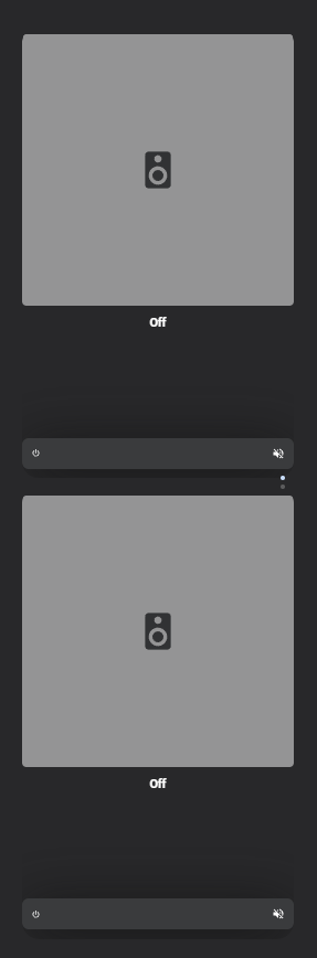
Since one of the last updates, Simple Swipe Card changes the height of the card. The image shows the same bubble card embedded in a simple swipe card at the top and only the one bubble card at the bottom:
Please open a BUG report on the Github page as that’s the place where I track the issues. Provide as much details as possible. Please also include which version works fine and since which version it doesn’t. Also include your yaml so I can reproduce it myself.
You can easily switch Simple Swipe Card versions through HACS and figure out which version has the wrong behavior. You don’t have to switch HA versions.
