I know, I know… just what the world needs, right? Another weather card. But I’m actually pretty happy with how this turned out and wanted to share the love.
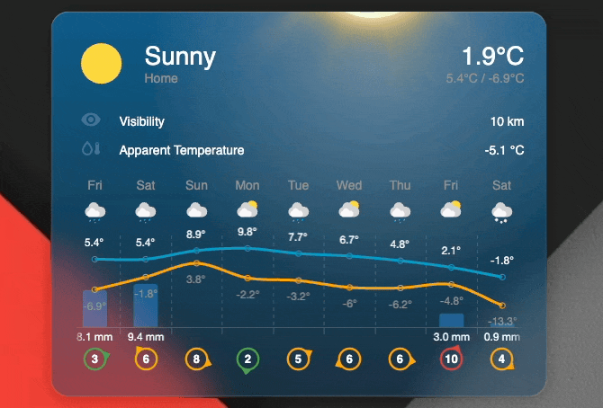
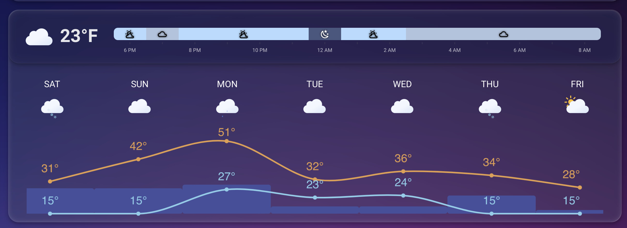
I recently started reworking my Home Assistant dashboard and got tired of “hacky” fixes for my dashboard trying to visualize weather data. I couldn’t find a custom card that handled long hourly or daily forecasts well, so I decided to try to build one that actually makes visualizing and scrolling through those larger datasets feel smooth. The design tries to adhere to the built-in weather card to some degree.
This started as a learning experiment, so it’s definitely tailored to my personal setup, but I hope others find it useful as well. My time is limited for larger development items but if you have some cool ideas I’m more than happy to hear those!
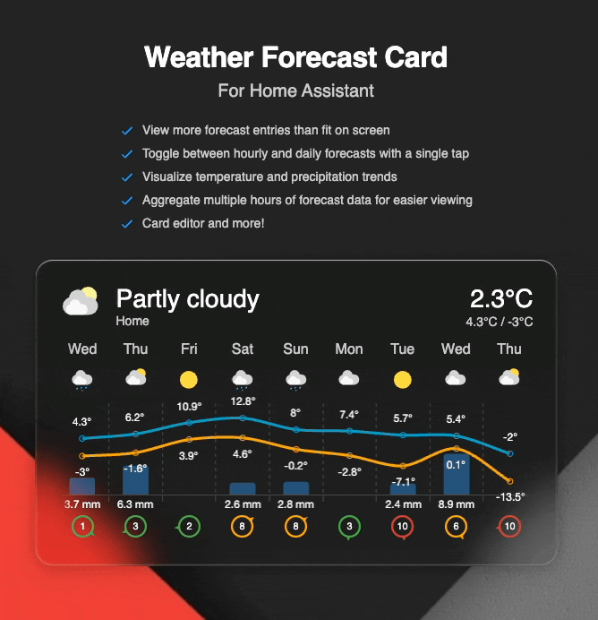
Some of the key features include
Scrollable forecast – View more forecast entries than fit on screen
Toggle views – Switch between hourly and daily forecasts with a tap
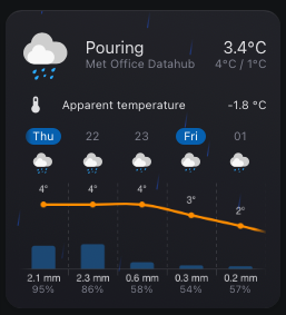
Visualize precipitation – See precipitation amounts for each forecast entry
Chart mode – Visualize temperature and precipitation trends
Extra attributes – Display extra attributes, like wind direction, wind bearing, or precipitation probability
Group hourly data - Aggregate multiple hours of forecast data for easier viewing
Custom icons – Use your own weather icons
Customizable actions – Configure tap, hold, and double-tap behaviors
Sun times - Visualize sunrise and sunset
Condition effects - Add a special touch with animated weather effects
Card editor - Configure the card directly in the UI. No YAML required
Few people have been asking for chart line colors. At the moment, the high temp color is your theme’s primary and low temp is the secondary color. Both are configurable via themes.
I did some quick testing and it looks like color steps aren’t too complicated to implement. Before moving forward I would like to ask your opinion if this is sensible or not:
Love this setup, overall. I just have one issue - I have set this card up as part of the title card, and it doesn’t seem to be working in the Android app. I just get the “Configuration error” message with no real details. Any idea what might be going on here? It works fine in Chrome on my desktop, but fails across multiple android devices.
There is a request for limiting the forecast slots. I’m planning on implementing this at some point as few people have requested it.
If you don’t want show the precipitation amount you can set its color to transparent in your theme:
# themes.yaml or whatever file you have

my-theme:
 weather-forecast-card-chart-precipitation-label-color: transparent
This will make it invisible. The reason I’m not yet considering adding this to the card is that most people want to know the actual precipitation amount so this is kind of a rare edge case.
0.6.0 has now been released. Please find release notes below:
Release highlights
Happy New Year everyone!
This release focuses on enhancing chart visualization and expanding customization options for the forecast section. In addition to these features, version 0.6.0 includes several fixes based on community-reported issues.
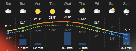
Color Thresholds and Line Styling
When using the forecast chart mode, you can now bring your data to life with color thresholds.
Gradient Styling: Enable forecast.use_color_thresholds to apply predefined color stops to temperature lines, creating a smooth gradient based on the temperature value.
Visual Distinction: To make the chart easier to read, the low-temperature line now uses a dashed styling to clearly separate it from the high-temperature line.
Updated Defaults: Default line colors have been refreshed to better represent high and low ranges, a common request from the users.
Navigating the horizontal forecast is now much easier for desktop users. This release introduces drag-to-scroll for non-touch pointing devices. You can now grab the forecast container with your mouse and drag or “flick” it to scroll, providing a more intuitive experience outside of mobile devices.
Configurable Forecast Slots
You now have granular control over how much data is displayed at once. Whether you want a minimal look or a deep dive into the week, you can now limit the number of items shown using:
forecast.daily_slots: Limits the number of daily forecast entries.
forecast.hourly_slots: Limits the number of hourly forecast entries.
Thanks for the continued feedback and support. I hope you enjoy this release!
Hi, thanks for this card! I am using it in my living-room on the big wall display - looks great!
Question: Ist it possible to make the font sizes also customizable via css/variables? Espcially in the forecast-chart the fontsize of the temperature values is too small in my usecase.
If you file a feature request to the GitHub project describing the exact needs, i.e. which fonts you would like to customize, I’m more than happy to consider doing it. Doesn’t sound too complicated and I’m sure others would enjoy it as well.
Currently the temperature is displaying up to 1 decimal point. Just to make it tidier, I wonder if you would be able to introduce the option to make it zero decimal places instead please?
The bar renders the value of the precipitation property in forecast entries. Make sure that is provided by your weather integration:
weather.forecast_home:
  forecast:
    - condition: clear-night
      precipitation_probability: 30 # <- Can be used an forecast.extra_attribute
      precipitation: 0.3 # <- This would render a low bar
      # ... other properties ...