By copying other similar examples I’ve found in my searching here (I’m a complete novice with yaml) I created some power and energy sensors in my configuration.yaml file, one of which performs some simple maths to create a new sensor output.
They work and I can display the results OK.
However the output of this new sensor provides a history which seems as if it is outputting text data rather than numerical data (but I’m not entirely sure about this).
This is what this new sensor’s output history looks like:

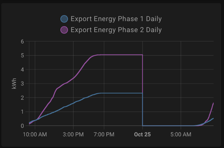
with all those different colours representing each change in the numerical value of the sensor, when I would expect it to look a bit more like one of these types of history charts:
This is the code for the sensor:
  - platform: template
    sensors:
      hot_water_energy_diverted:
        value_template: >-
          {% set white = states('sensor.export_energy_phase_2_daily') | float %}
          {% set red = states('sensor.export_energy_phase_1_daily') | float %}
          {{ (white - red) }}
The idea is this new sensor is calculating the difference between the other two sensors.
It’s doing that OK, and I can display the value from the sensor in a dashboard entity card and it is the correct value but why is it not chartable like the other two sensors from which it is derived?
Is there something in the yaml code I am missing?
Thanks for any guidance.


