I’m trying to create a nicer dashboard with stack in cards and cardmod.
The first time the page loads in a browser the cards all seem to “flash” into place.
Is this normal behavior or am i doing something wrong?
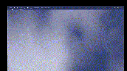
In the gif below you can see what i mean.
Below you can see the code i use for the card and also the theme i’m using. (Not sure if the theme has anything to do with it?!?) This card is put together with code i found in forums and on youtube channels. I don’t have much experience with CSS.
I’m using the margin bit a lot just to get the buttons a bit closer together, otherwise all the elements take up too much space.
If there is a better way of achieving a similar result i’m all ears. But i would at least like to get rid of the flashing if possible.
Main reason i want to get rid of it is that i want to start using some as those cards as popup cards via browsermod, but everytime the popup shows up you have the same behavior. If it was just on the main screen i could live with it doing it once while loading.
Any help would be greatly appreciated
Stack in Card Code:
type: custom:stack-in-card
cards:
  - type: horizontal-stack
    cards:
      - type: custom:button-card
        name: Outside
        styles:
          name:
            - font-weight: bold
            - font-size: 30px
            - justify-self: start
            - color: silver
        tap_action:
          action: navigate
          navigation_path: /layout-card/buttontest
        card_mod:
          style: |
            ha-card
              {
               background: trannsparent;
               margin: 25px 0px 0px 20px;
              }
      - type: markdown
        content: |-
          <font size= 5px color= silver> <center><b>
          {{state_attr("weather.home_hourly","temperature")}}°C
          </center></b></font> </a>
        card_mod:
          style: |
            ha-card
              {margin: -10px 0px 0px 110px;}
  - type: grid
    columns: 6
    square: false
    cards:
      - type: custom:mushroom-template-card
        primary: ''
        secondary: ''
        icon: ''
        card_mod:
          style: |
            ha-card
              {margin: -25px 0px 10px 0px;}
      - type: custom:mushroom-template-card
        primary: ''
        secondary: ''
        icon: ''
        card_mod:
          style: |
            ha-card
              {margin: -25px 0px 10px 0px;}
      - type: custom:mushroom-light-card
        entity: light.porch_lights
        name: Porch
        secondary_info: none
        layout: vertical
        card_mod:
          style: |
            ha-card
              {margin: -25px 0px 10px 0px;}
      - type: custom:mushroom-light-card
        entity: light.downstairs_lights
        name: Downstairs
        secondary_info: none
        layout: vertical
        card_mod:
          style: |
            ha-card
              {margin: -25px -30px 10px 0px;}
  - type: custom:mushroom-chips-card
    chips:
      - type: entity
        entity: binary_sensor.downstairs_motion
        content_info: none
    alignment: center
    card_mod:
      style: |
        ha-card
          {margin: -5px 0px 10px 0px;}
Theme:
# iOS Dark Mode Theme - dark-blue

#

ios-dark-mode-dark-blue-alternative:

  # Global

  background-image: "center / cover no-repeat fixed url('/hacsfiles/themes/ios-themes/homekit-bg-dark-blue.jpg')"

  lovelace-background: var(--background-image)

  primary-color: "#ff9f09"  # from Apple systemOrange dark mode

  light-primary-color: "#B6B6C1"  # (icons on left menu) (light: systemGray5 from iOS dark mode, dark: XXX)

  primary-background-color: "#2c2c2e"  # systemGray5 dark mode

  secondary-background-color: rgba(25, 25, 25, 0.9)

  divider-color: rgba(152, 152, 157, 0.3)  # from Apple systemGray dark mode

  accent-color: rgba(255, 159, 9, 1)

  # Text

  primary-text-color: "#FFF"

  secondary-text-color: "#d3d3d3"

  text-primary-color: "#FFF"

  disabled-text-color: "#555"  # XXX: https://github.com/basnijholt/lovelace-ios-dark-mode-theme/issues/2

  text-dark-color: "#FFF"

  # Sidebar Menu

  sidebar-background-color: var(--primary-background-color)

  sidebar-icon-color: var(--light-primary-color)

  sidebar-text-color: "#F1F1F1"

  sidebar-selected-background-color: var(--primary-background-color)

  sidebar-selected-icon-color: "#FFF"  # (light: systemGray5 from iOS light mode, dark: XXX)

  sidebar-selected-text-color: var(--sidebar-selected-icon-color)

  # States and Badges

  state-icon-color: "#FFF"

  state-icon-active-color: "#FFF"  # or make light icons yellow when active: rgba(255, 214, 10, 1)

  state-icon-unavailable-color: var(--disabled-text-color)

  paper-item-icon-active-color: "#FFF"  # see https://github.com/basnijholt/lovelace-ios-dark-mode-theme/issues/30

  # Sliders

  paper-slider-knob-color: "#FFFFFF"

  paper-slider-knob-start-color: var(--paper-slider-knob-color)

  paper-slider-pin-color: var(--paper-slider-knob-color)

  paper-slider-active-color: "#0984ff"  # from Apple systemBlue dark mode

  paper-slider-secondary-color: var(--paper-slider-knob-color)

  paper-slider-container-color: rgba(255, 255, 255, 0.5)

  paper-slider-font-color: "#000"

  ha-slider-background: none !important

  # Labels

  label-badge-background-color: "#23232E"

  label-badge-text-color: "#F1F1F1"

  label-badge-red: rgba(255, 159, 9, 0.7)  # from Apple systemOrange dark mode

  # Cards

  card-background-color: var(--secondary-background-color)  # Unused entities table background

  paper-listbox-background-color: var(--primary-background-color)

  ha-card-border-radius: 20px

  ha-card-background: rgba(10, 10, 10, 0.4)

  paper-card-background-color: var(--ha-card-background)

  ha-card-border-width: 0  # https://github.com/basnijholt/lovelace-ios-dark-mode-theme/issues/82#event-7732695357

  # Toggles

  paper-toggle-button-checked-button-color: "#484848"

  paper-toggle-button-checked-bar-color: "#484848"

  paper-toggle-button-unchecked-button-color: var(--paper-toggle-button-checked-button-color)

  paper-toggle-button-unchecked-bar-color: var(--disabled-text-color)

  # Table row

  table-row-background-color: var(--primary-background-color)

  table-row-alternative-background-color: var(--secondary-background-color)

  # Switches

  switch-checked-color: "#30d257"  # XXX: remove when https://github.com/home-assistant/home-assistant-polymer/pull/4203 is in HA

  switch-checked-track-color: "#30d158"  # from Apple systemGreen dark mode

  switch-checked-button-color: "#FFF"

  # Other

  paper-dialog-background-color: rgba(55, 55, 55, 0.8)  # e.g., background of more-info

  paper-item-icon-color: white  # also should mini-media-player icon white (but doesn't work by itself)

  more-info-header-background: rgba(25, 25, 25, 0.5)

  lumo-body-text-color: var(--primary-text-color)  # see https://github.com/basnijholt/lovelace-ios-dark-mode-theme/issues/42

  app-header-background-color: rgba(48, 69, 124, 0.4)

  markdown-code-background-color: "#464646"

  code-editor-background-color: "#161616"

  # Custom

  mcg-title-letter-spacing: .15em

  mini-media-player-base-color: white

  mini-media-player-icon-color: white

  # Added for https://github.com/basnijholt/lovelace-ios-dark-mode-theme/issues/72

  # TODO: add description for lines below. Suggested in https://github.com/basnijholt/lovelace-ios-dark-mode-theme/issues/72

  input-ink-color: var(--primary-text-color)

  input-fill-color: transparent

  input-disabled-fill-color: transparent

  input-label-ink-color: var(--primary-text-color)

  input-disabled-ink-color: var(--disabled-text-color)

  input-dropdown-icon-color: var(--primary-text-color)

  input-idle-line-color: var(--secondary-text-color)

  input-hover-line-color: var(--secondary-text-color)

  codemirror-property: var(--accent-color)

  #browser_mod.popup

  #dialog-backdrop-filter: blur(2em) brightness(0.75)

  popup-background-color: rgba(34,38,39,0.9)

  popup-border-width: 1px

  popup-border-radius: 1em

  tablet-popup-header-color: rgba(200, 218, 222, 0.05)

  tablet-popup-content-padding: 1.4em 2.2em 1.6em 1.5em

  tablet-popup-button-padding: 0.1em 2em 1.8em 2em

  tablet-popup-border-style: 1.5px solid rgba(0,0,0,0.2)