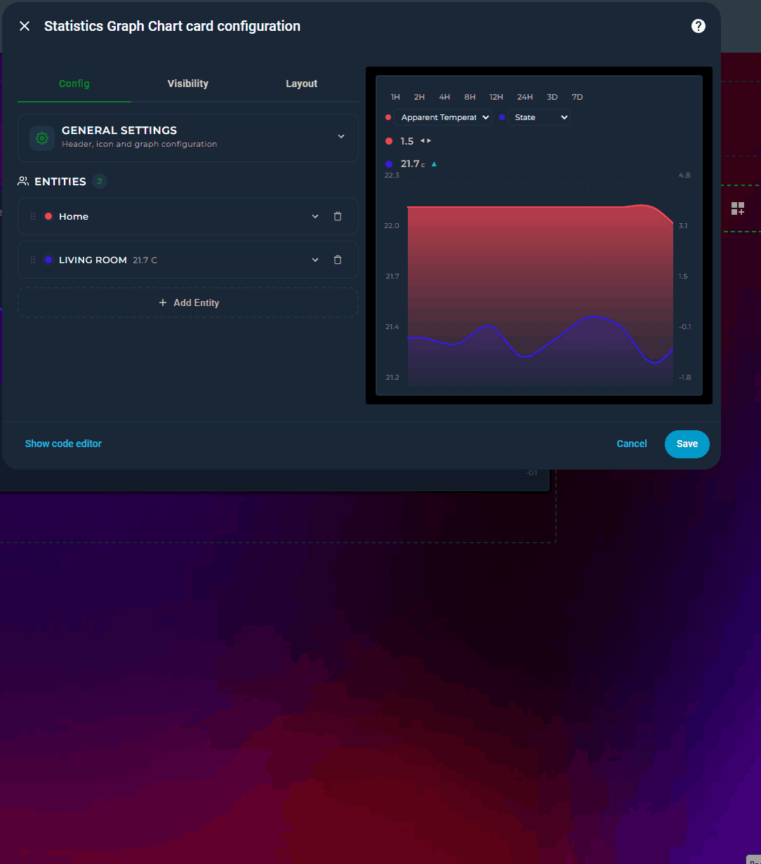
Live state rows with current value, MDI icons, and configurable font sizes
Rise/Fall colorization — graph segments automatically change color as values climb or drop, with independent colors for rising, falling, and stable periods
Trend icon — a ▲▼⯇⯈ indicator on each state row shows the current direction of change, calculated over a configurable time window (trend_period_hours)
Locale-aware formatting — control how numbers and timestamps are displayed per entity (number_format, datetime_format), independent of your HA locale
Full visual editor — every option is configurable through the Lovelace UI without touching YAML; entities can be reordered by drag-and-drop
Dual Y-axis support (primary + secondary) with per-axis bounds
Color thresholds with smooth or hard transitions
Min / Max extrema labels — always on, on click, or never
Average line — dashed reference at the mean value for the visible window
Tooltip with crosshair on hover
Per-entity gradient fill with same-hue fade
▦
Grid lines — horizontal + vertical aligned to actual data points
Logarithmic scale
Soft bounds (~ prefix) — axis expands when data exceeds the bound
state_map for non-numeric entities (binary sensors, input selects)
Attribute reading with dot-notation nested path support
Forward-fill for sparse sensors (e.g. weather entities)
Adaptive state color — state row inherits entity line color automatically
Interval picker — quick-select time range buttons (1H–7D) directly on the card, no editor needed
Attribute switcher — per-entity dropdown on the card to switch between state and any numeric attribute on the fly
Scrollable graph — set a visible window smaller than the data range and scroll horizontally through history
↔️
Configurable icon position — place the header icon on the left or right side of the title
Definatly going to look into this! Looking amazing and if you keep supporting this, it is way better than the default statistics card, and the mostly abandoned apex-charts (outdated) and simpler than plotly (no UI).
I really like the UI and the looks so far according your screenshots. I’ll give it a go.
What I am missing is an option to round the time on the x-axis of the chart.
I would like to display things in whole hours instead of the current time (- exactly 1 or more hour).
The flexibility and seemingly endless ways of representing your data is incredible. A bit overwhelming at first, but the amount of work that had to have gone into this, not to mention the documentation, is super impressive.
However, while I really admire and appreciate the rapid development, it may be time to stabilize the code, squash a few bugs. It’s not as sexy as new features, but there’s something seriously going awry underneath what you can see in your dashboard. After configuring two line graphs - one for CO2 and another tracking inside and outside temperatures, the dashboard was crashing constantly. I kept getting a “reload ui” button or something like that. It kept disappearing, reloading… in a loop. I was barely able to delete cards and restore sanity.
I have the guts feeling (according my installation) it is also very memory consuming, and could overflow the session quite easy…
Having said that. I do really dig it, and once it’s more of less stabilized, I would love to find a way to let it take over the standard HA (more-info) statistics (although, no clue howto do that yet) dialogs.
It is damn sexy, and does exactly what a good statistics card, needs to do. It just needs to be a little less aggressive on resources like memory.
When I enabled it and made my first 2 statistic-graph-chart- charts, my memory usage gone from 2-2.5 Gb to 6-7 Gb of usage.
Please try with the new update and give your feedbacks under github repo.
In my debug and test the card is consuming very little resources however this depends on user’s DB and the complexity of charts. So your feedbacks are very important to me.
As I mostly use github repo, please share the negative and positives changes between updates related to performance by creating github issue.
short question, there’s way to have more but 2 yaxis yet? (or some day)
Second one, since also yaxis related.
I do wonder about the yaxis definitions.
If I got 2 entities which should share the same yaxis since being of same type/same/unit_of_meas./ but inequal ranges, why is that yaxis sort of entity-bound? A couple of it’s setting have no effect at all which makes sense, since a specific axis surely can’t get differently defined multiple times?
Or would it allow to prevent populating data to an axis.
Eg.
Defined entity 1 for the primary yaxis with bounds from 0 to infinite
plus entity 2 also for the primary yaxis with bounds from 50 to 100 ?
Nevertheless, a nice card one must have some deeper look into for sure.
Thanks for the kind words. I hope I understood your question correctly. If not then please share a yaml example
Multiple Y-axes: Already supported. Set y_axis: independent on any entity, it gets its own hidden scale based on its data’s min/max. There’s no limit in terms of independent entity number. Primary (left) and secondary (right) axes remain shared and visible. Independent axes have no visible labels, they’re designed for trend comparison across sensors with very different units.
Shared axis bounds: When multiple entities share the same axis (both on primary), the axis range is the union of all their data, it expands to fit everything. Per-entity lower_bound / upper_bound are combined: the lowest lower bound and highest upper bound win. So your example:
Entity 1: lower_bound: 0 (no upper)
Entity 2: lower_bound: 50, upper_bound: 100
Result: primary axis = 0 to max(data, 100). Entity 2’s lower bound of 50 is ignored because entity 1 pulls it down to 0. This is intentional, a shared axis must show all entities correctly.
If you want entity 2 to only show values 50–100 while entity 1 uses 0, use y_axis: independent on entity 2 with its own bounds.
Assume the following.
I got battery_charge_power and battery_discharge_power, 2 entities with both having a range from 0 - infinite (well I wished it was like that, better said till max)
turn the discharge to run inverted works … result x * -1 similar to apex but
What I wanted is them to share 1 yaxis with a range from lets say -9000 till + 9000 which is easy, while I want to prevent the line being printed in case of 0.
Means as long as I got chargepower I want the battery_charge_line being drawn whereas if discharge_power is given it should draw that line.
So that I got 1 line with commmuted above or below 0.
And I wasn’t sure about how to define these. Will both apply to primary?
And must both be shared?
Both y_axis: primary, shared scale, one axis from -9000 to +9000
invert: true on discharge, flips it below zero, tooltip still shows positive
value_transform: “return x === 0 ? null : x” converts zero values to null, which creates a gap in the line. So when charging stops (charge = 0), that line disappears and only the discharge line remains visible.
If you want explicit axis bounds:
lower_bound: "-9000"
upper_bound: "9000"
The result should be a single visual line that moves above zero during charging and below zero during discharging, with no overlapping flat lines at zero.
First of all I felt the datepicker was broken … until I realised siwtching from day to week on a monday won’t show something differnt since it assumed I wanted to have a look into the future, eg. from today till + 7days.
Perhaps it would be an idea to calc it the other way round so that if selecting a week, a week is shown by a clac from now - 7days till today.
Same applies to month.
But, I must congratulate, you likely found the cpu & memory leak since v2.17 doesn’t put extra load on my NUC right now, no matter if using a bunch of entities with graduated fill and such like.
Excellent job.
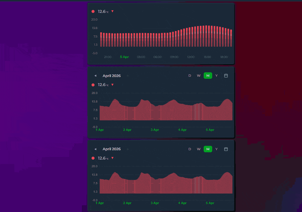
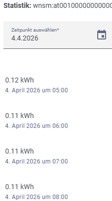
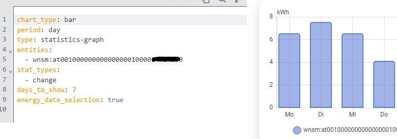
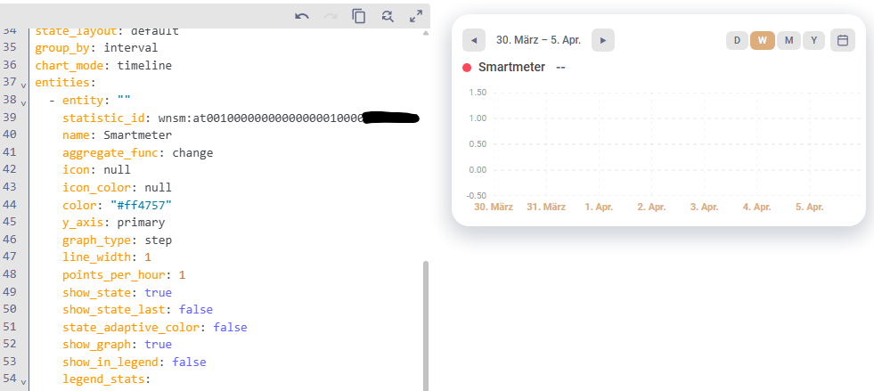
For my smart meter I am using a HACS integration that provides a recorder entity (wnsm:at0000…) that adds an hourly kWh value to the statistics. It does not provide a sensor entity for regular use.
 Home Assistant - Statistics Graph Chart Card
 Preview
 Features