I was hoping I could use the statistics graph to visualize my long-term energy consumption similar to the new energy dashboard, only for longer periods of time.
This would have the advantage of to visualize long term data without the need for bloating my database with unneeded detailed state data or using influx and grafana.
However, when I configure a statistics graph card with a “total energy sensor” (which works in the energy dashboard) I get an empty card.
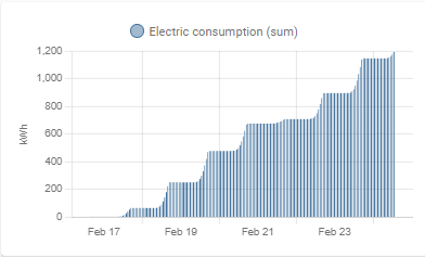
When I configure a “daily energy sensor” it actually shows data, but only in an aggregated form (sum), with hourly bars.
I was hoping to see one bar for every day in range with the consumed power of the entity on that day much like the energy-dashboard.
I know I can achieve a similar effect with Mini-Graph, but only at the cost of a bloated database.
Am I “doing this wrong”, expecting to much or just to impatient
It’s not just the reporting period. It’s also the aggregation method. Right now the graph sums up the daily values. The only method that shows any values is “sum”
Today’s value is “yesterday + today” even when I use the " daily energy sensor".
Also the “total energy sensor” does not show anything.
I don’t have this sensor configured for recording. I thought the statistics graph is based on the new statistics table in the database, so recording should not be required.
Is this a misconception?
Ok, so this chart seems to rely on the regular state data as the graphs appear if I add the sensor to the recorder. But the aggregation does not really make sense.
So I guess I’ll just have to wait and hope for:
use of statistics table
more reporting periods
new stat types to just show the value for the selected period instead of summing up all values since the beginning of time
So if I understand correctly the statistics-graph cannot currently show a bar chart similar to the energy dashboard for any kind of sensor? Or can it be done with some additional configuration I haven’t figured out yet. This is a sensor created by utility_meter component I was trying to display like that.
Im not sure what ur looking for, but is it this, or some, more advanced … i do also looking for every “options” to reduce my DB, load usage, in any means … not that i have problems so far, but who knows next year
thou yes, i have to set this as “Show 30days” which is “from current” , a template could/would adapt how i would “see” my data … thou im not there yet , how it’s stored in DB for longer terms, will also have to wait until i have an external, or internal maria DB
PS: i was also looking for a card, with the “option” to show “select-totalsumday” auto-add column
… maybe a html-template will be the solution, if noone have come with a better solution, when i get to this “priority”
edit: actually this card uses “aggregate” and “sum” , but apparently not the functionality, to “separate” in “Daily/monthly” “groups” …
Hi. I was searchign for the same and probably found
The statistics graph card has an option which is not available in GUI. So if you switch to Code Editor for the card you can choose one mroe graph type (expect min, max, mean, sum) - state. And it will do the trick. In case you have data in expected format.
I had the same requirement. Unfortunately the solution above does not work for me. I managed to get it working using ApexCharts. Also possible with mini-graph-card by the way.
The key to make it work is the group by delta function.
Hi, I’m using your example. Works great. Is there a method to make the mouse over window a bit smaller? I’m not able to see the values. Any help is appreciated.