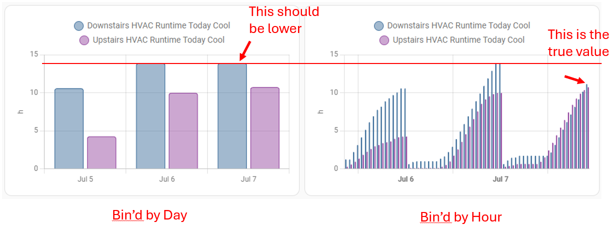
I have a sensor that outputs a total runtime per day for my AC. I want to use the statistics graph to show the max runtime for each day but it seems like there is an issue when I bin the bar graph by day. It can be clearly seen when also creating the same chart bin’d by hour. Seems like the current day hold the previous days high until it reaches higher.
Both of the charts shown use the same sensor. I set them up using the UI. The only thing different is the radio button on one is selected using day and the other is using hour.
Seems like maybe the graph is pulling data from the previous day maybe the last datapoint or something and since that is the max it uses that until the current day goes higher. But not sure why it would do that, my timezones are setup correctly and the sensor seems to be measuring okay, the first point of each day is ‘0’ just after midnight.
I think the problem is that at midnight the value of the sensor is still the accumulation of the previous day, and it takes a few milliseconds after midnight for it to be re-evaluated to reset to 0. So that value gets included in the statistic “max”, since the value of the sensor was technically still that value during the daily period.
Maybe what to try is get the history_stats to reset to 0 just before midnight, then the value at midnight will be 0?
Not sure if 1 minute is enough for history_stats to update, or if it needs to be longer, or if something could be done with the update_entity service to guarantee it.
You might be right, although I would think that the statistics chart would be smarter to account for this edge case. I feel like it must be relatively common.