I manually downloaded my 5 year Energy/Gas history from Enelogic.com via their API and managed to insert it into my MariaDB via SQL. That part works perfectly!
I don’t know whether it is related, but in a time-period which I did not touch (was fully filled by my P1 meter over time) I see a strange effect:
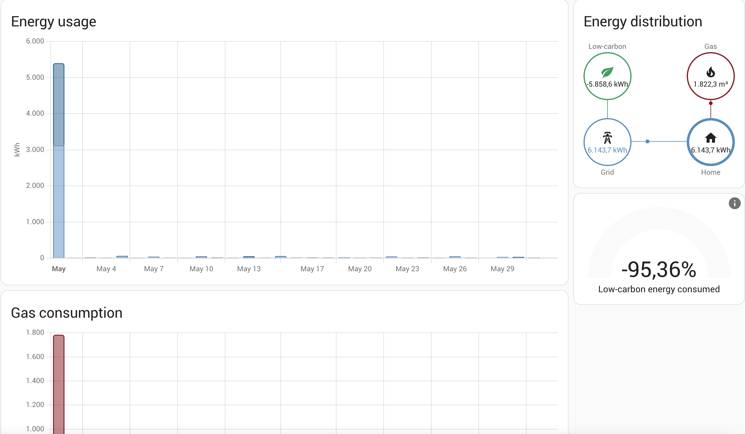
While May 2022 looks perfectly normal for both my Gas/Energy meters in the year view, in the daily/weekly/monthly view you can see a strange spike. In the actual database, I don’t see anything strange in the database itself.
I tried to repair it via adjust sum in development tools. But while I managed to repair the daily/weekly/monthly view, now the yearly view has a negative spike.
How can those views be different while running on the same database and how should I fix this?
Before sum adjust: Year view looking normal, while daily/weekly/monthly showing a spike

After sum adjust: Year view having negative spike, while daily/weekly/monthly now is fixed

