Issues about positioning & scaling elements
When creating a floorplan, people sometimes facing an issue “my floorplan is malformed on iPad/iPhone/etc”.
In short - you may spend lot of time to position your elements (lightbulbs, furniture, equipment, doors, smoke detectors, …) on a floorplan - i.e. by setting “top / left / scale” properties; and then on another device your results look differently.
On GitHub there are plenty of issues about the same problem. People consider this as a bug - which is wrong.
A similar case - a floorplan look differently when a view is in “panel: true” mode or with a right sidebar. Reason is same - size of a card is different in these cases.
There is a difference between icons/badges/labels and images in part of scaling.
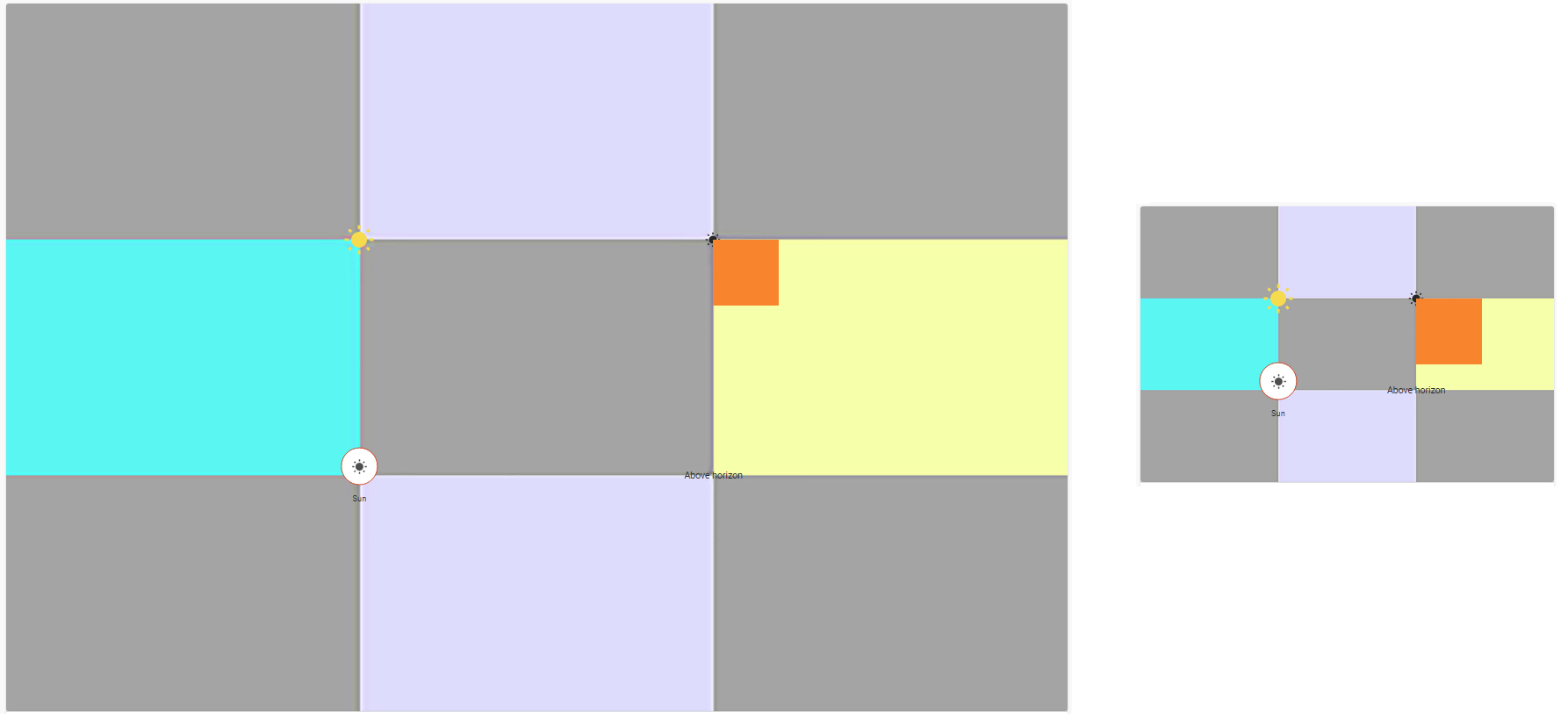
Consider an example below.
Create an image larger than your viewport (for instance, for my 1920x1200 screen I created a 3000x3000 image) with a similar “chess” pattern:

So, the image must have clear marks for 33%, 66% in horizontal & vertical directions.
Create a new view in Panel mode and add this card:
type: picture-elements
elements:
  - type: state-icon
    entity: sun.sun
    icon: mdi:white-balance-sunny
    style:
      top: 33.3333%
      left: 33.3333%
      transform: translate(-50%,-50%) scale(2,2)
  - type: icon
    icon: mdi:white-balance-sunny
    style:
      top: 33.3333%
      left: 66.6666%
  - type: state-badge
    entity: sun.sun
    icon: mdi:white-balance-sunny
    style:
      top: 66.6666%
      left: 33.3333%
  - type: state-label
    entity: sun.sun
    icon: mdi:white-balance-sunny
    style:
      top: 66.6666%
      left: 66.6666%
image: /local/images/test/9colors_low.jpg

Now resize the browser’s window - all elements are still placed on same places:

A small trick how to set positions ONCE - i.e. w/o endless “set position → save → reload page → check if it is OK → set position → …”:
– open your floorplan’s main image in Photoshop (or any other program with a similar functionality);
– place a mouse on a desired point;
– write down coordinates of this point in pixels (like “1234, 567”);
– calculate a relative coordinates like “left = COORD_X / IMAGE_WIDTH”; let it be “left = 1234 / 3000 = 41.13 %”.
Note that on a smaller viewport elements become BIGGER (respectively to the main image).
This may be solved by scaling elements differently on different viewports ("transform: translate(-50%,-50%) scale(diff_scale_value,diff_scale_value)").
Two ways may be used:
– the whole floorplan card is a decluttering-card - pass a scale value as a variable;
– use card-mod to set scales conditionally dependingly on a current viewport (use “mediaquery”).
Result - all tested elements (icons, badges, labels) are placed / scaled properly on different viewports.
Now let’s check images as elements.
Consider these facts:
- A main image fills all card’s area: first it fills the area in horizontal direction (since the card’s width is fixed), then it fills the area in vertical direction (according to the image’s aspect ratio).
- Assume that some “image” element is placed with
"left: 33.333%, translate(0%,0%)"- i.e. the top left corner has coord_x = 33.333%. So there is 66.6667% space left on the right. If the image’s width is less than this space - then this image is placed in this space with a possible gap between the image & right border (unoccupied space). If the image’s width is bigger - then it occupies the whole space left w/o a gap (no unoccupied space left). This is described here.
Means - image elements have different sizes (respectively to the main image) dependingly on a current viewport.
Add this element to the test card (image size is 100px x 100px - less than the main image):
  - type: image
    image: /local/images/test/1color.jpg
    style:
      top: 33.3333%
      left: 66.6666%
      transform: translate(0%,0%)
and resize the browser’s window:
One of possible solutions seems to use the same size for the main image and image elements:
– all image elements have "left: 0%, top: 0%, translate(0%,0%)";
– all image elements are PNG files with transparent background.
Check this:
type: picture-elements
elements:
  - type: image
    image: /local/images/test/car.png
    style:
      top: 0%
      left: 0%
      transform: translate(0%,0%)
image: /local/images/test/garage.png
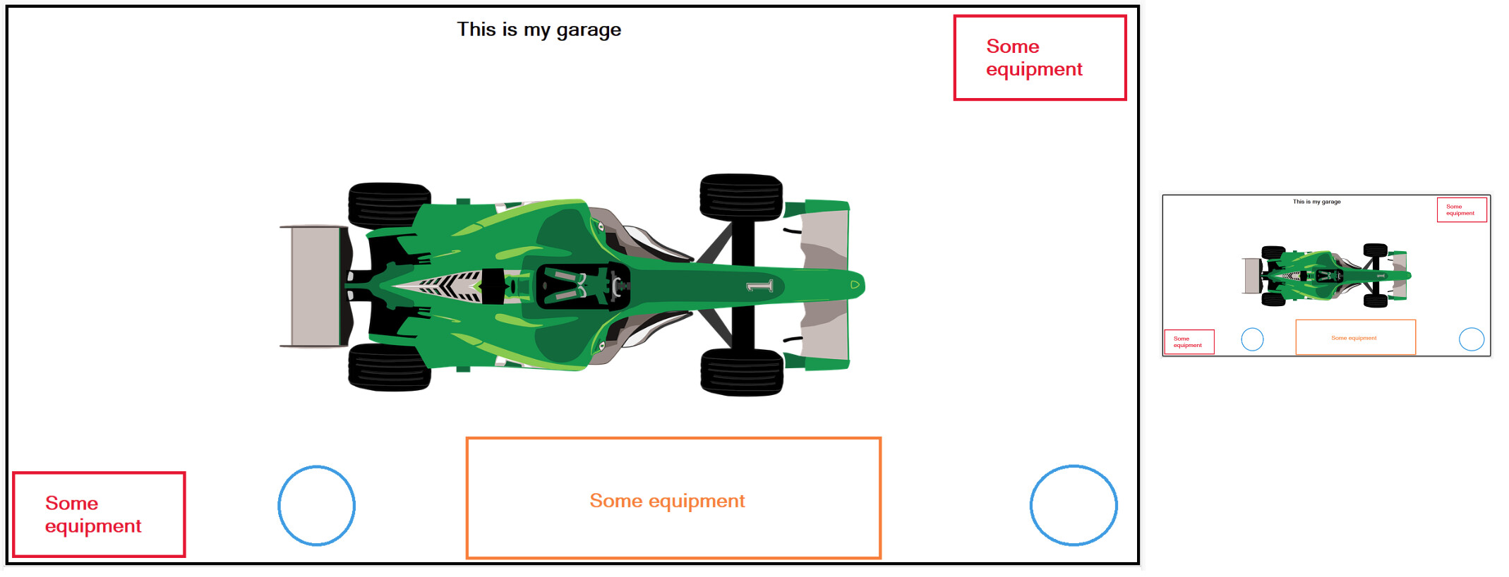
where the garage & car - are different images:

The same approach may be used to create “dark rooms” for a floorplan.
Another approach would using a dynamic width: see an example with a “scale” above, the “width” property should be treated similarly (different values for different viewports).