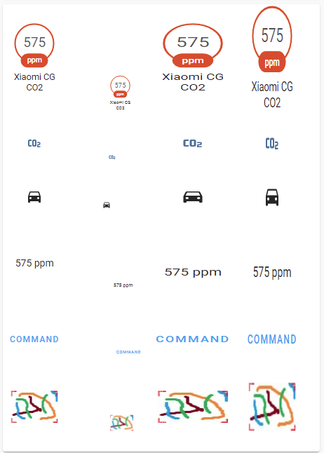
Intro:
This thread is dedicated to people who started using the Picture elements card.
It contains basic hints for styling elements.
This is not about using the "card-mod"
- everything regarding the "card-mod"
will be described in the corresponding thread.
Understanding positioning:
Positioning of some element is defined by the "top"
& "left"
properties.
Position is defined for a “center” of the element which is kind of geometrical center of the element by default.
But the element’s “center” may be re-defined using a "transform: translate()"
filter, for example:
-
"translate(-50%,-50%)"
- “center” is a geometrical center; -
"translate(0%,0%)"
- “center” is a left top corner; -
"translate(-100%,-100%)"
- “center” is a right bottom corner.
By default the filter is "translate(-50%,-50%)"
.
Below some examples for different "translate()"
filters are provided:
- type: picture-elements
title: '-'
style: |
ha-card { height: 300px !important; }
elements:
- type: state-badge
entity: sensor.cleargrass_1_co2
style:
top: 0%
left: 0%
transform: translate(0%, 0%)
- type: state-badge
entity: sensor.cleargrass_1_co2
style:
top: 0%
left: 20%
transform: translate(0, 50%)
- type: state-badge
entity: sensor.cleargrass_1_co2
style:
top: 0%
left: 40%
transform: translate(0, -50%)
- type: state-badge
entity: sensor.cleargrass_1_co2
style:
top: 0%
left: 60%
transform: translate(0, -100%)
- type: state-badge
entity: sensor.cleargrass_1_co2
style:
top: 0%
left: 80%
transform: translate(0, 100%)
image: /local/images/blue.jpg
Below all elements have "top: 0%"
position which corresponds to the top border of the elements’ area, and the "left: 0%"
position corresponds to the left border of the elements’ area.
All elements are centered on the top border of the elements’ area - this is because default center’s position is "translate(-50%,-50%)"
:
- type: picture-elements
title: '-'
style: |
ha-card { height: 150px !important; }
elements:
- type: state-badge
entity: sensor.cleargrass_1_co2
style:
top: 0%
left: 0%
- type: state-badge
entity: sensor.cleargrass_1_co2
style:
top: 0%
left: 20%
- type: state-badge
entity: sensor.cleargrass_1_co2
style:
top: 0%
left: 40%
- type: state-badge
entity: sensor.cleargrass_1_co2
style:
top: 0%
left: 60%
- type: state-badge
entity: sensor.cleargrass_1_co2
style:
top: 0%
left: 80%
image: /local/images/blue.jpg
When the "translate(0,0)"
is useful?
The "translate(0,0)"
filter could be useful for transparent png images which are supposed to overlap the main background image, this is basically can be used for floorplans:
- a main plot image is set as a background image with the style
"top: 0, left: 0, translate(0,0)"
; - other images are used as transparent masks for displaying dark rooms, plot details like furniture, home appliances & equipment; these images should have the same dimensions as the main background image; for these images the style
"top: 0, left: 0, translate(0,0)"
should be used too.
Rotating an element:
First let’s consider a rotation around Z-axis.
In the example below a rotation applied to these elements:
- state-badge;
- state-icon;
- icon;
- state-label;
- service-button;
- image.
There are 2 methods to define an angle:
- by “turns” (1 turn = 360degrees, used in the example below);
- by “degrees”.
By default because of unknown reason a rotation causes changing the "translate()"
style - so it causes changing a position too.
To avoid this, the "translate(-50%,-50%)"
filter must be used along with the "rotate()"
filter.
In the example below the first rotation (+90 degrees, 2nd column) is defined w/o using the "translate(-50%,-50%)"
filter, other rotations are defined with it. It is clearly seen that the 1st rotated element changed it’s position.
type: picture-elements
title: ''
elements:
- type: state-badge
entity: sensor.cleargrass_1_co2
style:
top: 8%
left: 10%
- type: state-badge
entity: sensor.cleargrass_1_co2
style:
top: 8%
left: 30%
transform: rotate(0.25turn)
- type: state-badge
entity: sensor.cleargrass_1_co2
style:
top: 8%
left: 60%
transform: translate(-50%,-50%) rotate(-0.25turn)
- type: state-badge
entity: sensor.cleargrass_1_co2
style:
top: 8%
left: 85%
transform: translate(-50%,-50%) rotate(0.5turn)
- type: state-icon
entity: sensor.cleargrass_1_co2
style:
top: 28%
left: 10%
- type: state-icon
entity: sensor.cleargrass_1_co2
style:
top: 28%
left: 30%
transform: rotate(0.25turn)
- type: state-icon
entity: sensor.cleargrass_1_co2
style:
top: 28%
left: 60%
transform: translate(-50%,-50%) rotate(-0.25turn)
- type: state-icon
entity: sensor.cleargrass_1_co2
style:
top: 28%
left: 85%
transform: translate(-50%,-50%) rotate(0.5turn)
- type: icon
icon: mdi:car
style:
top: 38%
left: 10%
- type: icon
icon: mdi:car
style:
top: 38%
left: 30%
transform: rotate(0.25turn)
- type: icon
icon: mdi:car
style:
top: 38%
left: 60%
transform: translate(-50%,-50%) rotate(-0.25turn)
- type: icon
icon: mdi:car
style:
top: 38%
left: 85%
transform: translate(-50%,-50%) rotate(0.5turn)
- type: state-label
entity: sensor.cleargrass_1_co2
style:
top: 52%
left: 10%
- type: state-label
entity: sensor.cleargrass_1_co2
style:
top: 52%
left: 30%
transform: rotate(0.25turn)
- type: state-label
entity: sensor.cleargrass_1_co2
style:
top: 52%
left: 60%
transform: translate(-50%,-50%) rotate(-0.25turn)
- type: state-label
entity: sensor.cleargrass_1_co2
style:
top: 52%
left: 85%
transform: translate(-50%,-50%) rotate(0.5turn)
- type: service-button
title: Command
service: homeassistant.update_entity
service_data:
entity_id: sun.sun
style:
top: 70%
left: 10%
- type: service-button
title: Command
service: homeassistant.update_entity
service_data:
entity_id: sun.sun
style:
top: 70%
left: 30%
transform: rotate(0.25turn)
- type: service-button
title: Command
service: homeassistant.update_entity
service_data:
entity_id: sun.sun
style:
top: 70%
left: 60%
transform: translate(-50%,-50%) rotate(-0.25turn)
- type: service-button
title: Command
service: homeassistant.update_entity
service_data:
entity_id: sun.sun
style:
top: 70%
left: 85%
transform: translate(-50%,-50%) rotate(0.5turn)
- type: image
image: /local/images/small_pic.jpg
style:
top: 90%
left: 10%
- type: image
image: /local/images/small_pic.jpg
style:
top: 90%
left: 30%
transform: rotate(0.25turn)
- type: image
image: /local/images/small_pic.jpg
style:
top: 90%
left: 60%
transform: translate(-50%,-50%) rotate(-0.25turn)
- type: image
image: /local/images/small_pic.jpg
style:
top: 90%
left: 85%
transform: translate(-50%,-50%) rotate(0.5turn)
image: /local/images/white.jpg
Below there is an example of rotation around X- & Y-axis (angle is defined by degrees) - for state-badge only.
Similarly to the previous example, the "translate(-50%,-50%)"
filter is applied only to the 2nd & 3rd rotations.
type: picture-elements
title: ''
style: |
ha-card { height: 180px !important; }
elements:
- type: state-badge
entity: sensor.cleargrass_1_co2
style:
top: 8%
left: 10%
- type: state-badge
entity: sensor.cleargrass_1_co2
style:
top: 8%
left: 30%
transform: rotateX(180deg)
- type: state-badge
entity: sensor.cleargrass_1_co2
style:
top: 8%
left: 60%
transform: translate(-50%,-50%) rotateX(180deg)
- type: state-badge
entity: sensor.cleargrass_1_co2
style:
top: 8%
left: 85%
transform: translate(-50%,-50%) rotateY(180deg)
image: /local/images/white.jpg
Scaling an element:
Scaling is achieved by using a "scale()"
filter.
Better to use with the "translate(-50%,-50%)"
filter as it was explained above.
In the example below the first scaling(0.5, 0.5) is defined w/o using the "translate(-50%,-50%)"
filter, other scalings are defined with it. It is clearly seen that the 1st scaled element changed it’s position.
Note: other methods to change an element’s size:
- state-badge - changing a badge’s size (link);
- state-badge, state-label, service-button - changing a font-size (link);
- state-icon, icon - changing an icon’s size (link);
type: picture-elements
title: ''
elements:
- type: state-badge
entity: sensor.cleargrass_1_co2
style:
top: 12%
left: 10%
- type: state-badge
entity: sensor.cleargrass_1_co2
style:
top: 12%
left: 30%
transform: scale(0.5,0.5)
- type: state-badge
entity: sensor.cleargrass_1_co2
style:
top: 12%
left: 60%
transform: translate(-50%,-50%) scale(1.5,1)
- type: state-badge
entity: sensor.cleargrass_1_co2
style:
top: 12%
left: 85%
transform: translate(-50%,-50%) scale(1,1.5)
- type: state-icon
entity: sensor.cleargrass_1_co2
style:
top: 31%
left: 10%
- type: state-icon
entity: sensor.cleargrass_1_co2
style:
top: 31%
left: 30%
transform: scale(0.5,0.5)
- type: state-icon
entity: sensor.cleargrass_1_co2
style:
top: 31%
left: 60%
transform: translate(-50%,-50%) scale(1.5,1)
- type: state-icon
entity: sensor.cleargrass_1_co2
style:
top: 31%
left: 85%
transform: translate(-50%,-50%) scale(1,1.5)
- type: icon
icon: mdi:car
style:
top: 43%
left: 10%
- type: icon
icon: mdi:car
style:
top: 43%
left: 30%
transform: scale(0.5,0.5)
- type: icon
icon: mdi:car
style:
top: 43%
left: 60%
transform: translate(-50%,-50%) scale(1.5,1)
- type: icon
icon: mdi:car
style:
top: 43%
left: 85%
transform: translate(-50%,-50%) scale(1,1.5)
- type: state-label
entity: sensor.cleargrass_1_co2
style:
top: 58%
left: 10%
- type: state-label
entity: sensor.cleargrass_1_co2
style:
top: 60%
left: 30%
transform: scale(0.5,0.5)
- type: state-label
entity: sensor.cleargrass_1_co2
style:
top: 60%
left: 60%
transform: translate(-50%,-50%) scale(1.5,1)
- type: state-label
entity: sensor.cleargrass_1_co2
style:
top: 60%
left: 85%
transform: translate(-50%,-50%) scale(1,1.5)
- type: service-button
title: Command
service: homeassistant.update_entity
service_data:
entity_id: sun.sun
style:
top: 75%
left: 10%
- type: service-button
title: Command
service: homeassistant.update_entity
service_data:
entity_id: sun.sun
style:
top: 75%
left: 30%
transform: scale(0.5,0.5)
- type: service-button
title: Command
service: homeassistant.update_entity
service_data:
entity_id: sun.sun
style:
top: 75%
left: 60%
transform: translate(-50%,-50%) scale(1.5,1)
- type: service-button
title: Command
service: homeassistant.update_entity
service_data:
entity_id: sun.sun
style:
top: 75%
left: 85%
transform: translate(-50%,-50%) scale(1,1.5)
- type: image
image: /local/images/small_pic.jpg
style:
top: 90%
left: 10%
- type: image
image: /local/images/small_pic.jpg
style:
top: 90%
left: 30%
transform: scale(0.5,0.5)
- type: image
image: /local/images/small_pic.jpg
style:
top: 90%
left: 60%
transform: translate(-50%,-50%) scale(1.5,1)
- type: image
image: /local/images/small_pic.jpg
style:
top: 90%
left: 85%
transform: translate(-50%,-50%) scale(1,1.5)
image: /local/images/white.jpg
Changing an origin point:
There is some issue with scaling - and it is better to show it with images.
By default the scaled image is scaled “from its center” - that means that original and scaled images are centrally aligned.
To change it, a "transform-origin"
function is used.
On the example below:
- the 1st row is with original images;
- the 2nd row is with scaled images (except the left image) - and the scaled images are centrally aligned with respect to the left image and to images on the 1st row;
- the 3rd row is with scaled images (except the left image) - and the scaled images are centrally aligned with respect to the left image and left-aligned to images on the 1st row;
- the 4th row is with scaled images (except the left image) - and the scaled images are top-aligned with respect to the left image and centrally aligned to images on the 1st row.
type: picture-elements
style: |
ha-card {
height: 550px !important;
}
elements:
- type: image
image: /local/images/small_pic.jpg
style:
top: 10%
left: 15%
- type: image
image: /local/images/small_pic.jpg
style:
top: 10%
left: 45%
- type: image
image: /local/images/small_pic.jpg
style:
top: 10%
left: 80%
- type: image
image: /local/images/small_pic.jpg
style:
top: 30%
left: 15%
- type: image
image: /local/images/small_pic.jpg
style:
top: 30%
left: 45%
transform: translate(-50%,-50%) scale(1.5,1.5)
- type: image
image: /local/images/small_pic.jpg
style:
top: 30%
left: 80%
transform: translate(-50%,-50%) scale(1.5,1.5)
- type: image
image: /local/images/small_pic.jpg
style:
top: 50%
left: 15%
- type: image
image: /local/images/small_pic.jpg
style:
top: 50%
left: 45%
transform-origin: left
transform: translate(-50%,-50%) scale(1.5,1.5)
- type: image
image: /local/images/small_pic.jpg
style:
top: 50%
left: 80%
transform-origin: left
transform: translate(-50%,-50%) scale(1.5,1.5)
- type: image
image: /local/images/small_pic.jpg
style:
top: 70%
left: 15%
- type: image
image: /local/images/small_pic.jpg
style:
top: 70%
left: 45%
transform-origin: top
transform: translate(-50%,-50%) scale(1.5,1.5)
- type: image
image: /local/images/small_pic.jpg
style:
top: 70%
left: 80%
transform-origin: top
transform: translate(-50%,-50%) scale(1.5,1.5)
image: /local/images/white.jpg
Another example - 4 images, 3 of them scaled with using "transform-origin: left top"
:
Note: a "border: 1px solid black"
style is used for make image’s border look more clear.
type: picture-elements
style: |
ha-card {
height: 250px !important;
}
elements:
- type: image
image: /local/images/small_pic.jpg
style:
top: 10%
left: 15%
transform-origin: left top
transform: translate(-50%,-50%) scale(3.5,3.5)
border: 1px solid black
- type: image
image: /local/images/small_pic.jpg
style:
top: 10%
left: 15%
transform-origin: left top
transform: translate(-50%,-50%) scale(2.5,2.5)
border: 1px solid black
- type: image
image: /local/images/small_pic.jpg
style:
top: 10%
left: 15%
transform-origin: left top
transform: translate(-50%,-50%) scale(1.5,1.5)
border: 1px solid black
- type: image
image: /local/images/small_pic.jpg
style:
top: 10%
left: 15%
border: 1px solid black
image: /local/images/white.jpg
Large images’ auto-scaling:
There is one more issue regarding scaling - for images whose width is larger than a card’s width.
These images are automatically scaled to fill all available area to the right (keeping aspect ratio):
The example below contains 3 same images:
- the 1st image is placed to the left top corner with
"translate(0,0)"
filter and fills the whole card to the right (keeping aspect ratio); - the 2nd & 3rd images are shifted to the right and fill the remained area to the right (keeping aspect ratio).
type: picture-elements
style: |
ha-card {
height: 450px !important;
}
elements:
- type: image
image: /local/images/pink.jpg
style:
top: 0%
left: 0%
transform: translate(0,0)
border: 1px solid black
- type: image
image: /local/images/pink.jpg
style:
top: 0%
left: 30%
transform: translate(0,0)
border: 1px solid black
- type: image
image: /local/images/pink.jpg
style:
top: 10%
left: 60%
transform: translate(0,0)
border: 1px solid black
image: /local/images/white.jpg
Changing font-size:
This operation may be applied to:
- state-badge;
- state-label;
- service-button.
For “state-badge” & “state-label” the "font-size"
style must be used.
For “service-button” - the "--mdc-typography-button-font-size"
variable must be used.
Note that changing the font-size for a badge causes a scaling the badge too.
type: picture-elements
title: ''
style: |
ha-card { height: 320px !important; }
elements:
- type: state-badge
entity: sensor.cleargrass_1_co2
style:
top: 12%
left: 10%
- type: state-badge
entity: sensor.cleargrass_1_co2
style:
top: 12%
left: 40%
font-size: 10px
- type: state-badge
entity: sensor.cleargrass_1_co2
style:
top: 12%
left: 80%
font-size: 20px
- type: state-label
entity: sensor.cleargrass_1_co2
style:
top: 30%
left: 10%
- type: state-label
entity: sensor.cleargrass_1_co2
style:
top: 30%
left: 40%
font-size: 10px
- type: state-label
entity: sensor.cleargrass_1_co2
style:
top: 30%
left: 80%
font-size: 20px
- type: service-button
title: Command
service: homeassistant.update_entity
service_data:
entity_id: sun.sun
style:
top: 40%
left: 10%
- type: service-button
title: Command
service: homeassistant.update_entity
service_data:
entity_id: sun.sun
style:
top: 40%
left: 40%
'--mdc-typography-button-font-size': 10px
- type: service-button
title: Command
service: homeassistant.update_entity
service_data:
entity_id: sun.sun
style:
top: 40%
left: 80%
'--mdc-typography-button-font-size': 20px
image: /local/images/white.jpg
Resizing icons:
Resizing may be done by using a "--mdc-icon-size"
variable.
This method may be applied to:
- state-icon;
- icon.
type: picture-elements
title: ''
style: |
ha-card { height: 200px !important; }
elements:
- type: state-icon
entity: sensor.cleargrass_1_co2
style:
top: 8%
left: 10%
- type: state-icon
entity: sensor.cleargrass_1_co2
style:
top: 8%
left: 45%
'--mdc-icon-size': 10px
- type: state-icon
entity: sensor.cleargrass_1_co2
style:
top: 8%
left: 80%
'--mdc-icon-size': 40px
- type: icon
icon: mdi:car
style:
top: 21%
left: 10%
- type: icon
icon: mdi:car
style:
top: 21%
left: 45%
'--mdc-icon-size': 10px
- type: icon
icon: mdi:car
style:
top: 21%
left: 80%
'--mdc-icon-size': 40px
image: /local/images/white.jpg
Resizing a badge:
Resizing may be done by using a "--ha-label-badge-size"
variable.
Note that this does not affect font-size.
type: picture-elements
title: ''
style: |
ha-card { height: 150px !important; }
elements:
- type: state-badge
entity: sensor.cleargrass_1_co2
style:
top: 12%
left: 10%
- type: state-badge
entity: sensor.cleargrass_1_co2
style:
top: 12%
left: 45%
'--ha-label-badge-size': 35px
- type: state-badge
entity: sensor.cleargrass_1_co2
style:
top: 12%
left: 80%
'--ha-label-badge-size': 80px
image: /local/images/white.jpg
Other styles for “state-label”:
- displaying prefix & suffix;
- displaying entity’s attribute;
- colored text.
type: picture-elements
style: |
ha-card {
height: 80px !important;
}
elements:
- type: state-label
entity: sun.sun
style:
top: 8%
left: 15%
- type: state-label
entity: sun.sun
prefix: '{ '
suffix: ' }'
style:
top: 18%
left: 15%
- type: state-label
entity: sun.sun
style:
top: 8%
left: 80%
color: orange
- type: state-label
entity: sun.sun
attribute: elevation
style:
top: 18%
left: 80%
image: /local/images/blue.jpg
Other styles for “state-icon” & “icon”:
- colored icon.
The “state-icon” element MUST be associated with some entity, the “icon” element - MAY be associated.
state-icon:
By default for entities like "sensor"
(same for "device_tracker"
, "person"
, "zone"
, …) an icon’s color for the “state-icon” does not depend on the entity’s state.
The "--paper-item-icon-color"
variable is used to change a color:
type: picture-elements
style: |
ha-card {
height: 70px !important;
}
elements:
- type: state-icon
entity: sensor.cleargrass_1_co2
style:
top: 6%
left: 10%
- type: state-icon
entity: sensor.cleargrass_1_co2
style:
top: 6%
left: 40%
'--paper-item-icon-color': red
image: /local/images/white.jpg
By default for entities like "binary_sensor"
, "sun.sun"
, "switch"
, "input_boolean"
an icon’s color for the “state-icon” DOES depend on the entity’s state - if the property "state_color: true"
is set for the element. If it is set to "false"
, then the color DOES NOT depend on the state.
The "--paper-item-icon-active-color"
& "--paper-item-icon-color"
variables are used to change a color.
The "--paper-item-icon-active-color"
variable affects on color if the property "state_color: true"
is set for the element.
The 1st row on the picture below is for "state_color: true"
, the 2nd row - for "state_color: false"
.
type: picture-elements
style: |
ha-card {
height: 170px !important;
}
elements:
- type: state-icon
entity: binary_sensor.service_on_value
state_color: true
style:
top: 6%
left: 10%
- type: state-icon
entity: binary_sensor.service_on_value
state_color: true
style:
top: 6%
left: 35%
'--paper-item-icon-active-color': red
'--paper-item-icon-color': cyan
- type: state-icon
entity: binary_sensor.service_off_value
state_color: true
style:
top: 6%
left: 65%
- type: state-icon
entity: binary_sensor.service_off_value
state_color: true
style:
top: 6%
left: 90%
'--paper-item-icon-active-color': red
'--paper-item-icon-color': cyan
- type: state-icon
entity: binary_sensor.service_on_value
state_color: false
style:
top: 20%
left: 10%
- type: state-icon
entity: binary_sensor.service_on_value
state_color: false
style:
top: 20%
left: 35%
'--paper-item-icon-active-color': red
'--paper-item-icon-color': cyan
- type: state-icon
entity: binary_sensor.service_off_value
state_color: false
style:
top: 20%
left: 65%
- type: state-icon
entity: binary_sensor.service_off_value
state_color: false
style:
top: 20%
left: 90%
'--paper-item-icon-active-color': red
'--paper-item-icon-color': cyan
image: /local/images/white.jpg
icon:
The "color"
CSS property is used to change an icon’s color:
type: picture-elements
style: |
ha-card {
height: 70px !important;
}
elements:
- type: icon
icon: mdi:car
style:
top: 6%
left: 10%
- type: icon
icon: mdi:car
style:
top: 6%
left: 40%
color: red
image: /local/images/white.jpg
Other styles for “service-button”:
Some styles may be changed:
type: picture-elements
style: |
ha-card {
height: 70px !important;
}
elements:
- type: service-button
title: Command
service: homeassistant.update_entity
service_data:
entity_id: sun.sun
style:
top: 6%
left: 15%
- type: service-button
title: Command
service: homeassistant.update_entity
service_data:
entity_id: sun.sun
style:
top: 6%
left: 70%
--mdc-theme-primary: red
background: rgb(220,220,220)
border: 1px solid black
border-radius: 5px
image: /local/images/white.jpg
Other styles for “service-badge”:
Example 1 - different styles:
type: picture-elements
style: |
ha-card { height: 140px !important; }
elements:
- type: state-badge
entity: sensor.cleargrass_1_co2
style:
top: 10%
left: 10%
- type: state-badge
entity: sensor.cleargrass_1_co2
style:
color: orange
'--label-badge-text-color': magenta
'--label-badge-red': green
'--label-badge-background-color': yellow
'--ha-label-badge-label-color': blue
'--ha-label-badge-size': 75px
'--ha-label-badge-title-width': 150px
'--ha-label-badge-title-font-size': 20px
top: 10%
left: 40%
- type: state-badge
entity: binary_sensor.updater
style:
top: 10%
left: 70%
- type: state-badge
entity: binary_sensor.updater
style:
top: 10%
left: 90%
color: orange
'--label-badge-text-color': magenta
'--label-badge-blue': green
'--label-badge-background-color': yellow
'--ha-label-badge-size': 35px
'--mdc-icon-size': 29px
'--ha-label-badge-title-font-size': 10px
image: /local/images/white.jpg
Example 2 - hidden label:
type: picture-elements
style: |
ha-card { height: 120px !important; }
elements:
- type: state-badge
entity: sensor.cleargrass_1_co2
style:
top: 10%
left: 10%
- type: state-badge
entity: sensor.cleargrass_1_co2
style:
color: transparent
top: 10%
left: 40%
image: /local/images/white.jpg
Example 3 - playing with "background-color"
& "opacity"
:
type: picture-elements
style: |
ha-card { height: 120px !important; }
elements:
- type: state-badge
entity: sensor.cleargrass_1_co2
style:
top: 10%
left: 10%
- type: state-badge
entity: sensor.cleargrass_1_co2
style:
top: 10%
left: 30%
opacity: 0.3
- type: state-badge
entity: sensor.cleargrass_1_co2
style:
top: 10%
left: 50%
background-color: rgb(0, 128, 0)
- type: state-badge
entity: sensor.cleargrass_1_co2
style:
top: 10%
left: 70%
background-color: rgb(0, 128, 0)
opacity: 0.3
- type: state-badge
entity: sensor.cleargrass_1_co2
style:
top: 10%
left: 90%
background-color: rgba(0, 128, 0, 0.3)
image: /local/images/white.jpg
Other styles for “image”:
type: picture-elements
title: ''
style: |
ha-card {
height: 280px !important;
}
elements:
- type: image
image: /local/images/small_pic.jpg
style:
top: 10%
left: 20%
transform: translate(-50%,-50%) scale(2,2)
- type: image
image: /local/images/small_pic.jpg
style:
top: 10%
left: 70%
filter: saturate(0.1)
transform: translate(-50%,-50%) scale(2,2)
- type: image
image: /local/images/small_pic.jpg
style:
top: 30%
left: 20%
filter: invert(100%)
transform: translate(-50%,-50%) scale(2,2)
- type: image
image: /local/images/small_pic.jpg
style:
top: 30%
left: 70%
border: 1px solid black
transform: translate(-50%,-50%) scale(2,2)
image: /local/images/white.jpg
Conditional styles:
Styles can be set dynamically dependingly on some conditions (like some entity’s state) with the help of "card-mod"
:
type: vertical-stack
cards:
- type: entities
entities:
- entity: input_boolean.test_boolean
- type: picture-elements
style: |
ha-card {
{% if is_state('input_boolean.test_boolean','on') %}
--my-state-color: magenta;
--my-transform-style: translate(-50%,-50%) rotate(-0.25turn);
{% else %}
--my-state-color: cyan;
--my-transform-style: translate(-50%,-50%)
{% endif %}
}
elements:
- type: state-badge
entity: sensor.cleargrass_1_co2
style:
top: 8%
left: 20%
'--label-badge-background-color': var(--my-state-color)
transform: var(--my-transform-style)
- type: state-icon
entity: sensor.cleargrass_1_co2
style:
top: 28%
left: 20%
'--paper-item-icon-color': var(--my-state-color)
transform: var(--my-transform-style)
- type: icon
icon: mdi:car
style:
top: 38%
left: 20%
color: var(--my-state-color)
transform: var(--my-transform-style)
- type: state-label
entity: sensor.cleargrass_1_co2
style:
top: 52%
left: 20%
color: var(--my-state-color)
transform: var(--my-transform-style)
- type: service-button
title: Command
service: homeassistant.update_entity
service_data:
entity_id: sun.sun
style:
top: 70%
left: 20%
'--mdc-theme-primary': var(--my-state-color)
transform: var(--my-transform-style)
- type: image
image: /local/images/small_pic.jpg
style:
top: 90%
left: 20%
transform: var(--my-transform-style)
image: /local/images/white.jpg
Changing Z-order for elements:
By default elements have a Z-index in accordance to the order they are defined in a card.
The example below has one “image” element, some “state-label” elements, some “icon” elements.
Some elements are overlapped by the “image” element by default.
The "z-index"
property may be used to change a Z-index:
type: picture-elements
style: |
ha-card {
height: 150px !important;
}
elements:
- type: icon
icon: mdi:car
style:
top: 10%
left: 10%
- type: icon
icon: mdi:car
style:
top: 10%
left: 40%
z-index: 999
- type: state-label
entity: sun.sun
style:
top: 35%
left: 20%
- type: state-label
entity: sun.sun
style:
top: 40%
left: 20%
z-index: 999
- type: image
image: /local/images/pink_mask.png
style:
top: 0%
left: 0%
- type: icon
icon: mdi:car
style:
top: 10%
left: 20%
- type: state-label
entity: sun.sun
style:
top: 30%
left: 20%
image: /local/images/blue.jpg
Styling custom cards inside the Picture elements card:
Example 1 - toggle-entity row:
type: picture-elements
style: |
ha-card {
height: 250px !important;
}
elements:
- type: custom:hui-element
row_type: toggle-entity
entity: input_boolean.test_boolean
name: Some toggle (default style)
style:
top: 0%
left: 0%
transform: translate(0,0)
- type: custom:hui-element
row_type: toggle-entity
entity: input_boolean.test_boolean
name: Some toggle
style:
top: 14%
left: 0%
transform: translate(0,0)
width: 250px
'--paper-item-icon-color': magenta
color: cyan
- type: custom:hui-element
row_type: toggle-entity
entity: input_boolean.test_boolean
name: Some toggle
style:
top: 21%
left: 0%
transform: translate(0,0)
width: 250px
'--paper-item-icon-color': green
color: orange
- type: custom:hui-element
row_type: toggle-entity
entity: input_boolean.test_boolean
name: Some toggle
style:
top: 28%
left: 0%
transform: translate(0,0)
width: 250px
'--paper-item-icon-color': red
color: magenta
'--switch-unchecked-track-color': lightgreen
'--switch-checked-track-color': cyan
'--switch-unchecked-button-color': red
'--switch-checked-button-color': green
image: /local/images/white.jpg
Example 2 - Glance card:
type: picture-elements
style: |
ha-card {
height: 450px !important;
}
elements:
- type: custom:hui-element
card_type: glance
entities:
- entity: sensor.cleargrass_1_co2
name: Some toggle (default style)
style:
top: 10%
left: 10%
transform: translate(0,0)
'--paper-item-icon-color': red
'--ha-card-background': rgba(0,100,0,0.8)
'--ha-card-border-radius': 14px
- type: custom:hui-element
card_type: glance
entities:
- entity: sensor.cleargrass_1_co2
name: Some toggle (default style)
style:
top: 60%
left: 10%
transform: translate(0,0)
'--paper-item-icon-color': red
'--ha-card-background': rgba(0,0,0,0)
background-image: url("/local/images/blue_low_2.jpg")
background-size: 100% 100%
image: /local/images/pink.jpg
Example 3 - Entities card:
type: picture-elements
style: |
ha-card {
height: 250px !important;
}
elements:
- type: custom:hui-element
card_type: entities
entities:
- entity: input_boolean.test_boolean
name: Some toogle
- entity: input_number.test_number
name: Some silder
style:
top: 5%
left: 5%
transform: translate(0,0)
'--paper-item-icon-color': red
'--ha-card-background': rgba(0,0,255,0.1)
'--ha-card-border-radius': 14px
width: 400px
--primary-text-color: orange
image: /local/images/white.jpg
reserved post 13
reserved post 14
reserved post 15
reserved post 16
reserved post 17