Tabdeck Card is a tabbed card for Lovelace dashboards. It puts any number of ordinary cards into tabs, with a full visual editor, so a busy dashboard fits into one card. It’s in the default HACS store, and v1.1.0 is out now.
I built it because the older tabbed cards kept breaking after HA frontend updates. Tabdeck doesn’t use any outside UI components, so HA’s own components can’t clash with it. Tabs stay loaded when you switch between them, so maps, cameras and graphs draw properly the first time you open their tab, without the “navigate away and back” trick.
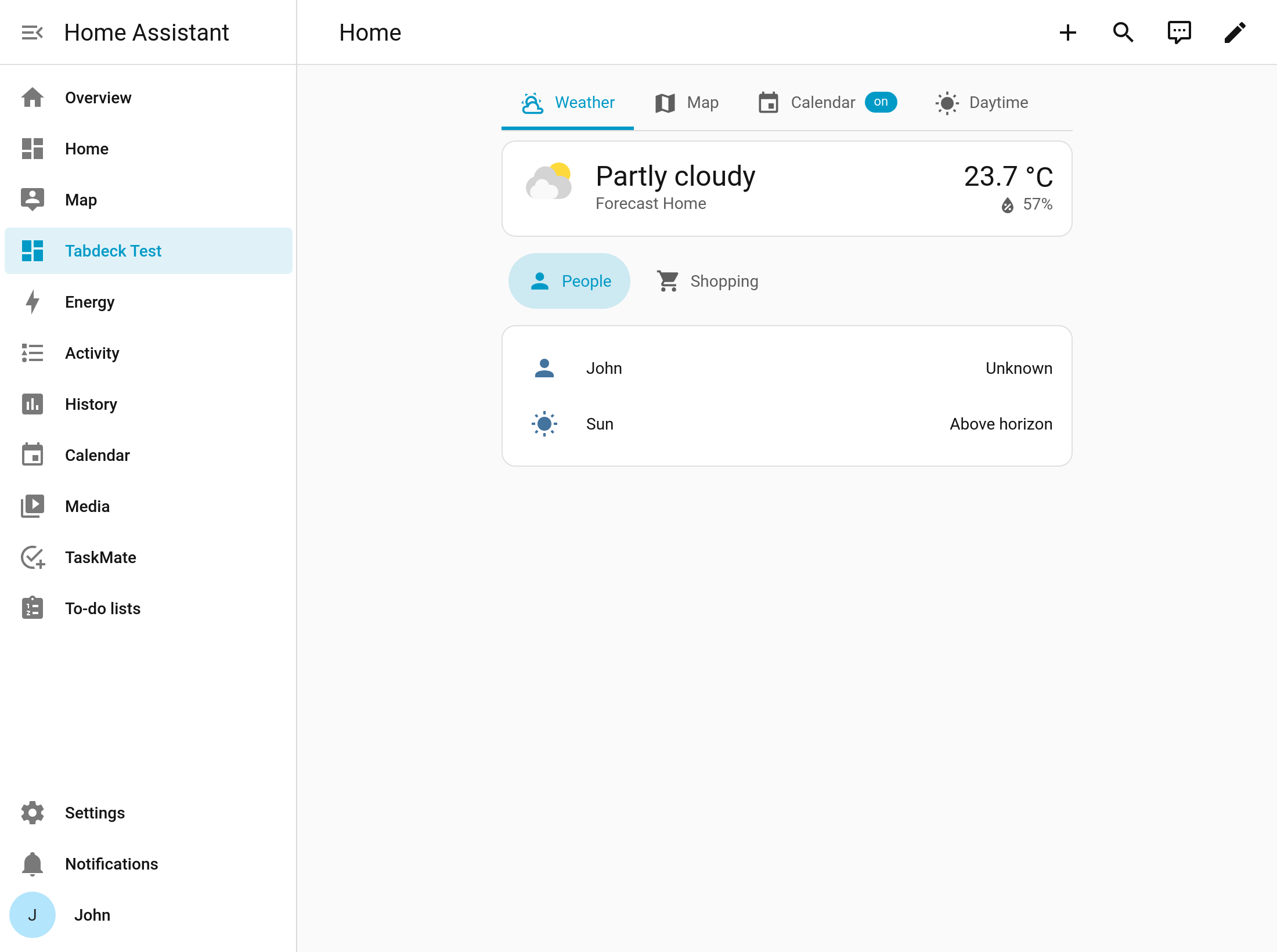
 Try it in your browser first: Tabdeck Card — live demo
The live demo has example decks, a YAML box you can edit, and pretend devices (guest mode, a garage door, lights) that change visibility, badges and alerts as you flip them. No Home Assistant needed.
What it does
Getting started
- Starter templates. The editor builds a working deck from your own entities: Rooms, Lights, Security, Media, Climate, Energy or Family.
- Convert from another card. Paste a
tabbed-card,swipe-card,state-switch, Bubble Card pop-ups, a stack or grid, a sections view or a whole dashboard, and you get Tabdeck tabs back. Anything that can’t carry over is explained. - Visual editor. Add, drag to reorder, duplicate, copy and paste tabs, with HA’s own card editor and condition editor built in. It also tells you why a tab is hidden right now, with a
 or
 for each condition.
Tabs that react to your home
- Badges from an entity or template, as text or a dot, with formatting (
21.456→21.5°,150→99+). - Live icons, names and colours from templates, so the Garage tab can turn red while the door is open.
- Alert pulse. A tab pulses while its conditions are met: a door left open, a leak, a freezer warming up.
- Visibility by state, number, screen size, time, user or template, with
and/or/not. - Auto-select a tab when something happens, and one tab per area or label generated for you.
Layouts
- Bar on the top, bottom, left or right, in underline, pill, segmented, boxed, text or rail styles. Or use one of the presets: iOS, Material, Glass, Minimal or Rail.
- Dock: a phone-style bottom navigation bar, with an optional floating action button.
- Grouped tabs as a second row or a ▾ dropdown menu.
- Split view shows every tab side by side on wide screens. There are also icon-only tabs on narrow screens, pagination dots, a scroll-spy page mode and a collapsible deck.
Wall panels and getting around
- Auto-rotate through tabs, pausing when someone touches the screen, and return to the default tab when nobody’s using it.
- Remember the tab per browser, in the URL (
#tab=lights), or across every device through a helper entity. Automations and Node-RED can switch the tab on every panel through that helper. - Swipe, full keyboard navigation, quick-switch search, hotkeys (1–9), and the back button returning to the previous tab.
- Each person can arrange their own tabs (reorder or hide them) without touching the config.
- Tab actions: a tab can navigate to another view, and any tab can run an action when it opens or closes.
Everything else
- Theme it with CSS variables, no card-mod needed.
- Proper screen-reader tab semantics, and reduced-motion is respected.
- The editor and card are translated into English, Deutsch, Español, Français, Italiano, Nederlands, Polski and Português.
A quick example
type: custom:tabdeck-card
preset: ios
remember: browser
tabs:
  - name: Climate
    icon: mdi:thermostat
    card:
      type: thermostat
      entity: climate.living_room
  - name: Lights
    icon: mdi:lightbulb-group
    badge: "{{ states.light | selectattr('state', 'eq', 'on') | list | count }}"
    card:
      type: entities
      entities:
        - light.kitchen
        - light.hall
  - name: Garage
    icon: "{{ 'mdi:garage-open' if is_state('cover.garage', 'open') else 'mdi:garage' }}"
    alert:
      - condition: state
        entity: cover.garage
        state: open
    card:
      type: tile
      entity: cover.garage
If you’re coming from kinghat/tabbed-card, your existing config keeps working. Or paste it into the editor’s Convert option to get native Tabdeck tabs.
Install
It’s in the default HACS store. Search for Tabdeck Card, or:

Then add a card and pick Tabdeck Card from the list.
Links
 Wiki (every option, with screenshots): Home · tempus2016/tabdeck-card Wiki · GitHub
- Live demo: Tabdeck Card — live demo
 v1.1.0 release notes: Release v1.1.0 · tempus2016/tabdeck-card · GitHub
 Issues: Issues · tempus2016/tabdeck-card · GitHub
 Ideas and questions: tempus2016/tabdeck-card · Discussions · GitHub
 Showcase: if you build a deck you’re happy with, I’d love to see it. Post it here or use the Show and tell form on GitHub.
Feedback and feature requests are very welcome. The “expand the selected tab” option in this release came straight from a suggestion on GitHub.