Sorry Frenck, but I AM a Dashboard Person: My Complete Multi-Room Neon Ecosystem 
Hey everyone,
I was reading through the recent 2026.6 release notes and saw Frenck immediately raise his hand to say:
"
I am not a dashboard person. Not because I don't like them; I love seeing what you all build. But designing a beautiful one is a kind of visual creativity I just don't have."
Well... Frenck might not be a dashboard person, but I absolutely am!  Over the last couple of days, I completely overhauled my entire setup (30-ish dashboards) into a unified, dark cyber-neon theme.
I built them all by taking my existing, old-fashioned dashboards and moving them entirely into the new Sections style. I finally got rid of the absolute headache of nesting cards grid in grid in grid and so on. With a bit of AI support to help crunch through the migration, I generated 50,000+ rows of code to bring this entire home ecosystem to life, adding a vibrant splash of color to the default dark-mode style. Honestly, after staring at that much neon yaml config, I feel like I've accidentally opened a portal to a parallel universe! 
Instead of just one screen, I designed a cohesive, multi-dashboard network customized for wall tablets, deep-dive system energy monitoring, and everyday family utility. Below are some examples of the rooms, sensors, shopping lists, and custom remotes. I am incredibly happy to hear your feedback!
1. The Hubs & Room Tablets 
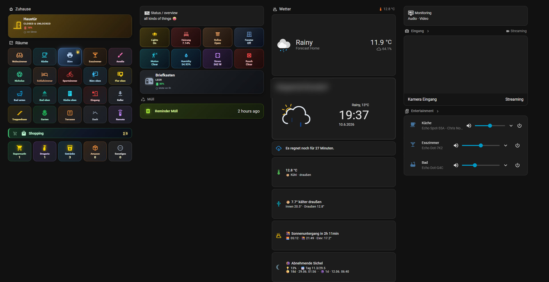
 Main Overview & Weather Station
- What it is: The central landing dashboard for a birds-eye view of the entire house.
- Key Features: A massive, stylized weather layout with an integrated live countdown for incoming rain ("Es regnet noch für..."). It features a highly organized sub-grid mapping out every single room in the house for instant navigation, quick status overviews, a dedicated physical letterbox status tracker, and live-streaming camera feeds for primary entrances.
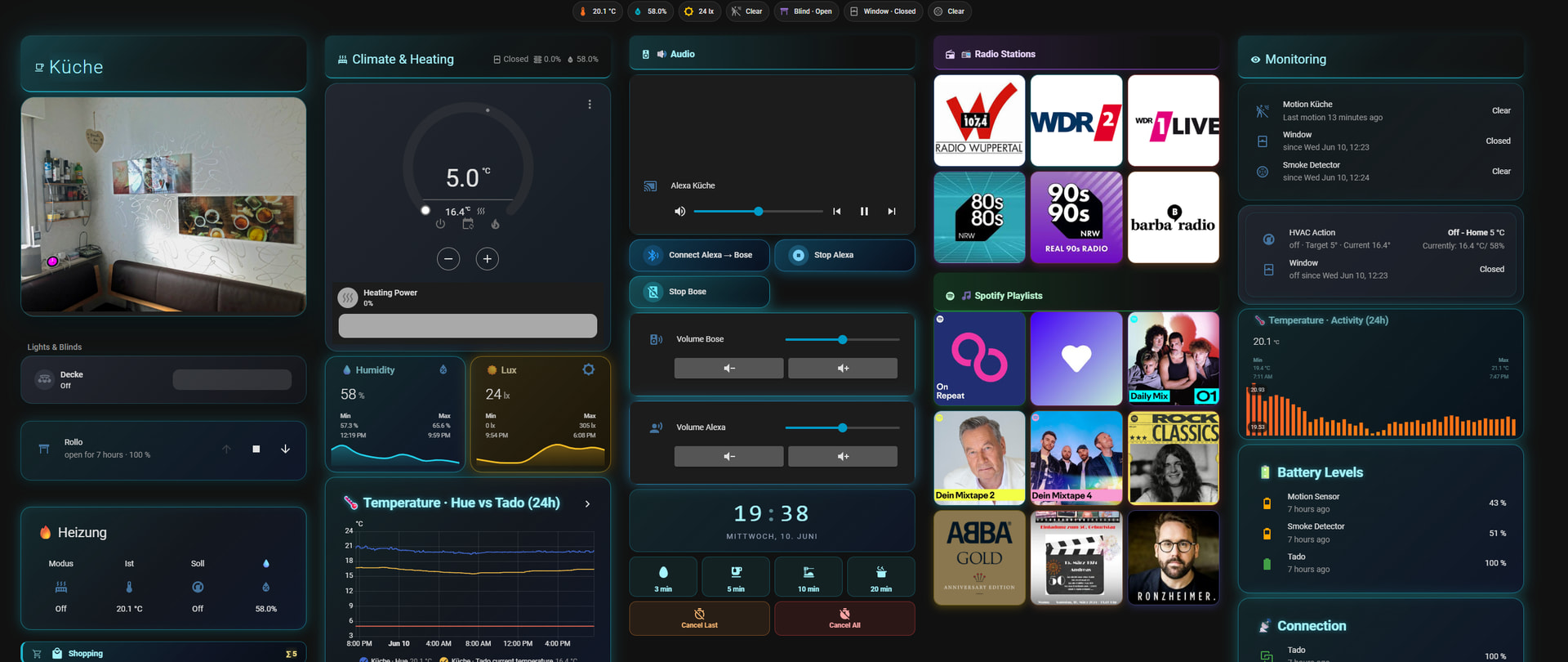
 Kitchen Central Command
- What it is: A high-traffic landscape dashboard focused on climate tracking, multi-room audio, and morning routines.
- Key Features: * Custom audio routing matrices allowing quick streaming handoffs between Alexa and Bose hardware.
- A colorful grid layout mapping popular radio stations (WDR2, 1Live, Barba Radio) and dynamic Spotify playlists using customized graphic cards.
- Deep-dive climate tracking using
apexcharts-cardto actively overlay sensor data from different hardware manufacturers (Hue vs. Tado) across a 24-hour cycle.
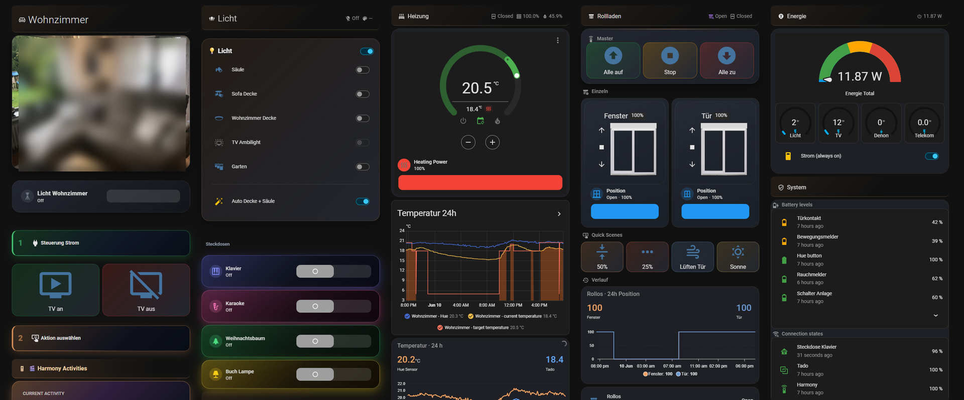
 Living Room Media Tablet
- What it is: A relaxed, dark-themed dashboard optimizing room comfort and high-end entertainment.
- Key Features: Features a live camera preview, custom climate dials, dedicated shutter/blind columns, and an integrated Harmony Activities automation engine (
TV an,TV aus) matching custom smart power-switch cards.
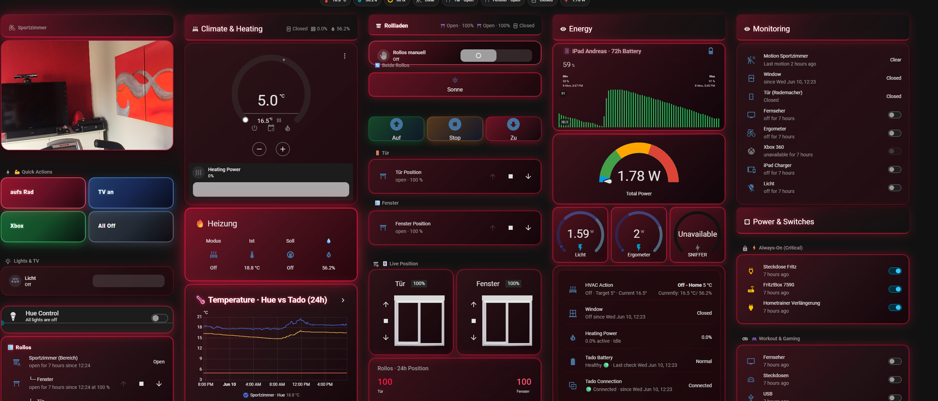
 Dedicated Sport & Workout Room
- What it is: A specialized view utilizing a striking red neon glow to match the room's energy.
- Key Features: Live tracking metrics specifically tailored for a home gym environment. It monitors real-time power consumption in watts, maps out an automated target tracking graph for tablet/device battery drainage over a rolling 72-hour period, and includes quick macros for workout states (
aufs Rad).
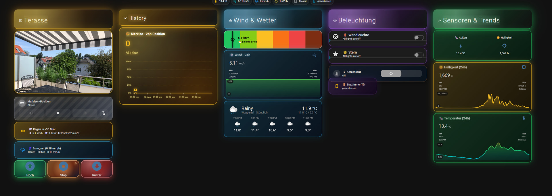
 Terrace & Garden Dashboard
- What it is: An outdoor-focused dashboard utilizing gold and blue accent themes.
- Key Features: Houses a live snapshot of the outdoor space, manual roller-shutter controls, and a multi-tiered wind speed/weather safety warning bar chart to monitor awning conditions safely before heavy weather hits.
2. Specialized System & Utility Views 
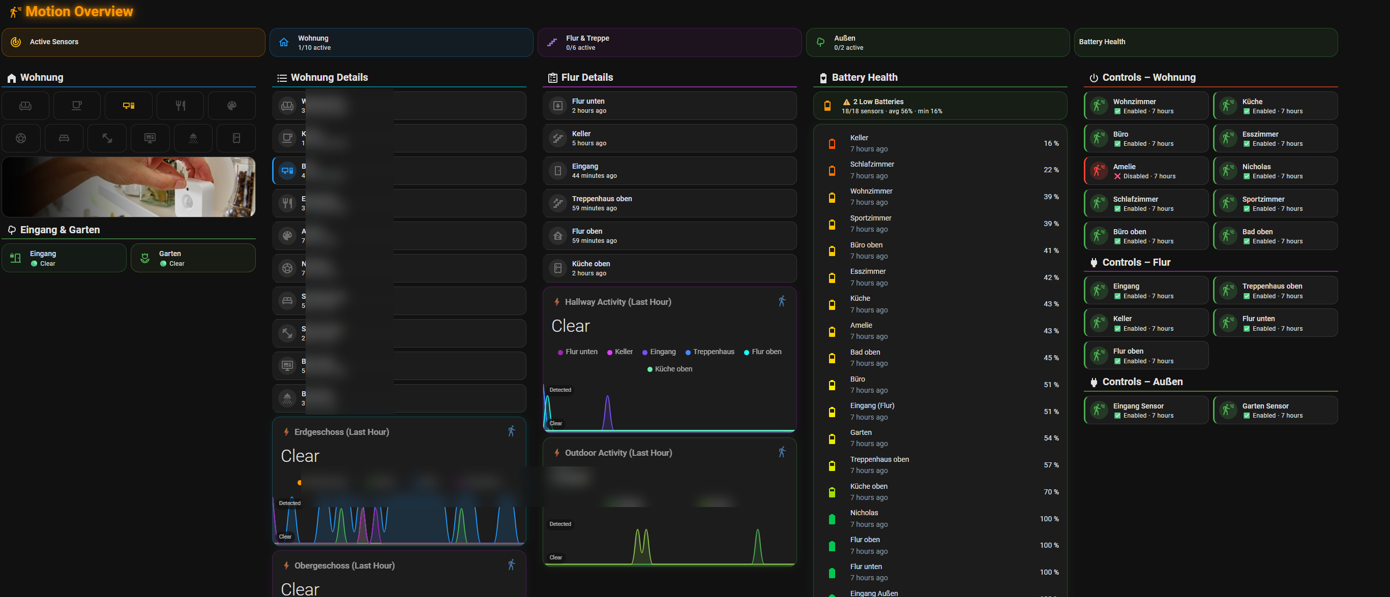
 Motion Overview & Battery Matrix
- What it is: The ultimate system administrator view tracking every sensor across the entire property.
- Key Features: A stunning grid system that parses house levels (Erdgeschoss vs. Obergeschoss) into live timeline wave graphs mapping motion frequency over the last hour. Includes a master battery health column sorting all wireless hardware from lowest to highest percentage, and automated toggle controls for individual room tracking zones.
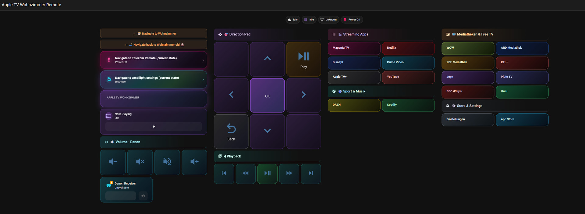
 Apple TV & Denon Custom Remote
- What it is: A custom-scaled virtual interface replacing physical hardware remotes.
- Key Features: A gorgeous, clean D-pad controller layout flanked by individual navigation matrices mapping out core streaming apps (Netflix, Prime Video, Disney+) and German media libraries (Mediatheken, Joyn, RTL+).
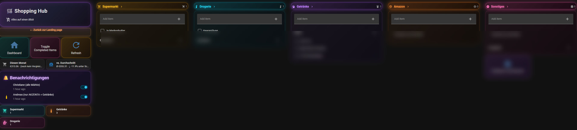
 The Family Shopping Hub
- What it is: A clean, multi-column inventory board keeping the household running smoothly.
- Key Features: Separates shopping needs into dedicated, color-coded custom cards for the local Supermarkt, Drogerie, Getränke, and online order tracking. Includes an advanced budget/spending comparison tracker, change logs, and direct notification toggles for family members.
 Theme & Frontend Stack Used
To achieve this highly polished look across all dashboards, I heavily relied on the following integrations (mostly via HACS):
- Styling & Borders: Heavy usage of
card-modto handle custom borders, drop shadows, and glow intensities. - Layout Structure: Pixel-perfect grids using
grid-layout/type: gridto ensure columns scale symmetrically. - Graphs & Trends:
apexcharts-cardfor multi-colored trend metrics and historical sensor logging. - Buttons: Custom
button-cardscripts to build the uniform grid remote and radio shortcuts.
I’m incredibly happy with how fluid this feels moving from room to room. I'm happy to share specific YAML templates, card configurations, or card-mod styling strings if anyone wants to duplicate a specific aesthetic.
Let me know what you think! Which room view is your favorite?# Sorry Frenck, but I AM a Dashboard Person: My Complete Multi-Room Neon Ecosystem
Hey everyone,
I was reading through the recent 2026.6 release notes and saw Frenck immediately raise his hand to say:
"
Well... Frenck might not be a dashboard person, but I absolutely am! Over the last couple of days, I completely overhauled my entire setup into a unified, dark cyber-neon theme.
Instead of just one screen, I designed a cohesive, multi-dashboard ecosystem customized for wall tablets, deep-dive system health monitoring, and family utility. Here is a tour of the setup!
Let me know what you think! Which room view is your favorite?
Thanks, Andreas


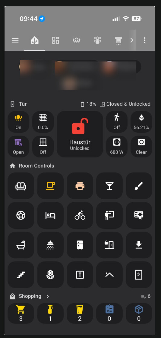
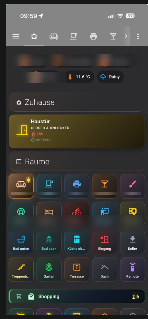
 ), and it got me thinking: "what if every room icon matched the color theme of that room's actual page?" So I tried it. Then I added small status indicators on each tile — showing at a glance if a light is on, the blinds position, a window open, current power draw, humidity, the front door lock state, even the shopping list counts at the bottom.