I would also appreciate a card like that 
Unfortunately, I haven’t found anything, that even goes in that direction.  I’m expirementing with Plotly card, but haven’t come to a good solution yet.
I’m needing this mostly for the hot summer months, so I’ll see, what I can come up with this summer season. I’ll tag you, if I find something useful! 
Closest to it, I’ve ever seen, was this: Simple Air Comfort card
But what I need, is more precise, more close to a real Mollier diagram, so I can use it for tuning HVAC in industrial environment Or more precise, just to show the nitpickers, that I’m within specs and they should leave my office 
I will be happy with your tag, very happy 
@paddy0174 @BebeMischa Hope I’m not too late.
Plotly Code
type: custom:plotly-graph
raw_plotly_config: true

layout:
  title:
    text: Behaglichkeitsfeld
    subtitle:
      text: Raumluftfeuchte - Raumtemperatur
  xaxis:
    range: [12, 28]
    dtick: 2
    title: Raumlufttemperatur [°C] →
  yaxis:
    range: [0, 100]
    dtick: 10
    title: Relative Feuchte [% ] →
  shapes:
    - type: path
      xref: x
      yref: y
      path: 'M 17, 85 L 21.5,80 L 25,60 L 27,30 L25.5,18 L20,20 L17,40 L16,75 Z'
      fillcolor: rgb(203, 206, 44)
      line:
        color: transparent
      layer: below
      label:
        text: noch behaglich
        textposition: "bottom center"
        padding: 10
        xanchor: left
        yanchor: bottom

    - type: path
      xref: x
      yref: y
      path: 'M 17.5, 74 L 22.5,65 L 24,35 L 19, 38 Z'
      fillcolor: lime
      line:
        color: transparent
      layer: below
      label:
        text: behaglich

    - type: circle
      fillcolor: green
      opacity: 0.5
      line:
        color: transparent
      layer: below
      x0: 20
      x1: 23
      y0: 40
      y1: 60


  annotations:
    - x: 24
      y: 85
      text: "zu feucht (schwül)"
      showarrow: false
    - x: 15
      y: 22
      text: "zu trocken"
      showarrow: false


    - x: 20
      y: 50
      text: "Cold"
      showarrow: false
      xanchor: right
    - x: 23
      y: 50
      text: "Too warm"
      anchor: "left center"
      xanchor: left
      showarrow: false
    - x: 21.5
      y: 60
      text: "Wet"
      showarrow: false
      xanchor: center
      yanchor: bottom
    - x: 21.5
      y: 40
      text: "Dry"
      showarrow: false
      xanchor: center
      yanchor: top
entities:
  - entity: sensor.wohnzimmer_temperature
    name: Temperatur
    internal: true
    period: auto
    fn: $fn ({ ys, vars }) => vars.temperature = [ys[0]]
  - entity: sensor.wohnzimmer_humidity
    name: Luftfeuchtigkeit
    internal: true
    period: auto
    fn: $fn ({ ys, vars }) => vars.humidity = [ys[0]]
  - entity: ""
    x: $fn ({ vars }) => vars.temperature
    "y": $fn ({ vars }) => vars.humidity
    mode: markers
    name: points
    marker:
      color: rgb(255,255,0)
      size: 10
    type: scatter
refresh_interval: 10
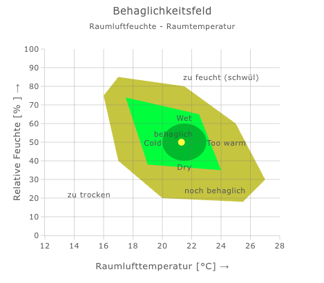
@BebeMischa For certain you can draw a mollier diagram using plotly.