Hi,
The current thermostat card seems a bit confuse:
It isn’t intuitive to know what is the set temperature and what is the room temperature.
Would be better to have a caption “Set to” next to the thermostat temperature?
Hi,
The current thermostat card seems a bit confuse:
It isn’t intuitive to know what is the set temperature and what is the room temperature.
Would be better to have a caption “Set to” next to the thermostat temperature?
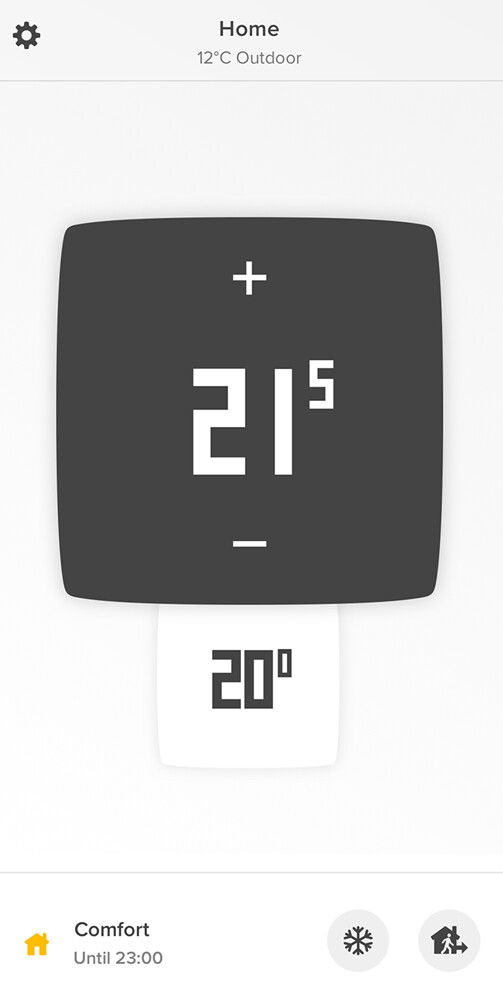
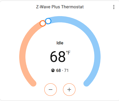
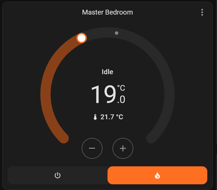
Your thermostat is set to 19, the temperature now is 21.7
It looks clear to me…
in the UI settings, you even are allowed to switch the positions with just clicking a toggle, if you like that order.
The problem is not the order, but which is which ![]()
There are two temperatures. Which one is the set temperature and which is the room temperature?
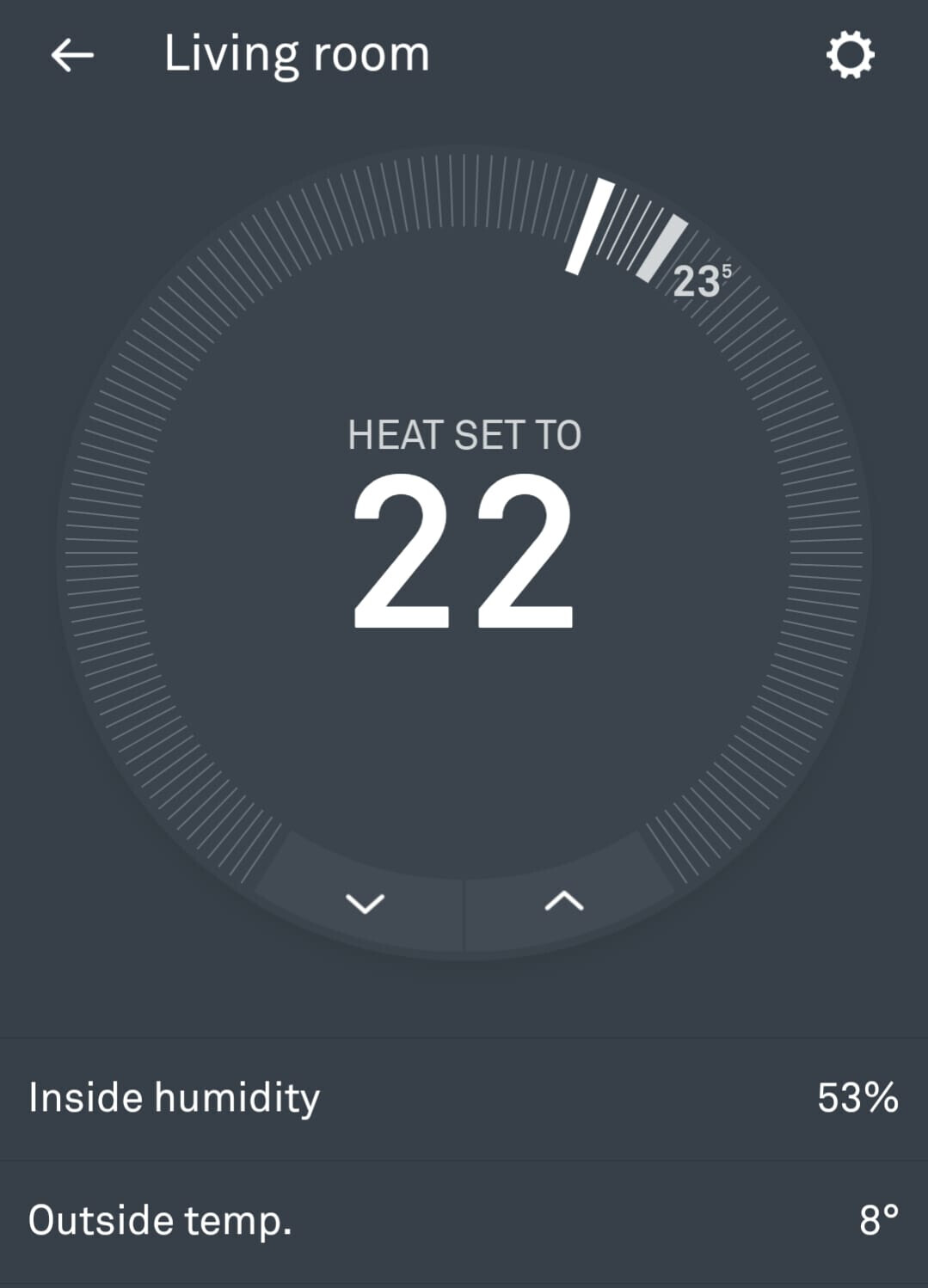
Nest, for example, clearly says “Heat set to…”
To me it’s pretty clear. The one with the temperature icon should show the current room temp. So the other must be the set temp.
Also visible from the slider: as it is clear that you set the temp here and not magically adjust the current room temp like a witch, the lower one has to be the set temp.
I wrote about this because I’m surrounded by people with different opinions who, unfortunately, just don’t see it clearly ![]()
This is why Nest, for example, now explicitly says “Heat set to…” (whereas in their initial software release, this label was missing).
This is really a matter of interpretation…
To me, the smaller value with the thermometer icon, is obviously the current temperature.
The bigger one, which is bigger because you want to make sure that the set temperature is clearly visible, in the center, is obviously the other.
You could create something yourself, for instance I have this on a smaller wall tablet:
Also: you are not really sharing a project so you would be better off putting it in the “Configuration” subforum.
Yes, but it shouldn’t be open to interpretation.
An user should be able to look at the card and understand it instantly without a second thought.
Nest clearly says: “Heat set to…”
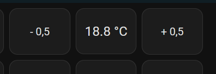
Netatmo put the sign (plus and minus) next to the Set temperatue.
But when you have a card with two temperatures, where the difference between them is just the size, it becomes a bit confuse for the user.
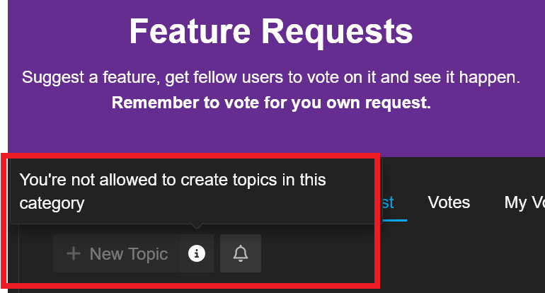
I though it should be on “Feature request”, but I’m not able to post there…
How do I know the numbers on the gas pump is how much has been pumped or how much more can be pumped?
How do I know if the times printed on the store is opening hours or closed hours?
Some things is tricky, you just need to learn it.
Hi,
It seems I posted originally at the wrong sub-forum, so here I am on the correct one ![]()
The current thermostat card seems a bit confuse:
There are two temperatures shown, where the difference between them is just the size.
This makes unclear to many users to understand which one is the set temperature and which is the room temperature.
Nest, for example, clearly says “Heat set to…”
Netatmo put the sign (plus and minus) next to the Set temperatue, so we can clearly know that field is the Set temperature:
So, is there any way to add a caption on the Thermostat Set Temperature (or on the Room Temperature) to make it easier to understand?
There is a display showing how much was pumped and the number starts at zero.
Knowing how much more could be pumped is useless information, since the gas nozzle just stops when the tank is full anyway ![]()
By default, the top (larger font) is the current set point and the bottom is the current temp.
Adding the option show_current_as_primary: true swaps them. This does two things. First is make the current temp the larger font number. It also moves your setpoint down just above the +/- buttons which makes more sense to me.
Mine is set at heat/cool right now. So there is a low and high set point. But, you can see what I mean on placement with the above option.
Thanks, I completely understand your point, but it’s still a bit confusing for users because there are two temperatures without a clear indication of which is which ![]()
I don’t disagree. I have gotten accustomed to it.
You can look here for more thermostat cards and see if any of them help you.
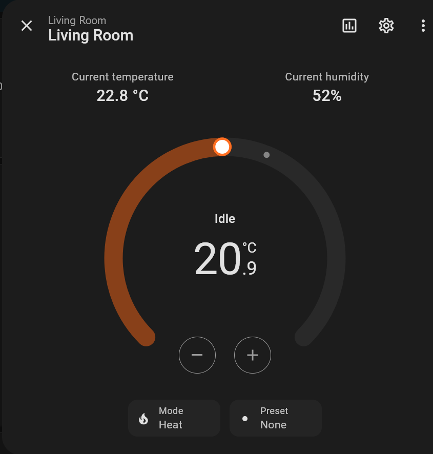
Here’s an odd thing: I don’t use full-size thermostat cards in my dashboards. I have badges along the top which show the temperature at each thermostat. To see or adjust the set point, I click or tap on the thermostat badge. When I do that, I get the thermostat control. In this display, the current temperature is smaller, and is labeled “Current temperature.” The big number is the set point. Above it is the state of the system (“Heating” or “Idle”):
Are you saying this format isn’t carried over into the thermostat card? It seems to address the issue of lack of labeling. And if those who prefer that can switch the “big” and “small” numbers, even better.
Thanks!
I just noticed that if I click on the 3 dots (top right corner), I have access to this:
That makes much more sense!
But while on the dashboard, the card is like this:
Would be great to have the card like the first one on the Dashboard.
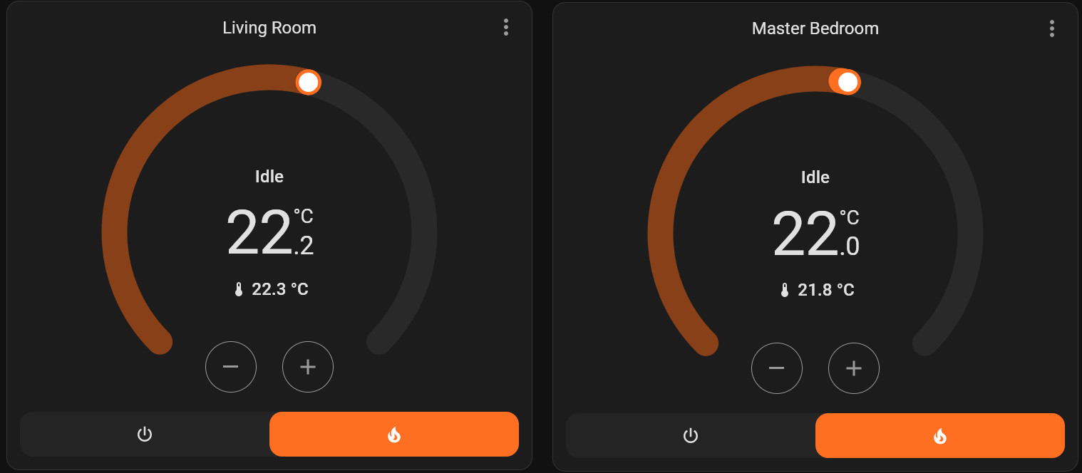
If I assume the lower one has to be the set temperature, so I’ll read it wrong on this situation below.
Please, compare both:
27 days later and you are still actively not trying to learn what the numbers mean.
Yes in those cases it’s not correct that the set temperature is higher, that is false. Most of the planet has summer and occasional sun even in winter that could cause the temperature to be higher than set temperature.
But it can’t be that hard to learn what number is what.
Have you looked at custom cards?
Or you could build your own using the picture elements card.
First of all, there’s no need to be so aggressive ![]()
Even though I’ve learned how to use it, I still believe the way the card is presented isn’t intuitive.
Furthermore, your explanation of how it works, stating that the smaller number is the set thermostat temperature, doesn’t align with reality, as I’ve demonstrated above. There is nothing to do with the sun or the summer.
I’m not the only one using this dashboard. Having to constantly explain how it works to other users just isn’t practical.
Can we agree that the card isn’t intuitive, and that a comparison of how this information is displayed by other thermostats (whether Nest, Netatmo, or any other) proves this point perfectly?
If it’s not intuitive, should it be improved or should we keep blaming the users?
I Picked this “statement” as i first thought You didn’t knew the difference of the Set-Temp (The one that Increase/Decrease, when you manually click or Draw the Slider )
I Find that quite Obvious, That This Is The Set Temperature
The Smaller “below” With the tiny Thermometer, Is the Current Temperature ( Hint the Themometer ! )
BTW, This Is Not the Room Temperature, but the Temperature Close to the Unit ( As it is a part of the Unit )
So Basically You can G.A.S about the Small Number, And Use the Set Number BIG Number, However the Set number will never be close to your Room Temperature !.
Use a wall mount, or what ever Temperature-Sensor, to Measure your Room Temperature, and Use this Temperature-Sensor to Control the Set Temperature.
Again, Don’t take Any Notice of the “small number, with the small thermometer” in your Dashboard, Because it just indicates the Temp, Very Close to Your Unit
( Place another Thermometer 1 meter apart, or What ever and you’ll see)
I’m not.
I did not say that. I said the opposite. As you also quoted.
I do not think it’s unintuitive. And there seems to be more of us that find it completely acceptable.
That is also why I said, instead of waiting for someone else to fix your problem, try some other cards or make one yourself.
If you had a lot of people agreeing with you then I would not have said that. But since a lot find it acceptable or does not have an opinion, chances are it will not be “fixed”.