Hello, I have a Series 10 Apple Watch and have configured three actions for it. In past versions, they fit perfectly on the screen. Unfortunately I do not have have a screenshot of it, but the screenshots in the App Store show how it used to look with 4 actions fitting just fine on the screen:
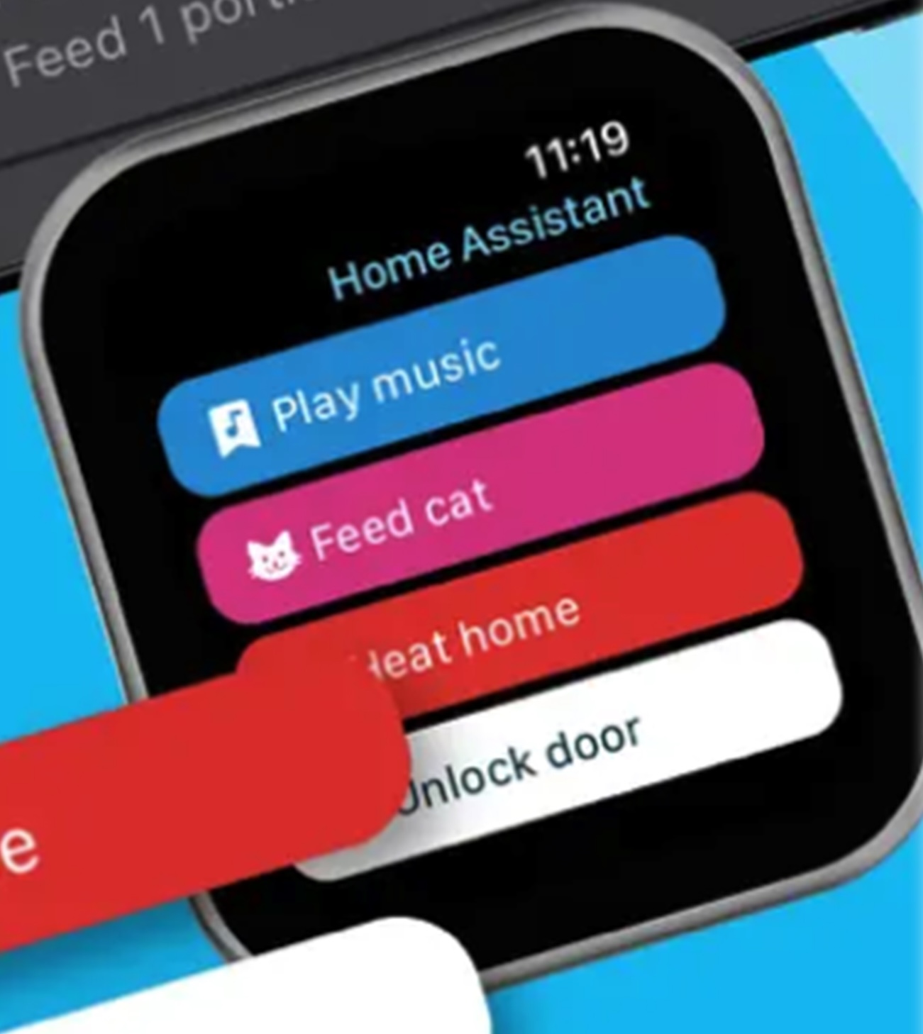
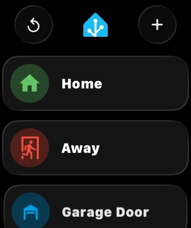
After updating to 2026.9.0, I noticed major changes. I first needed to hide the new “areas in home” option. That removed one of the additional items in the list, but the add button remained. I then found that if I turn off the assist shortcut, that moved the add button to the top right. I am now pretty close to how I had it, but the spacing is still way too spread out. I also tried the new grid view, but that also cuts items off.
-
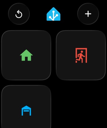
Can some adjustments be made to comfortably fit 3 items in list or 4 items in grid view without getting cut off? There is clearly space to do so, things just need to be compacted back the way it used to be. If people prefer the new spaced out layout, then a “compact mode” toggle would be helpful.
Thank you.