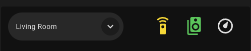
Hey all, I’ve done some thread searching and googling/reddit searching but can never find something that’s very close to my issue here. I’'m trying to change the color of a sub-button of a bubble card within a horizontal stack based on the state of my climate.thermostat. Getting ChatGPT to help me with the styling code, the below YAML is what I’ve got so far but it’s not working exactly. What I’m trying to achieve is:
climate.thermostat state =
- heat = orange
- cool = light blue
- heat_cool = white
- off = greyed out/disabled
However at the moment it just shows white despite the current state of the device being heat.
Any thoughts?
type: horizontal-stack
cards:
  - type: custom:bubble-card
    card_type: select
    entity: input_select.selector
    show_state: true
    show_name: false
    scrolling_effect: false
    show_icon: false
  - type: custom:bubble-card
    card_type: sub-buttons
    button_type: switch
    sub_button_alignment: left
    styles: >
      /* Remove pill background + border */

      .bubble-sub-button {
        background: none !important;
        border: none !important;
        box-shadow: none !important;

        height: 54px !important;
        min-width: 54px !important;

        display: flex !important;
        align-items: center !important;
        justify-content: center !important;

        margin-top: 4px !important;
      }


      /* Icon sizing + positioning */

      .bubble-sub-button-icon {
        --mdc-icon-size: 36px !important;
        transform: translateY(4px) !important;
        display: inline-block !important;
      }


      /* Static colors */

      .bubble-sub-button:nth-child(1) .bubble-sub-button-icon {
        color: #FFD600 !important;   /* Yellow - Remote */
      }


      .bubble-sub-button:nth-child(2) .bubble-sub-button-icon {
        color: #00C853 !important;   /* Green - Speaker */
      }


      /* === Dynamic Thermostat Coloring (robust selectors) ===
         We target the 3rd sub-button icon when the climate.thermostat entity is in a given state.
         Different HA/frontends expose state on body classes or on ha-state-icon/ha-icon attributes,
         so we include several selector patterns for compatibility.
      */


      /* HEAT */

      body.state-climate-thermostat-heat .bubble-sub-button:nth-child(3)
      .bubble-sub-button-icon,

      body[class*="state-climate.thermostat-heat"]
      .bubble-sub-button:nth-child(3) .bubble-sub-button-icon,

      ha-state-icon[data-entity-id="climate.thermostat"][data-state="heat"] ~
      .bubble-sub-button:nth-child(3) .bubble-sub-button-icon,

      ha-icon[data-entity-id="climate.thermostat"][data-state="heat"] ~
      .bubble-sub-button:nth-child(3) .bubble-sub-button-icon {
        color: #FF6D00 !important;   /* Orange for heat */
        opacity: 1 !important;
      }


      /* COOL */

      body.state-climate-thermostat-cool .bubble-sub-button:nth-child(3)
      .bubble-sub-button-icon,

      body[class*="state-climate.thermostat-cool"]
      .bubble-sub-button:nth-child(3) .bubble-sub-button-icon,

      ha-state-icon[data-entity-id="climate.thermostat"][data-state="cool"] ~
      .bubble-sub-button:nth-child(3) .bubble-sub-button-icon,

      ha-icon[data-entity-id="climate.thermostat"][data-state="cool"] ~
      .bubble-sub-button:nth-child(3) .bubble-sub-button-icon {
        color: #4FC3F7 !important;   /* Light Blue for cool */
        opacity: 1 !important;
      }


      /* HEAT_COOL (supporting heat_cool and heat-cool naming) */

      body.state-climate-thermostat-heat_cool .bubble-sub-button:nth-child(3)
      .bubble-sub-button-icon,

      body.state-climate-thermostat-heat-cool .bubble-sub-button:nth-child(3)
      .bubble-sub-button-icon,

      body[class*="state-climate.thermostat-heat_cool"]
      .bubble-sub-button:nth-child(3) .bubble-sub-button-icon,

      body[class*="state-climate.thermostat-heat-cool"]
      .bubble-sub-button:nth-child(3) .bubble-sub-button-icon,

      ha-state-icon[data-entity-id="climate.thermostat"][data-state="heat_cool"]
      ~ .bubble-sub-button:nth-child(3) .bubble-sub-button-icon,

      ha-state-icon[data-entity-id="climate.thermostat"][data-state="heat-cool"]
      ~ .bubble-sub-button:nth-child(3) .bubble-sub-button-icon,

      ha-icon[data-entity-id="climate.thermostat"][data-state="heat_cool"] ~
      .bubble-sub-button:nth-child(3) .bubble-sub-button-icon,

      ha-icon[data-entity-id="climate.thermostat"][data-state="heat-cool"] ~
      .bubble-sub-button:nth-child(3) .bubble-sub-button-icon {
        color: #FFFFFF !important;   /* White for heat_cool */
        opacity: 1 !important;
      }


      /* OFF */

      body.state-climate-thermostat-off .bubble-sub-button:nth-child(3)
      .bubble-sub-button-icon,

      body[class*="state-climate.thermostat-off"]
      .bubble-sub-button:nth-child(3) .bubble-sub-button-icon,

      ha-state-icon[data-entity-id="climate.thermostat"][data-state="off"] ~
      .bubble-sub-button:nth-child(3) .bubble-sub-button-icon,

      ha-icon[data-entity-id="climate.thermostat"][data-state="off"] ~
      .bubble-sub-button:nth-child(3) .bubble-sub-button-icon {
        color: #9E9E9E !important;   /* Greyed out */
        opacity: 0.6 !important;
      }


      /* Preserve row spacing */

      .bubble-sub-buttons-bottom,

      .bubble-sub-buttons,

      .bubble-sub-button-container,

      .bubble-sub-buttons-container {
        min-height: 58px !important;
        align-items: flex-start !important;
        padding-top: 2px !important;
      }
    sub_button:
      main: []
      bottom:
        - show_background: false
          icon: mdi:remote
          scrolling_effect: false
          force_icon: true
          show_state: false
          show_last_changed: false
          show_attribute: false
          content_layout: icon-right
          fill_width: false
          tap_action:
            action: navigate
            navigation_path: "#remotes"
        - icon: mdi:speaker-multiple
          show_background: false
          scrolling_effect: false
          tap_action:
            action: navigate
            navigation_path: "#speakers"
          content_layout: icon-right
          fill_width: false
        - icon: bha:thermostat
          state_background: false
          show_background: false
          scrolling_effect: false
          content_layout: icon-right
          fill_width: false
          tap_action:
            action: navigate
            navigation_path: "#thermostat"
          width: 4
    hide_main_background: true
    rows: 1
    card_layout: large
grid_options:
  columns: full
  rows: auto