Hi @dcapslock, I am responding to this post. I know that there are significant changes in ha-dialog. I have one specific problem with the browser mod popup. I am unable to set dynamic widths for the popup dialog.
As popup content, I have custom:layout-card, type grid-layout. I have various column layouts for media queries. Before the update, the widths changed dynamically according to the defined var(–max-popup-column), which is set in the style for browser_mod.popup. It worked perfectly.
browser_mod.popup
action: fire-dom-event
browser_mod:
  service: browser_mod.popup
  data:
    title: System Information
    style: >
      --max-popup-column: 3;
    content:
      type: custom:mod-card
      card_mod: !include ../../snippets/style_popup_footer.yaml
      card:
        type: custom:layout-card
        layout_type: custom:grid-layout
        layout: !include ../../snippets/popup_footer_layout.yaml
        cards:
          #################################################
          #                                               #
          #                HOME ASSISTANT                 #
          #                                               #
          #################################################
          - type: entities
            title: Home Assistant
            show_header_toggle: false
            card_mod:
              class: header
popup_footer_layout.yaml
grid-template-columns: 1fr
grid-template-rows: auto
margin: 0
padding: 0
mediaquery:
  '(min-width: 1441.99px)':
    grid-template-columns: repeat(var(--max-popup-column, auto-fill), var(--max-popup-column-width, 560px))
    grid-template-rows: auto
  '(min-width: 800px)':
    grid-template-columns: 560px
    grid-template-rows: auto
    margin: 0
    padding: 0
Before the update, it looks like this. Which I would like to have now.
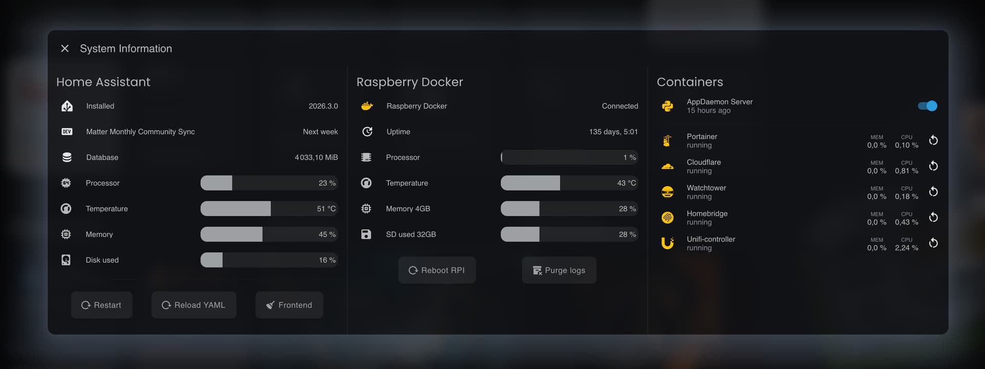
Currently, the width for the dialog is set fixed according to —popup-width. This variable can be changed via themes, but I would lose control over different popup layouts. Do you know how I could set different widths for layout-card?

edit: So I’ve come up with a solution… you need to set it in ha-dialog.type-browser-mod-popup
    ha-dialog.type-browser-mod-popup {
      --ha-dialog-width-md: calc(var(--max-popup-column) * var(--popup-width, 550px)) !important;
      --bar-card-border-radius: 12px !important;
      --ha-card-border-radius: 0px !important;
      --ha-card-background: none !important;
    }