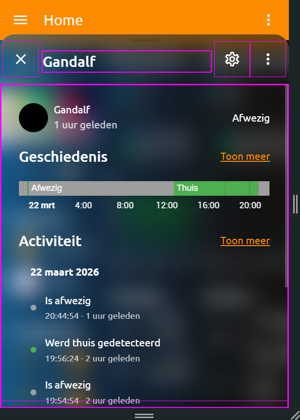
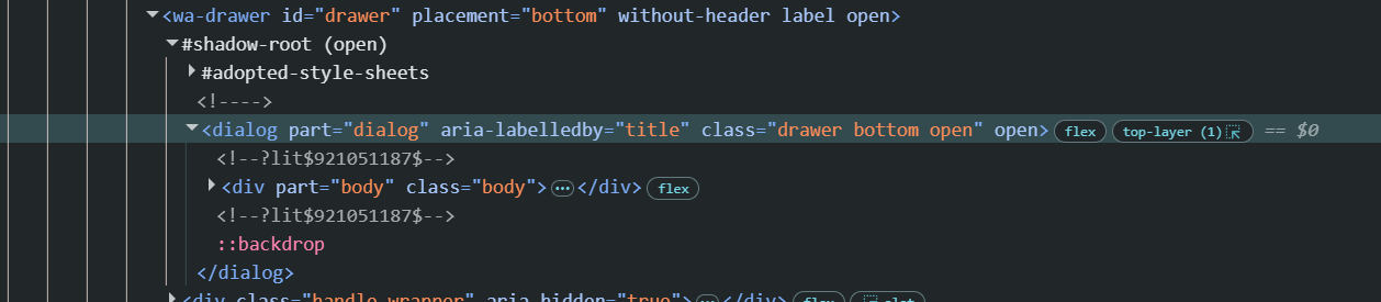
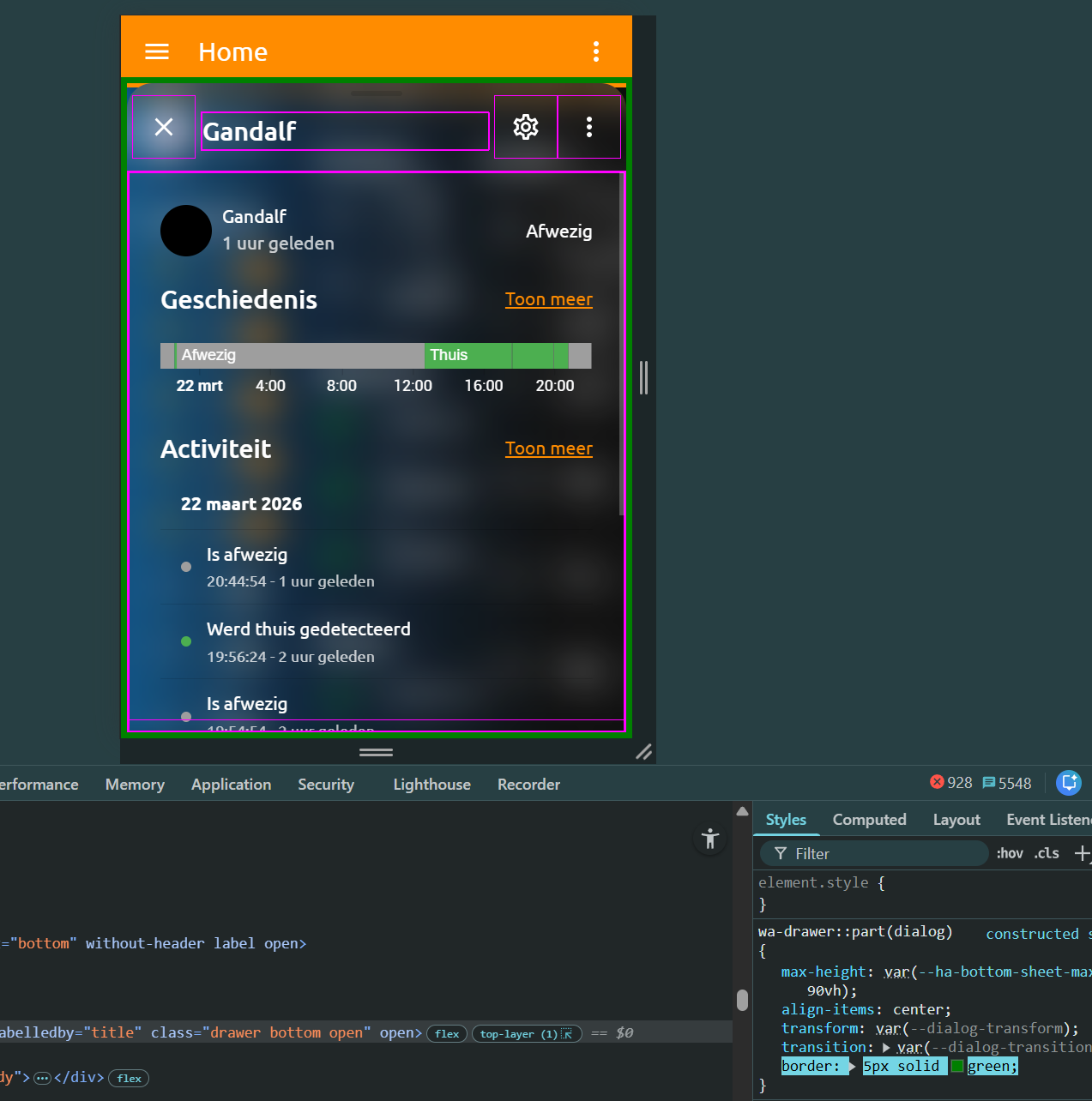
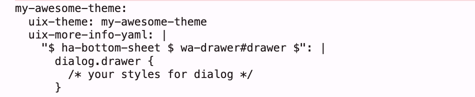
But the purple border isnt applied there.
Also when i remove :host { } right after "ha-bottom-sheet $ wa-drawer#drawer $": the rest(purple 1px border and dialog::before {…}) after that isnt even applied at all?
What i want is purple(green here to show) border all arround this dialog thing like:
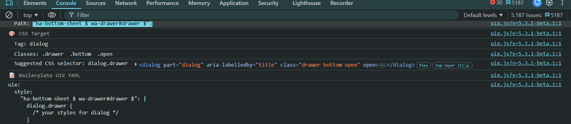
Your theming here is not correct. If you will be crossing shadow root you need to use uix-more-info-yaml.
Also, make sure you are on 5.3.1 for uix_path() to suggest correct theming boilerplate for elements that can only be set by theming, as well as correct first shadow root selector.
A quick note on what may be seen to be an entities issue but would actually be a custom card issue needing an update to support UIX. Example here being fold-entity-row and styling the folded rows (it applied its style: key directly using card_mod). 3.0.2 of fold-entity-row now supports UIX.
NOTE: This applied to the LFT fork of fold-entity-row
Striking the hot iron UIX Forge for available in v6.0.0-beta.2
Only available in 6.0.0-beta.2
UIX Forge - template everything of stock/custom Frontend elements: card, badge and row molds currently supported
Event spark - have actions send data to that element which can then be used in templates (think buttons to change any parameter of an element including visibility)
Tooltip spark - add tooltips to a target element in the element
Attribute spark - change a data attribute of an element? (test use case being add/remove/change title attribute to alter Browser’s tooltip behaviour)
Tile Icon spark - add a tile icon to the element, with action support
Foundries - save your shared config for UIX Forge in UIX integration backend, making the configs available everywhere not just one dashboard in UI mode
Have any ideas for sparks? Leave a Feature Request in GitHub repo or strike up a Discussion.
Other molds are planned including picture-element and section.
No doubt what you find to do with UIX Forge may push its boundaries. If you find an issue either submit via GitHub issues or strike up a discussion.
NOTE: While some sparks may work well in anticipated use cases, there may be many where the spark is impossible to strike into position. e.g. a Tile icon on a button will show, but its actions don’t block the main button actions.
So yes, @Mariusthvdb time to step into the forge and get working with your molds and let the sparks fly.
UPDATE: on review I see it’s inconsistent to have macros in forge but forge uix out in main config. So for next beta uix key will move under forge. History was that uix had to be in config to be picked up, but now UIX Forge applies UIX styling directly it no longer needs to be there, and foundry uix gets resolved anyhow. This has been implemented in 6.0.0-beta.2
Thanks so much for all your new ideas and enhancements.
My English is not the best, but with yours, I have the most problem to understand. Not your fault, but mine. But do you think to write somehow with more examples (with screenshots of the more and existing, what they are doing and their result is, most probable that is easier to understand, what the pure config doc wants to explain) or easier language a little bit more?
Do I understand it correctly, the new Forge is something like the config template card but in jinja and at the end of the day at least a solution for me for for some ideas.
Yes, like a template card, keeping with Jinja templates which are the template of choice for UIX. Yes, it does provide for a solution for that WTH.
As for examples, they will come over time as the best examples are from real use cases, not what I may dream up . I have desire for the community to submit UIX Guides including for UIX Forge.
An example that shows the type of config shown in the Event spark. The two tiles have both regular state conditions (input_boolean) and then event driven templated hidden - my test case as the hardest part of working with elements the 'Home Assistant` way is visibility.
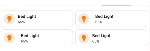
This is the result. The only solution I know that comes close to this without duplicating elements is exapnder-card without a title.
But at least for me, it would be more than great to see, what your existing examples do visually exactly. EG the existing badge, icon and popup sparks examples.
If all goes well and there is not so much to fix based on use cases, then some UIX Guides based on simple examples will come soon. Though the examples are really straightforward that you can pick up and quickly see visually what they do.
Just to help though… here are some tooltips on tiles. Though I do note an issue with the wa-tooltip taking up space…
I would say that a lot of visual people only try out something, if they see what a try would bring. Not everyone is even trying out any options before having a clue, what a feature really would bring and display on the UI. That was the idea behing my suggestion.
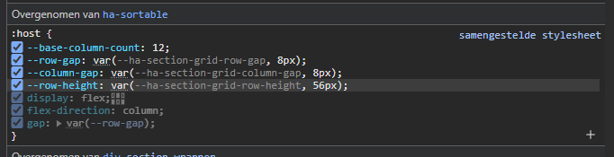
If you wish to specify height via uix then this should be done from the containing section and adjusting the CSS var, otherwise you will have trouble with overlapping cards. You can get to section yaml via three dots when editing a section in UI.
i am gonna bug ya last time Daryn
sofar thank you for helping me out on this…
and pls keep rocking! it’s aprreciated!
i knewn the tile height works fine in uix in the card itself…
also i do understand that grid etc cards…
but when i open inspector…
What I really miss inside all the documentation your are writing and making is screenshots, of the results.
Most of the documentation is using technical terms which aren’t very common, and the results of the code examples seems mostly up to imagination.
Furthermore, I absolutely love the integration so far. But to be honoust, I also think I use 10% of it’s true potential due to not understanding the purpose/meaning of most of it’s possibilities/outcome and features.
Screenshots take the most time of all of the production of coding and documentation of features in UIX. Simple as that.
UIX Forge is forging along to provide a base to have an up to date replacement for many solutions which are either not maintained, or have performance or other issues. Once UIX Forge is bedded down well then I will be able to switch into making improved guides.
When more time is available I will be able to work out how to have automation capture screenshots for documentation, then they will be available from the start.
EDIT: May also work out how to provide for a test instance with side-by-side yaml and visual result.
Entity image override now available in 6.0.0-beta.5
Working on suggestion from @Mariusthvdb, 6.0.0-beta.5 supports entity image override which until now could only be achieved using backend customise:.
The override works in the same was as icons, but with the CSS var being specifically for an entity. Templates are supported. You need to define CSS var for each override (e.g. person), there is no way to glob this.
Supported are all elements used for Person, listed below. Elements used for other entities can be used with those entities (e.g. tile icon, state-badge)
Grid spark now available for UIX Forge in 6.0.0-beta.6
Grid spark can be used for any container with repetetive elements, grid card itself, picture-glance entities icons row etc. Possibly entities card rows container but yet to test.
Grid spark simplifies applying CSS to define grid and grid options including areas, then spark config allows providing a sequential list of area names to apply to the container elements. Media queries are also supported to apply specific configuration at screen setpoints.
The possibilities are endless. Read more in the Grid spark documentation.
Examples with images to be included in future UIX Guides
 Striking the hot iron
  UIX Forge for available in v6.0.0-beta.2
 . I have desire for the community to submit
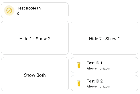
 Grid spark now available for UIX Forge in 6.0.0-beta.6