I have a device that is on a battery, so it sleeps most of the time. This (I think) leads to a peculiarity when graphing values in the lovelace UI. I am using Home Assistant 2021.6.4, but I have been seeing this since I started using HA about a year ago.
I have several small esp8266 or esp32 boards scattered around my house. All have a BME280 sensor (temperature, relative humidity, air pressure). All are programmed with ESPhome but are configured to send data to MQTT and on into HA.
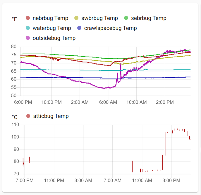
As you can see in the graph, all of the devices have their temperature data shown in a lovelace history card as “F”, consistent with my global HA “imperial” setting. That is, all except for one device. In the legend, it shows “C”, but the data being graphed is actually “F”. The data is numerically correct, but the UoM label is wrong, and it doesn’t get combined with the other entities even though it’s part of the same history card.
That sensor, atticbug, is in my attic, which is why the temperature is quite a bit higher than the others. The large blank areas in the atticbug graph are simply because I had it offline for a while this weekend. It runs off battery power, so it sleeps for 20 minutes, wakes up, reports the readings over MQTT, and then goes back to sleep. That’s why the graph is not continuous.
- I do not set any UoM in the ESPhome device configuration.
- In the core.entity_registry, all of the devices’ temperature entities have
"unit_of_measurement": "\u00b0C". - By monitoring the MQTT messages, I can see that all devices report the temperature state as a centigrade value (without sending any UoM).
- In the history card definition, I have just a list of entities with no additional properties.
When I look at the data for the atticbug temp sensor in the HA states table, I see 2 peculiarities:

As expected, the device becomes unavailable during its 20 minute sleeps. When it wakes up and reports a value, something makes an entry in the states table that is numerically the same as the value the device reported before it went to sleep. I know from monitoring MQTT that it’s not the device mistakenly doing that.That is followed a very short time later by the device’s actual sensor report. That leads to something you can see in the plots I pasted above: small vertical line segments instead of dots. A similar effect is seen for air pressure and relative humidity values.
The second thing is the UoM. In the states table, the actual numeric sensor readings (including the duplicated values) have a UoM of “F”. The “unavailable” entries have a UoM of “C”. I speculate that it’s those “unavailable” entries, which are the most recent for a huge majority of the time, which make lovelace thing that atticbug’s temperature values are in “C”.
So, does my reasoning make any sense? And what can I do about this? Is it likely a bug or just something that I’m not doing quite right?

