[Updated 2019.08.18] Hemera (Day) and Nyx (Night) themes with support for some custom Lovelace cards

I have made some themes and designs I like to share.

Hemera and Nyx themes

I’m using two themes - available on Github - , Hemera (Day) and Nyx (Night).

These themes support of course Home Assistant but also some Lovelace components

It has built-in support for the following custom components:

The themes work closely together with decluttering templates to style every card using a theme, instead of hard coding things in a card or view.

It is the first version, so not everything is uploaded yet to github, and fully functional / themeable yet.

How does it look like?

For now, I created a main theme, and some variants with different background, primary and secondary colors.

The below screenshots show some mobile examples of the day and night theme, and the custom components side by side.

Update 2019.08.18 Two new variations in the works:

Hemera 01 day theme

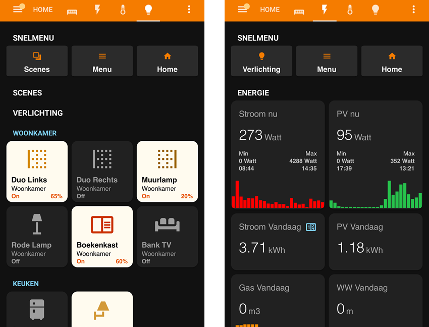
Based on the Hemera 01 light grey/orange/blue day theme:

The left screenshot displays a quick menu and some lights. LIght buttons are based on the custom button-card, extended with the area (you see Woonkamer/Livingroom) and the brightness of the bulb if the bulb supports this.

The right screenshot shows some examples of the custom mini-graph-card in action.

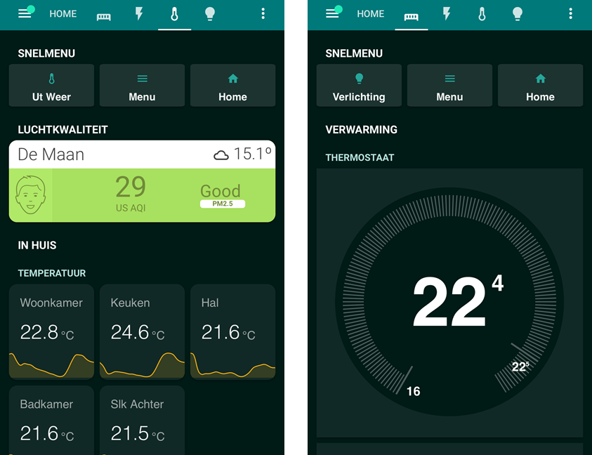
The left screenshot displays the themed simple-weather-card and again some examples of the mini-graph-card.

The right screenshot shows the custom thermostat-card. Fully themed!
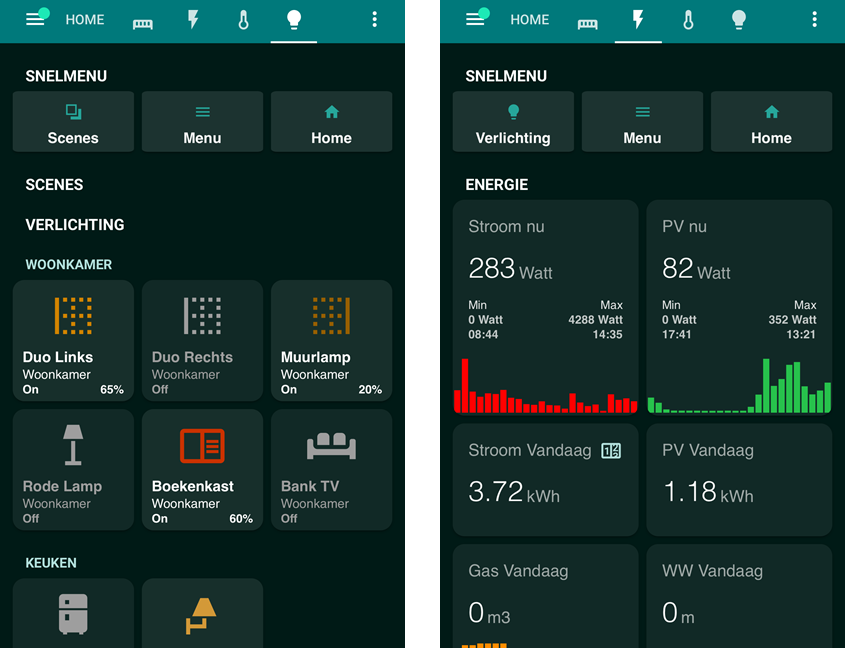
Nyx 01 night theme

Based on the Nyx 01 black/orange/blue theme:

Nyx 03 night theme

And the fully Teal Green Nyx 03 teal/teal/teal theme:

This theme is - for lights on - much darker than the Nyx 01 theme. Still thinking that it is a bit too dark!

6 Likes

Just a small experiment that went well: I decluttered the light template by using templates :smile:

The decluttering template for the lights used settings for each state of the light (on/off/…).

As the template names contain the state name, this could be templated leaving a single state in the decluttering template file:

  # As every state is defined in the theme, and we have no other settings than color per state,
  # a template can be used to set the color and background of the card.
  # This saves having to write code for all the different states!
  #
  # Even a decluttering template can be decluttered ;-)
  state:
    - value: "[[[ return '' + entity.state + ''; ]]]"
      styles:
        card:
          - --ha-card-background: "[[[ return 'var(--theme-button-card-color-state-' + entity.state + ')'; ]]]"
        icon:
          - color: "[[[ return 'var(--theme-button-icon-color-state-' + entity.state + ')'; ]]]"
        lock:
          - color: "[[[ return 'var(--theme-button-lock-color-state-' + entity.state + ')'; ]]]"
        label:
          - color: "[[[ return 'var(--theme-button-label-color-state-' + entity.state + ')'; ]]]"
        name:
          - color: "[[[ return 'var(--theme-button-name-color-state-' + entity.state + ')'; ]]]"
        state:
          - color: "[[[ return 'var(--theme-button-state-color-state-' + entity.state + ')'; ]]]"
        custom_fields:
          area:
            - color: "[[[ return 'var(--theme-button-area-color-state-' + entity.state + ')'; ]]]"

Saved about 60 lines of yaml in this template.

The functionality of Lovelace cards keeps suprising me.

value: "[[[ return '' + entity.state + ''; ]]]"

You can probably change that to:

value: "[[[ return entity.state; ]]]"

Really like what you did with those buttons btw! Looks great. I might try to mimic that.

Also… what are those ‘Menu’ and ‘Home’ buttons? You already have that at the top, right? As in, that Compact Custom Header.

That was my first try, but it didn’t work, so that’s why I came up with the return ‘’ . Took me some hours to discover that that did work…

All cards are based on the theming and decluttering cards to make things fully theme-aware.

Regarding the buttons: The standard menu via CCH is much too small om my phone, and scrolling through the menu-bar (yes, I got that many views) is a pain. While looking for a solution, @jimz011 appeared to have solved this problem with a simple row of buttons.

For now, this works very well with my thumbs.

I’m still optimizing the themes and decluttering cards. It was a lot of work creating a nice material design based theme, and rewriting all the decluttering cards, but now I see that a simple switch from theme makes all the cards I use follow the theme a very pleasant result.

Looks awesome. Can you share the code?

I have another great idea which you might like as well @AmoebeLabs. Keep an eye on my thread I will release it sunday or monday.

Next up is theming the way you do, but that might cost me a bit more time :rofl:

Its on Github. Just follow the links in the first post.
I have no idea how to create such a nice Github block here btw.

I will. Currently only working on ironing out some errors in the themes and adjusting the templates. Some things can be done a bit easier and/or with less yaml code.

Less yaml code sometimes needs 50 lines of CSS extra, but it makes theming easier…

At least you can look at a working example. I could not, and had to try everything out myself as most home assistant configurations use hard-coded colors and other difficult-to-theme solutions.

But on the other hand: I like to build visual things, so it was fun. Took me a few months though to get where I am now, but I’m happy with the result.

The green Teal theme is currently my favorite. It was just a crazy idea: lets make the primary and secondary colors green, but worked out very well for myself :smile:

I don’t mean the custom components, I mean the theme. Don’t see any theme related links but the screenshots.

Aaarghhhhhh. I didn’t copy the github links, put the picture links :stuck_out_tongue_closed_eyes:

I have corrected this. Now you links point to my github account, where you can find the material design colors, all the themes, and part of my home assistant config!

Yeah, and I thank you for your hard work on theming. Not my favorite colors, but I love the way you wrote it.

The first Hemera and Nyx themes are a proof of concept for theming. Nyx 3 was an experiment if the theme setup should also handle the same color tints.

From that experiment, I know I have to ironing out some problems in these themes.

I have about 50 color schemes / palettes ready to get implemented. With such a number, you understand that I first want a good-enough theme setup (say 0.9), as modifying so many themes is a lot of work…

The difficult thing is to map these palettes to the setup used by Home Assistant.
And of course, you can’t use just any color if you want that colors like green/yellow/red are still possible, or that ligts “on” colors still work…

Small update on what I’m working on: two new dark themes:

  • Played with some button variations
  • Added a divider
  • Added a new circle card

Nothing is on Github yet. That will be done later when the circle card and the themes are ready. With so many changes it takes some time to rework everything again.

Some work on the lights for these themes is also on the way: A status light, as if it are physical buttons :smile:

image

3 Likes

Nice work. Looks great.

Any news on these themes? I really like the grey with yellow one :grinning:
Looking forward to see these new themes on your Github page.

I am actually very curious on how you did that beautiful mini-graph (I mean the colors). That is pretty awesome. Can’t wait to see how you did that.

Ah yes, I will update my Github pages for these themes once I have finished current work on some themes and my new card. Those two are taking a lot of my spare time currently!

Some examples of the new card with the green/yellow theme behind it.

The arc can be colored using a fixed color, color-stops and a gradient as you can see.
The card itself can handle multiple entities and attributes (nr 4: is from the darksky sensor, where temperature, humidity and pressure are attributes).

And with some nice filters:

And the flexibility to add actions to switch one or more light bulbs for instance where objects (circles and icons in thes case) adapt their color depending on the state of the light bulb:

image

Original theme, without 3D shadows and filters on the card:
image

The outcome of the filters (great or horrible) depend greatly on the theme. The green/yellowish theme does great I must say with these 3D look filters (which are heavy for some older mobile devices), but other themes just become ugly…

Once I have finished the card, or at least good-enough for the public, I will also update the themes to what I have now on my own setup.

1 Like

Hi, I have installed your themes using HACS with themes support activated.

I restart HA to test the themes and my GUI were all in error and just have a notification with lots of components which was invalid (frontend, map, …)

I remove the dummy.md file and it’s was working again …

I assume it is due to the Dummy.md file in the theme folder which is copied by HACS during installation. On startup, HA try to parse it and fails …

What’s the point of this dummy.md file ?
Could you remove it ?

1 Like

That file should never have been there in the repository.
I removed that file in all repositories.

I will check with HACS why an extra file is a problem. HACS has had similar problems with custom cards in the past.

Thanks for reporting!

1 Like

What steps did you follow to get this installed?
I tried and wasn’t able to do it. What exactly is it that you installed using HACS?

First of all, you need to activate the support of theme in HACS

hacs:
  token: yourtoken
  theme: true

Restart HA.

Then you need to add the github repo as a custom repositories. Copy the Github URL and select Theme as type.

Then the repository will be available in the store and you should be able to install it