I have tried for 48 hours to achieve it myself but i failed miserably.
I have plugged the washing machine to a zigbee smart plug which reports consumption (sensor.plug_washing_machine_energy) as an accumulating number (cannot be reset). This is currently at 42.33 kWh.
I have also created a utility meter through the helper menu (sensor.washing_machine_monthly_consumption) which tracks the aforementioned sensor and resets every 1 month, showing me the monthly consumption of my washing machine.
I want to create a graph that shows the monthly consumption of this device for the last X months (for now, the previous 2 months since the plug was installed and started counting energy consumption 3 months ago).
I have managed to do so using the built-in statistics graph
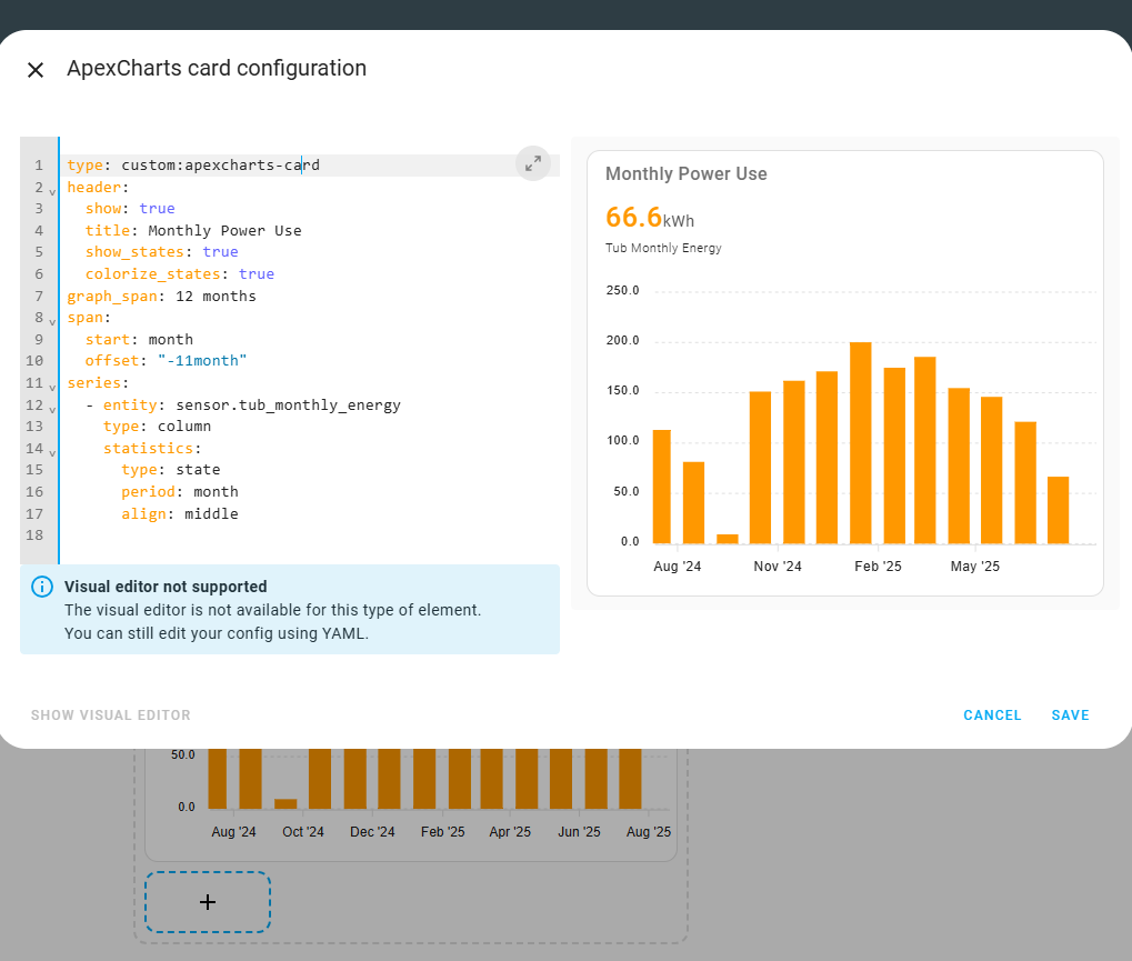
However I want more flexibility on the graph parameters and I was thinking of using the apexchart-card from HACS. However, no matter what code I tried, i can’t seem to make the graph work… Graph shows “loading…” and displays nothing…
There is a running discussion and good documentation for all things Apexcharts, however it can take a lot of digging to find out what you need.
The graphs are very powerful, but if your settings are not ‘just right’ then nothing will show.
The basic graph in Apexcharts is a time-state plot for the past 24 hours. This uses the entity state from the entity table, which only exists for 10 days. If you want to go back in time, then there is a setting to switch any series to plotting from ‘statistics’ which then uses the long-term statistics table.
Yes you will need a utility meter output that resets monthly - this generates an entity sensor that holds the running ‘used energy’ for the month, and therefore historically will run from 0 at the start of each month to the full monthly-used quantity at the end of the month. This we can plot.
Once on ‘statistics’ the options permit selecting the type of stats. HA keeps things like period:- max, min, mean, sum, state and change, but here I would suggest just ‘state’.
I have used the ‘month’ and ‘middle’ options, which seem to work.
After that the important bit is to set the graph span and offset start so as to cover the period being plotted.