Hi all,
I’m using a few robot vacuums that are jailbroken and running Valetudo (which I absolutely love, by the way!). However, I’m clearly not smart enough to make the Home Assistant interface user-friendly enough—at least not to maintain my SOAF (Significant Other Acceptance Factor).
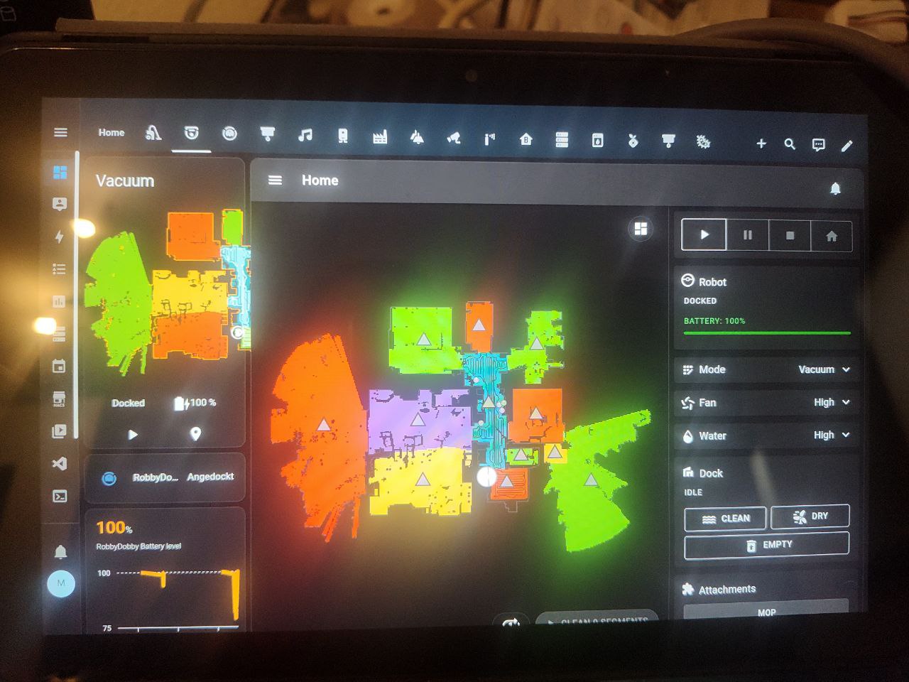
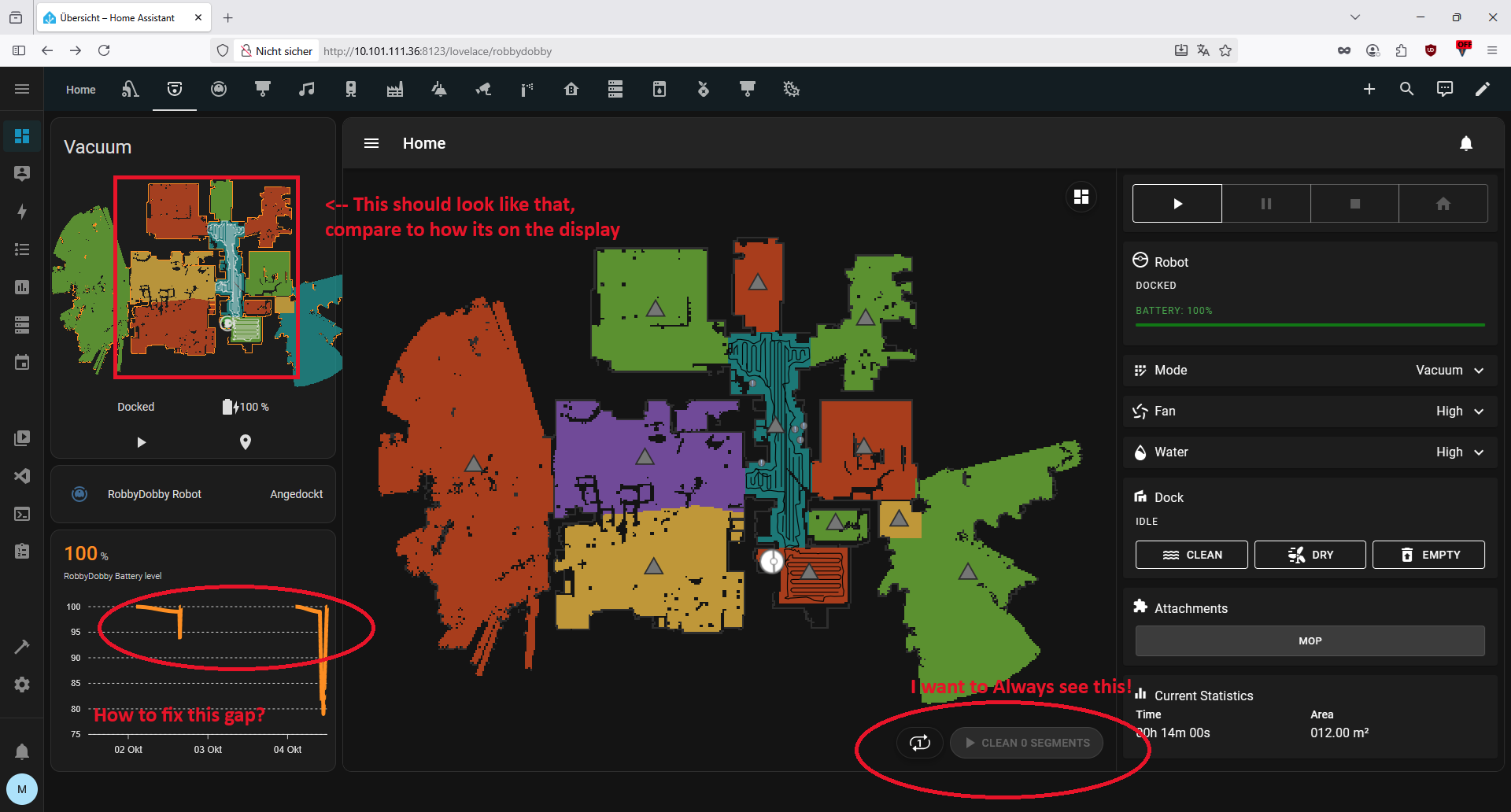
Right now, the segment buttons (see screenshot) under the vacuum card are mostly invisible on our 10" wall-mounted tablets. These tablets are placed next to the entrance door in kinda each room, and the robot just isn’t easy to use from them, but they are our main interface to HA and all related stuff, that’s why we have em everywhere. This issue with the buttons being easily reachable is becoming a bit of a problem at home ![]() .
.
What I currently use:
I’m relying on custom:layout-card to display all the relevant info, but I’m fully aware that my current solution isn’t ideal. I really would like to switch to something better if it makes the interface more functional and easier to use. I’ve got the picture-elements card on my mind, when I think about how to improve this.
What I’d like to achieve as endgoal:
I’d love to transition to a picture-elements card, using the robot’s map as a background, and add clear buttons or controls for:
- Selecting multiple rooms in a sequence (for vacuuming in the order or selection, and with dry pads not gluing the dirt to the floor with the dragging of wet pads)
- Then when done vacuuming, automatically switch to mopping mode (only now running with wet pads) after vacuuming is done
- Create operational shortcuts for the everyday use to trigger the above mentioned procedures
What I’d like to achieve in near futere:
I’d like to fix my 2-column layout on my dashboard like this:
-
Left column (20%):
- The vacuum’s map
- Current status
- Battery level and battery history graph for the past 3 days (to detect if it got stuck or failed to dock, or being kicked out of dock by accident—happens a lot with my L10s Ultra and S50)
-
Right column (80%):
- An iframe showing the Valetudo web interface directly
Also, notice how the top row of buttons on my tablets is way too tall compared to how it appears in Firefox. I can’t seem to shrink it down. If you have any tips for that too, please let me know!
Here’s my current config:
(Yes, my kid insists the robot is named RobbyDobby—like Dobby the elf
)
title: RobbyDobby
icon: mdi:robot-vacuum-variant
path: robbydobby
type: custom:layout-card
layout_type: custom:grid-layout
layout_options:
  grid-template-columns: 20% 80%
  grid-template-areas: |
    "valetudo iframe"
  grid-template-rows: 100%

cards:
  - type: vertical-stack
    cards:
      - type: custom:valetudo-map-card
        vacuum: valetudo_robbydobby
      - type: entities
        entities:
          - vacuum.valetudo_robbydobby
      - type: custom:apexcharts-card
        graph_span: 3d
        header:
          show: true
          show_states: true
          colorize_states: true
        series:
          - entity: sensor.valetudo_robbydobby_battery_level
    view_layout:
      grid-area: valetudo

  - type: iframe
    url: http://10.101.112.5
    view_layout:
      grid-area: iframe
What I get on my tablets:
What I want instead:
TL;DR – I need help with:
- Improving the HA UI layout for a better SOAF
- Getting a cleaner interface on wall-mounted tablets
- Adding quick controls for common cleaning sequences
- Fixing that oversized top row on tablets
- Seeing some real-world examples from others using Valetudo in a more elegant way
If you’ve built something similar or have suggestions, I’d love to see your setups! Especially if you’ve nailed the picture-elements + Valetudo combo.
Thanks in advance!
Manny