Hi. im looking for vertical slider, at the moment i found 3 but none of them work for i what want.
works best for shutters.
this one works, but i cant put the numeric state and also i cant name it
this one i can manage to work, i tried HACS install, and manual install, and doesnt work with a input_number value.
im making a DMX control throw MQTT, its working but i want vertical slider that i can name, and show numeric state fo the slider.
if anyone have any hidden vertical slider ahhahah
thanks!
What kind of vertical slider are you looking for?input_number.your_entity. Here you can change the display to a slider or field.
Then you can use this in an entities card. See: Entities card - Home Assistant
If you are using yaml in stead of the UI you could add this to your dashboard:
- type: entities
  entities:
  - entity: input_number.your_entity
    name: "Sliding al them ways"
    icon: mdi:slide
    tap_action:
      action: none
i currently have slider, but from left to right
i want them to be from up and down.
im trying to do a mixer card, something like this but with name and values.
this is a horizontal stack with this code in it.
type: custom:my-slider-v2
Those look great!
How can this be achieved?
plasterer
January 3, 2025, 10:51am
6
yip, I’d be interested in how you did this as well… Looks fantastic
pyzone
April 12, 2025, 3:58am
7
As for 04.25 :
Upper controls -
GitHub - tolnai/hacs_cover_slider: Slider cover card for Home Assistant
Bottom - standard HA card
Covers are my own DIY.
Each slider is for separate entity, no scripts or automations.
At least for a while
2 Likes
Yet another great looking implementation!
I see that these are for cover entities though… any chance they’d be able to be used for something like lights?
pyzone
April 14, 2025, 6:51am
9
Oh, sorry!
pyzone
April 14, 2025, 9:46am
10
By the way…
You be better off simply modifying the CSS to rotate the sliders within a card using:
transform: rotate(90deg) or
This card and direction: bottom-top
A button card with integrated slider
type: horizontal-stack
cards:
  - type: custom:slider-button-card
    entity: light.xxxx
    slider:
      direction: bottom-top
      background: gradient
      use_state_color: true
    action_button:
      mode: custom
      show: true
      tap_action:
        action: toggle
    icon:
      show: false
      use_state_color: false
      icon: ""
Width, color, info and more can be customized
pyzone
April 14, 2025, 10:21am
13
unfortunately, I’m not very good in CSS. MQTT is much more familiar to me
No worries, all suggestion should be considered.
I mean… sure, kinda?
also, doing the transform doesn’t work on finger tracking. You still need to swipe lef/right to adjust the transformed element
Well yeah it needs more than one line of code. What’s your point?
That is why I also suggested the slider-button
that “simply modifying the CSS to rotate the sliders within a card using transform” is not the sought-after solution here.
In case you didn’t think rotate wouldn’t work with additional code. A rough example…
type: custom:layout-card
layout_type: custom:grid-layout
layout:
  grid-template-columns: 1fr 1fr 1fr
  margin: 0px 0px 0px 0px
cards:
  - type: entities
    entities:
      - type: custom:slider-entity-row
        entity: light.night_stand
        card_mod:
          style:
            hui-generic-entity-row $: |
              .pointer {
                display: none;
                }
            .: |
              ha-slider{
                 --_inactive-track-shape: var(--md-slider-inactive-track-shape, var(--md-sys-shape-corner-full, 10px))!important;
                 --_active-track-shape: var(--md-slider-inactive-track-shape, var(--md-sys-shape-corner-full, 10px))!important;
                 transform: rotate(-90deg);
                 margin-top: 100px;
                 --_inactive-track-height: 50px ;
                 --_active-track-height: 50px ;
                 --md-slider-handle-height: 28px ;
                 --md-slider-handle-width: 12px ;
                 --_label-container-color: transparent ;
                 --_label-text-color: transparent ;
                 --_active-track-color: {{"#%02x%02x%02x" %
              state_attr(config.entity,"rgb_color") }} ;
                 --_inactive-track-color: grey ;
                 --md-slider-handle-color: dodgerblue;
                      }
              ha-slider:after {
                content: "Night Stand";
                transform: rotate(90deg);
                width: 70px;
                position: absolute;
                right: 70px;
                top: 6px;
                font-size: 10px;
               }
    card_mod:
      style: |
        ha-card {
          height: 150px !important;
          width: 120px;
          background: transparent;
          border: none;
          }
  - type: entities
    entities:
      - type: custom:slider-entity-row
        entity: light.tv_lightstrip
        card_mod:
          style:
            hui-generic-entity-row $: |
              .pointer {
                display: none;
                }
            .: |
              ha-slider{
                 --_inactive-track-shape: var(--md-slider-inactive-track-shape, var(--md-sys-shape-corner-full, 10px))!important;
                 --_active-track-shape: var(--md-slider-inactive-track-shape, var(--md-sys-shape-corner-full, 10px))!important;
                 transform: rotate(-90deg);
                 margin-top: 100px;
                 --_inactive-track-height: 50px ;
                 --_active-track-height: 50px ;
                 --md-slider-handle-height: 28px ;
                 --md-slider-handle-width: 12px ;
                 --_label-container-color: transparent ;
                 --_label-text-color: transparent ;
                 --_active-track-color: {{"#%02x%02x%02x" %
              state_attr(config.entity,"rgb_color") }} ;
                 --_inactive-track-color: grey ;
                 --md-slider-handle-color: dodgerblue;
                      }
              ha-slider:after {
                content: "TV Lightstrip";
                transform: rotate(90deg);
                width: 70px;
                position: absolute;
                right: 70px;
                top: 6px;
                font-size: 10px;
               }
    card_mod:
      style: |
        ha-card {
          height: 125px !important;
          width: 100px;
          background: transparent;
          border: none;
          margin-left: -80px !important;
         }
  - type: entities
    entities:
      - type: custom:slider-entity-row
        entity: light.pc_lights
        card_mod:
          style:
            hui-generic-entity-row $: |
              .pointer {
                display: none;
                }
            .: |
              ha-slider{
                 --_inactive-track-shape: var(--md-slider-inactive-track-shape, var(--md-sys-shape-corner-full, 10px))!important;
                 --_active-track-shape: var(--md-slider-inactive-track-shape, var(--md-sys-shape-corner-full, 10px))!important;
                 transform: rotate(-90deg);
                 margin-top: 100px;
                 --_inactive-track-height: 50px ;
                 --_active-track-height: 50px ;
                 --md-slider-handle-height: 28px ;
                 --md-slider-handle-width: 12px ;
                 --_label-container-color: transparent ;
                 --_label-text-color: transparent ;
                 --_active-track-color: {{"#%02x%02x%02x" %
              state_attr(config.entity,"rgb_color") }} ;
                 --_inactive-track-color: grey ;
                 --md-slider-handle-color: dodgerblue;
                      }
              ha-slider:after {
                content: "PC Lights";
                transform: rotate(90deg);
                width: 70px;
                position: absolute;
                right: 70px;
                top: 15px;
                font-size: 10px;
               }
    card_mod:
      style: |
        ha-card {
          height: 125px !important;
          width: 100px;
          background: transparent;
          border: none;
          margin-left: -160px !important;
         }
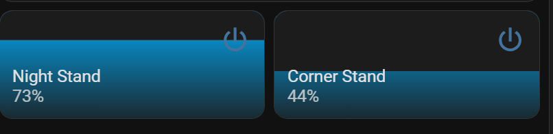
An outside of the box solution…
type: custom:layout-card
layout_type: custom:grid-layout
cards:
  - features:
      - type: custom:service-call
        entries:
          - type: slider
            unit_of_measurement: "%"
            value_attribute: brightness
            tap_action:
              action: perform-action
              perform_action: light.turn_on
              data:
                brightness_pct: "{{ value | int }}"
              target:
                entity_id: light.night_stand
            entity_id: light.night_stand
            range:
              - 0
              - 100
            step: 1
            thumb: default
            styles: |
              :host {
                {% if is_state(config.entity, "on") %}
                --color: rgb({{ state_attr(config.entity, "rgb_color") }})
                {% endif %}
               }
              .tooltip {
                {% if is_state(config.entity, "off") %}
                display: none;
                {% endif %}
               }
    type: tile
    entity: light.night_stand
    features_position: bottom
    vertical: false
    tap_action:
      action: none
    icon_tap_action:
      action: more-info
    hide_state: true
    card_mod:
      style: |
        hui-card-features {
         transform: rotate(-90deg) !important;
         width: 140px;
         height: 130px;
          left: 10px;
          }

  - features:
      - type: custom:service-call
        entries:
          - type: slider
            unit_of_measurement: "%"
            value_attribute: brightness
            tap_action:
              action: perform-action
              perform_action: light.turn_on
              data:
                brightness_pct: "{{ value | int }}"
              target:
                entity_id: light.pc_lights
            entity_id: light.pc_lights
            range:
              - 0
              - 100
            step: 1
            thumb: default
            styles: |
              :host {
                {% if is_state(config.entity, "on") %}
                --color: rgb({{ state_attr(config.entity, "rgb_color") }})
                {% endif %}
               }
              .tooltip {
                {% if is_state(config.entity, "off") %}
                display: none;
                {% endif %}
               }
    type: tile
    features_position: bottom
    vertical: false
    tap_action:
      action: none
    icon_tap_action:
      action: more-info
    hide_state: true
    entity: light.pc_lights
    card_mod:
      style: |
        hui-card-features {
         transform: rotate(-90deg) !important;
         width: 140px;
         height: 130px;
          left: 10px;
          }
  - features:
      - type: custom:service-call
        entries:
          - type: slider
            unit_of_measurement: "%"
            value_attribute: brightness
            tap_action:
              action: perform-action
              perform_action: light.turn_on
              data:
                brightness_pct: "{{ value | int }}"
              target:
                entity_id: light.tv_lights
            entity_id: light.tv_lights
            range:
              - 0
              - 100
            step: 1
            thumb: default
            styles: |
              :host {
                {% if is_state(config.entity, "on") %}
                --color: rgb({{ state_attr(config.entity, "rgb_color") }})
                {% endif %}
               }
              .tooltip {
                {% if is_state(config.entity, "off") %}
                display: none;
                {% endif %}
               }
    type: tile
    features_position: bottom
    vertical: false
    tap_action:
      action: none
    icon_tap_action:
      action: more-info
    hide_state: true
    entity: light.tv_lights
    card_mod:
      style: |
        hui-card-features {
         transform: rotate(-90deg) !important;
         width: 140px;
         height: 130px;
         left: 10px;
          }
layout:
  grid-template-columns: 1fr 1fr 1fr
  margin: 0px 0px 0px 0px


