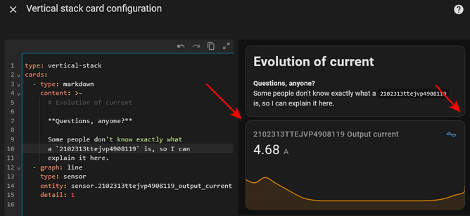
Hi. I sometimes use vertical stack card to add some explanation to a card - either above or below.
The red arrows point out the fact that the borders express that these are two different cards. That same separation occurs with the rest of the cards on the dashboard. We don’t know (visually) that these two things are connected.
I’ve noticed that this causes confusion with users, precisely when I am trying to bring clarity. Things move around in HASS dashboards, according to screen size and orientation. We don’t know if the markdown is a header to what’s below or a footer to what’s above. The visual cues should help.
Can we do better than card-mod?
Getting a Card-mod solution is not particularly easy. Especially if we consider the diversity of themes. But it has been attempted and done.
However, my real question is that this should be a core feature of vertical card stack (and horizontal, for that matter). If they stack things together, we should (at least as an option) be able to visually group them together, in a consistent way with the rest of the UI.
Anyone agree? Particularly, anyone with the skills to contribute the enhancement? ![]()
Thanks in advance for any comments.
