This release adds two new regions and makes multi-source setups more honest when something breaks.
MeteoSwiss (Switzerland)
If you run the hass-swissweather integration, the card now auto-detects its weather_warnings_at_<postcode> sensor and shows MeteoSwiss warnings with the usual severity colors, progress, and expandable detail.
NSW RFS ā Australian bushfire alerts
New provider for the built-in NSW Rural Fire Service feed. It surfaces live bushfire, grass-fire, and hazard-reduction incidents, colored by the Australian Warning System (Emergency Warning / Watch and Act / Advice).
Because that integration creates one entity per incident (without a parent device) and those come and go, thereās a new sources config option that just collects them all for you ā no need to hand-list volatile geo_location.* entities:
Degraded-source indicator
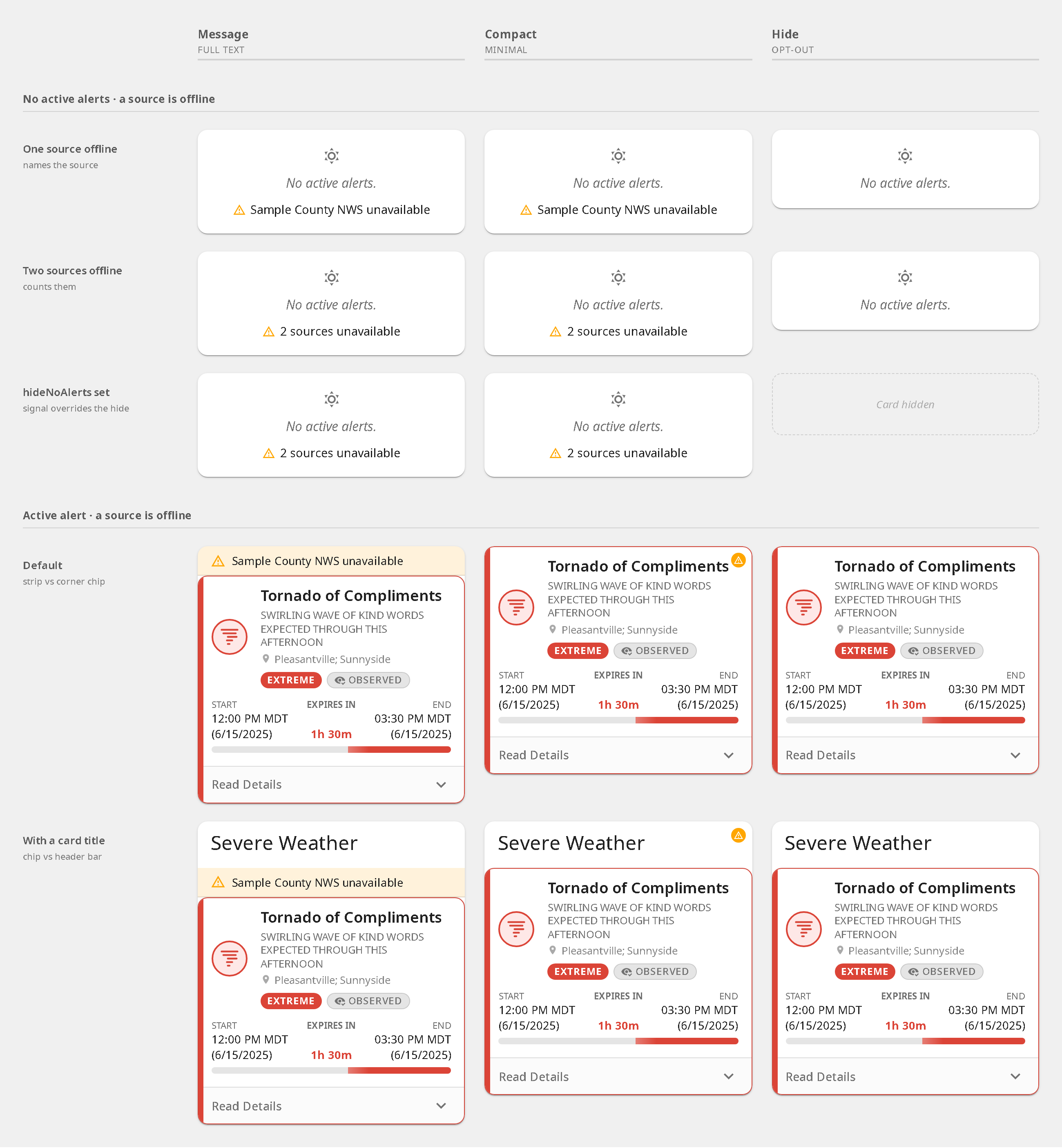
If you OR several alert sensors into one card and one of them goes unavailable, the card used to quietly show āNo active alertsā ā hiding the fact that a source had gone dark. Now it shows a badge naming the broken source instead, and stays on screen even with hideNoAlerts by default. You can tune this with unavailableBehavior: message | compact | hide.
Also in this release
Zone filtering now reads CAP geocodes for better matching
Alerts from sensors in unknown/unavailable state are no longer dropped
Affected-area mini-map renders its geometry as a proper basemap
Bundle downleveled to ES2019 so it loads on older Android WebViews
āOngoingā metadata verbiage for open-ended warnings
Update via HACS (search āWeather Alerts Cardā). Full notes on GitHub:
As always, bug reports and feature/provider requests welcome on GitHub.
v3.3.0-alpha.3 ā tap actions, detail pop-ups, progress styling
Thereās a lot in this one, and three of the four features started as requests in this thread. Itās a pre-release, so youāll need āshow beta versionsā enabled for the card in HACS.
Tapping a row opens that alert in a modal with the whole thing in it: icon, title, headline, area, badges, progress bar, metadata, description and instructions. Itās genuinely per-alert for every provider, so an aggregate sensor holding five warnings gives you five separate pop-ups rather than one shared panel listing everything.
The full Home Assistant action schema works too, so more-info, navigate, url, toggle and the rest all do what youād expect on a row. If you use Bubble Card, navigate to a pop-up hash still works and is documented in the README.
All of it is configurable from the visual editor ā thereās a Tap action dropdown in the Behavior section. That part only landed this morning, so if you tried alpha.2 and went looking for it, it genuinely wasnāt there.
You asked back in June for a straight line instead of the diagonal dashes on the active range. Itās in, and it turned into a per-phase setting rather than a single toggle, so each phase of an alertās life can carry its own treatment:
solid, striped, shimmer and pulse are the options, and thereās a matching iconBorderStyle for the ring around the alert icon. Both are in the visual editor. If plain everywhere is what you were after, the config above is it.
Your second request, un-hiding dismissed alerts on a timer, hasnāt been built yet. Restore-all in the editor is still the manual answer.
Bubble-style whole-row progress
Instead of a thin progress bar, the row itself can fill:
progressFill: background
A low-opacity wash grows across the row as the alert progresses, behind the text, with the thin track hidden. It picks up the alertās severity color and dims on expired rows. Tunable through the --wac-* tokens if the default strength isnāt right for your theme.
You asked in the very first reply whether thereād be a Home Assistant theme to match the card, and I said a proper theme was a someday item. This isnāt that, but itās the groundwork: the card now exposes a set of --wac-* CSS tokens for its surfaces, and alert bodies default to transparent so they inherit whatever your theme is doing rather than painting their own background.
That means a translucent or glassy theme now shows through the card instead of fighting it, and you can restyle the surfaces without reaching into internal class names:
The full token list is in the README under Surface theming.
This is the change Iād most like eyes on. Alert bodies used to paint a solid background and now donāt, which is a visual change that affects every user regardless of config. Itās been in the alpha channel since 20 July with no reports either way, and Iād rather hear about it now than after it ships. If youāre on a translucent, glass, or heavily customised theme, a screenshot would be genuinely useful.
Also
Simplified Chinese joins English, French, Spanish, Italian and German. And thereās a documentation site now at Weather Alerts Card ā the README is still the complete reference, but the site is easier to read on a phone.
What Iām asking for
If you run this alpha, Iād like to know about three things specifically: whether the card looks wrong on your theme now that backgrounds are transparent, whether the detail pop-up behaves on mobile, and whether the tap-action dropdown in the editor does what you expect. Everything else is a bonus.
Bug reports are better on GitHub than buried in the thread:
Everything from the 3.3.0 alpha series is now GA, so if you turned on āshow beta versionsā in HACS to follow along, you can turn it back off.
The three headline features are the ones I wrote up in the alpha post above ā tap actions with the built-in detail pop-up, per-phase progress styling, and the --wac-* surface tokens ā and they ship unchanged. Rather than repeat all of that, hereās whatās landed since.
NINA ā German civil protection. Tenth provider, reading the built-in nina integration. It carries DWD weather warnings, LHP flood warnings, and MoWaS / KATWARN / BIWAPP civil-protection messages alike, with real CAP severity and working onset and expiry times. NINA creates one binary_sensor per region per message slot, so point the card at the NINA device and warnings get picked up as they land in the slots.
One caveat I want to be upfront about: this adapter has a known expiry date. The nina integration is removing its entire entity attribute surface in HA 2026.11 (core#161882), and the replacement hides description and recommended_actions behind an action a dashboard card canāt call while itās rendering. So the adapter is correct through HA 2026.10 and stops working after that. The route past it is cap_alerts#66, reading BBKās CAP feed directly, which also gets you polygons, certainty, urgency, eventCode and multilingual bodies that the integration never exposed. Follow that issue if youāre on NINA.
Editor dropdowns work again on Home Assistant older than 2026.02. The visual editor was emitting only the newer selection componentās event shape, which left every dropdown inert on older cores: the menu opened, you just couldnāt pick anything. The card now detects which component set is registered at render time and talks to whichever is there. That fixed all 18 dropdowns, not just the ones that were originally reported.
Dutch joins English, French, Spanish, Italian, German and Simplified Chinese, auto-detected from your Home Assistant locale. Thanks to @BaszzV and @MF-142 for those two.
On the transparency change: it soaked in the alpha channel for a couple of weeks and nobody reported anything either way, so itās now live for everyone. Alert bodies no longer paint their own background, which means a translucent theme renders its alpha once instead of compounding into a solid look. If your card looks off after updating, thatās the change to suspect, and Iād like to see a screenshot.
Update via HACS (search āWeather Alerts Cardā). Full notes on GitHub:
Thereās also a documentation site now at Weather Alerts Card if the README is getting unwieldy on a phone.
As always, bug reports and provider requests are welcome on GitHub.