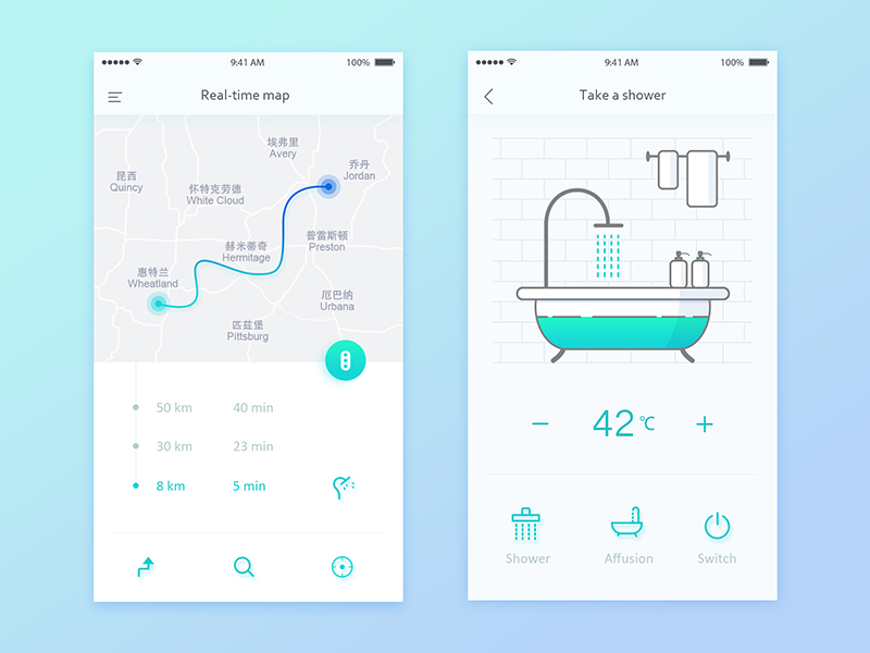
I noticed a few common details that make these UIs look incredible:
• More space creates a natural clean look.
• No cells but soft dividers (or just space).
• Gradients and glows!
• Big functional icons / states. Small labels.
• Flat + shadows.
YES! I would love to have a meaningful display with elements like these!
As a UI/UX designer I have to say - treat these images with a little scepticism. I see these sorts of things from young folks trying to build a resume or just trying to get noticed. You’ll see these UI’s fall apart when things like workflow, interaction design and unit re-usability get examined. Whilst the artwork might look like it would be a nice treatment for icons and imagery - ask yourself - how do these portray subsequent UI elements - modals, wizards etc? How can the interaction work?
For the folks saying lovelace can do it - yeah, maybe it can - but you can’t readily “do it” as many of the items pictured require an artist (for concepts) + UI designer (for UI/UX and workflow) + frontend developer to make lovelace items to cater for the niche interactions required.
Don’t get me wrong - can you imagine the time when we get to that point? It’ll be great!
That’s actually really interesting. I used to spend way to much time on uimovement.com.
The stuff on their is beautiful but probably impractical, like you suggest.
Very pretty mock-ups, in that “75% whitespace and 25% content” kind of way …
I started automating my home in 2006 and, during my early years, making a dashboard UI seemed … important. Having an attractive wall-mounted touchscreen was what signaled to guests that our home was “smart”. Just look! The screen wakes up when we arrive home! Unlock a door and the little padlock icon on the screen changes to an open padlock! Oooh! Aaaah!
When the touchscreen died, it was removed and replaced by an even more attractive … poster. Thirteen years later, even the UI on my phone is a minimalist “Just the facts, ma’am!” (75% content, 25% whitespace).
Nevertheless, can’t deny the mock-ups would impress the guests.
Our dashboard started like this. But we’re moving it to a more information based system. Things like weather with radar, driveway camera so we know when people are approaching, Google calendar, etc. The home controls are on secondary screens so we can get to them if we choose.
1 . Go to you home-assistant config folder (where your configuration.yaml is located) and create a themes.yaml file where you paste my code
2 . Open your configuration.yaml and look for the “frontend” section and insert this:
frontend:
  themes: !include themes.yaml
3 . Open or create the www folder in your config folder and save the background image
4 . Restart home assistant
5 . Set the theme in your profile
6 . Edit your view with the lovelace frontend editor -> raw editor and set the background like this:
views:
  - title: Home
    icon: 'mdi:home'
    background: center / cover no-repeat url("/local/background.jpg")
    path: default_view
Instructions for adding the custom cards are linked in my post.
Thanks naofireblade! I got all the way to your step 5 OK. It did take me about 10 minutes (and 8 open tabs full of search results) to figure out that the profile is accessed by clicking the little round icon at the top of the left-hand menu bar.
I’m a little stumped on step 6. First question: Where in the file do those lines go? I already have an indented line at the end of the file in the raw editor which says “title: Home” with no dash in front of it. And, at the top of the file, the first two lines are:
title: Home
views:
Which brings me to another question: Where is this file I’m editing physically located? If I screw it up, and lovelace won’t open, I’d like to be able to restore it back to the way it was before I messed with it.
Sorry for the newbie questions. I’m sure they all seem really dumb to someone who’s familiar with this stuff.
I thought about explaining where to open the profile but found no good short words to explain it, sorry .
When you found the “title: Home” part, then you got the right place. Just paste the “background: center etc…” line after that with the same indentation as title. You don’t need the other lines, I jsut posted them for you to find the right place.
The dash must not be in front of title. It marks the beginning of a new list entry and the entry can start with any attribute because the ordering of attributes is irrelevant in yaml.
I think the lovelace config is physically stored in a database and not in a file anymore. But if you screw it up, you should always be able to access the raw editor.
I agree. If you’re the only one using it more info, less pretty layout is ideal, but if you have guests or in-laws who need to be able to use the interface without a tutorial then the 25% content 75% white space is important. It helps someone who is unfamiliar process the information. Basic design techniques like what you find in Robin Williams book Design for Non-designers would be great for public facing interfaces.
In our home, our guests don’t need access to “the interface”. Lighting, HVAC, and security remain accessible via traditional physical controls (wall switches, thermostat, keypads). There’s nothing new to learn. This is by design; our HA system provides benefits but everything can still run without it.
Automation logic is responsible for monitoring and managing things. I rarely ever use the UI and when I do it’s to view some metric (like total heating hours) or to control a device when I am away (like adjust temperature or open the garage door for a delivery).
When I do reference the UI, I’ve found it useful to take note of why I’m doing it. It may be something I could automate. For example, I no longer check if any doors are open after dark. An automation monitors all doors late in the evening and announces if any have been left open.
This seams like a good place to ask, is there any interest in knowing how to swap in your own icons in place of existing Material Design Icons? I got obsessed with it and came up with a simple method and a not so simple one, but if its not in demand I have other uses of my time.
Still a WIP, but on the right path, I think the issue with the massive white space is unless you want to constantly be navigating or you are using very large screens (this is designed for 1280x800) you have to pack stuff in there.
This design could be shrunk considerably if you just went to pure iconography but then you lose the ability for others to use it easily. You have to use iconography only on phones but anywhere else I think if you can you should spell it out.
The whole goal of these screens is to make it so others will engage with it.


 Maybe in a custom theme.

 .
.

