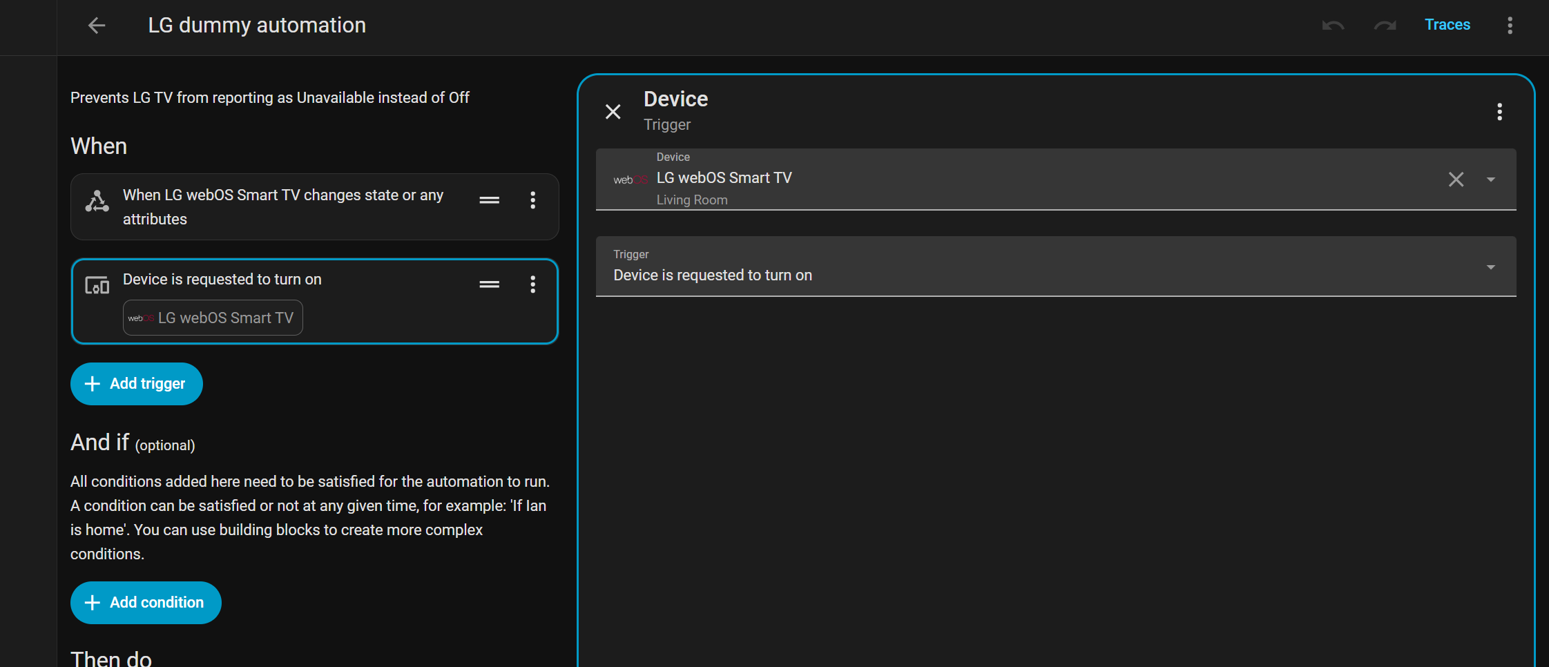
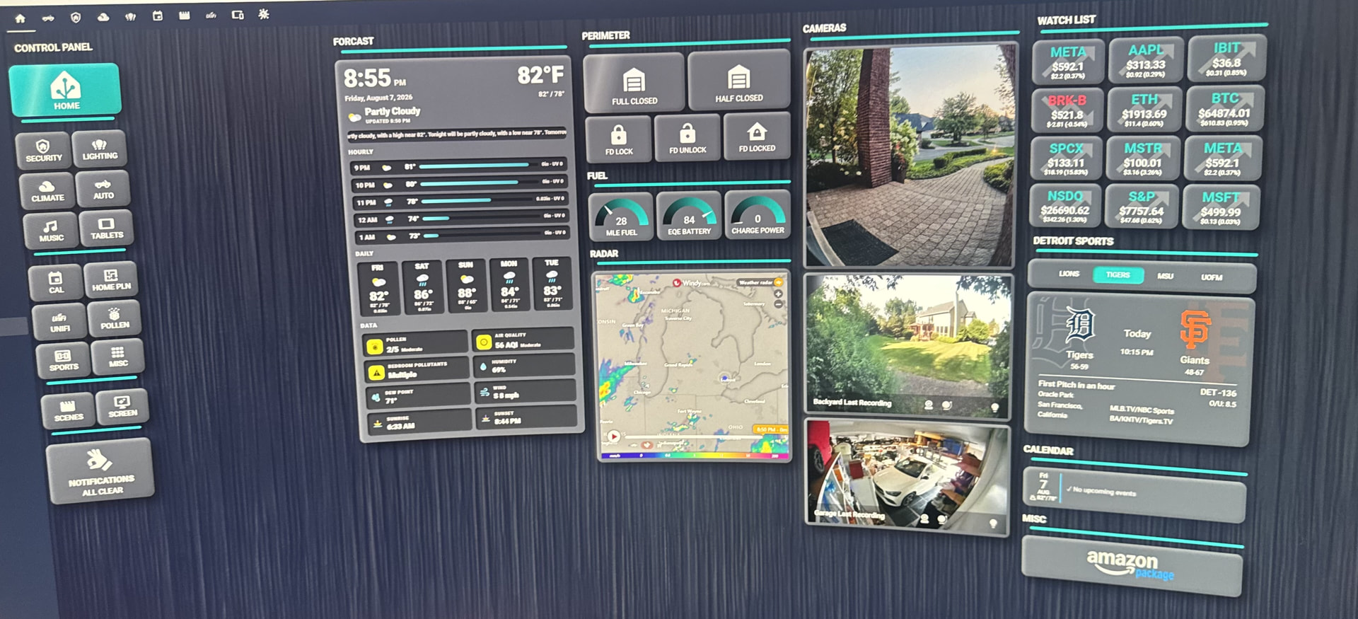
Why is that if I want less than 4 columns, I get increasingly more wasted space rather than resizing to fill the space like it should? I can’t find any settings to adjust this and have only found a few posts from years ago talking about the same issue that exists with the device configuration view. I’ve also had automation configuration views that are too constrained to even be able to read sensor IDs from dropdown menus making them unusable. Seems like this should be a default behavior to stretch to fill or at least have a configurable setting for adjusting it.
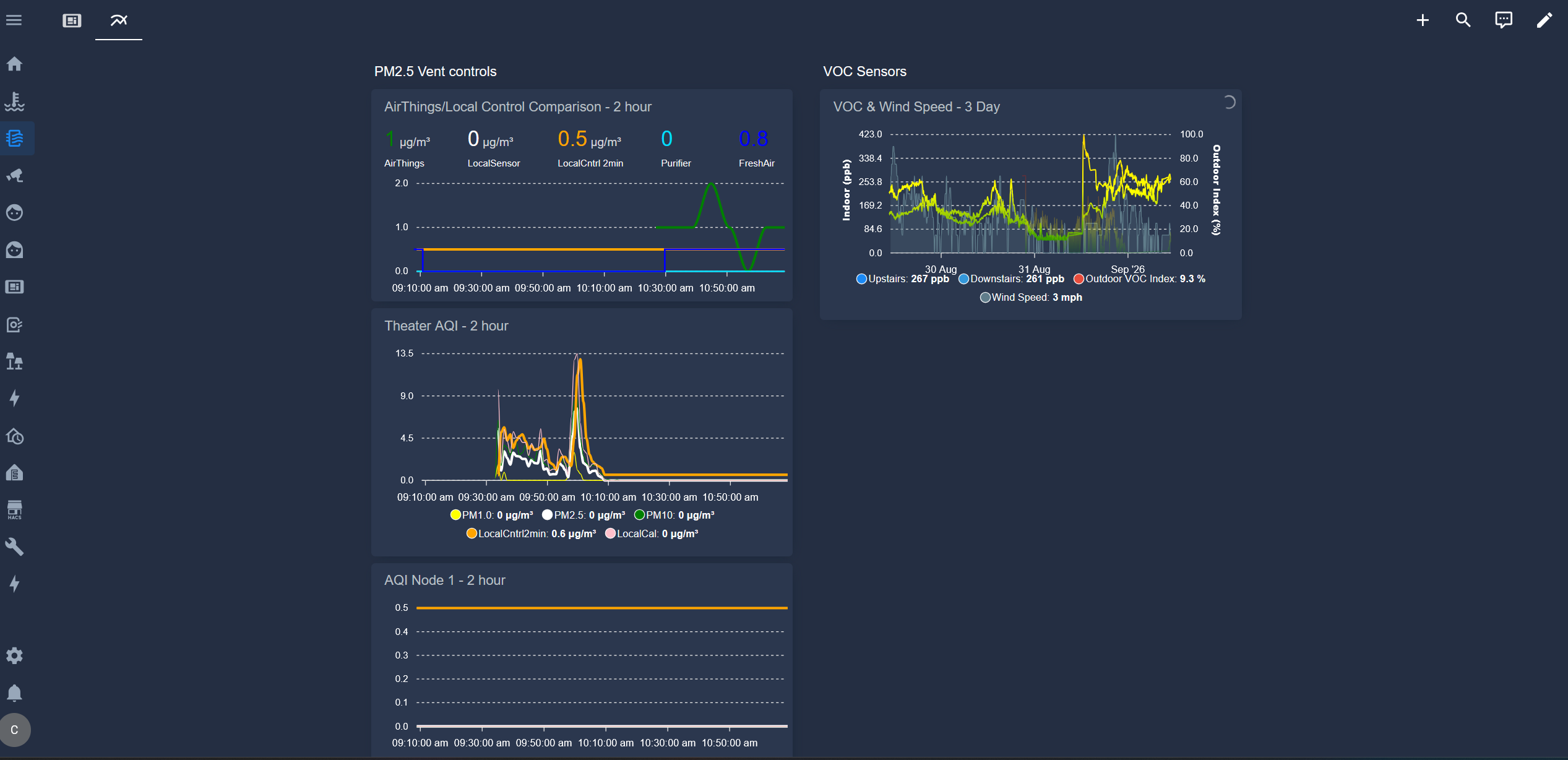
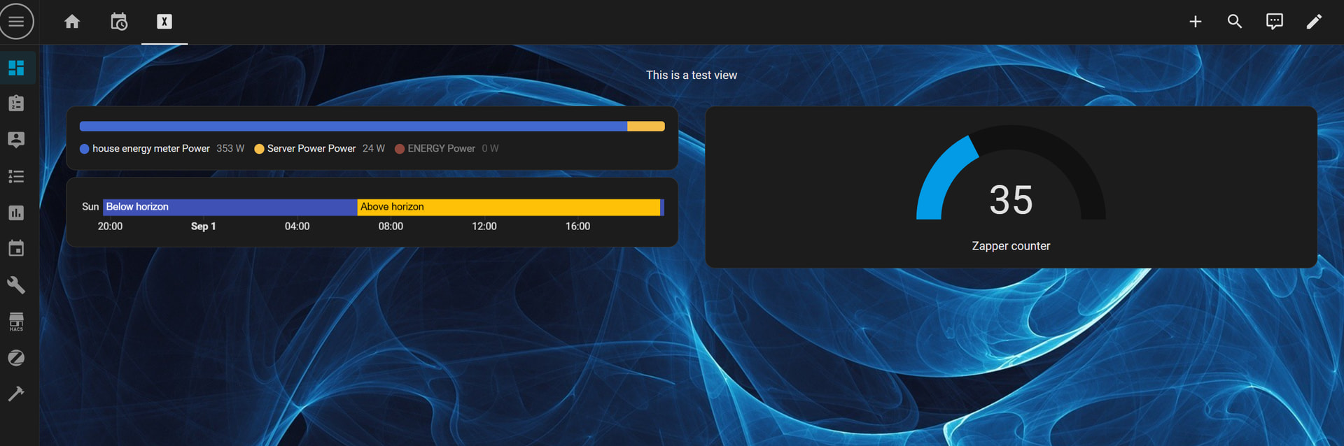
I tried that, but instead of stretching the graphs it just stacks 2 next to each other in the same section.
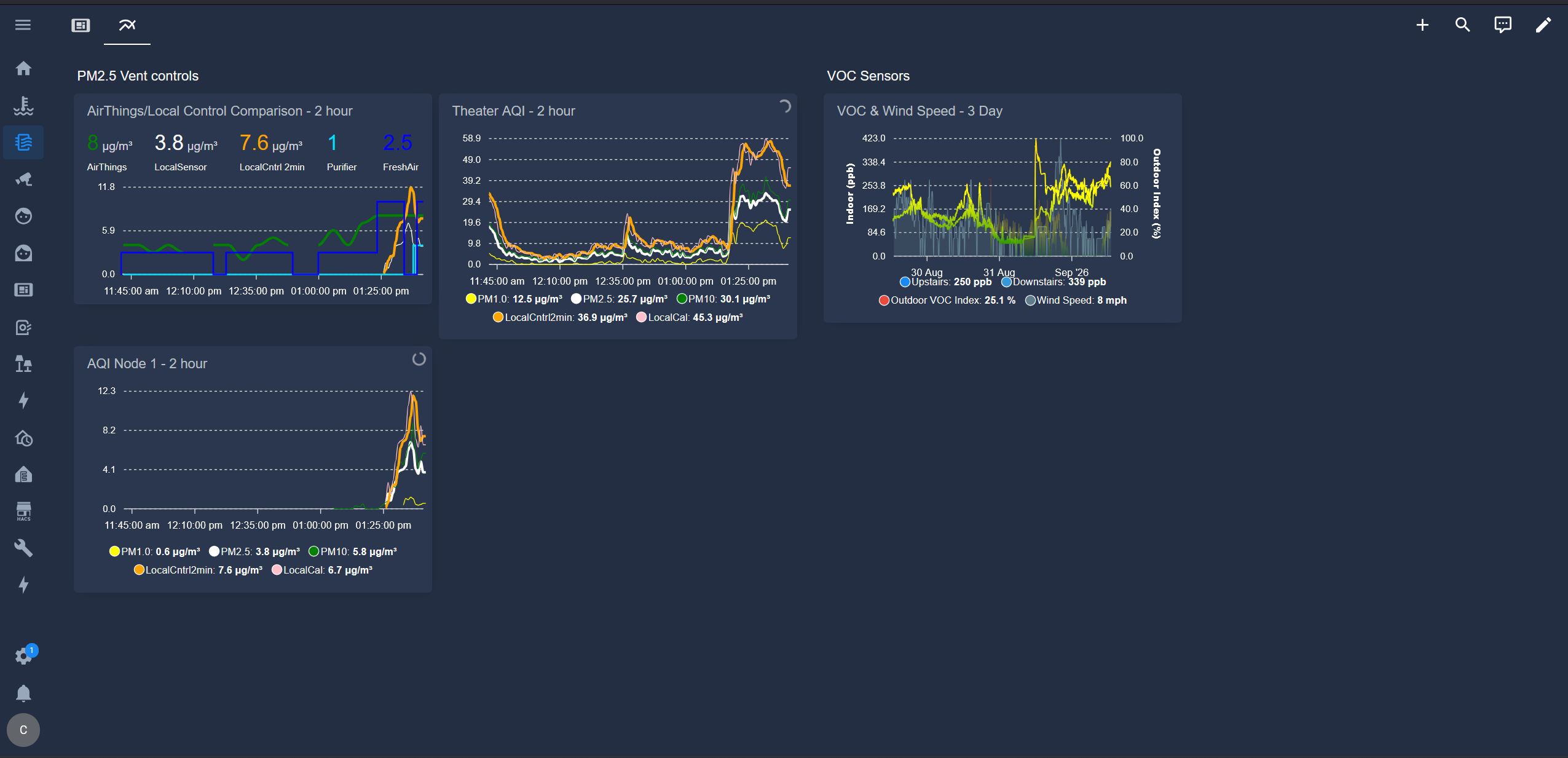
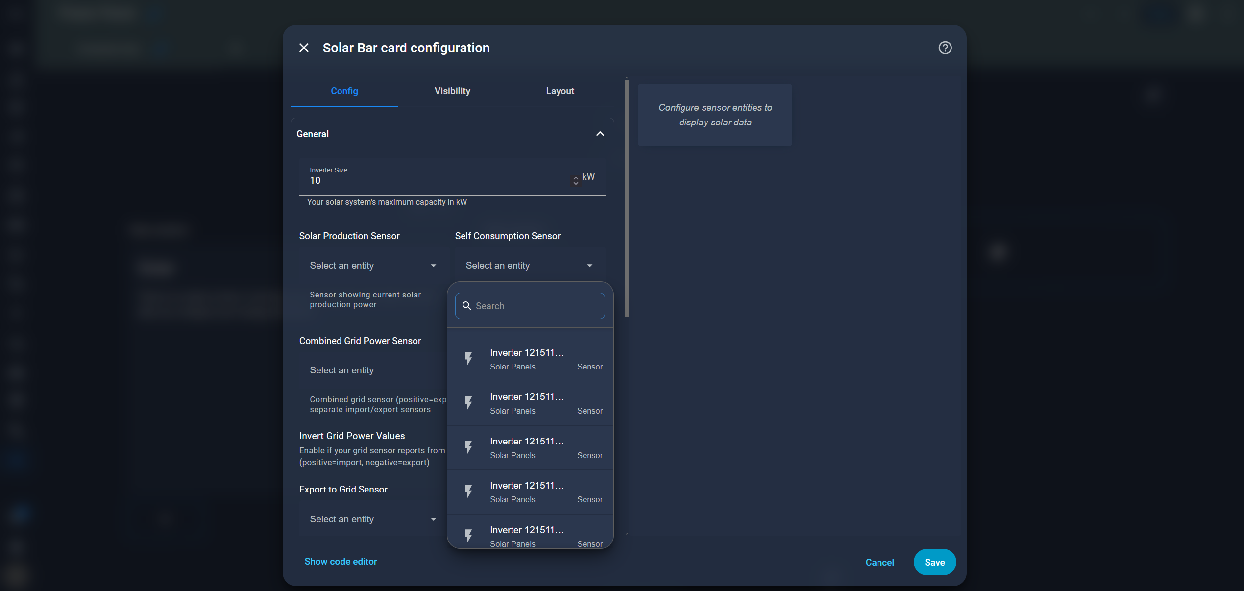
I don’t see any draggable borders in the configurations. Also, I guess it was this Solar card configuration window that had the too-narrow dropdowns and no way to resize the window to stretch it.
Ok, I got a different type of card to stretch in the visual editor layout tab, but Apex graph cards don’t have a visual editor and I’m not sure how to get them to stretch without that. I tried a couple things with Gemini’s help, but none of them have worked so far.
copy the visual settings from another card to apex graph cards. change the other card to yaml, copy the settings (it should be pretty clear), then paste them in the other cards yaml at the bottom.
THANK YOU!!! That was the ticket!  I don’t know why I didn’t think of that.
grid_options:
  columns: full