The automation editor is not designed to use the available screen area on a 16:9 screen.
Negative effects:
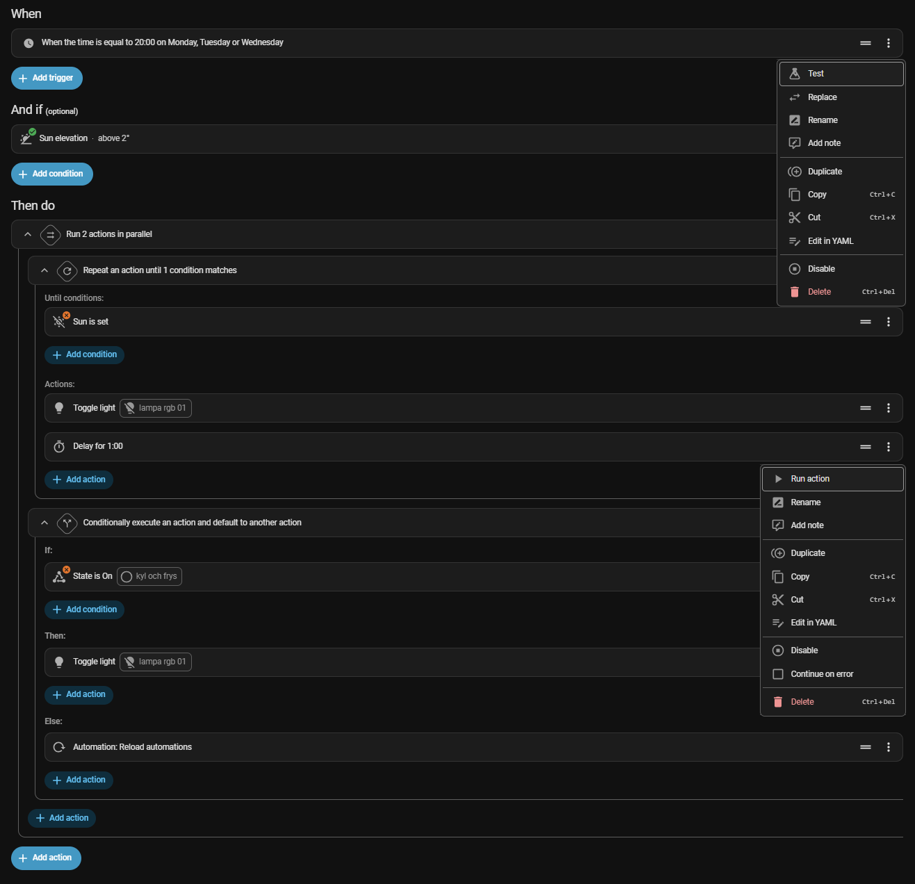
There’s too little overview.
Too much scrolling is needed.
Hard to drag and drop far when scrolling is needed to reach the desired place.
Actions are hidden in menus.
Proposal
Putting all of these together should make editing an automation require fewer clicks, less scrolling, better overview, less dragging around etc.
Add the ability to rename trigger/condition/action and set/show trigger id directly in the header without having to use the rename action hidden in a menu.
Add the actions from the … menu directly in the header for trigger/condition/action for direct access, better overview and faster editing.
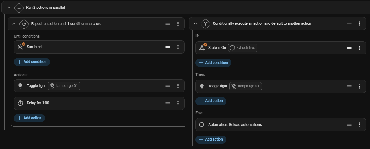
Render parallel actions side by side, not stacked vertically as a sequence for improved context and clarity plus less scrolling.
Remove all the add buttons.
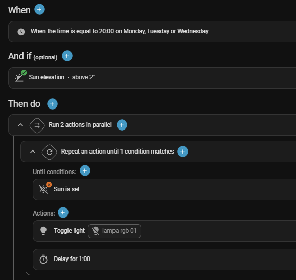
Place the add action at the top of the group in the header to save space vertically and avoid having to scroll so much.
The context is given by the position of the add/+ button in the example below to there’s no need to write it out every time.
Allow adding anywhere, not just at the end and then having to drag the item to its correct position.
E.g. Showing a + to add a trigger/condition/action when pointing above/between/below existing such items in the automation.
As is
The degree of wasting space horisontally and vertically is enormous…
I have also launched a bit similar feature request some time ago:
My opinion is that the devs build a nice piece of software, when implementing the automation editor. But the widgets occupy so much space, that my brain doesn’t see the automation logic anymore. There is way too much visual noise.
But - seen the talent available among the devs and UX guys - I am pretty convinced that they can solve it without too much of efforts.
However I am not sure whether they agree/disagree with these thoughts, or perhaps simply don’t have time to implement it. Because I got no feedback on my proposal unfortunately.
I might be wrong. but I think (remembering some discord discussions) that this whole interface is designed to fit on mobile.
And that basically the device target for all interfaces is mobile as a priority #1.
Thus I fear that densifying the interface to scroll less on wide screen will enter in competition with keeping this interface usable on a smartphone (narrow information spread verticaly+pop up or menus).
I personally never coded any automation on a smartphone, thus do not shoot on me for that. I am bringing back here this constrain that I think is taken care of by the design team.