Why can’t I force a certain amount of columns in the sections layout?
This would be very useful on a tablet wall dashboard. Now I can only use two columns but I would like to use three.
Why can’t I force a certain amount of columns in the sections layout?
This would be very useful on a tablet wall dashboard. Now I can only use two columns but I would like to use three.
Interesting thought. What would you expect to happen, say, you specify the dashboard to show 5 columns, but the tablet is nowhere big enough to show even 2 columns?
Yes. Showing to many columns would mess up the layout.
For my tablet the screen would be big enough to show 3 columns but HA won’t show me more than two. Would be great of I could somehow force a number of columns. Maybe configurable in yaml?
Madelena, what can you propose in a bit different case?
1.On a desktop PC, a user wants to see 4 columns.
2.On a tablet - 3.
I.e. defining a maximum number of columns dependently on a mediaquery.
Shrink to fit (reduced card/text size)
You can play with theme for that (at least its the way I do it).
Using different themes on the PC and the Tablet.
Playing with min and max section width in the theme should allow you to have the number of columns you want (as long as the content fit of course)
The interesting variables for sections in the theme are the following:
Thanks for info, I am using a similar way myself for testing - but only for testing.
The point is to not use any fixed-size-variables. This is a grid, it can manage it itself if properly tuned. Hmm, was a bit hasty; probably using this max/min-width is the only way…
Have you tried vertical stack cards in masonry layout? I create a vertical stack for each column. This is the only way I can force three columns on my 1920x1080 tablets.
Of course masonry adapts itself to a viewport.
But in some cases not in a way I want: for instance, masonry puts 3 columns in a landscape orientation, but I need 2 - for a particular view.
Currently I use a custom layout-card to achieve this. Sections does not seem to support this kind of customizations.
I expect the default behavior to show as many as can fit, and if I set a custom amount it should break the view and set it exactly as I set it to, and it’s on me to fix it
There definitely needs to be a way to display an additional column over the current default.
I just bought a new 8.7 inch Android tablet (Galaxy A9) to use with Fully Kiosk Browser as a wall panel and am utterly disappointed to find that it only displays two columns, which are oversized IMO. There is plenty of screen real estate to display three.
It basically renders this tablet useless for my needs and I am going to have to opt for the larger and more expensive Galaxy A9+, which I pray will render three columns.
I thought maybe enabling the “Dense Section Placement” option might make a difference, but doesn’t appear to do much/anything. 
@madelena Please can we have a “Show Additional Column” option? I believe that is probably the best way to handle this, rather than specifying an exact number.
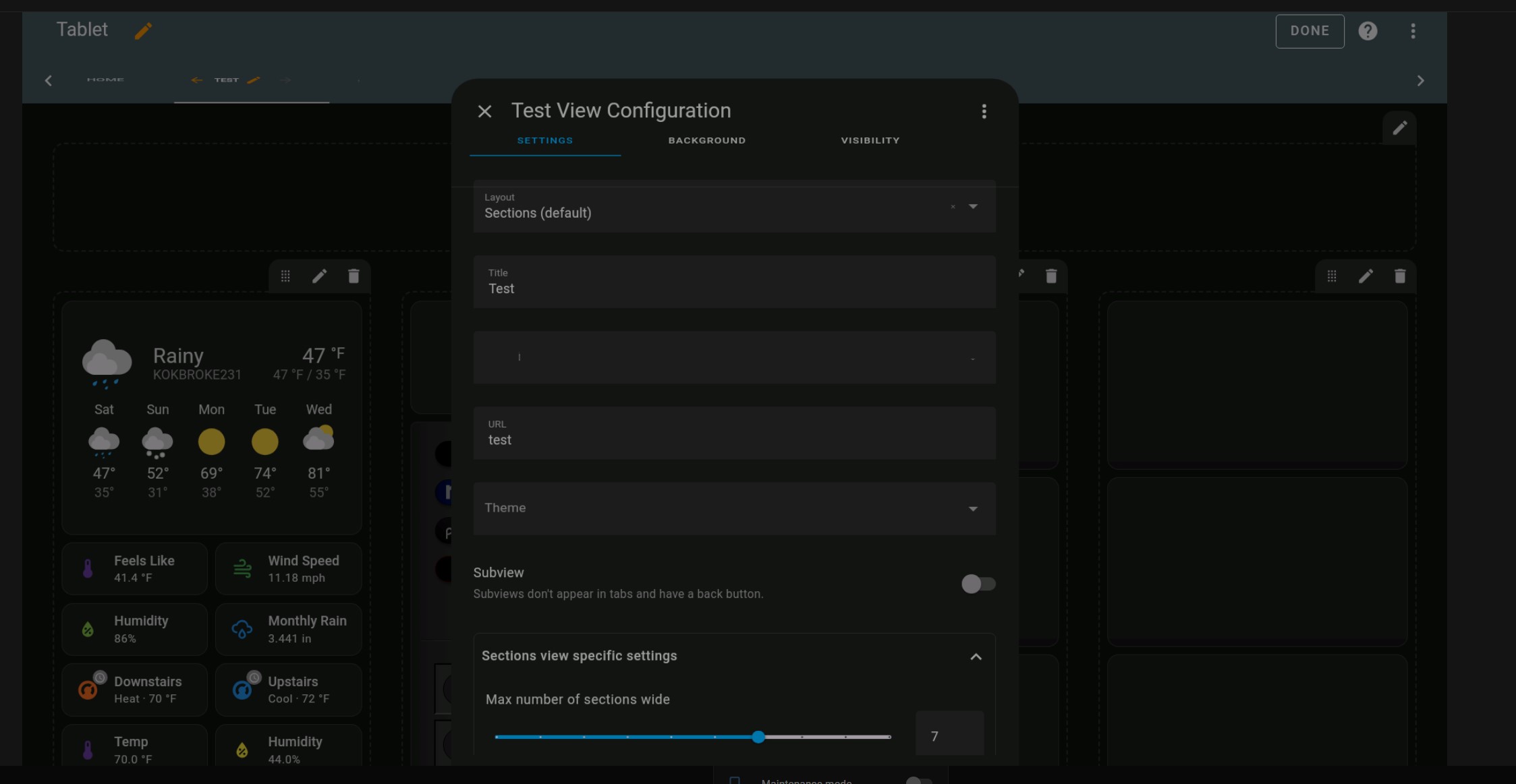
Change max number of sections wide on the view.
That doesn’t do anything. It’s set to the default of four, but only displays two.
Please share a chunk of the top portion of the dashboard code you are having issues with.
You have to add more sections.
I have a large tablet (32") and can only get 4 columns regardless of the max number of sections I set it to. I can set it to 5,6 or 7 and it will only display 4.To get around this I’ve been using the Horizontal (layout-card) setting the max column to 5 to get more columns but would like to use the Sections view eventually.
Can you post a screenshot?
Of the tablet? My computer shows the correct number of columns.
Yes from the tablet