I created another Dashboard.
My dashboard is completely responsive, so it can be used on desktop, tablets and also on the mobile app.
It has a sidebar, which is usable for current information. On small devices with a small screen (less than 1024px width) the sidebar will be automatically hidden.
The main view (the dashboard itself) is based on the default hui-masonry-view, so it’s completely configurable and every card can be add…
Another nice feature is, that the cards can be added comfortable with the help of the UI.
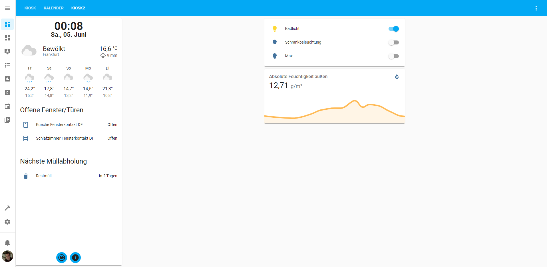
Firstly I like to present you my complete setup and layout of my setup dashboard.
But you don’t have to style the dashboard as I did. It’s completely configurable.
On desktop and tablets it can look like:

And on mobile:

My dashboard consists mainly out of two custom components which I created:
HA-Dashboard
https://github.com/wassy92x/lovelace-ha-dashboard
This plugin can be added as custom repository in HACS, but I also created a pull-request in the hacs-default-repsitories, so it will be soon available in default-HACS.
Update: Now available in HACS Default.
For configuration see my GitHub-Repository.
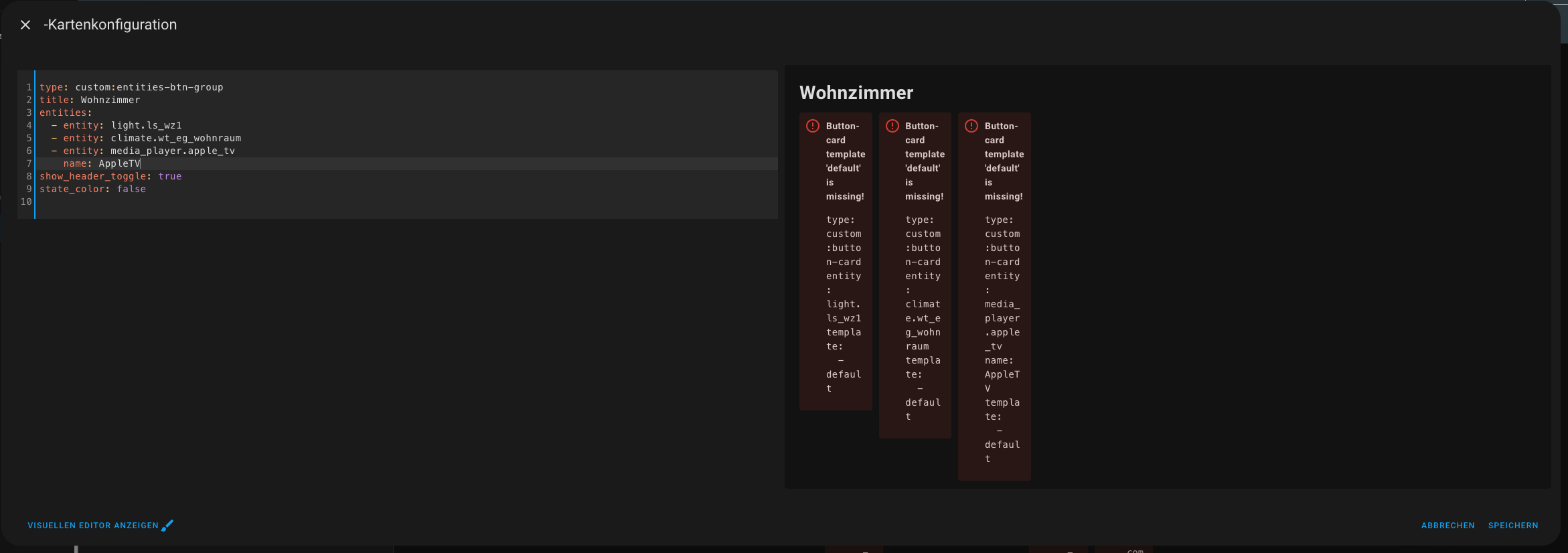
Entities-Button-Group
https://github.com/wassy92x/lovelace-entities-btn-group
This plugin can also be added as custom repository in HACS, but I also created a pull-request in the hacs-default-repsitories, so it will be soon available in default-HACS.
Update: Now available in HACS Default.
For configuration see my GitHub-Repository.
This Frontend-Plugin is also usable itslelf, without my dashboard.
Furthermore you need the following Plugings to get the dashboard as mine:
views:
- title: Kiosk
path: kiosk
type: 'custom:ha-dashboard'
sidebar:
buttons:
- icon: mdi:robot-vacuum
action:
action: call-service
service: browser_mod.popup
service_data:
title: Xiaomi Roborock
card:
buttons: true
entity: vacuum.roborock_vacuum_s5
type: 'custom:xiaomi-vacuum-card'
stickyCards:
- type: 'custom:digital-clock'
style: |
ha-card {
margin: 0 5px;
border-radius: 0;
border-bottom: 1px solid white;
}
- type: weather-forecast
entity: weather.frankfurt_openweathermap
style: |
ha-card {
padding-top: 0 !important;
padding-bottom: 0 !important;
}
cards:
- type: 'custom:auto-entities'
card:
type: entities
title: Offene Fenster/Türen
filter:
include:
- entity_id: binary_sensor.*_fensterkontakt*
state: 'on'
show_empty: false
sort:
method: entity_id
cards:
- type: 'custom:entities-btn-group'
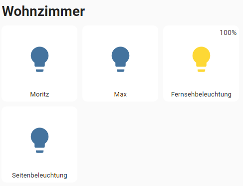
title: Wohnzimmer
entities:
- light.moritz
- entity: climate.wohnzimmer_thermostat_int0000001
variables:
curTempEntity: sensor.wohnzimmer_temperatur
- entity: media_player.firetv_wohnzimmer
name: FireTV
- type: 'custom:entities-btn-group'
title: Küche
entities:
- entity: light.esstischlampe
- entity: climate.kueche_thermostat
variables:
humidityEntity: sensor.kuche_feuchtigkeit
curTempEntity: sensor.kuche_temperatur
- entity: var.state_spulmaschine
name: Spülmaschine
- type: 'custom:entities-btn-group'
title: Außen
entities:
- entity: switch.pool_warmwasserpumpe
name: Warmwasser
- template:
- camera
variables:
pictureUrl: https://mycamera.com/weg
name: Weg
title: Kiosk
Furthermore I have the following button templates to style the buttons:
button_card_templates:
  default:
    aspect_ratio: 1/1
    styles:
      card:
        - border-radius: 10px
        - box-shadow: none
        - transition: none
      name:
        - font-size: 0.8em
  light:
    template:
      - default
    custom_fields:
      brightness: >
        [[[ if (entity && entity.attributes && entity.attributes.brightness) {
        return Math.round(entity.attributes.brightness * (100 / 255)) + '%' }
        return '' ]]]
    styles:
      custom_fields:
        brightness:
          - position: absolute
          - right: 5px
          - top: 5px
          - font-size: 0.85em
    double_tap_action:
      action: call-service
      service: browser_mod.popup
      service_data:
        title: '[[[ return entity.attributes.friendly_name ]]]'
        card:
          type: 'custom:light-entity-card'
          entity: '[[[ return entity.entity_id ]]]'
  var:
    template:
      - default
    show_state: true
    styles:
      state:
        - bottom: calc(25% - 0.4em)
        - position: absolute
        - width: 100%
        - text-align: center
        - font-size: 0.8em
        - font-weight: bold
  media_player:
    template:
      - default
    show_entity_picture: true
    styles:
      entity_picture:
        - width: 95%
        - height: 100%
        - border-radius: 5px
  climate:
    template:
      - default
    show_icon: false
    show_state: true
    show_name: false
    tap_action:
      action: call-service
      service: browser_mod.popup
      service_data:
        title: '[[[ return entity.attributes.friendly_name ]]]'
        card:
          type: 'custom:simple-thermostat'
          entity: '[[[ return entity.entity_id ]]]'
          hide:
            temperature: '[[[ return variables && variables.curTempEntity ]]]'
          sensors:
            - entity: '[[[ return variables && variables.curTempEntity ]]]'
              name: Temperatur
            - entity: '[[[ return variables && variables.humidityEntity ]]]'
              name: Feuchtigkeit
          step_size: 0.5
    custom_fields:
      curTemp: >
        [[[ if (variables && variables.curTempEntity &&
        states[variables.curTempEntity]) { return
        (Math.round(states[variables.curTempEntity].state * 10) / 10) +
        states[variables.curTempEntity].attributes.unit_of_measurement } else if
        (entity && entity.attributes) { return
        (Math.round(entity.attributes.current_temperature * 10) / 10) + '°C' }
        return '' ]]]
      targetTemp: >
        [[[ if (entity && entity.attributes) { return
        entity.attributes.temperature + '°C' } return '' ]]]
      humidity: >
        [[[ if (variables && variables.humidityEntity &&
        states[variables.humidityEntity]) { return
        (Math.round(states[variables.humidityEntity].state * 10) / 10) +
        states[variables.humidityEntity].attributes.unit_of_measurement } return
        '' ]]]
    styles:
      state:
        - bottom: 5px
        - position: absolute
        - width: 100%
        - text-align: center
        - font-size: 0.8em
      custom_fields:
        curTemp:
          - position: absolute
          - left: 0
          - top: calc(50% - 0.6em)
          - width: 100%
          - font-size: 1.2em
        targetTemp:
          - position: absolute
          - right: 5px
          - top: 5px
          - font-size: 0.85em
        humidity:
          - position: absolute
          - left: 5px
          - top: 5px
          - font-size: 0.85em
  camera:
    template:
      - default
    show_entity_picture: true
    entity_picture: '[[[ return variables.pictureUrl ]]]'
    styles:
      entity_picture:
        - width: 95%
        - height: 100%
        - border-radius: 5px
    tap_action:
      action: url
      url_path: '[[[ return variables.pictureUrl ]]]'


 and also who to use styes, as I’d like to have 3 icons on a row.