Why did someone feel the need to add borders around cards to the default theme? It totally takes away from the look of my mushroom chip cards!
4 Likes
the new “Tile” card does recreate the look and feel of the mushroom cards.
Unfortunately, there are some details, which are not working “as a replacement” or addition to existing mushroom cards:

As you can see in the Screenshot, I’ve tried to compare mushroom cards with the new tile card.
- row: Tile Card, door sensor - closed.
- row: Tile Card, using an “update” entity.
Here we can see, that the icon does not show any color…
Compared with the “Update card” from Mushroom directly below. - row: Light entity in Tile Card - to compare the icon color from the Update Entitiy…
Since Icon Color is working here, I would also expect the same for the Update entity… ?!
also, the mushroom cards use a text style which is a bit more “bolt” than the tile card… that doesn’t look well when you are using the cards together in a layout…
Design is a very sensitive thing.
I never used mushroom cards (but I really really admire the work) only because of «too rounded cards». I hate round corners (not more than 4px), round background for icons, very very hate round persons’ avatars.
It is personal…
1 Like
It isn’t Mushroom. I may look like Mushroom, smell like Mushroom, maybe it even taste like Mushroom, but it isn’t Mushroom 
As per release blog post, you might want to tune in, into the State of the Open Home on November 13th 
…/Frenck
2 Likes
The Tile Card is in its early stages. There is more to come
One is Mushroom, the other is Tile, differences are vanishingly small:

1 Like
Isn’t the mushroom card guy working for NC now ? I seem to remember some announcement like this ? Would certainly explain the mushroom-like-but-not-quite design 
I already got that “it is not mushroom” - but since Paul is now working for NabuCasa it is clear, where the design came from
And it would be nice - if we do have at least a “mushroom-alike” card, that the look and feel would match more closer to the original?
at least, what can be done:
In Mushroom Git an issue could be raised that the musroom cards to not apply to the themes font-design (regarding the bold entity status)…
Compared Mushroom / Tile Card with different themes:


2 Likes
Hi guys, I would also like to express my disappointment regarding the more info statistics graphs. No consistency and detailed information are getting lost. Please revert, there are so many other things which could be improved. I have one or two sensors which benefit from this, but this is the minority. A lot of sensor just look unsharp now:

19 Likes
Hi all!
Has anyone else had their power flow diagram fall apart after the update? Or am I the only one having this problem?

I noticed that with this release if you use the map card in a grid card that your home/device is not centered in the middle but centured at the bottom of the page.
Please reconsider the More Info change from history to statistics data by default.
I think it is great to have better access to the statistics data, but when I click for more info, I want to see the fine grained detail, especially for sensors that might change rapidly like power, voltage, (some) temperature sensors.
I want to know When something changed and often want to see how fast it changed.
If a value briefly dropped or spiked, I want to be able to easily see that. There have been times where casually glancing at More Info has alerted me to something that I didn’t know was happening. If I have to dig for it, I’d rarely find those.
The releases have been really great and over the last year or more. So thanks for all the care that has gone into them.
12 Likes
Found a bug. It’s related to a new longer name of CO2 Signal leaf in some languages such as Romanian.

Smart reloading of automations, Water usage, Gigajoule support, What a great release this is! Thanks 
please tell me:
What can you pick from the “old” history information, that you can’t pick from this statistics information?


In my opinion, the new statistics do provide a more detailed way for analysing any potential issues…
And I DO agree, that is doesn’t probably make much sense on all sensors…
But then, it could be considered, if it is required that these sensors have the state_class “measurement” or any other state_class that is writing long term statistics.
In fact, In my opinion, it does make sense to use this type of statistic on sensors that actually generating statistics with min/mean/max information.
For sensors, where I don’t want to use this, I can create templates - or, I haven’t really checked any history … at all…
The correct decission here can be pretty difficult I guess…
We are used to have the History with a clear “state changed from x to y” chart…
But on the other hand - I had to create a Dashboard with statistics card for each entity where I wanted to get such information… having that in the more information is a BIG improvement in my eyes…
What could the compromise be?
A parameter which you can use to decide what type of statistic can should be displayed?
Including both? and make it selectable?
Include a forth option into the graph for “state” - which can then be enabled or disabled?
1 Like
wtv1211’s comment is correct. It depends on the set language whether the figure falls apart or not. If I change the language to English, the graphics will be ok.
I meant with my example, that you easily can adjust Mushroom via theme.
I am getting the OS error and I am running Debian 11
Ok idk then. Submit an issue here and make sure to include your system information as per the instructions in the issue template.
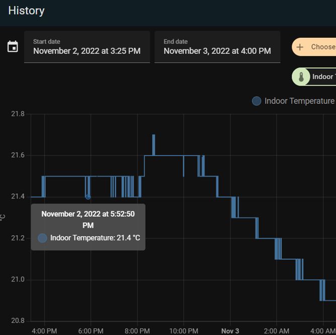
Let me explain. Stats don’t show actual value of sensor state but statistics in a period of time (in 5 minute intervals from what I can see). You don’t know what were the actual values and that is what people are asking for. Example below:

and in reality there were a few measurements in that period of time:
Personally I don’t mind but the problem is that the reason why it was implemented, to load this view faster, is not visible at all. It does not load it faster than before. I have 14 days of history in recorder and not keeping all entities there (especially I’ve dropped motion sensors from my alarm system as they were flooding the db). Using MariaDB with a stable size of 2.3 GB.
9 Likes
Again: You cannot see, when the values occur anymore. Only ± 5 minutes. And you cannot see the real value, but only min max and mean.
If you like this and are not interested in the values but want only to see smoothed graphs which gives you only a trend or impression. Fine. But why do you want to educate the other users, that they can see everything there, what is not the truth. And why would you be against an option, whaqt to show. Leave it to the user. Everyone has another use case.
I will never understand the “I like it, so no option needed, the others have to like it as well”, as in your arguments.
16 Likes