@Mattias_Persson Is there an alternative way to use the old popup for the lights? How to proceed? I think the old design suits the dashboard better than the Mushroom Cards.
1 Like
Maybe this will help you on the right track:
1 Like
Hi, was wondering if someone can assist me with garbage cards.
I am using Garbage Collection installed via HACS. For each of 3 garbage types that are collected, I created sensor which shows how many days until next pickup of that specific trash.
I was wondering if someone might help to do one small change, if any type of trash is scheduled to be taken out today, swap the colors of text and background to act same way as the current theme works in this dashboard.
Also, the other this is I can not figure out why this icon in code “delete-alert” is so much smaller than every else icon.
icons.yaml
icon_garbage_day:
  styles:
    custom_fields:
      icon:
        - width: 87%
        - margin-top: -8%
        - fill: >
            [[[
              return variables.state_on
                  ? '#616161'
                  : '#9da0a2';
            ]]]
  custom_fields:
    icon: >
      [[[
        let style = `
          <style>
            @keyframes on {
              from {
                transform: scaleY(0);
              }
              to {
                transform: scaleY(1);
              }
            }
            .on {
              animation: on 1s;
              transform-origin: -100% 46%;
              animation-fill-mode: forwards;
            }
            @keyframes off {
              from {
                transform: scaleY(1);
              }
              to {
                transform: scaleY(0);
              }
            }
            .off {
              animation: off 1s;
              transform-origin: -100% 46%;
              animation-fill-mode: forwards;
            }
          </style>
        `,
          path = `
            <path d="M 11,14L 13,14L 13,9L 11,9L 11,14 Z M 19,4L 19,6L 5,6L 5,4L 8.5,4L 9.5,3L 14.5,3L 15.5,4L 19,4 Z M 6,19L 6,7.00001L 18,7.00001L 18,19C 18,20.1 17.1,21 16,21L 8,21C 6.9,21 6,20.1 6,19 Z M 11,18L 13,18L 13,16L 11,16L 11,18 Z"/>
          `,
          gradient = `
            <linearGradient id="A" gradientUnits="userSpaceOnUse" x1="5.401" y1="34.714" x2="43.817" y2="11.74">
              <stop offset="0" stop-color="#64acb7"/>
              <stop offset="1" stop-color="#7fdbe9"/>
            </linearGradient>
          `;
        if (variables.state_on && variables.timeout < 2000) {
            return `
              <svg viewBox="0 0 50 50"> ${style} ${gradient}
                <path d="M2.9,8h44.3v29.9H2.9V8z" fill="#20262890"/>
                <path class="on" d="M2.9,8h44.3v29.9H2.9V8z" fill="url(#A)"/> ${path}
              </svg>
            `;
        }
        if (variables.state_on && variables.timeout > 2000) {
            return `
              <svg viewBox="0 0 50 50"> ${gradient}
                <path d="M2.9,8h44.3v29.9H2.9V8z" fill="#20262890"/>
                <path class="on" d="M2.9,8h44.3v29.9H2.9V8z" fill="url(#A)"/> ${path}
              </svg>
            `;
        }
        if (variables.state === 'off' && variables.timeout < 2000) {
            return `
              <svg viewBox="0 0 50 50"> ${style} ${gradient}
                <path class="off" d="M2.9,8h44.3v29.9H2.9V8z" fill="url(#A)"/> ${path}
              </svg>
            `;
        } else {
            return `
              <svg viewBox="0 0 50 50"> ${style}
                ${path}
              </svg>
            `;
        }
      ]]]
configuration.yaml
     - type: grid
        title: Notifikacije
        view_layout:
          grid-area: notifikacije
        columns: 2
        cards:
          - type: custom:button-card
            entity: sensor.smece2022
            name: MKO
            state_display: >
              [[[
                if (variables.state === '0') {
                    return 'Today';
                }
                if (variables.state === '1') {
                    return 'Tomorrow';
                }
                else return 'In' + variables.state + ' days';
              ]]]
            template:
              - base
              - icon_garbage_day

          - type: custom:button-card
            entity: sensor.smecepapir2022
            name: Plastika
            icon: mdi:trash-can-outline
            state_display: >
              [[[
                if (variables.state === '0') {
                    return 'Today';
                }
                if (variables.state === '1') {
                    return 'Tomorrow';
                }
                else return 'In ' + variables.state + ' days';
              ]]]
            template:
              - base
              - icon_garbage_day

          - type: custom:button-card
            entity: sensor.smecetetrapak2022
            name: Tetrapak
            state_display: >
              [[[
                if (variables.state === '0') {
                    return 'Today';
                }
                if (variables.state === '1') {
                    return 'Tomorrow';
                }
                else return 'In ' + variables.state + ' days';
              ]]]
            template:
              - base
              - icon_garbage_day

1 Like
I’m thinking one of these
-
the sensors you’ve created, change
'0'to'on'instead -
add styles manually
same viewbox?
You need to call frontend.reload_themes
See my post above about creating custom icons, A different take on designing a Lovelace UI - #3799 by masoncrawford1994, there is a section about scaling the icons that should help next time.
This is the path scaled with the above steps
M23.13 28.74 26.87 28.74 26.87 19.39 23.13 19.39 23.13 28.74ZM38.09 10.04 38.09 13.78 11.91 13.78 11.91 10.04 18.455 10.04 20.325 8.17 29.675 8.17 31.545 10.04 38.09 10.04ZM13.78 38.09 13.78 15.65 36.22 15.65 36.22 38.09C36.22 40.147 34.537 41.83 32.48 41.83L17.52 41.83C15.463 41.83 13.78 40.147 13.78 38.09ZM23.13 36.22 26.87 36.22 26.87 32.48 23.13 32.48 23.13 36.22Z
you also have the option to override the state_on
you could add
variables:
    state_on: >
        [[[ return (!entity || entity.state !== -1) ? entity.state === 0 : false  ]]]
like so
     - type: grid
        title: Notifikacije
        view_layout:
          grid-area: notifikacije
        columns: 2
        cards:
          - type: custom:button-card
            entity: sensor.smece2022
            name: MKO
            state_display: >
              [[[
                if (variables.state === '0') {
                    return 'Today';
                }
                if (variables.state === '1') {
                    return 'Tomorrow';
                }
                else return 'In' + variables.state + ' days';
              ]]]
            variables:
               state_on: >
                  [[[ return (!entity || entity.state !== -1) ? entity.state === 0 : false  ]]]
            template:
              - base
              - icon_garbage_day
2 Likes
Nice, I think you forgot variables:
1 Like
dam, I was wondering why my tabs didn’t line up when I added the code in.
fixed it thanks
Great, now working as I wanted it to. Thanks @Mattias_Persson and @masoncrawford1994

@Mattias_Persson just one more quick question about the Media tab and conditional_media, how does the ocnfiguration of sensor.youtube_watching look like?
I have a media player active, but for the main display it is still showing from plex recently added. I guess I need to add this sensor.youtube_watching.
Does this swap my active media player into the front page and shows what is active on it, i.e. TiviMate in my example?


Nah, that’s just to get the thumbnail matt8707/youtube-watching.
“conditional media” is here /packages/tv_media.yaml#L49-L94
Somehow, even with the --custom-button-card-border-radius or --button-card-border-radius had the border issue. Any idea what it could be?
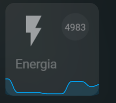
          - type: custom:button-card
            entity: sensor.yidjcev0q3_output_power
            name: Energia
            state_display: >
              [[[ return ' '; ]]]
            template:
              - base
              - circle
            custom_fields:
              icon: >
                <ha-icon icon="mdi:flash" style="color: #9da0a2;"></ha-icon>
              circle: >
                [[[
                  if (entity) {
                    return `
                      <svg viewBox="0 0 50 50">
                        <circle cx="25" cy="25" r="20.5" stroke="none" stroke-width="1.5" fill="rgba(255,255,255,0.04)" />
                        <text x="50%" y="54%" fill="#8d8e90" font-size="14" text-anchor="middle" alignment-baseline="middle" dominant-baseline="middle">${parseInt(entity.state)}</text>
                      </svg>
                    `;
                  }
                ]]]
              graph:
                card:
                  type: custom:mini-graph-card
                  entities:
                    - sensor.yidjcev0q3_output_power
                  show:
                    icon: false
                    name: false
                    state: false
                  line_color: var(--info-color)
                  hours_to_show: 1
                  points_per_hour: 20
              push_graph: >
                [[[
                  setTimeout(() => {
                    let elt = this.shadowRoot,
                      card = elt.getElementById('card'),
                      container = elt.getElementById('container'),
                      graph = elt.getElementById('graph');

                    if (elt && card && container && graph) {
                      card.insertBefore(graph, container);
                    }
                  }, 0);
                  return null;
                ]]]
            styles:
              custom_fields:
                graph:
                  - position: absolute
                  - width: 100%
                  - clip-path: inset(0 round var(--button-card-border-radius))
                  - left: 0
                  - bottom: 0
try this
clip-path: inset(0 round calc( var(--button-card-border-radius) - 0.1vw ))
This is from #ripple, .js-tilt-glare { might be something to do with tilt, but this might result in it being to small when tilt is off unless you add come custom css
Didn`t work. Actually, doenst seens to have any effect.
Sure but this was tested on sensor card, you’re using custom:mini-graph-card
1 Like
Yeah. I’ll keep trying to solve this, i need the mini-graph-card because his configurations settings and options.
Is it possible to update your github with more of the configs?
For example the popup/media_controls.yaml or /local/images/ATVPlus_bg.jpg, etc…
Updated my repo with some images and changes to template.yaml.
Will add some more this week, if I get a chance.
Feel free to send me a DM so we’re not flooding Mattias’s thread with unnecessary replies. 
1 Like