Looking forward to Chapter 2, hopefully soon. 
2 Likes
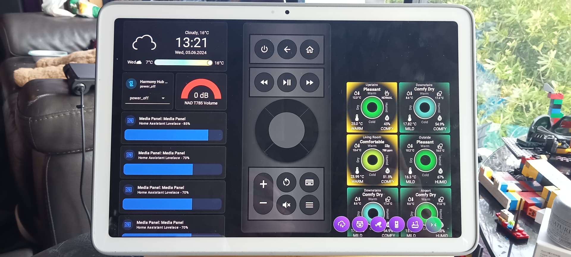
I have several cards optionally hidden using conditions in the Visibility tab within a section. However, when hidden, all sections move up, creating an unpredictable layout. I ended up creating fewer sections with a vertical stack and hiding the cards with a conditional card, but I wonder if there’s a better way. Has anyone tackled this problem?
Those are emoji. You can insert them using whatever emoji panel is native to your device:
- on mobile devices, there is usually a smiley face icon on the keyboard
- on Windows, you can press Windows + .
- on Mac, you can press Command + Ctrl + Space
Linux shortcuts will likely vary depending on the operating system and what picker you have installed; on my Ubuntu machine, I use the program Emote, the shortcut for which is Ctrl + Alt + E.
Additionally, you could browse a list of emoji like this one in a browser and copy the emoji you want; however, compared to your system’s native emoji picker, that’s extra steps.
Just starting to experiment with the sections view. It looks promising.
Some functions I have found to be missing so far:
- The ability to duplicate a section.
- The ability to edit the section YAML without editting the entire dashboard YAML.
This is the reason why i dont use this view and stick to masonry. Have they created a solution to fix the space between columns yet?
It is possible by tweaking the theme:
https://community.home-assistant.io/t/customize-gap-between-new-sections-dashboard-layout/701480/5
Love all the work going into the frontend lately!
Big thanks to all involved!
Looking forward to the grid layout. Has anybody seen any announcements on when it will drop?
Isn’t that the grid layout which is a future feature currently under development?
The sections view is the grid layout. However, in practice it only looks like a grid if you limit cards to a few types (mostly the tile cards). Most of the older cards have height that doesn’t fit exactly in the grid.
Is this a bug in the new dashboarding?
I have a Timer added to the dashboard. I want to see how much time is remaining. I have it configured like this but it shows just the default duration of the timer and does not count down in the ui.
I’m thinking this 0:07:00 should be 0:04:16


HA Front-end Devs,
Is there a way to hide the display of the CONFIG and VISIBILITY options tab choices for a configuration editor that uses the <ha-form> control? I am using the <ha-form> control in a configuration editor dialog that allows the user to edit settings for the card. The CONFIG and VISIBILITY options menu is not needed during card configuration editing. This appears for both Masonry and Panel (1 card) dashbaord definitions.
Note that this just started appearing recently, I believe with the 2024.5.x (or 2024.6.x) release.
Figure 1 - Configuration Editor Form

Figure 2 - Parent Dashboard Definition

Thanks
This is the new feature in 2024.6. It allows users to set up conditions that must be met for the card to be shown in the dashboard, without the need to put the card inside a conditional card. This is available in the visibility tab while the config tab is what we had before. Why would your want to remove this feature?
No, I don’t think so. The OP reads like there is a section view (currently released as experimental) and there will be a grid view which is currently in closed testing.
The section view is definitely not a grid layout. It is merely an automatic line breaking, i.e. sections.
The quoted screen literally shows the sections view with some colours overlayed on it to show the grid.
Also see this part of the post:
This is already in there, those are the few cards I meant that do work as a grid in the sections view.
I don’t want to remove it per-se, I just want it to look like it was before. It’s taking up valuable real-estate on the form.
In doing some global searches, I ran across a showVisibilityTab in the hui-card-element-editor.ts module which seems like it might be able to control the visibility, but I have no idea where to set that in my card source. I am pretty new to designing custom cards (my first actually), and documentation is sparse.
In my card, I do the following to invoke the editor:
  public static getConfigElement() {
    return document.createElement('stpc-editor');
  }
my editor form render code looks like this:
  protected render(): TemplateResult {
    return html`
      <ha-form
        .data=${this.data || this.config}
        .schema=${this.schema}
        .computeLabel=${formatLabel}
        .hass=${this.hass}
        @value-changed=${this.changed || this.OnValueChanged}
      ></ha-form>
    `;
  }
Chrome dev tools shows the following element structure - not sure where the hui-card-element-editor or paper-tabs gets generated from - I have no references to those in my card source code.

At the end of the day, I just want my card editor form to look like it was prior to the 2024.6 update.
Another alternative would be to add a CSS selector that sets a display: none style on the paper-tabs element to hide the tabs. Like so:

Just not sure how to craft the selector or where to put it in my code. All of these shadow roots are driving me bonkers!
I’m also trying to get rid of some padding between <ha-form> auto-generated input fields (e.g. ha-selector, ha-form-string, etc), but that is another problem.
Designing custom cards for HA is hard! LOL
I may be wrong but I hope not.
I thought that everything is arranged in a grid. And to use this grid there will be a sections view and a grid view selectable. The sections view will automatically display the cards with a defined amount of columns and then perform an automotic line break. The grid view will let the user actually define where and how to place a card.
Essentially what Thomas Loven has created already, but now finally implemented into HA.
The sections view is cool and all, but it does not really allow the user to layout himself properly. It just helps create some grouping.
Just to be clear, I’m not a developer, I’m just writing this as a user.
I’m not sure if you understood what I was trying to say, if you did, then just ignore me.
This visibility thing is supposed to show up in the card configuration window, it’s the only place it’s shown. It’s a different thing than the visibility tab in the edit view page or in the edit section window. It was introduced here:
And as far as I understand, it’s supposed to be shown for all cards (or at least all that support visual editor). If you remove it from your card, you are removing this feature, there’s no other way to access it.
1 Like
When I CAST to a nest hub the gap shows up. The gap does not show up but not on the HOME ASSISTANT APP or a BROWSER. I have a pixel tablet hub as well, same behavior cast gap is there, app displays as it should.
While Casting to Google Pixel Tablet Conditional Conditional cards ON, pushes the cards down as it should

While Casting to Google Pixel Tablet. When the conditional cards are OFF, there is a gap showing, seems to default to one grid height each.
Using the Home Assistant App on a Google Pixel Tablet. Shows how it should. Conditional cards disappear completely.
