Can you provide a little more context to where you screen scraped the pic from? Looks like a custom:slider-button-card
It’s just the ‘tile’ card afaik
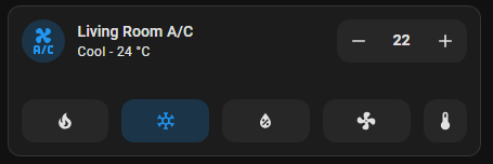
I found this in the first post.

If it’s Default Theme And a Native card(without card_mod), it’s not a tile-card !
( Unless it’s somehow vertical-align-left, With background color )
It is a concept that is work in progress. ![]()
2 Likes
I recently noticed that you can drag-and-drop cards without entering the Edit mode. I can’t reproduce it every time.
2024.4.3, Firefox
Here is my idea: what if we could drag-and-drop cards without entering the Edit mode when pressing some shift/alt/ctrl key?
Hi
I want to use the new section view type with only 1 column (I know I could use the panel type as well). But when using only 1 column is there a way to use the the entire width of the screen? I want to make the 1 columm much wider than on my pasted screenshot

3 Likes
I just did a quick test using this code on a Tile card… kinda helps but the card doesn’t get put in the middle of the page.
type: tile
entity: sensor.week_day
layout_options:
  grid_columns: 120

Not sure if there is a proper way to fix this.
At the moment , a section has a fixed max width of 4 columns.
So no solution for now.
I noticed that a blank space appears when the entity-filter card has no entities to display. Does anyone have an idea on how to solve that?

Great addition ! As far as I am concerned this is a VERY welcome new feature.
I’ve noticed a problem if anyone cares to figure it out. ![]()
(OBVIOUSLY KNOWING this is a work in progress).
When I set a graph card to a 4 column grid, the number is cropped probably by the graph layer over it if that makes sense:

Moreover, I would like to make a suggestion !!
It would be nice to be able to set Thermostat / Climate cards that are two or even 3 rows, and have separate controls on each row. For example, temp controls, presets, and modes.
This is what you can do now:

And this is how I would like to set up mine for example:
(ignore the Temperature button on the second row, it’s a prt-scr from the current card)
So Temperature AND HVAC Modes are always present.
You can probably do something exactly like this now, by utilizing a vertical-stack, and having the thermostat on top and buttons for whatever you like on a card bellow. Or one could use the normal thermostat card, and four 1-column buttons. But still, I think this would be good to have !!
Anyway, thanks for the awesome work. <3
This may be a silly question, but why can’t I Drag n Drop? Do I need a special add-on installed? I thought it was announced as available?
Or is it still in beta?
Tried to find more info, but couldn’t
It only works on views with view type Sections (experimental)
1 Like
This section view is great for what I need. Only issue I have is that sometimes not all the cards shows up on first load. I have to click on another dashboard and back to reload. Anyone experience this issue?
Image (not all cards are loaded)

Image (when all cards loaded)

This is fantastic. I was never happy with the look of my dashboards whatever I tried. Now I ignored the warning and converted all my dashboards. Great job again HA.
And, of course I find something that sits not quite right. My PC shows 4 columns, my tablet shows 3 columns, my car shows 2 columns, and my phone shows 1 column1. That makes sense. But I can’t get any design to work in a satisfying way with the Z-grid re-arrangement. I read the article and agree, the Z-grid is the best in the comparison, but I’m missing the N-grid option. That would do it for me. My brain works in columns left to right. Why was this not considered?
I have tried several work arounds (like keep one section per column), but started making separate 1,2,3 and 4 column dashboards
2 Likes
Hi, the sections fetaure is great.
How can i begin with 2 columns an lower 1 column over the complete section ?

Great work!
I do not know whether this is mentioned above (did not find the time to read all replies to the blog): working with the sections in the GUI is perfect. What I am missing creating my cards using the GUI, is being able to copy and paste a whole section like you can with cards. Only seem to be able to copy and paste each individual card of a section to a new section.
5 Likes
Is there any documentation yet, so people could find out what CSS and classes/id’s are being used for the improved dashboard and cards?
A good (or better) UI starts with consistency…
Consistency is key here, and HA is currently a mess when we have a look at the UI and all the random padding/margin/font-sizes inside HA itself, but also all the different cards.
In an ideal world these should be standardized, with the possibility to override the defaults using your (own custom) theme(s).
1 Like
I agree. HA really could use a well definied style guide (if there is any documentation on that already, I haven’t seen it).
It’s not just fonts and margins. The most irritating to me is that the tiles cards use gray for entity state off, not dark blue like older cards. And gray is used for unavailable entities in the older cards.
In general tile cards have jarringly different style. I’m guessing it’s meant to complety replace some of the old cards (at least the entity one), as in the official screenshots it’s never used together with them.
It would be really nice to get some clarification to know what to look for in the future. Are the older cards going to be updated to make them more in line with the tiles cards?