vaidyasr
June 20, 2021, 4:00am
1080
I am not able to see the values at the end of the column chart. Any issue in my config?
type: custom:apexcharts-card
apex_config:
  stroke:
    show: true
    width: 1
    curve: smooth
  legend:
    show: true
  dataLabels:
    enabled: true
graph_span: 24h
header:
  show: true
  title: Today's Energy Usage
  standard_format: true
series:
  - entity: sensor.daily_energy_usage
    type: column
    name: Power Usage
    group_by:
      func: avg
      duration: 2h
For that to happen data points needs to be aligned, so you need to use group_by and set the same duration for both series.
float_precision: 3
What do you mean by “see the values at the end of the column chart”?
vaidyasr
June 21, 2021, 4:31am
1082
@RomRider like the above image.
1 Like
Datalabels is an option available in the card configuration thus overriding what you have in apex_config
series:
  - entity: sensor.daily_energy_usage
    type: column
    name: Power Usage
    group_by:
      func: avg
      duration: 2h
    show:
      datalabels: true
1 Like
Wow! Absolutely amazing plugin!!!
One question, how do I remove this bottom label when hovering?
mamoel
June 22, 2021, 1:20pm
1085
I really love the ApexCharts card. Amazing job!
I hope it will be integrated soon as an “official” Lovelace element.
2 Likes
Here you go:
apex_config:
xaxis:
tooltip:
  enabled: false
2 Likes
I don’t think that is ever going to happen
5 Likes
I hope it is, it’s insanely superior to ChartJS which is used by Lovelace now.
That did the trick, thank you!
Hi, just discovered this amazing card, thanks for making it!
I am trying to compare the energy consumption (here we have three different tariffs) of the current day (or week) and the current month.
Is there some way to have two (or more) concentric donut charts? (paintbrushed image attached)
tfmeier
June 23, 2021, 11:52pm
1092
I have the following code
type: 'custom:apexcharts-card'
header:
  show: true
  title: Humidity Trend Ensuite
  show_states: false
  colorize_states: true
graph_span: 24h
series:
  - entity: sensor.tmr01_htu21_humidity_ensuite
    name: HTU21
    type: line
    stroke_width: 2
  - entity: sensor.ensuite_humidity
    name: Xiaomi
    type: line
    stroke_width: 1
  - entity: switch.deta01_fan_ensuite
    transform: 'return x == ''on'' ? 1 : 0;'
    type: area
    curve: stepline
    stroke_width: 0
apex_config:
  yaxis:
    - show: true
      decimalsInFloat: 0
    - show: false
      decimalsInFloat: 0
      min: 0
      max: 1
      tickAmount: 1
  chart:
    width: 100%
    height: 313
This is a test to compare two humidity sensors. sensor.ensuite_humidity data comes in via MQTT and I see on MQTT.fx that data is submitted every 5 mins (Tasmota). I also see the correct humidity on the graph footer but can’t see the graph itself.
When I create a std sensor with entity sensor.ensuite_humidity in lovelace I see the graph.
Any idea why this is not plotting on ApexCharts?
hajo62
June 24, 2021, 7:36am
1093
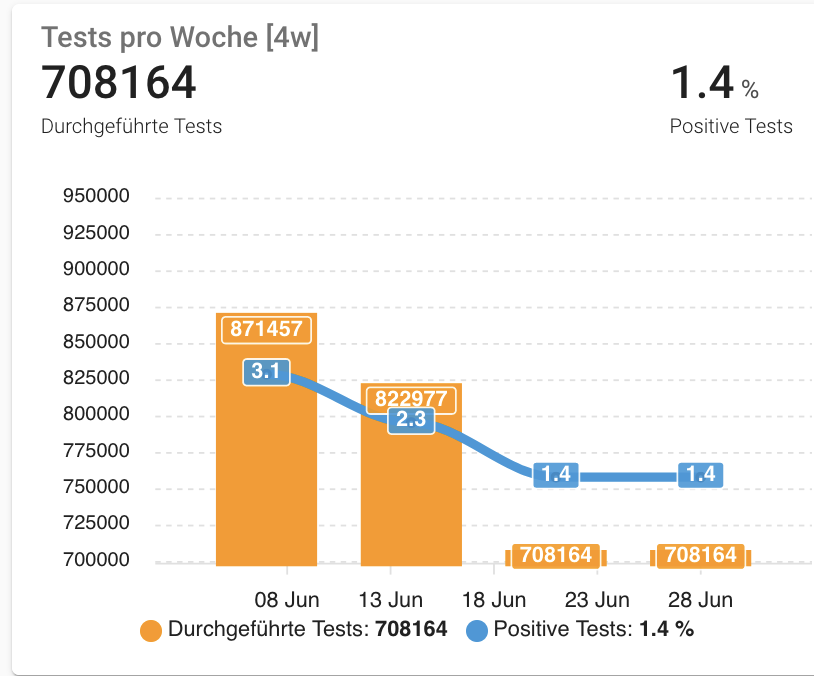
The total covid test sensor gives the number of tests done in a week and changes every Wednesday afternoon. I wonder how I could display the sensor with bars for the last 4 week. My history includes the last 32 days.
type: custom:apexcharts-card
graph_span: 28d
update_interval: 1h
span:
  start: isoWeek
  offset: '-21d'
header:
  show: true
  title: Tests pro Woche [4w]
  show_states: true
apex_config:
  markers:
    size: 2
    colors: white
    strokeColors: black
    strokeWidth: 2
    hover:
      size: 7
  tooltip:
    x:
      format: ddd dd MMM
  yaxis:
    - id: first
      show: true
      forecNiceScale: true
      decimalsInFloat: 0
      opposite: false
      min: 700000
      max: 950000
    - id: second
      show: false
      tickAmount: 2
      decimalsInFloat: 0
      title:
        text: Thumbnails
      opposite: true
series:
  - entity: sensor.rki_covid_germany_tests_performedtests
    name: Durchgeführte Tests
    yaxis_id: first
    type: column
    group_by:
      func: last
      duration: 1w
    show:
      datalabels: true
  - entity: sensor.rki_covid_germany_tests_positivityrate
    name: Positive Tests
    yaxis_id: second
    type: line
    unit: '%'
    group_by:
      func: last
      duration: 1w
    show:
      datalabels: true
    extend_to_end: false
With that, a Friday’s result is what I expect. But on a Monday it looks like the right screenshot…
Hello all, quick question. I use one chart that has a mix of Area and line. When I use a gradient on the Area, the stroke width for the line isn’t honored.
If I remove the gradient then the stroke shows up on the line graph. Is there a setting I can use so that the opacity of the gradient doesnt affect the line graph?
The blue is area and the red is the line graph.
tfmeier
June 29, 2021, 5:46am
1095
Any ideas on this? The data does flow into Home Assistant but it just doesn’t plot on ApexCharts. As mentioned when I create a std sensor with entity sensor.ensuite_humidity in lovelace (created via the mqtt platform) I see the graph.
You have 3 series and 2 yaxis, probably the reason.
I’m not sure I understand the problem (that is my understanding):
Chart 1: 4 weeks displayed, from Monday 1st of June to Sunday 27th of June
Chart 2: 4 weeks displayed, from Monday 8th of June to Sunday 4th of July:
The current day being a Monday, it just takes the last value of the sensor (from the previous week) and use that for the current week
Since I don’t know what your data looks like, it’s hard to tell if something’s really wrong.
Without your config, it’s going to be hard to help
@RomRider here, is my config
type: custom:apexcharts-card
header:
  title: Tank Percent
  show: true
  show_states: true
show:
  loading: true
graph_span: 24h
apex_config:
  yaxis:
    - id: first
      max: 90
      min: 0
      forceNiceScale: true
      decimalsInFloat: 0
      opposite: false
    - id: second
      max: 60
      min: 0
      forceNiceScale: true
      decimalsInFloat: 0
      opposite: true
  xaxis:
    axisBorder:
      show: false
    labels:
      style:
        fontSize: 10px
        fontFamily: Segoe UI Light
  chart:
    height: 315
  grid:
    show: false
    borderColor: '#404040'
    strokeDashArray: 3
    position: back
  legend:
    show: false
  dataLabels:
    enabled: false
  fill:
    type: gradient
    gradient:
      type: vertical
      shadeIntensity: 0.8
      inverseColors: false
      opacityFrom: 0.6
      opacityTo: 0
      stops:
        - 0
series:
  - entity: sensor.400_gal_water_tank_level
    yaxis_id: first
    name: 400 gal Tanks
    type: area
    color: 2eb9ff
    stroke_width: 1
    group_by:
      func: avg
      duration: 5min
    float_precision: 0
    show:
      extremas: true
  - entity: sensor.wasa_line_pressure
    yaxis_id: second
    name: WASA Line Pressure
    type: line
    color: ff2e51
    stroke_width: 2
    group_by:
      func: avg
      duration: 5min
    float_precision: 0
    show:
      extremas: true
now:
  show: false
  color: 2eb9ff
  label: Now
style: |
  ha-card {
     --ha-card-background: rgba(0, 0, 0, 0);
     box-shadow: none;
     margin: 8px 0px 28px 8px;
     font-size: 15px;
     font-family: Segoe UI Light;
   }
   div#header__title {
     font-size: 10px;
   }
I may be off here but it seems you have duplicate entries here?
  yaxis:
    - show: true
      decimalsInFloat: 0
    - show: false
      decimalsInFloat: 0