ApexCharts card - A highly customizable graph card

I can’t remove decimals (round up the value) for some reason. Tried to use abs() in transform didn’t work.

series:
  - entity: sensor.nbg6616_netout
    unit: kB/s
    transform: return (x/-8);
    name: Wifi Download
    color: '#0000ff'
  • my speed is reported by netdata from my router and returns kilobits, with negative values. So I turn it into kiloBytes and negate the value, hence *-8…
    How to remove decimals from results?

Can someone advise on how to combine the following:

span:
  end: day
span:
  start: month

WIthout end: day I don’t get the correct results but wthout start: month the graph doesn’t start on the first day of the month.

Please advise because I’m lost now :slight_smile:

Edit: I’m using a Utility Meter with setting cycle: daily.

Why does the chart keep summing data from the previous day?

The green bar, consumed energy from panels, should have been reset when a new day started and yet it create a weird sum of doubling the previous day (3.4 + 3.4 + the state value right now)

And the sensor:
image

Any ideas?

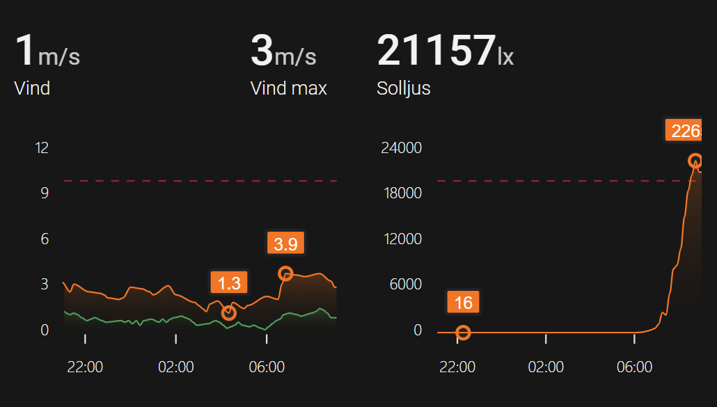
Has anyone been able to create something like this? Basically vertical bars filling up / down. Kind of like a radial bar but displayed as a standing vertical bar that fills up to a maximum value. The first one below shows the utilization of a sensor (15,8 A used out of maximum 20 A).

Might be easier to achieve with custom bar card than with apex charts.

1 Like

Thanks, never thought of that. Found a nice one.

I have an input_text helper which i use to track history of mileage between EV charges, this is tracked in the history of the helper.

This helper doesnt update daily so it can stay the same value for various amounts of time before changing. I am wanting to display on a graph where each column represents the value of mileage but it is only displayed when the value is changed.

Currently if i group by 1d i can get multiple columns the same. Is this achievable?

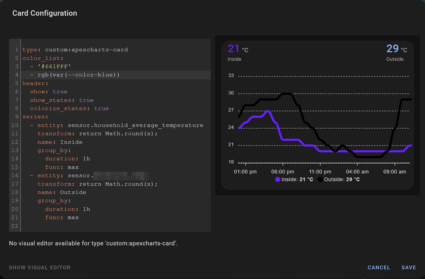
I’d like to specify some CSS variables in the color_list section. This seems to work for the colourised header state, but results in a black colour in the graph itself and the legend. This seems like it may be an issue with the card but I wanted to check in case I’m missing something.

type: custom:apexcharts-card
color_list:
  - '#661FFF'
  - rgb(var(--color-blue))
header:
  show: true
  show_states: true
  colorize_states: true
series:
  - entity: sensor.household_average_temperature
    transform: return Math.round(x);
    name: Inside
    group_by:
      duration: 1h
      func: max
  - entity: sensor.<city-name>_temp
    transform: return Math.round(x);
    name: Outside
    group_by:
      duration: 1h
      func: max

Hi all thanks for these charts @RomRider
I’ve created these 2 charts but for some reason it misses the label on the first day on the first column.
Can anyone tell me what I need to change to add it.
Thanks.
Here’s my code…

type: custom:apexcharts-card
experimental:
  color_threshold: true
update_interval: 5min
apex_config:
  xaxis:
    labels:
      format: ddd
  stroke:
    show: true
    width: 2
    curve: smooth
  chart:
    height: 140%
  legend:
    show: true
    showForSingleSeries: true
    horizontalAlign: right
    position: top
  dataLabels:
    offsetY: 2
    style:
      fontSize: 12px
    enabled: true
    background:
      enabled: true
      borderColor: '#fff'
      borderWidth: 2
      borderRadius: 2
      opacity: 0.7
      foreColor: '#ccccff'
      dropShadow:
        enabled: true
        top: 2
        left: 2
        blur: 1
        color: '#000000'
        opacity: 0.5
  fill:
    type: gradient
    gradient:
      type: horizontal
      shadeIntensity: 0.1
      opacityFrom: 0.25
      opacityTo: 1
      inverseColors: true
      stops:
        - 0
        - 90
        - 100
graph_span: 1w
span:
  end: day
header:
  show: true
  title: Daily Energy
series:
  - entity: sensor.daily_energy
    color: rgb(138,43,226)
    type: column
    show:
      datalabels: true
    group_by:
      func: last
      duration: 24h
    unit: kWh

3 Likes

Hi All

i have now this chart running. But i want to exclude the red line from the “fill” function. how can i do this?

this is the code

  - icon: mdi:solar-power
    cards:
    - type: 'custom:apexcharts-card'
      graph_span: 3h
      header:
        show: true
        title: PV Anlage
        show_states: true
        colorize_states: true
      series:
        - entity: sensor.kostal_pv_to_battery_power
          name: Batterie laden
          color: '#ff444f'
          opacity: 0
        - entity: sensor.kostal_home_power_from_grid
          name: Netzbezug
          color: '#00b4fb'

      all_series_config:
        type: area
        curve: smooth
        stroke_width: 1
        show:
          extremas: true
        group_by:
          func: avg
          duration: 5m
      apex_config:
        fill:
          type:
            - gradient
          gradient:
            type: vertical
            opacityFrom: 0.6
            opacityTo: 0.1
        tooltip:
          x:
            format: 'HH:mm'

Thanks for the reply regarding header size. It seems the Apexchart is not responsive to the header style options I found in another thread 🔹 Card-mod - Add css styles to any lovelace card - #1867 by Ildar_Gabdullin

The goal is to reduce the header size, I tested color below copy-pasted from another thread just to see if it is responsive. If you can write out the code to decrease header size that would be helpful :slight_smile:

Option 1: doesn’t do anything

style: |
  ha-card {--ha-card-header-color: green;}  

Option 2: doesn’t do anything

style: |
  .card-header {
    background-color: green;
  }  

Hi all.
I have graph that shows electricity prices from nordpool component.

image

Is it somehow possible to get horizontal line that will always be at constant value. Like for example line that always will be 0.140 like this:

image

type: custom:apexcharts-card
experimental:
  color_threshold: true
graph_span: 24h
header:
  title: Electricity Price Today
  show: true
span:
  start: day
now:
  show: true
  label: Now
series:
  - entity: sensor.nordpool_kwh_lv_eur_4_10_0
    type: column
    show:
      extremas: true
    float_precision: 3
    data_generator: |
      return entity.attributes.raw_today.map((start, index) => {
        return [new Date(start["start"]).getTime(), entity.attributes.raw_today[index]["value"]];
      });
    color_threshold:
      - value: 0
        color: rgba(19, 120, 22, 0.8)
      - value: 0.1
        color: rgba(138, 177, 0, 0.92)
        opacity: 1
      - value: 0.15
        color: rgba(198, 114, 0, 0.92)
      - value: 0.188
        color: rgba(200, 0, 0, 0.5)
      - value: 0.25
        color: rgba(140, 0, 72, 0.8)
      - value: 0.35
        color: rgba(0, 0, 0, 0.8)
apex_config:
  yaxis:
    - title:
        text: c/kwh
      decimalsInFloat: 3
  chart:
    height: 200px

1 Like

Yes, I have it to show a threshold line for when the outdoor sun covers should be retracted.

apex_config:
    yaxis:
      - 'y': 10
        strokeDashArray: 5
        borderColor: '#962626'
        borderWidth: 1

Thanks, but looks like my configuration is too specific.

  - 'y': 0.140

sadly does not show anything :frowning:

Looks like some code is missing from my post, please try the following:

apex_config:
  annotations:
    position: back
    yaxis:
      - 'y': 10
        strokeDashArray: 5
        borderColor: '#962626'
        borderWidth: 1
2 Likes

This is awesome, Thank You very much!

Does anyone know what the status on “Long Term Statistics” is? I understand it has been discussed? I would really like to have that implemented since that would allow me to show electricity consumption over a longer period of time via the build in functionality.

1 Like

Is there any way to use the usual ‘column’ type as a rangeBar type with timeline data (specifically the electricity price for today and tomorrow)? What I’m trying to produce is bars not centered atop ‘08:00’, for example, but that sit between ‘08:00’ and ‘09:00’. With the ‘now’ label as guide for the eye, it looks like the price changes 07:30 and 08:30 and so on.
Perhaps some offset for the axis?

Or is there an easy way to offset the ‘now’ label? I’ve not found this, neither have I been able to produce a xaxis annotation, even though an yaxis annotation works fine.

1 Like

I’m going to test and merge the PR next week, sorry I’ve been super busy lately.

1 Like

I think I read someone having this issue with the extremas background rectangle but can’t find the post. Does anyone know how to fix it?