ApexCharts card - A highly customizable graph card

I had to create a new “rounded” sensor of the original one to use in the Lovelace frontend. The “round(0)” at the end can be changed to (2) if you want two decimals.
Maybe the same approach is needed in your case?

- platform: template
  sensors:
    energy_current_consumption_rounded:
      friendly_name: "Energy - Current consumption rounded"
      unit_of_measurement: "W"
      icon_template: mdi:flash-outline
      value_template: >-
        {{ (states('sensor.energy_current_consumption')|float)|round(0) }}

so glad I see this… having an issue in core history and even mini-graph-card, where I need to fill the graph relative to the x-axis… yours is the first I see doing that.

Would you be able to throw me the config settings for that please.

I cant get it that even though it is such a ‘default’ need, we would need to card-mod our way to it.

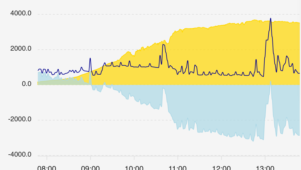
this is my bare/base apexchart I tried (which isnt very nice to my HA instance, but thats another matter)

  - type: custom:apexcharts-card
    header:
      title: Gebruik actueel per uur
    update_interval: 30sec
    all_series_config:
      stroke_width: 1
      curve: smooth
    graph_span: 12h
    series:
      - entity: sensor.zp_actuele_opbrengst
        color: gold
      - entity: sensor.calculated_bruto_verbruik
        color: darkblue
      - entity: sensor.netto_verbruik
        color: lightblue

could you help me out please?

I need this:

and not this:

so sun should only fill from 0 to max sensor value upward, and same for the light blue, but then from max to min

Sure, here comes the code :slight_smile: Hope it can help you.

type: custom:apexcharts-card
header:
  title: ''
  show: true
  show_states: true
  colorize_states: false
graph_span: 24h
apex_config:
  tooltip:
    enabled: false
  annotations:
    position: back
    yaxis:
      - 'y': 0
        strokeDashArray: 0
        borderColor: '#303030'
        borderWidth: 1
  yaxis:
    forceNiceScale: true
    labels:
      style:
        fontSize: 10px
        fontFamily: Segoe UI Light
  xaxis:
    axisBorder:
      show: false
    labels:
      style:
        fontSize: 10px
        fontFamily: Segoe UI Light
  legend:
    show: false
  chart:
    height: 225
  grid:
    show: false
    borderColor: '#303030'
    strokeDashArray: 3
    position: back
  dataLabels:
    enabled: false
  stroke:
    width: 1
  fill:
    type: gradient
    gradient:
      type: vertical
      shadeIntensity: 0.8
      inverseColors: false
      opacityFrom: 0.7
      opacityTo: 0
      stops:
        - 0
series:
  - entity: sensor.garaget
    name: Garaget
    type: area
    curve: smooth
    fill_raw: last
    color: '#404040'
    float_precision: 1
    transform: return x + 1;
    show:
      in_chart: true
  - entity: sensor.nibe_105703_40004
    name: Utomhus
    type: area
    curve: smooth
    fill_raw: last
    color: fc7703
    float_precision: 1
    transform: return x + 1;
    show:
      extremas: false
  - entity: sensor.nibe_105703_43084
    name: Eltillsats
    type: column
    color: orange
    fill_raw: last
    show:
      in_chart: true
    group_by:
      func: avg
      duration: 20min
style: |
  ha-card {
     --ha-card-background: rgba(0, 0, 0, 0);
     box-shadow: none;
     margin: 8px 8px 38px 8px;
     font-size: 15px;
     font-family: 'Segoe UI Light";
     text-align: center
   }
   div#header__title {
     font-size: 20px;
     font-weight: 300;
     font-family: 'Segoe UI Light";
     font-color: #ff0000
   }

thanks!.

I finally got somewhere… yo have a lot of settings, and out of the box that didnt make it happen just yet for me. Turns out I didnt have the correct type selected, (thought to use line, and fill the area below that…). Now found out I need the type: area…

  - type: custom:apexcharts-card
    header:
      title: Gebruik actueel per uur
    update_interval: 30sec
    all_series_config:
      stroke_width: 1
      curve: smooth
    graph_span: 6h
    series:
      - entity: sensor.zp_actuele_opbrengst
        color: gold
        type: area
      - entity: sensor.calculated_bruto_verbruik
        color: darkblue
      - entity: sensor.netto_verbruik
        color: lightblue
        type: area

is getting closer

to the end goal

and I have to find out which of the config options make that happen. Maybe I can smooth out all of those spikes, by lowering the update frequency to 1 minute.

If you have suggestions please dont hold back!

1 Like

Looks nice!
What you could try is altering your code like below and changing 20min to something that gives you the look you want:

series:
  - entity: sensor.calculated_bruto_verbruik
    color: darkblue
    group_by:
      func: avg
      duration: 20min
1 Like

much better, and I didnt have to avg to 20min, 2 min suffices. As a matter if fact it is near perfect :wink:

original:

apex

guess I need to do that for the light blue too:

heck yeah:

and some finetuning:

  - type: custom:apexcharts-card
    header:
      title: Gebruik actueel per uur
    update_interval: 1min
    graph_span: 6h
#    apex_config:
#      fill:
#        type: gradient
#        gradient:
#          opacityFrom: 0.9
#          opacityTo: 0.5
    series:
      - entity: sensor.zp_actuele_opbrengst
        color: gold
        type: area
        name: Zon
        stroke_width: 3
        opacity: 0.5
      - entity: sensor.calculated_bruto_verbruik
        color: darkblue
        name: Verbruik
        group_by:
          func: avg
          duration: 2min
        stroke_width: 1
      - entity: sensor.netto_verbruik
        color: lightblue
        type: area
        name: Vermogen
        group_by:
          func: avg
          duration: 2min
        stroke_width: 3
        opacity: 0.5

not bad at all :wink:

thanks again, you made my day.

for the fun of it, a frontend selectable span:

type: custom:config-template-card
entities:
  - input_select.apex_span
variables:
  span: states['input_select.apex_span'].state
card:
  type: custom:apexcharts-card
  update_interval: 1min
  graph_span: ${span}
  series:

Mar-22-2022 15-52-20

13 Likes

I am really enjoying this component, but there is one thing I miss: the option to pan through the data by dragging (zoom would also be nice). Is this something that could be added?

Just adding a second screenshot to the previous post, this one shows a little better the ON and OFF of the heater overl the temperature changes

2 Likes

Hi,

I’m trying to plot the weather forecast contained in a sensor I’m scraping from the local weather webpage to the sensor’s attributes. The sensor state looks like this:

state_class: measurement
forecast_time: |-
  - 12:00
  - 13:00
  - 14:00
  - 15:00
...
forecast_temperature: |-
  - 15.0
  - 16.0
  - 17.0
  - 17.0

forecast_time is the local time and forecast_temperature is the temperature.

I am trying to write a data_generator to plot this, but I can’t quite work it out:

series:
  - entity: sensor.inpo_praha_temperature
    stroke_width: 2
    data_generator: |
      return entity.attributes.forecast_time.map((time, index) => {
        return [new Date(moment().format('YYYY-MM-DD'+'T'+time).getTime(), entity.attributes.forecast_temperature[index]];
      });

I would very much appreciate some help!

Thanks

HI,
having some severe issues with apex-chart cards performance in my views, I need to ask if this still belongs to the ‘regular’ console errors we could expect and forget, or if I should post an issue at the GitHub. Its a real let down currently, and HA dev nightly (which has a new way of web socket handling) doesnt really like it:

please if anyone could check these errors, and see if they are showing in your config too? thanks!

You should be able to drag the graph if using a mouse and zoom with the mouse wheel.
I use the following y-axis setting to be able to only drag the graph horizontaly which felt more logical.

defaults:
  yaxes:
    fixedrange: true

I cannot drag or zoom with my mouse (I can drag and zoom in another component with the same mouse).

Can you then drag only within the original boundaries (ie one day), or can you scroll through the whole history?

EDIT - I was looking at the wrong typ of graph (plotly-graph)

The whole history!

Here is my config for a standard graph.

type: custom:plotly-graph
title: Power
entities:
  - entity: sensor.power
defaults:
  yaxes:
    fixedrange: true
hours_to_show: 3
refresh_interval: 10
layout:
  xaxis:
    rangeselector:
      'y': 1.5
      buttons:
        - count: 1
          step: minute
        - count: 1
          step: hour
        - count: 12
          step: hour
        - count: 1
          step: day
        - count: 7
          step: day

You are referring to the Plotly component (in which you can indeed pan and zoom), but I was referring to the component of this topic: ApexCharts.

Indeed! So sorry. I am testing all sorts of graphs and got carried away. :grimacing:

Hi,
I am making following chart :

- type: custom:apexcharts-card
    apex_config:
      chart:
        height: 350px
    experimental:
      color_threshold: true
    graph_span: 24h
    header:
      title: Elpriser pr. time (kr/kWh)
      show: true
    span:
      start: hour
      offset: '-2h'
    now:
      show: true
      label: Nu
    yaxis:
      - min: 0
        apex_config:
          tickAmount: 5
    series:
      - entity: sensor.strom_pris
        type: column
        data_generator: |
          var data = entity.attributes.raw_today.map((start, index) => {
            return [new Date(start["hour"]).getTime(), entity.attributes.raw_today[index]["price"]];
          });
          if (entity.attributes.tomorrow_valid) {
            data.concat(entity.attributes.raw_tomorrow.map((start, index) => {
              return [new Date(start["hour"]).getTime(), entity.attributes.raw_tomorrow[index]["price"]];
            }));
          }
          return data;
        float_precision: 2
        color_threshold:
          - value: 0
            color: green
          - value: 2.8
            color: orange
          - value: 3.5
            color: red
          - value: 5
            color: darkred

and the sensor data is at the moment of the screenshot this :

current_price: 3.405
unit: kWh
currency: DKK
area: East of the great belt
area_code: DK2
tomorrow_valid: true
next_data_update: '13:08:00'
today:
  - 2.686
  - 2.806
  - 2.869
  - 2.951
  - 2.869
  - 2.993
  - 2.907
  - 3.207
  - 3.413
  - 3.431
  - 3.223
  - 3.196
  - 3.138
  - 2.873
  - 2.765
  - 2.838
  - 2.922
  - 3.237
  - 3.76
  - 4.054
  - 3.891
  - 3.597
  - 3.561
  - 3.405
tomorrow:
  - 3.495
  - 3.439
  - 3.464
  - 3.452
  - 3.462
  - 3.446
  - 3.419
  - 3.435
  - 3.478
  - 3.337
  - 3.325
  - 3.31
  - 3.264
  - 2.756
  - 2.547
  - 2.611
  - 2.773
  - 2.192
  - 2.283
  - 2.482
  - 2.295
  - 2.245
  - 2.177
  - 2.079
raw_today:
  - hour: '2022-04-02T00:00:00+02:00'
    price: 2.686
  - hour: '2022-04-02T01:00:00+02:00'
    price: 2.806
  - hour: '2022-04-02T02:00:00+02:00'
    price: 2.869
  - hour: '2022-04-02T03:00:00+02:00'
    price: 2.951
  - hour: '2022-04-02T04:00:00+02:00'
    price: 2.869
  - hour: '2022-04-02T05:00:00+02:00'
    price: 2.993
  - hour: '2022-04-02T06:00:00+02:00'
    price: 2.907
  - hour: '2022-04-02T07:00:00+02:00'
    price: 3.207
  - hour: '2022-04-02T08:00:00+02:00'
    price: 3.413
  - hour: '2022-04-02T09:00:00+02:00'
    price: 3.431
  - hour: '2022-04-02T10:00:00+02:00'
    price: 3.223
  - hour: '2022-04-02T11:00:00+02:00'
    price: 3.196
  - hour: '2022-04-02T12:00:00+02:00'
    price: 3.138
  - hour: '2022-04-02T13:00:00+02:00'
    price: 2.873
  - hour: '2022-04-02T14:00:00+02:00'
    price: 2.765
  - hour: '2022-04-02T15:00:00+02:00'
    price: 2.838
  - hour: '2022-04-02T16:00:00+02:00'
    price: 2.922
  - hour: '2022-04-02T17:00:00+02:00'
    price: 3.237
  - hour: '2022-04-02T18:00:00+02:00'
    price: 3.76
  - hour: '2022-04-02T19:00:00+02:00'
    price: 4.054
  - hour: '2022-04-02T20:00:00+02:00'
    price: 3.891
  - hour: '2022-04-02T21:00:00+02:00'
    price: 3.597
  - hour: '2022-04-02T22:00:00+02:00'
    price: 3.561
  - hour: '2022-04-02T23:00:00+02:00'
    price: 3.405
raw_tomorrow:
  - hour: '2022-04-03T00:00:00+02:00'
    price: 3.495
  - hour: '2022-04-03T01:00:00+02:00'
    price: 3.439
  - hour: '2022-04-03T02:00:00+02:00'
    price: 3.464
  - hour: '2022-04-03T03:00:00+02:00'
    price: 3.452
  - hour: '2022-04-03T04:00:00+02:00'
    price: 3.462
  - hour: '2022-04-03T05:00:00+02:00'
    price: 3.446
  - hour: '2022-04-03T06:00:00+02:00'
    price: 3.419
  - hour: '2022-04-03T07:00:00+02:00'
    price: 3.435
  - hour: '2022-04-03T08:00:00+02:00'
    price: 3.478
  - hour: '2022-04-03T09:00:00+02:00'
    price: 3.337
  - hour: '2022-04-03T10:00:00+02:00'
    price: 3.325
  - hour: '2022-04-03T11:00:00+02:00'
    price: 3.31
  - hour: '2022-04-03T12:00:00+02:00'
    price: 3.264
  - hour: '2022-04-03T13:00:00+02:00'
    price: 2.756
  - hour: '2022-04-03T14:00:00+02:00'
    price: 2.547
  - hour: '2022-04-03T15:00:00+02:00'
    price: 2.611
  - hour: '2022-04-03T16:00:00+02:00'
    price: 2.773
  - hour: '2022-04-03T17:00:00+02:00'
    price: 2.192
  - hour: '2022-04-03T18:00:00+02:00'
    price: 2.283
  - hour: '2022-04-03T19:00:00+02:00'
    price: 2.482
  - hour: '2022-04-03T20:00:00+02:00'
    price: 2.295
  - hour: '2022-04-03T21:00:00+02:00'
    price: 2.245
  - hour: '2022-04-03T22:00:00+02:00'
    price: 2.177
  - hour: '2022-04-03T23:00:00+02:00'
    price: 2.079
today_min:
  hour: '2022-04-02T00:00:00+02:00'
  price: 2.686
today_max:
  hour: '2022-04-02T19:00:00+02:00'
  price: 4.054
today_mean: 3.191
tomorrow_min:
  hour: '2022-04-03T23:00:00+02:00'
  price: 2.079
tomorrow_max:
  hour: '2022-04-03T00:00:00+02:00'
  price: 3.495
tomorrow_mean: 2.949
unit_of_measurement: DKK/kWh
device_class: monetary
icon: mdi:flash
friendly_name: Strøm Pris

At night 00:00 the tomorrow_validthe sensor will go false and no data would be for tomorrow. During the day around 13:30-14:00 the sensor tomorrow_valid will go true and data will be available for tomorrow in the attribute raw_tomorrow for sensor sensor.strom_pris however my graph doesn’t show the data as you can see in the first graph screenshot. At 00:00 the data would show in the graph (second graph screenshot) but then it’s missing the previous 2h. Any ideas what i am doing wrong ?

When having 2 or more curves, is there a way to make the info-box that appears when hovering your mouse over the lines to show ALL curves in the same info-box? Because sometimes it can be hard to select all diffrent curves individually. This way it doesnt matter if all curve’s stats is shown in the box at the same time at the specific time you’re on.

dear all… someone could point me to the right direction on how to solve my problem??
I have a binary_sensor.alarm (with state 0 and 1) but when i create my apexchart card… no values!
I’m trying to create something like the history bar chart (with on or off states) in HA history.

Thanks a lot.

Something like this?

type: custom:apexcharts-card
graph_span: 2w
span:
  end: day
header:
  show: true
  title: Binary
series:
  - entity: binary_sensor.workday_sensor
    transform: 'return x === "on" ? 1 : 0;'
    name: ' '
    type: area
    color: grey
    opacity: 0.2
    stroke_width: 0
    curve: stepline
    show:
      legend_value: true
      in_header: false
      name_in_header: false
      datalabels: false
1 Like

hi! thanks a lot! it works like a charm!!!
so please, just another question:

Could you check this discussion??

I’m using that code for two input_select, the first to select the sensor and the second for select the period… now… how can i use human-readable names insted of sensor name???

Thanks a lot.