Does this work
transform: "return ((Math.round(x/1000))*1000) ;"
Does this work
transform: "return ((Math.round(x/1000))*1000) ;"
Yes it did, thank you!
But I just realized that the group_by functionen messes it up anyway so I have to figure out how to get a smooth curve but also rounded values in the header.
group_by:
  func: avg
  duration: 10min
I am trying to integrate a few graphs into a dashboard and would like to make the entire background transparent. Is this possible for apex charts? I did nto find any option in the github docs.
Hi guys
I use garmin connection and related integration to record my daily steps data to hass.
Both garmin connection and integration has big update delay, which makes the correct daily data updated to the next day

In apexcharts-card, it looks like this
Has anyone found a way to control the width of the radialbar’s bar? Compare the two charts below and the left radialbar has thicker bars because only using one series:
Is there a way to set stacked: true for specific entities only?
As you can see from the image, I’ve got whole of house ‘consumption’ but also showing key appliances individually. I’d like to just stack those appliances only without stacking the total consumption.
Yes, you can do it with hollow: size: like this:
type: horizontal-stack
cards:
  - type: custom:apexcharts-card
    chart_type: radialBar
    series:
      - entity: sensor.cpu_temperature
        color: rgb(255, 87, 34)
        max: 90
        show:
          legend_value: false
    apex_config:
      plotOptions:
        radialBar:
          offsetY: 0
          startAngle: -108
          endAngle: 108
          hollow:
            size: 80%
          dataLabels:
            name:
              show: false
            value:
              show: false
          track:
            strokeWidth: 80%
            margin: 0
      legend:
        show: false
      chart:
        height: 200
      grid:
        padding:
          left: 10
          right: 10
          bottom: 0
  - type: custom:apexcharts-card
    chart_type: radialBar
    series:
      - entity: sensor.cpu_temperature
        color: rgb(255, 87, 34)
        max: 90
        show:
          legend_value: false
    apex_config:
      plotOptions:
        radialBar:
          offsetY: 0
          startAngle: -108
          endAngle: 108
          hollow:
            size: 65%
          dataLabels:
            name:
              show: false
            value:
              show: false
          track:
            strokeWidth: 80%
            margin: 0
      legend:
        show: false
      chart:
        height: 200
      grid:
        padding:
          left: 0
          right: 0
          bottom: 20
Ah, of course! Tanks for sharing!
Has anyone found a way to force 1 or 2 decimals in ApexCharts? On the axis I believe it is possible but not in header or labels in the chart. Would look a lot better if it was consistent.
I tried having two axis but a) I couldn’t seem to make only one axis stacked and b) I couldn’t get the two axis to have the same range.
Any ways around this?
Hey! I use this code down here to track the daily usage of my smart plug. I guess I got it right?
I have 2 questions, is there some way to change where the info “energy use today” in the header is? Can I have that info below everything?
And I would like a chart below this showing the average energy use and min/max per week and month. How would that code look like?
Thank you!
type: vertical-stack
cards:
  - type: custom:apexcharts-card
    apex_config:
      chart:
        stacked: true
    graph_span: 14d
    span:
      end: day
    show:
      last_updated: true
    header:
      show: true
      show_states: true
      colorize_states: true
      title: Energy-use today =
    yaxis:
      - min: 0
        decimals: 3
        apex_config:
          tickAmount: 5
    series:
      - entity: sensor.smartplug_energi_dator_dag
        name: Energy-use per day
        type: column
        color: fc7703
        float_precision: 3
        group_by:
          func: last
          duration: 1d
        show:
          datalabels: true
I would like to share some data_generator that I wrote because I think it might be of interest for some of you: I wanted to have local extrema instead of just a single one. Since I use long-term statistics, with the hourly values, I decided that a local extremum was a value that was as extreme as its two neighboring hours and more extreme than the hours h±2.
The trick here is that I want to have access to the whole list of values so tranform is not going to cut it. I thus (ab)used data_generator:
  - entity: sensor.temperature_exterieure
    name: Mini/maxi
    stroke_width: 0
    show:
      datalabels: true
      legend_value: false
    data_generator: |
      const statistics = await hass.callWS({
          type: 'history/statistics_during_period',
          start_time: new Date(start).toISOString(),
          end_time: new Date(end).toISOString(),
          statistic_ids: [entity.entity_id],
          period: "hour",
      });
      const stats = statistics[entity.entity_id];
      var result = [];
      var window = [];
      stats.forEach( (item) => {
        window.push([item, parseFloat(item.mean)]);
        if (window.length < 5)
          return;
        if (window.length > 5)
          window = window.slice(1)
        var [mid, val] = window[2]
        if ((val >= window[1][1] &&
            val >= window[3][1] &&
            val > window[0][1] &&
            val > window[4][1]) ||
           (val <= window[1][1] &&
            val <= window[3][1] &&
            val < window[0][1] &&
            val < window[4][1])) {
           result.push([
            ((new Date(mid.start).getTime()) + (new Date(mid.end).getTime()))/2,
            val
          ])
        }
      });
      return result;
The result looks like this:
The only downside is that since there are only as many values as extrema, apexcharts detects that the different series do not have synchronized dates and thus only shows a single series in the popup. I didn’t try, but a way to mitigate that may be to produce null values instead of outright skipping the datapoint.
Do you mind sharing your config settings for this graph?
Hi Guys,
Is it possible to have a mushroom template card (with a lightgroup) represent the colors of the light(s) in the icon?
Happy to share 
type: custom:apexcharts-card
header:
  title: ''
  show: false
  show_states: true
  colorize_states: false
graph_span: 24h
apex_config:
  tooltip:
    enabled: false
  annotations:
    position: back
    yaxis:
      - 'y': 0
        strokeDashArray: 0
        borderColor: '#303030'
        borderWidth: 0
  yaxis:
    - seriesName: Grader
      min: 0
      forceNiceScale: true
      decimalsInFloat: 0
      opposite: true
      labels:
        style:
          fontSize: 10px
          fontFamily: Segoe UI Light
    - seriesName: Procent
      decimalsInFloat: 0
      labels:
        style:
          fontSize: 10px
          fontFamily: Segoe UI Light
  xaxis:
    axisBorder:
      show: false
    labels:
      style:
        fontSize: 10px
        fontFamily: Segoe UI Light
  legend:
    show: false
  chart:
    height: 225
  grid:
    show: true
    borderColor: '#EDEDED'
    strokeDashArray: 4
    position: back
  dataLabels:
    enabled: false
  stroke:
    width: 1
  fill:
    type: gradient
    gradient:
      type: vertical
      shadeIntensity: 0
      inverseColors: false
      opacityFrom: 0.3
      opacityTo: 0.05
      stops:
        - 0
series:
  - entity: sensor.mb_humidity
    name: Utomhus
    type: area
    curve: smooth
    fill_raw: last
    color: b0e4ff
    float_precision: 1
    show:
      extremas: false
    group_by:
      func: avg
      duration: 20min
  - entity: sensor.nibe_105703_40004
    name: Utomhus
    type: area
    curve: smooth
    fill_raw: last
    color: fc7703
    float_precision: 1
    transform: return x + 1;
    show:
      extremas: true
  - entity: sensor.nibe_105703_43084
    name: Eltillsats
    type: column
    color: orange
    fill_raw: last
    show:
      in_chart: false
      in_header: false
    group_by:
      func: avg
      duration: 20min
style: |
  ha-card {
     --ha-card-background: rgba(0, 0, 0, 0);
     box-shadow: none;
     margin: 10px -10px 20px 5px;
     font-size: 15px;
     font-family: 'Segoe UI Light";
     text-align: center
   }
   div#header__title {
     font-size: 20px;
     font-weight: 300;
     font-family: 'Segoe UI Light";
     font-color: #ff0000
   }
type: custom:apexcharts-card
header:
  title: ''
  show: true
  show_states: true
  colorize_states: false
graph_span: 12h
apex_config:
  tooltip:
    enabled: false
  annotations:
    position: back
    yaxis:
      - 'y': 10
        strokeDashArray: 5
        borderColor: '#f7a6af'
        borderWidth: 1
  xaxis:
    axisBorder:
      show: false
    labels:
      style:
        fontSize: 10px
        fontFamily: Segoe UI Light
  chart:
    height: 175
  grid:
    show: false
    borderColor: '#404040'
    strokeDashArray: 10
    position: back
  legend:
    show: false
  dataLabels:
    enabled: false
  stroke:
    width: 1
  fill:
    type: gradient
    gradient:
      type: vertical
      shadeIntensity: 0
      inverseColors: false
      opacityFrom: 0.4
      opacityTo: 0
      stops:
        - 0
yaxis:
  - min: 0
    max: ~10
    apex_config:
      forceNiceScale: true
      decimalsInFloat: 0
      labels:
        style:
          fontSize: 10px
          fontFamily: Segoe UI Light
series:
  - entity: sensor.mb_wind_speed
    name: Vind
    type: area
    color: 3ca358
    float_precision: 0
    fill_raw: last
  - entity: sensor.mb_wind_speed_max
    name: Vind max
    type: area
    curve: smooth
    color: fc7703
    fill_raw: last
    show:
      extremas: true
style: |
  ha-card {
     --ha-card-background: rgba(0, 0, 0, 0);
     box-shadow: none;
     margin: 28px 0px 38px 8px;
     font-size: 15px;
     font-family: 'Segoe UI Light";
     text-align: center
   }
   div#header__title {
     font-size: 20px;
     font-weight: 300;
     font-family: 'Segoe UI Light";
     font-color: #ff0000
   }
Hi all,
I currently have the following to show my car’s battery and range:

Is there a way to show the range within the dial, instead of the EV battery value?
So I want to use the battery percentage to fill the dial, but show the range value as text within the dial instead of on top in the header.
Below is my code:
type: custom:apexcharts-card
style: |
  ha-card {
    border: 0px solid green;
    background-color: var(--dwains-theme-primary);
    box-shadow: none;
    font-size: 15px;
    color: rgb(148,148,148);
    height: 400px;
  }
chart_type: radialBar
apex_config:
  chart:
    height: 355px
  plotOptions:
    radialBar:
      startAngle: -135
      endAngle: 135
      hollow:
        margin: 0
        size: 70%
        background: '#fff'
        image: undefined
        imageOffsetX: 0
        imageOffsetY: 0
        position: front
        dropShadow:
          enabled: true
          top: 3
          left: 0
          blur: 4
          opacity: 0.24
    track:
      background: '#fff'
      strokeWidth: 67%
      margin: 0, // margin is in pixels
      dropShadow:
        enabled: true
        top: '-3,'
        left: 0,
        blur: 4,
        opacity: 0.35
  legend:
    show: false
  fill:
    type: gradient
    gradient:
      shade: dark
      type: horizontal
      shadeIntensity: 0.5
      gradientToColors: '#ABE5A1'
      inverseColors: false
      opacityFrom: 1
      opacityTo: 1
      stops:
        - 0
        - 100
  stroke:
    dashArray: 4
    lineCap: flat
header:
  show: true
  title: Hyundai Ioniq 5
  show_states: true
  colorize_states: true
series:
  - entity: sensor.ioniq_5_ev_battery
    name: EV Battery
    show:
      in_chart: true
      in_header: false
      datalabels: false
  - entity: sensor.ioniq_5_range_by_ev
    name: Range
    show:
      in_chart: false
      in_header: true
      datalabels: false
Hi,
I have created a chart with the greenly component, there are a few examples and mine looks like this right now:

Two questions:
type: custom:apexcharts-card
header:
  show: true
  colorize_states: true
  show_states: true
apex_config:
  legend:
    show: false
  chart:
    height: 120px
    extremas: true
update_interval: 30min
graph_span: 24h
now:
  show: true
span:
  start: day
series:
  - entity: sensor.greenely_prices
    type: area
    stroke_width: 5
    color: '#03c03c'
    float_precision: 3
    show:
      datalabels: false
    data_generator: |
      // REMOVE ME
          return entity.attributes.current_day.map((entry) => {
            return [new Date(entry.date + 'T' + entry.time), entry.price];
          });
My data looks like this for the sensor:
- date: '2022-08-05'
  time: '00:00'
  price: 0.0212
- date: '2022-08-05'
  time: '01:00'
  price: 0.019
- date: '2022-08-05'
  time: '02:00'
  price: 0.0203
- date: '2022-08-05'
  time: '03:00'
  price: 0.0256
- date: '2022-08-05'
  time: '04:00'
  price: 0.0298
- date: '2022-08-05'
  time: '05:00'
  price: 0.04
- date: '2022-08-05'
  time: '06:00'
  price: 0.0643
- date: '2022-08-05'
  time: '07:00'
  price: 0.149
- date: '2022-08-05'
  time: '08:00'
  price: 0.2307
- date: '2022-08-05'
  time: '09:00'
  price: 0.454
- date: '2022-08-05'
  time: '10:00'
  price: 0.6473
- date: '2022-08-05'
  time: '11:00'
  price: 0.4537
- date: '2022-08-05'
  time: '12:00'
  price: 0.3166
- date: '2022-08-05'
  time: '13:00'
  price: 0.3291
- date: '2022-08-05'
  time: '14:00'
  price: 0.5096
- date: '2022-08-05'
  time: '15:00'
  price: 0.324
- date: '2022-08-05'
  time: '16:00'
  price: 0.3623
- date: '2022-08-05'
  time: '17:00'
  price: 0.4537
- date: '2022-08-05'
  time: '18:00'
  price: 0.3403
- date: '2022-08-05'
  time: '19:00'
  price: 0.2722
- date: '2022-08-05'
  time: '20:00'
  price: 0.199
- date: '2022-08-05'
  time: '21:00'
  price: 0.14
- date: '2022-08-05'
  time: '22:00'
  price: 0.1048
- date: '2022-08-05'
  time: '23:00'
  price: 0.0644
Thanks for any suggestions!
I don’t suppose someone could give me a hand getting a power usage donut working?
I have a good chuck working easily enough but now I’m trying to achieve the following…
I don’t have every device monitored in my house so Ideally I need the donut to represent everything as a fraction of the current total home power usage. So if my total usage is currently 2 kwatts and my fridge is 150w I’d like the fridge to be shown as (150/2000) percent so actually just 7.5% of the donut.
I suspect I need to calculate some kind of “Other” amount which is everything that does not have a power meter on it to report it’s usage.
And ideally any device using 0w should not show in the legend at the bottom.
I tried “showForZeroSeries: false” but maybe it’s not supported cause my entire chart vanishes?
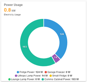
type: custom:apexcharts-card
chart_type: donut
update_interval: 15s
header:
  show: true
  title: Power Usage
  show_states: true
  colorize_states: true
series:
  - entity: sensor.electricity_usage
    show:
      in_chart: false
      in_header: true
  - entity: sensor.athom_plug_v2_01_energy_power
    show:
      in_header: false
  - entity: sensor.athom_plug_v2_02_energy_power
    show:
      in_header: false
  - entity: sensor.athom_plug_v2_03_energy_power
    show:
      in_header: false
  - entity: sensor.athom_plug_v2_04_energy_power
    show:
      in_header: false
  - entity: sensor.athom_plug_v2_05_energy_power
    show:
      in_header: false
  - entity: sensor.athom_plug_v2_06_energy_power
    show:
      in_header: false
I try to align the xaxis ticks with the values. How is this possible?
And how can I start the diagram more to the left, at the yaxis instead of in the middle of the chart?
(Now is only there for reference, to make clear it is a forecast. I dont need that in the final version)

This is the config for this card:
type: custom:apexcharts-card
graph_span: 6d
span:
  start: hour
  offset: '-0h'
apex_config:
  xaxis:
    labels:
      format: ddd
  tooltip:
    x:
      format: ddd dd. MMM.
now:
  show: true
  label: now
yaxis:
  - id: temp
    min: ~0
    max: ~30
    decimals: 0
series:
  - entity: weather.home
    name: max.
    yaxis_id: temp
    unit: °C
    type: line
    color: red
    data_generator: |
      return entity.attributes.forecast.map((entry) =>
      {
        var date = new Date(entry.datetime);
        return [date, entry.temperature];
      });
  - entity: weather.home
    name: Regen
    yaxis_id: mm
    unit: mm
    type: column
    color: blue
    data_generator: |
      return entity.attributes.forecast.map((entry) =>
      {
        var date = new Date(entry.datetime);
        return [date, entry.precipitation];
      });
    show:
      datalabels: true


