No, unfortunately. First you need to use long term statistic to have recorded date for that period of time and when doing so you can only set it up to display the lastest x months and not from a specific date. At least I haven’t been able to.
Has anyone found a way to plot state attributes like state_attr('climate.garageelementet', 'current_temperature') or do I really need to make a template sensor out of it first?
@RomRider I have the same issue as @galaxy_explorer not being able to show sun.sun attributes elevation and azimuth.
In developer tools i can see the attributes and their value, but in Apexcharts i get N/A.
The same config worked for me earlier but not anymore, not sure at what level it stopped working.(half a year ago at least) A fresh install of HA 2022087, and apex2.0.1 gave the same result. (no modifications of default recorder setup)
Hi,
I can’t see the hand in the Toolbar.
Why ?
Thank’s

type: custom:apexcharts-card
graph_span: 24h
stacked: true
header:
  show: true
  title: Production
  show_states: true
apex_config:
  chart:
    zoom:
      enabled: true
    toolbar:
      show: true
      tools:
        download: true
        selection: true
        zoom: true
        zoomin: true
        zoomout: true
        pan: true
        reset: true
    type: area
    height: auto
  stroke:
    show: true
    width: 1
    curve: smooth
  legend:
    show: true
  fill:
    type: gradient
    gradient:
      shadeIntensity: 0.1
      opacityFrom: 0.25
      opacityTo: 1
      inverseColors: true
      start:
        - 100
        - 80
        - 0
series:
  - color: rgb (26,158,11)
    entity: sensor.production
    type: area
    name: Production sur 6h
    show:
      datalabels: false
view_layout:
  position: main
Édit: Ok, not working on iPad, ok on Windows 10
hey all, I did some searches on this and found some (confusing) information that didn’t help me. How I can query data from my InfluxDB database with Apex charts? As you know, data in HA is purged after a certain time and I’d rather not increase that time because I have a separate server for InfluxDB that my Home Assistant feeds. Right now, only Grafana (add on) can do this easily. thanks!
This thread should probably help you out with what you want to do
you can use a data_generator to access the attributes of an entity, there is a good example of this in the documentation.
1 Like
Has anyone found a way to make one line bolder than the others? As I understand it the stroke width is configured across all series. In the example below I would like the green line to stand out, gets a bit cluttred as it is now:

Edit: Solved with stroke_width.
Another question, has anyone found a way to have vertical lines indicating where each day starts? So that it is easier to see in the graph where a day starts and ends? Tried annotations but only got it to work on the yaxis since I don’t know where to place them on the xaxis since that is a date.
thank you, sir!
1 Like
Did you manage to get the xaxis annotations to work without adding a static text but a sensor value for x, x2?
no, I didn’t get it to work. It seemed to influence the ‘now’ line and other things.
I ended up plotting a step-in curve agains a secondary y-axis:

1 Like
Would it be possible to elaborate a bit on this?
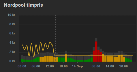
Sorry. It’s probably easy, but I have tried and failed to fill similar gaps (as BolleK had) in my plot. My use is electricity price (hour slot) that I have split into 3 steplines (past of today, rest of today and tomorrow). Maybe its just to extend last value to last hour+1?
edit: added link to org post
Hi, I don’t know what is wrong with my config of a Yearly - Monthly Power overview. I only see the current month, and not the Month before. The Sensors are running since February.

type: custom:apexcharts-card
graph_span: 12month
update_interval: 1hour
cache: true
span:
  end: month
  offset: '-1hour'
header:
  show: true
  title: MoleNord Monthly Overview
  show_states: true
  colorize_states: true
apex_config:
  xaxis:
    labels:
      format: MM
      show: true
      showAlways: true
  yaxis:
    forceNiceScale: false
    decimalsInFloat: 0
  chart:
    type: area
    height: 300
  stroke:
    show: true
    width: 1
  legend:
    show: true
  dataLabels:
    enabled: false
    distributed: true
  fill:
    type: gradient
    gradient:
      shadeIntensity: 0.1
      opacityFrom: 0.25
      opacityTo: 1
      inverseColors: true
      stops:
        - 0
        - 90
        - 100
series:
  - entity: sensor.energy_import_monthly
    name: Consumption Monthly
    type: column
    float_precision: 0
    group_by:
      func: max
      duration: 30d
    show:
      extremas: true
  - entity: sensor.solarexportminusmonthly
    name: Selfused Monthly
    type: column
    float_precision: 0
    group_by:
      func: max
      duration: 30d
  - entity: sensor.energy_export_monthly
    name: Exported Monthly
    type: column
    float_precision: 0
    group_by:
      func: max
      duration: 30d
  - entity: sensor.solarh_98050_month_eq
    name: Production Monthly
    type: column
    float_precision: 0
    group_by:
      func: max
      duration: 30d
´``Hi,
Not sure what I’m missing but if I copy the code and paste it into a custom button-card nothing shows. Could you give me a hand  ?
?
Did you get the pool card working? Could you if so help me out by showing the complete code?
Possible bug?
When combining two entities, one with “type: column” and the other one being “type: line” everything looks normal if the “type: line” series is set to “extend_to: end”.

Now look what will happen if I set “extend_to: now” for the series that has “type: line”. The columns shrimps into very tiny bars.


1 Like
Just starting out on this fine charting tool. Great to see you can use an attribute of an entity.
One question I have and have yet to get to work is to utilise the attribute when it is non numeric?
I have motion states for cams and an attribute that details if a person is detected.
Im looking to chart the number of times a person is detected over a period.
As the attribute ‘personDetected’ is a string val of ‘true’ I thought I could use a transform to pick this up (as per previous binary sensor values, and use that, however that expression never seems to eval to true. (possible values for this attribute is either true/false
Sample code below.
type: custom:apexcharts-card
all_series_config:
  stroke_width: 2
graph_span: 24h
header:
  show: true
  title: Person Activity
  show_states: true
  colorize_states: true
now:
  show: true
  color: red
  label: Now
series:
  - entity: binary_sensor.backdoor_motion
    attribute: personDetected
    transform: 'return x === ''true'' ? 1 : 0;'
span:
  end: day
Regardless of time span of eval against true/false, it always returns 0. What am I doing wrong here?
Any tips please?
I would like to use the chart to display the price of petrol.
But not all decimal places are displayed.
I saw you can adjust the Y axis with
‘decimals: 4’
but only on the Y axis.
hi can some vouch me how to create a chart like this

ref link : Custom DataLabels Bar – ApexCharts.js
1 Like
hi… instead of total like above can i add a sensor state to be showed which is not listed in entity series?
something like this is it possible?
    pie:
      donut:
        labels:
          show: true
          total:
            show: true
            label: Total
            formatter: |
              EVAL:function(w) {
                return {{states('sensor.processor_use')}} + " core"
                }````