First of all thanks for this amazing card. It’s absolutely fabulous.
Does anyone know how to change the decimal number notification for the y-axis label from decimal point to decimal comma (5,7 instead of 5.7)?
It’s not in your localization settings. I tried changing date formats to Danish, dit not work either. Simple fix is to remove decimals
Is it possible to cut a line?
I have a value that is only valid for three hours a day.

The red line is all the way through, I’d like it to only be displayed between 17 and 20h. I’ve tried this to no avail:
      let pr =[entity.attributes.gasday,entity.attributes.gasday,entity.attributes.gasday];
      console.log(pr);
      return [...entity.attributes.gasday].reverse().map((entry)
      => {
        const lNow = now;
        console.log(entry);
        now -= 30 * 60 * 1000;
        return [lNow, entry];
      }).reverse();
Btw thanks to Romrider, I have 10k+ views of my spot price prognosis per day, and it’s Apexchart-card that is the business end of visuals.
Henrik
Does anybody know how to use a sensor value to set a horizontal line in the chart?
This doesn’t work:
 apex_config:
   annotations:
     yaxis:
       - 'y': hass.states['sensor.mysensor'].state
Yes I solved it.
I created a sensor (in my sensors.yaml):
- platform: template
  sensors:
    medelpris_el_kr:
      friendly_name: Medelpris på el idag
      entity_id:
        - sensor.nordpool_kwh_se3_sek_3_095_025
      value_template: '{{ states.sensor.nordpool_kwh_se3_sek_3_095_025.attributes.mean }}'
Then I added this to the apexchart:
  - entity: sensor.medelpris_el_kr
    type: line
    transform: return x * 100
    group_by:
      func: avg
      duration: 24h
Hopefully that helps.
/Fanan
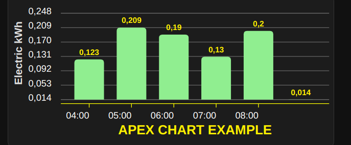
Here’s two snippets of code that will work for you. Your choice which one you choose.
yaxis:
  - id: electric
    decimals: 3
    apex_config:
      title:
        text: Electric kWh
        style:
          fontSize: 16px
      forceNiceScale: 'no'
      labels:
        show: true
        formatter: |
          EVAL:function(value) {
            let text = parseFloat(value).toFixed(3);
            let result = text.replace(".", ",");
            return result;
          }
        style:
          colors: '#ffffff'
          fontSize: 14px
series:
or
apex_config:
  yaxis:
    show: true
    labels:
      show: true
      formatter: |
        EVAL:function(value) {
          let text = parseFloat(value).toFixed(3);
          let result = text.replace(".", ",");
          return result;
        }
      style:
        colors: '#ffffff'
        fontSize: 16px
1 Like
Many thanks for the support! Working great.
Thanks for your post. This is something I would like to have to! Unfortunally the code for the config.yaml doesn’t work:
template:
  - sensor:
      - name: Grafico riscaldamento soggiorno - sta riscaldando ## In English it's heating
        state: "{{ states('sensor.tado_riscaldamento_bagno_temperature') | float }}" ## the value of the sensor is equal to current temperature
        availability: "{{ states('sensor.tado_riscaldamento_bagno_heating') | int}}" ## when it's not heating, availability is 0, so the value of the sensor is null
I have the 2022.1.1 version of HA. Most yaml code is written as this in my HA:
  - platform: template
    sensors:
      energy_gas_en_elektriciteit_maandelijks_eur:
        friendly_name: 'Totale netto maand kosten energie'
        value_template: "{{ (states('sensor.gas_maandelijks_eur')|float + states('sensor.energy_import_total_maandelijks_eur')|float)|round(2) }}"
        unit_of_measurement: "€"
How can I get this to work?
Hi! I’ll try to help you, if I can (even though I’m not an expert in template sensors).
I suggest you to proceed step by step
1) Check in developer tools the result of your value
{{ ( states('sensor.gas_maandelijks_eur') | float + states('sensor.energy_import_total_maandelijks_eur') | float) | round(2) }}
If you obtain the right value, go on.
2) Create a really simple template sensor in configuration.yaml
template:
  - sensor:
      - name: Totale netto maand kosten energie
        state: "{{ ( states('sensor.gas_maandelijks_eur') | float + states('sensor.energy_import_total_maandelijks_eur') | float) | round(2) }}"
Restart home assistant and check if you see your template sensor (go to entities and search for “Totale netto maand kosten energie”)
3) Play with availability, units, etc
Then you can come back to configuration.yaml and add more complexity to your sensor (unit of measurement, availability, etc)
Maybe this approach could help you creating your template sensor. Otherwise I suggest you to search videos / post about creating a template sensor!
1 Like
Are there any examples on how to modify the header?
This is with a floating header:

I would like to put the header in the middle of the card.
@Rubbervdh When you have created your template sensor, if you want to play with availability, keep in mind that:
- when availability is 0 (int) → the sensors is not available in home assistant and its value in the chart is null
- when availability is different from 0 → the sensor is available in home assistant and its value is the value you have assigned to it in configuration.yaml
So if you want that your sensor is unavailable when {{ states(‘sensor.my_sensor’) }} is 0, you should write something like this:
template:
  - sensor:
      - name: Totale netto maand kosten energie
        state: "{{ ( states('sensor.gas_maandelijks_eur') | float + states('sensor.energy_import_total_maandelijks_eur') | float) | round(2) }}"
        availability: "{{ states('sensor.my_sensor') | int }}"
Short answer No. As per the HA Apex Chart documentation, Positioning will be supported later. Note, the HEADER is an HA option and is not part of the official Apex Chart system.
However, you could make use of the legend option within the apex_config.
Much neater and takes up less vertical space (depending on fontsize), plus an optional title if so inclined. See https://apexcharts.com/docs/options/legend/ for all options and much more.
Code snipped to get you started.
apex_config:
  chart:
    height: 250
  legend:
    show: true
    showForSingleSeries: true
    position: top
    horizontalAlign: center
    fontSize: 30px
    offsetX: 0
    offsetY: 0
    labels:
      useSeriesColors: true
    onItemClick:
      toggleDataSeries: false
    onItemHover:
      highlightDataSeries: false

1 Like
Thanks for the response. I see that you’re way of writing in the config.yaml is different from mine. I have my sensors this way:
sensor:
  - platform: systemmonitor
    resources:
      - type: processor_use
      - type: processor_temperature
      - type: memory_free
      - type: disk_use_percent
        arg: /
      - type: disk_use
      - type: disk_free
      - type: throughput_network_in
        arg: enp0s3
      - type: throughput_network_out
        arg: enp0s3
# Temperatur-Attribut Buitentemp volgens HA zelf
  - platform: template
    sensors:
      norwegian_temperature:
        friendly_name: "met.no Tempratuur Buiten"
        unit_of_measurement: '°C'
        value_template: "{{ state_attr('weather.huis', 'temperature') }}"

# Temperatur-Attribut Windkracht volgens HA zelf
  - platform: template
    sensors:
      norwegian_temperature:
        friendly_name: "met.no Windkracht Buiten"
        unit_of_measurement: 'km/h'
        value_template: "{{ state_attr('weather.huis', 'wind_speed') }}"

#WK gemiddelde beide sensors
  - platform: min_max
    name: avg_wk_xiaomi_sonoff
    type: mean
    entity_ids:
      - sensor.sonoff_woonkamer_sensor_temperature
      - sensor.woonkamer_temperature
#WK gemiddelde beide sensors 24h
  - platform: statistics
    name: WK avg Sonoff en Xiaomi 24h
    entity_id: sensor.avg_wk_xiaomi_sonoff
    state_characteristic: mean
    max_age:
      hours: 24

# Gemiddelde WK temp Sonoff 24h
  - platform: statistics
    name: WK Sonoff avg 24h
    entity_id: sensor.sonoff_woonkamer_sensor_temperature
    state_characteristic: mean
    max_age:
      hours: 24
# Gemiddelde WK temp Xiaomi 24h
  - platform: statistics
    name: WK Xiaomi avg 24h
    entity_id: sensor.woonkamer_temperature
    state_characteristic: mean
    max_age:
      hours: 24

#Buiten gemiddelde beide sensors zonder tijd
  - platform: min_max
    name: avg_bu_sonoff_sonoff2
    type: mean
    entity_ids:
      - sensor.sonoff_buiten_sensor_temperature
      - sensor.sonoff_buiten_sensor_2_temperature

#Buiten gemiddelde beide sensors 24h
  - platform: statistics
    name: BU avg Sonoff hok en huis 24h
    entity_id: sensor.avg_bu_sonoff_sonoff2
    state_characteristic: mean
    max_age:
      hours: 24

# Gemiddelde Buiten temp Sonoff naast huis 24h
  - platform: statistics
    name: BU Sonoff naast huis avg 24h
    entity_id: sensor.sonoff_buiten_sensor_2_temperature
    state_characteristic: mean
    max_age:
      hours: 24
So in short: I start with the tag Sensor:
And under that tag i define my sensors and their platform, like template.
I see that you start with Template. Is that te platform or is that a different way of writing? I am getting errors when I trie it that way
Sorry, on the phone here, but if you look at the template documentation, your way is now considered “legacy”, meaning that it’s still supported, but the new way with template on the top level is the recommended way going forward.
“Legacy binary sensor configuration format
This format still works but is no longer recommended. Use modern configuration.”
I actually just discovered this myself and I would recommend reading the documentation and related discussion well before converting to the new one.
E.g. friendly name is now not longer needed. It now takes advantage of unique_id instead.
Just when I start getting it it changes  that’s unfortunate.
So I need to change all my sensors for it to work? Or can I just create a Template and work from there and keep te others?
I also got another thermostat than you, maybe that’s the problme? I dont have a entity heating but I do have an attribute, dont know exactly what to do now

this is fantastic! i want to use this but im having a hard time figureing out what is what. With that coulmn in entity sensor.power_consumption. I made a utility helper and I would like the graph to display 2 hours of live demand and have the bar graph display 7 days of total power consumption for that full day using the helper. But i would like to make the columns transparent so it is nicer to see. any idea what i would need to change?
Hi there, I have a presence sensor tracking the rooms I’m in over the day. Possible states are “Bath”, “Kitchen”, “Hall”, …
Is it possible with ApexCharts and without any additional sensor to create a donut diagram showing how many percent of the day or how long I’m in certain rooms?
I am building an energy consumption card and have a few questions.
- Is it possible to plot the lines until to the last value (actual / current) and not until end of day?
- Can Apexchart show the current consumption (which I have in a separate sensor) and todays average so far, like I mocked on the chart?

My code so far:
type: custom:apexcharts-card
stacked: true
layout: minimal
graph_span: 24h
header:
  standard_format: false
  show: true
  title: Stromverbrauch heute
span:
  start: day
series:
  - entity: sensor.shelly_3em_channel_a_power
    name: Phase 1
    color: '#560BAD'
    type: line
    group_by:
      func: last
      duration: 45m
    stroke_width: 3
    show:
      extremas: false
      header_color_threshold: true
      legend_value: false
  - entity: sensor.shelly_3em_channel_b_power
    name: Phase 2
    color: '#B5179E'
    type: line
    group_by:
      func: last
      duration: 45m
    stroke_width: 3
    show:
      extremas: false
      legend_value: false
      header_color_threshold: true
  - entity: sensor.shelly_3em_channel_c_power
    name: Phase 3
    type: line
    color: '#F72585'
    group_by:
      func: last
      duration: 45m
    stroke_width: 3
    show:
      extremas: false
      legend_value: false
      header_color_threshold: true
- Have a look at the extend_to option
1 Like