I would opt for your solution. Easier and cleaner. Just one thing, use this
{{ 0 | int }}
instead of just 0 in your template.
Also check the syntax in the Template editor before adding the code into the configuration.yaml file.
Success.
I would opt for your solution. Easier and cleaner. Just one thing, use this
{{ 0 | int }}
instead of just 0 in your template.
Also check the syntax in the Template editor before adding the code into the configuration.yaml file.
Success.
Thank you very much for your precious suggestions!
It works, but I have one last question for a perfect outcome!
In configuration.yaml I’ve added the following template sensor
template:
  - sensor:
      - name: “Grafico riscaldamento soggiorno - sta riscaldando”
        state: >
          {% if is_state('sensor.tado_riscaldamento_soggiorno_heating', '0.0') %}
            {{ 0 | int }}
          {% else %}
            {{ states('sensor.tado_riscaldamento_soggiorno_temperature') }}
          {% endif %}
Then I’ve created the following apex-chart with the new template sensor in orange in order to highlight when it’s heating:
type: custom:apexcharts-card
graph_span: 30min
header:
  show: true
  title: Temperatura
  show_states: true
  colorize_states: true
series:
  - entity: climate.tado_riscaldamento_soggiorno
    attribute: temperature
    name: Temp desiderata ## desired temperature in English
    stroke_width: 1.5
    type: line
    curve: smooth
    color: '#ba181b'
    opacity: 1
    unit: °C
    show:
      extremas: false
      in_header: false
  - entity: sensor.tado_riscaldamento_soggiorno_temperature
    name: Temp attuale ## current temperature in English
    stroke_width: 3
    type: area
    curve: smooth
    color: '#4d908e'
    opacity: 0.07
    unit: °C
    show:
      extremas: true
      name_in_header: false
      in_header: true
  - entity: sensor.grafico_riscaldamento_soggiorno_sta_riscaldando
    name: Sta riscaldando ## is heating in English
    stroke_width: 0
    type: area
    curve: smooth
    color: orange
    opacity: 0.5
    show:
      in_header: false
      legend_value: false
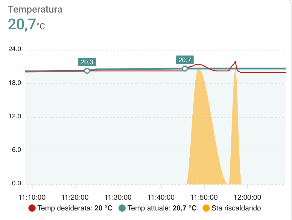
Here you can see the resut: it works, since as soon as I rise the desired temperature (red line) my thermostat starts heating and on the graph appears an orange area that perfectly overlaps current temperature!
But I have one last question.
When it’s not heating, the value of my custom sensor is 0 and this changes the y axis min (the graph automatically sets y axis, min value, to 0).
I would like not to change the y axis and I have to ideas.
Idea 1
In apex chart card I would like to use y-axis function to change dinamically its min value (setting it, for example, to the min value of current temperature in the last 24 h - 1). I’ve made a few attempts but
Idea 2
I could simply change my template sensor in configuration.yaml so that
So I could change the following template sensor replacing {{ 0 | int }} with something that could give me a null or empty value (maybe {{ “” }} but I think this would give me a string value). I’m searching for a solution in forums, but up to now I didn’t find it. Do you think it could be possibile? Sorry for abusing your patience!
template:
  - sensor:
      - name: “Grafico riscaldamento soggiorno - sta riscaldando”
        state: >
          {% if is_state('sensor.tado_riscaldamento_soggiorno_heating', '0.0') %}
            {{ 0 | int }} ### <- VALUE I NEED TO CHANGE WITH NULL OR EMPTY
          {% else %}
            {{ states('sensor.tado_riscaldamento_soggiorno_temperature') }}
          {% endif %}
Anyway, thank you very much for your kind help!! 
EDIT
I think I’ve found a pretty smart solution for the template sensor with just two lines of code.
Since I want a sensor that
I’ve changed the template sensor as follows:
template:
  - sensor:
      - name: Grafico riscaldamento soggiorno - sta riscaldando
        state: "{{ states('sensor.tado_riscaldamento_soggiorno_temperature') | float }}"
        availability: "{{ states('sensor.tado_riscaldamento_soggiorno_heating') | int}}"
Through “availability”:
I’ll test it one day, and then we’ll se if I managed to obtain the desired result!
Hi! No - and I’m not sure how to do that. Do you have any pointers to hand out?
Hi,
Can anyone please offer a suggestion on what I’m doing wrong here. I’ve searched this topic and the open bugs in Git. While I can find some items relating to Stacking, none of them really describe the problem I’m having.
I’ve got a few Apex Charts cards working well but this stacked area chart isn’t behaving as I’d expect.
What I’m trying to do is show the elements that make up my total electricity usage (to see how bad a job we’re doing at timing usage against our solar production). I’ve got a bunch of Zigbee plugs reporting power and a template sensor to calculate the “other” electricity.
What’s actually shown below is that all the different elements are overlaid on top of each other rather than stacking and it looks like each has picked it’s own scale which isn’t what’s shown on the primary y-axis.
I know some of the items in the dashboard entry are superfluous, it’s just part of me trying switching things on and off.
Thanks.

type: custom:apexcharts-card
apex_config:
  chart:
    stacked: true
    height: 300px
graph_span: 5h
span:
  start: hour
  offset: '-34h'
now:
  show: true
  label: Now
header:
  show: true
  title: Detailed past four hours
all_series_config:
  stroke_width: 2
series:
  - entity: sensor.ninja_power
    yaxis_id: first
    type: area
    curve: stepline
    extend_to: false
  - entity: sensor.dehumidifier_power
    yaxis_id: first
    type: area
    curve: stepline
    extend_to: false
  - entity: sensor.desk_fan_power
    yaxis_id: first
    type: area
    extend_to: false
  - entity: sensor.washing_machine_power
    yaxis_id: first
    type: area
    curve: stepline
    extend_to: false
  - entity: sensor.dishwasher_power
    yaxis_id: first
    type: area
    curve: stepline
    extend_to: false
  - entity: sensor.other_appliances_power
    yaxis_id: first
    type: area
    curve: stepline
    extend_to: false
Try
type: column
not
type: area
Thanks for the quick reply! That seems to have done the trick. I’m sure I’d seen an example somewhere using type: area but I could well be mistaken …
I would suggest you to try different solutions…
Idea 0
As somebody suggested, try to create a new identical series but group its results (if your graph span is 24 hours, I guess that if you group the values by 24 hours duration, you could obtain a straight line… but I could be wrong)
For example you should try to add something like that in your apex-chart:
  - entity: sensor.same_price_sensor
    type: line
    name: Average24h
    group_by:
      func: avg
      duration: 24h
Idea 1
You can create a statistic template that generates the average value of another entity in the last x hours (for example 24 hours) and then add that new entity in an apex chart graph with the same graph_span (for example 24 hours).
For example it could be something like this (but always check the code by yourself in statistic template webpage):
sensor:
  - platform: statistics
    name: "my sensor mean value over last 24 hours"
    entity_id: sensor.my_sensor
    state_characteristic: mean
    max_age:
      hours: 24
Then in your entities you’ll find a new entity that you can add to your apex chart as a new sensor
Idea 2
You can try some hacs integrations that (without coding) similarly creates an entity that gives you the average value of another sensor in a period of time.
For example you could try this hacs integration: GitHub - jeroenterheerdt/HADailySensor: Sensor for Home Assistant that gets reset at midnight
Then you can add the new entity to your apex chart as a new series!
Actually I think I spoke to soon.
Looking at the latest plots it seems to have got the axis consistent now between the series which is a step in the right direction but is still not actually stacking up the values of the different series.
Some fidelity is also lost using bars but I could probably have a play with the time grouping being used.
Hi All. Is it possible to create a bar chart using the entity state as the series value? I am keen to replace my use of the bar card to save some space on the dashboard.
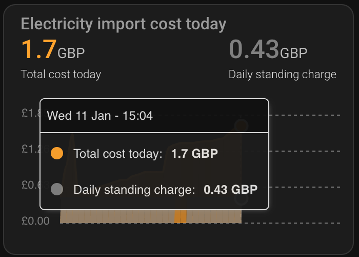
For currencies I would like to force values to 2 decimal places. I have tried float_precision: 2 in the series, however this results in trailing zeros being removed.
type: custom:apexcharts-card
header:
  title: Electricity import cost today
  show_states: true
config_templates: default
span:
  start: day
graph_span: 24h
color_list:
  - orange
  - grey
all_series_config:
  type: area
series:
  - entity: sensor.electric_cost_today
    name: Total cost today
    float_precision: 2
    group_by:
      func: avg
      duration: 30mins
  - entity: sensor.electric_tariff_standing
    name: Daily standing charge
    float_precision: 2
    group_by:
      func: avg
      duration: 30mins
apex_config:
  yaxis:
    min: 0
    labels:
      formatter: |
        EVAL:function (val) {
         return "£" + val.toFixed(2);
        }
    forceNiceScale: true
  xaxis:
    axisTicks:
      show: false
    labels:
      show: false
  chart:
    height: 150
Hi guys! I’ve just completed the graph I was writing about in the last days: the result satisfies my expectations 100%, so I’ll summarise here what I did (maybe somebody wants to do something similar).
A special thanks to @Kertz1954 for helping me in some previous posts!
ABSTRACT
I wanted to recreate the default history climate graph highlighting
Here you can see the result:

CURRENT TEMPERATURE: GREEN
I’ve added a series in my apex chart with the sensor that gives me the current temperature
  - entity: sensor.tado_riscaldamento_bagno_temperature
    name: Temp attuale
    stroke_width: 3.5
    type: area
    color: '#4d908e'
    opacity: 0.08
    unit: °C
    show:
      extremas: true
      name_in_header: false
      in_header: true
    group_by:
      func: avg
      duration: 5m
DESIRED TEMPERATURE: RED
I’ve added a series in my apex chart with the sensor that gives me the desired temperature.
series:
  - entity: climate.tado_riscaldamento_bagno
    attribute: temperature
    name: Temp desiderata
    stroke_width: 1.5
    type: line
    color: '#CC3333'
    opacity: 1
    unit: °C
    show:
      extremas: false
      in_header: false
    group_by:
      func: avg
      duration: 5m
IS HEATING: ORANGE
Here comes the tricky part.
I want that when it’s heating (heating sensor > 0), the chart becomes orange.
In order to achieve that result, I’ve created a new template sensor in configuration.yaml that
 when it’s not heating I don’t want a 0 value, since this will interfere with y-axis min value in my chart)
So I’ve created in my configuration.yaml the following sensor:
template:
  - sensor:
      - name: Grafico riscaldamento soggiorno - sta riscaldando ## In English it's heating
        state: "{{ states('sensor.tado_riscaldamento_bagno_temperature') | float }}" ## the value of the sensor is equal to current temperature
        availability: "{{ states('sensor.tado_riscaldamento_bagno_heating') | int}}" ## when it's not heating, availability is 0, so the value of the sensor is null
Pay attention to “availability”:
Finally I’ve added the template sensor to my apex chart as a third orange series:
  - entity: sensor.grafico_riscaldamento_bagno_sta_riscaldando
    name: Sta riscaldando
    stroke_width: 0
    type: area
    color: orange
    opacity: 0.5
    show:
      in_header: false
      legend_value: false
    group_by:
      func: avg
      duration: 5m
FULL APEX CHART CODE
type: custom:apexcharts-card
graph_span: 12h
header:
  show: true
  title: Temperatura bagno
  show_states: true
  colorize_states: false
series:
  - entity: climate.tado_riscaldamento_bagno
    attribute: temperature
    name: Temp desiderata
    stroke_width: 1.5
    type: line
    color: '#CC3333'
    opacity: 1
    unit: °C
    show:
      extremas: false
      in_header: false
    group_by:
      func: avg
      duration: 5m
  - entity: sensor.grafico_riscaldamento_bagno_sta_riscaldando
    name: Sta riscaldando
    stroke_width: 0
    type: area
    color: orange
    opacity: 0.5
    show:
      in_header: false
      legend_value: false
    group_by:
      func: avg
      duration: 5m
  - entity: sensor.tado_riscaldamento_bagno_temperature
    name: Temp attuale
    stroke_width: 3.5
    type: area
    color: '#4d908e'
    opacity: 0.08
    unit: °C
    show:
      extremas: true
      name_in_header: false
      in_header: true
    group_by:
      func: avg
      duration: 5m
Have a nice day people! Keep “home-assisting”! 
WOW !! so nice !! can you share code for that ? looks amazing !!
Hello to all!
I made an apexchart card that is showing two sensors.
But I got two issues with it:
Utility meter sensor resets its value on midnight, but on apexchart card I see it like it would reset the value on 10:30 am and until 10:30am the bar doesn’t show up on chart.

Second, when I have both sensor visualization on, the bars are quite thin. When I disable the temp visualization they are getting thicker and in that way I would like to see them always.
Code:
type: custom:apexcharts-card
view_layout:
  grid-area: main-left
yaxis:
  - id: usage
  - id: temp
    opposite: true
apex_config:
  chart:
    stacked: false
    height: 300px
graph_span: 1month
span:
  start: month
show:
  last_updated: true
header:
  show: true
  show_states: true
  colorize_states: true
  title: Heat pump energy consumption daily
series:
  - entity: sensor.heat_pump_energy_daily
    yaxis_id: usage
    name: Heat pump
    type: column
    unit: ' kWh'
    group_by:
      func: max
      duration: 24h
    show:
      datalabels: true
  - entity: sensor.lumi_lumi_weather_temperature
    stroke_width: 2
    type: area
    yaxis_id: temp
    name: External temp
    group_by:
      func: avg
      duration: 24h
    extend_to: now
Thank you for any hint
To many lines to post here, so here’s a link. Download the apex-chart.txt and paste the contents into a dashboard tab (Markdown card will do). It will not work for you, but at least you can view the code. Have fun !!
https://drive.google.com/drive/folders/1F1GJs6IKI029L5W94VlX7mAcEbjVTpSF?usp=sharing
Amazing graph!
Great idea the “plus” and “minus” button!
I’m creating something similar with chips mushroom cards:
![]()
But I’m struggling with the syntax of graph_span in apex chart.
I tried this:
type: custom:apexcharts-card
graph_span: {{states['input_number.grafici_temperatura_ore'].state | int }}h
but it
Can you please tell me what I’m doing wrong with the sinter in apex chart?
Thank you very much!!
You need this type of format, plus the custom config template card in your HA enviroment.
I would also suggest a counter rather than an input_number.
Hope this helps.
type: custom:config-template-card
entities:
  - counter.graph_temp_hour_counter
  - sensor.mgc_schiphol_description
  - sensor.mgc_schiphol_station_name
card:
  type: custom:apexcharts-card
  update_interval: 2min
  graph_span: ${{states['counter.graph_temp_hour_counter'].state+'h'}}
Thank you very much!
I’ve tried this but it doesn’t worK
type: custom:apexcharts-card
graph_span: ${{states['counter.grafici_temperatura_ore'].state+'h'}}
But… I think maybe the problem is that you guys are operating in config template card. Tomorrow I’ll install it and try with more patience!
Thank you very much!!
Yes, that’s a must have !!
I will handle it than you so much !