You could wrap it with card-templater, it allows to add templates to almost any attribute (there is another card that allows templating too)
EDIT, example where I use wto input select fields to drive the offset
to use individual entities for the hourly prices?
Ive deleted that CC providing those attributes (not allowed in core HA…) but do have a rest sensor providing 24 entities
I have this in a custom:mini-graph-card config now, but would prefer it to be an apexcharts.
Hi, can anyone help me troubleshoot two issues please?
No matter what I do, I can’t seem to disable the automatic scaling of the Y axis. I would like to be able to set min and max manually so it doesn’t constantly adjust with my MQTT sensors. However, when I do this it shows me the correct Y axis for a second whilst pulling data from my sensor, but then defaults to the max value of the sensor and continues to automatically adjust the scale. I have tried forceNiceScale with no luck.
I also can’t seem to set a label on my Y axis. No matter what options I out in, nothing ever shows.
I can’t help thinking that the two issues are related, and would be very grateful if someone could point out whatever obvious point I’m missing!
Hi, your post was 2 years ago, and unfortunately I can’t help you with your question either.
But could you share the yaml for your solar forcast card? Especially the readout of the SOLCast pv_estimate10 and pv_estimate90 (both Future Forecast) with the correct timestamp would interest me. (the setting of the data_generator). Thanks a lot!
To generate a forecast card using Apexcharts and SolCast showing the past forecast values (forecastpv_estimate in kWh) and the future lower and upper bound probabilistic forecast data P10, P90 (detailedForecastpv_estimate10 and pv_estimate90 in kWh) and the generated PV power (solarman_total_ac_output_power_active in W):
type: custom:apexcharts-card
apex_config:
  chart:
    height: 350px
all_series_config:
  unit: kWh
  float_precision: 3
  opacity: 0.3
  stroke_width: 3
header:
  title: Daily forecast
  show: true
  standard_format: true
  show_states: true
  colorize_states: true
graph_span: 1d
span:
  start: day
  offset: '-0d'
now:
  show: true
  label: Now
yaxis:
  - id: kWh
    min: 0
    max: 0.6
    apex_config:
      tickAmount: 5
  - id: header_only
    show: false
series:
  - entity: sensor.solarman_total_ac_output_power_active
    yaxis_id: kWh
    type: area
    name: PV
    color: orange
    opacity: 0.4
    show:
      legend_value: false
      in_header: false
    stroke_width: 1
    transform: return x/1000
    group_by:
      func: avg
      duration: 1min
    extend_to: false
  - entity: sensor.solcast_forecast_today
    yaxis_id: kWh
    type: line
    name: forecast
    color: black
    opacity: 1
    stroke_width: 2
    data_generator: |
      var now = new Date().getTime();
      var today = entity.attributes.forecast
        .filter(start => new Date(start["period_start"]).getTime() < (now + 1000*60*30))
        .map((start, index) => {
        return [
          new Date(start["period_start"]).getTime(), start["pv_estimate"] || 0
        ];
      });
      var data = today
      return data;
    show:
      legend_value: false
      in_header: false
    extend_to: false
  - entity: sensor.solcast_forecast_today
    yaxis_id: kWh
    type: line
    name: detailedForecast
    color: grey
    opacity: 1
    stroke_width: 2
    data_generator: |
      var now = new Date().getTime();
      var today = entity.attributes.detailedForecast
        .filter(start => new Date(start["period_start"]).getTime() > (now - 1000*60*30))
        .map((start, index) => {
        return [
          new Date(start["period_start"]).getTime(), start["pv_estimate"] || 0
        ];
      });
      var data = today
      return data;
    show:
      legend_value: false
      in_header: false
    extend_to: false
  - entity: sensor.solcast_forecast_today
    yaxis_id: kWh
    type: line
    name: 10%
    color: grey
    opacity: 0.6
    stroke_width: 1
    data_generator: |
      var now = new Date().getTime();
      var today = entity.attributes.detailedForecast
        .filter(start => new Date(start["period_start"]).getTime() > (now - 1000*60*30))
        .map((start, index) => {
        return [
          new Date(start["period_start"]).getTime(), start["pv_estimate10"] || 0
        ];
      });
      var data = today
      return data;
    show:
      legend_value: false
      in_header: false
    extend_to: false
  - entity: sensor.solcast_forecast_today
    yaxis_id: kWh
    type: line
    name: 90%
    color: grey
    opacity: 0.6
    stroke_width: 1
    data_generator: |
      var now = new Date().getTime();
      var today = entity.attributes.detailedForecast
        .filter(start => new Date(start["period_start"]).getTime() > (now - 1000*60*30))
        .map((start, index) => {
        return [
          new Date(start["period_start"]).getTime(), start["pv_estimate90"] || 0
        ];
      });
      var data = today
      return data;
    show:
      legend_value: false
      in_header: false
    extend_to: false
How do you reference attributes? The docs say that you can read an attribute instead of state, but it doesn’t do anything, state is the same as the last value of the data_generator which reads an array called rates. The “current” value is also held in an attribute called rate.
In a console.log in the data_generator I can reference entity.attributes.rate.value_inc_vat, but how do I use this in the attribute?
attribute string v1.4.0 Instead of retrieving the state, it will retrieve an attribute of the entity. Make sure you increase update_delay if the chart doesn’t reflect the last value of the attribute
I have added an extra entity and hidden the incomplete graph (ends at now) and used the state from that as the header, meanwhile taken the data_generator for the same, hidden the header. Now I’m left with legend names and values at the bottom for each duplicate series How can I remove the legend at the bottom, I blanked them out but the dots remain?
I had the span set to 24h with an 12h offset, but this needs to be more dynamic as the next day’s forecast doesn’t appear until 4pm and after midnight, the start: day really screwed things up. how can I restrict the range to consistently show previous 2 hours and as much future data at is available, sizing the graph to the available data rather than getting the flatline at the end?
X-axis labels go wonky by less then 4 group by_points, plain wrong at 1 group_by point
(The below examples are simplified, my actual use case is to make a dynamic overview for a Campground, where alas single or few nights is very common.)
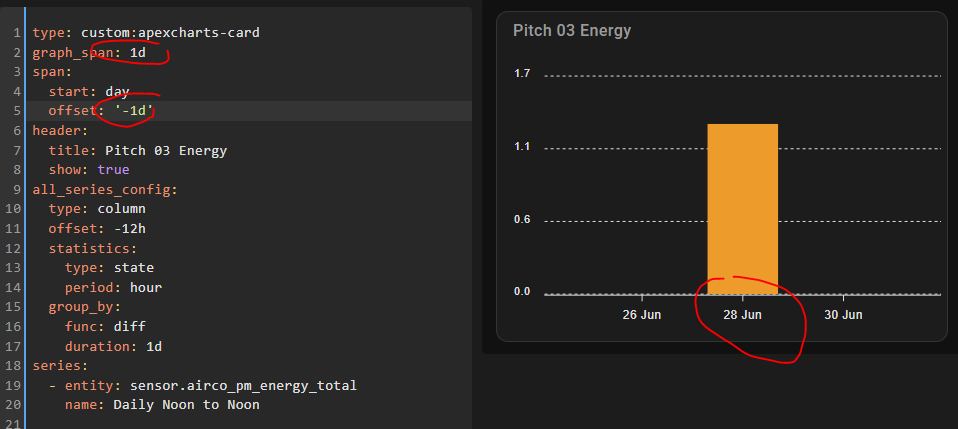
So when I group_by, in order to both get a “diff” result, but also to count noon-2-noon, at 4 nights, it all looks dandy:
So I wonder if this is something I should report as issue, or if there is anything I can do.
BTW: when I use span: end: day it does not work at all for 1 day, so calculating the start is already a bit of a workaround.
For clarity: that last 1-day image, the data is for June 26, as intended, but the x-axis is wrong, so it displays multiple numbers, and a different date ends up in the middle
Is there some place better to get support/discussion on this component?
git discussions and issues seem to go unanswered and the git readme sends me here… also many questions and no response/answers.
I like this graph, implementation but config by trial and error is painful


 to find your way aound